The outline for this post is as follows:
- The Myth and Its Flaw
- Context and Analysis
- Posts Providing Further Information and Analysis
- References
This is the "main version" of this post, which means that this post lacks most of my references and citations. If you would like a more comprehensive version with all the references and citations, then please go to the "+References" version of this post.
References are cited as follows: "[#]", with "#" corresponding to the reference number given in the References section at the end of this post.
1. The Myth and Its Flaw
Climate models predict that in moist tropical areas, a region of the lower atmosphere will warm more than Earth's surface. This region of greater warming is known as the "hot spot". The myth claims that a 2006 report of the United States Climate Change Science Program (CCSP) provided evidence against the hot spot's existence. Many myth advocates resort to deception (or willful avoidance of evidence) in order to defend this myth.
Proponents of this myth include David Evans, Stefan Molyneux, Joe Bastardi, Steve Milloy, Theo Wolters, Nicola Scafetta, S. Fred Singer, Christopher Monckton, Luboš Motl, Anthony Watts, Ken Gregory from Friends of Science (via Clive Best), Paul Homewood, Tom Nelson, EIKE (the European Institute for Climate and Energy), CO2 is Life, US Issues, Turbulent Eddie, No Tricks Zone, and 1000frolly.
The myth's flaw: The CCSP made no definitive claim on whether the hot spot exists. Instead they noted that issues with data quality and data analysis prevented firm conclusions from being made. Though lower atmospheric warming was most evident in regions with better data quality, CCSP suggested that other data sources and data analyses should be used to confirm these results. Scientists later examined these data sources, confirming the hot spot's existence (I discuss this further in "Myth: The Tropspheric Hot Spot does not Exist"). Most observational analyses show about as much, or more, "hot spot" warming than was projected by the models that myth advocates abuse. Myth proponents obscure these points by ignoring these later analyses, fabricating images, and evading what the CCSP stated.
Climate models predict that in moist tropical areas, a region of the lower atmosphere will warm more than Earth's surface. This region of greater warming is known as the "hot spot". The myth claims that a 2006 report of the United States Climate Change Science Program (CCSP) provided evidence against the hot spot's existence. Many myth advocates resort to deception (or willful avoidance of evidence) in order to defend this myth.
Proponents of this myth include David Evans, Stefan Molyneux, Joe Bastardi, Steve Milloy, Theo Wolters, Nicola Scafetta, S. Fred Singer, Christopher Monckton, Luboš Motl, Anthony Watts, Ken Gregory from Friends of Science (via Clive Best), Paul Homewood, Tom Nelson, EIKE (the European Institute for Climate and Energy), CO2 is Life, US Issues, Turbulent Eddie, No Tricks Zone, and 1000frolly.
2. Context and Analysis
Section 2.1: Myth proponents offer fabricated images to mislead people
Earth's atmosphere contains multiple layers. The layer closest to the Earth's surface air is known as the troposphere. Climate models predict that tropospheric warming in the tropics should increase with increasing height. See "Myth: The Tropospheric Hot Spot is a Fingerprint of CO2-induced Warming" for more on the mechanism behind this increased warming; however, knowing this mechanism is not required for understanding the points made in this blogpost.
The aforementioned tropical warming amplification is called the tropical tropospheric hot spot by many critics of mainstream climate science. Figure 1 depicts the hot spot (amplification of warming with increasing height in the tropics) in response to warming caused by increased solar activity or in response to warming caused by increased carbon dioxide (CO2):

Figure 1: ECHAM3/LSG model (European Center/Hamburg Model 3 / Large Scale Geostrophic coupled atmosphere-ocean climate model) simulation of the atmospheric response to (a) increased solar forcing (from increased solar output) and (b) increased CO2 forcing (from increased CO2 levels). Colored areas indicate significant responses, with darker blues indicating cooling and darker reds indicating warming. The horizontal axis represents latitude, with the tropics being between roughly 30°N and 30°S. The vertical axis represents altitude, with decreasing atmospheric pressure as altitude increases. The tropical troposphere lies below 150hPa, while the tropical stratosphere is above 70hPa. Tropical tropospheric warming increases with height in both panels a and b, indicating that the hot spot forms in response to both solar-induced warming and CO2-induced warming. In contrast, strong tropical stratospheric cooling comes with CO2-induced warming, but not solar-induced warming. This figure is taken from a 2001 report of the United Nations Intergovernmental Panel on Climate Change (IPCC) [1, page 707].
Scientists can use data from weather balloons (radiosondes) to investigate whether the hot spot exists. A 2006 report of the United States Climate Change Science Program (CCSP) examined some of this radiosonde data. Myth proponents claim that this CCSP report provides evidence against the hot spot's existence. Myth advocates defend this claim by taking an image from the CCSP report, and comparing this image to model-based temperature projections. This involves comparing temperature trends from the HadAT2 (Hadley Center Radiosonde Temperature) radiosonde analysis with model-based projections supplied by the CCSP. Figures 2 and 3 show two of these comparisons made by the myth defender David Evans:
Section 2.1: Myth proponents offer fabricated images to mislead people
The aforementioned tropical warming amplification is called the tropical tropospheric hot spot by many critics of mainstream climate science. Figure 1 depicts the hot spot (amplification of warming with increasing height in the tropics) in response to warming caused by increased solar activity or in response to warming caused by increased carbon dioxide (CO2):
 |
Figure 1: ECHAM3/LSG model (European Center/Hamburg Model 3 / Large Scale Geostrophic coupled atmosphere-ocean climate model) simulation of the atmospheric response to (a) increased solar forcing (from increased solar output) and (b) increased CO2 forcing (from increased CO2 levels). Colored areas indicate significant responses, with darker blues indicating cooling and darker reds indicating warming. The horizontal axis represents latitude, with the tropics being between roughly 30°N and 30°S. The vertical axis represents altitude, with decreasing atmospheric pressure as altitude increases. The tropical troposphere lies below 150hPa, while the tropical stratosphere is above 70hPa. Tropical tropospheric warming increases with height in both panels a and b, indicating that the hot spot forms in response to both solar-induced warming and CO2-induced warming. In contrast, strong tropical stratospheric cooling comes with CO2-induced warming, but not solar-induced warming. This figure is taken from a 2001 report of the United Nations Intergovernmental Panel on Climate Change (IPCC) [1, page 707]. |
Scientists can use data from weather balloons (radiosondes) to investigate whether the hot spot exists. A 2006 report of the United States Climate Change Science Program (CCSP) examined some of this radiosonde data. Myth proponents claim that this CCSP report provides evidence against the hot spot's existence. Myth advocates defend this claim by taking an image from the CCSP report, and comparing this image to model-based temperature projections. This involves comparing temperature trends from the HadAT2 (Hadley Center Radiosonde Temperature) radiosonde analysis with model-based projections supplied by the CCSP. Figures 2 and 3 show two of these comparisons made by the myth defender David Evans:
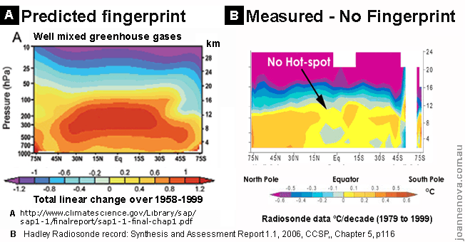 |
Figure 2: Evans' image constructed from a 2006 report of the CCSP [5, figure 1.3 on page 25 and figure 5.7 on page 116]. The left panel depicts a 1958 - 1999 temperature projection from the Parallel Climate Model ensemble (PCM). The projection is based on the temperature response to increased greenhouse gases such as CO2. Temperature trends are in °C per 42 years. The right panel displays HadAT2 warming/cooling trends versus height for 1979 - 1999. Temperature trends are in °C/decade [2]. The tropics lie between 30°N and 30°S. Pressure decreases from the Earth's surface (near the bottom of the y-axis) to the troposphere to the stratosphere (near the top of the y-axis). The tropical troposphere lies below 150hPa, while the tropical stratosphere is above 70hPa. |
 |
Figure 3: Evans' image constructed from a 2006 report of the CCSP [5, figure 1.3 on page 25 and figure 5.7 on page 116]. The right panel depicts a 1958 - 1999 temperature projection from the Parallel Climate Model ensemble (PCM). The projection is based on the temperature response to multiple factors including aerosols and increased greenhouse gases such as CO2. Temperature trends are in °C per 42 years, using the same color-scale as the left panel of figure 2. The left panel displays HadAT2 warming/cooling trends versus height for 1979 - 1999. Temperature trends are in °C/decade, using the same color-scale as the right panel of figure 2 [3]. The tropics lie between 30°N and 30°S. Altitude increases from the Earth's surface (near the bottom of the y-axis) to the troposphere to the stratosphere (near the top of the y-axis). |
Figure 2's right panel and figure 3's left panel show 1979 - 1999 HadAT2 temperature trends. Figure 2's left panel and figure 3's right panel display 1958 - 1999 model-based projections, though Evans' labeling of figure 3 may create the false impression that these are model-based projections for 1979 - 1999. Myth defenders Anthony Watts, Nicola Scafetta, Joe Bastardi, and Fred Singer resort to a similar tactic to create the false impression that the HadAT2 data and model-based projections cover the same time-frame, as do others.
Some myth proponents, including Evans, also compare the CCSP's 1979 - 1999 HadAT2 trends with 1890 - 1999 model-based projections from a 2007 report of the United Nations Intergovernmental Panel on Climate Change (IPCC). These myth proponents focus on panels c and f from this IPCC figure shown below:
 |
Figure 4: Atmospheric temperature change in °C/century from 1890 to 1999 in the Parallel Climate Model ensemble (PCM) in response to (a) increased solar forcing (from increased solar output), (b) volcanic activity, (c) well-mixed greenhouse gases such as CO2, (d) tropospheric and stratosopheric ozone changes, (e) sulfate aerosols, and (f) the sum of all the aforementioned factors. Darker blues represent cooling and darker reds represent warming. The horizontal axis indicates latitude, with the tropics being between roughly 30°N and 30°S. The vertical axis indicates altitude, with decreasing atmospheric pressure as altitude increases [4, figure 9.1 of page 675]. The tropical troposphere lies below 150hPa, while the tropical stratosphere is above 70hPa. |
Thus myth proponents compare 1979 - 1999 HadAT2 trends with model-based projections for 1890 - 1999 or for 1958 - 1999. This comparison makes no sense, since 21-year HadAT2 data would likely show less total warming than 42-year and 110-year model-based projections, even if the climate models in question were accurate. The color-scales also differ between the HadAT2 images vs. the model-based projections. For instance, a warming trend of ~0.2°C/decade would appear yellow on the HadAT2 image. In contrast, that same rate of warming would be ~0.8°C of total warming on the 1958 - 1999 CCSP model-based image and would appear dark orange (almost red), not yellow. For the IPCC's 1890 - 1999 image, this amount of warming would be ~2.1°C and thus would be beyond the image's color-scale. Comparing these three graphs is therefore misleading, since the same level of warming would be a different color in all three images.
Thus Evans' figures 2 and 3 use both a misleading color-scale and a misleading time-frame that renders their model-data comparisons invalid. This is rather ironic, since Evans complains that scientists use misleading color-scales for their hot spot graphs.
So why do myth proponents engage in this misguided comparison? Is the CCSP to blame? No, because unlike myth defenders, the CCSP compared 1979 - 1999 HadAT2 trends with 1979 - 1999 model-based trends using the same color-scale for both trends, as shown in figure 5 below:
 |
Figure 5: Temperature projections for 1979 - 1999 for four climate model ensembles: (A) Community Climate System Model ensemble (CCSM3.0), (B) Parallel Climate Model ensemble (PCM), (C) Geophysical Fluid Dynamics Laboratory Global Coupled Climate Model ensemble (GFDL-CM2.1), and (D) Goddard Institute for Space Studies EH ensemble (GISS-EH). The projections are based on the temperature response to 20th century (20CEN) changes in multiple factors, including aerosols and increased greenhouse gases such as CO2. Panel (E) displays displays HadAT2 warming/cooling trends versus height for 1979 - 1999. Temperature trends are in °C/decade [5, figure 5.7 on page 116]. The tropics lie between 30°N and 30°S. Atmospheric pressure decreases from the Earth's surface (near the bottom of the y-axis) to the troposphere to the stratosphere (near the top of the y-axis). The tropical troposphere lies below 150hPa, while the tropical stratosphere is above 70hPa. |
Yet myth defenders do not display the CCSP's 1979 - 1999 model-based projections from figure 5. Instead myth proponents display images (such as figures 2 and 3) that remove the 1979 - 1999 model-based projections, and replace them with CCSP or IPCC model-based projections for 1959 - 1999 or 1890 - 1999. Myth proponents therefore present a fabricated image that exaggerates the difference between HadAT2 and the model-based trends. If myth proponents know they are doing this, then they are deceptive. If myth defenders do not know they are doing this, then they are willfully ignorant, since they did not look up the original source of their image (the 2006 CCSP report), even though that source is freely available online. So if someone presents you with comparisons like figures 2 and 3, and acts as if those comparisons are credible, then that person is misleading you.
The myth proponent Joanne Nova (and presumably her partner David Evans, another myth advocate) know they are excluding the models in figure 5 when they present figures 2 and 3. The blogger ItsNotNova (who may also go by the name "Nice One") called Nova and Evans out on this in 2013. Yet Nova and Evans post their fabricated images anyway, without a retraction or correction, and thus willfully exclude the models in figure 5. So Nova and Evans deceptively offer fabricated images in order to defend the myth.
The myth proponent Joanne Nova (and presumably her partner David Evans, another myth advocate) know they are excluding the models in figure 5 when they present figures 2 and 3. The blogger ItsNotNova (who may also go by the name "Nice One") called Nova and Evans out on this in 2013. Yet Nova and Evans post their fabricated images anyway, without a retraction or correction, and thus willfully exclude the models in figure 5. So Nova and Evans deceptively offer fabricated images in order to defend the myth.
Section 2.2: Myth proponents rely on a CCSP report that undermines their myth
Though myth proponents' figures 2 and 3 exaggerate the difference between the models and HadAT2, CCSP's figure 5 still shows some differences between the model-based projections and HadAT2. Since this post focuses on the tropospheric hot spot, I will focus on the differences in the troposphere. CCSP suggest some reasons for this models vs. HadAT2 discrepancy, though myth proponents usually conveniently leave out the CCSP's reasoning:
"Taken together these results imply that any residual systematic errors in the homogenized radiosonde products will likely lead to a spurious cooling bias.
[...]
Another noticeable difference is that the HadAT2 data show a relative lack of warming in the tropical troposphere, [...] where all four models simulate maximum warming. This particular aspect of the observed temperature-change pattern is very sensitive to data adjustments [...]. Tropospheric warming in the observations is most obvious in the [northern hemisphere] extra-tropics, where our confidence in the reliability of radiosonde records is greatest.
[...]
[...]
Another noticeable difference is that the HadAT2 data show a relative lack of warming in the tropical troposphere, [...] where all four models simulate maximum warming. This particular aspect of the observed temperature-change pattern is very sensitive to data adjustments [...]. Tropospheric warming in the observations is most obvious in the [northern hemisphere] extra-tropics, where our confidence in the reliability of radiosonde records is greatest.
[...]
Systematic, historically varying biases in day-time relative to night-time radiosonde temperature data are important, particularly in the tropics [...]. These are likely to have been poorly accounted for by present approaches to quality controlling such data [...] and may seriously affect trends [5, pages 74, 115 - 116, and 121]."
To elaborate on these points further: for years scientists have known that radiosonde analyses contain spurious cooling in the tropical troposphere. Accounting for this spurious cooling, along with internal climate variability, explains most of the difference between models vs. radiosonde analyses with respect to tropical tropospheric warming. Neither internal variability nor the spurious cooling imply a flaw in the climate models, as I discuss in "Myth: Santer et al. Show That Climate Models are Very Flawed". The HadAT2 team acknowledges this.
The spuriously cool radiosonde trends resulted from changes in radiosonde equipment during the 1980s; these changes made radiosondes more prone to direct heating by the Sun, such that the radiosondes were no longer just measuring air temperature. This is what CCSP refers to when they mention "historically varying biases in day-time relative to night-time radiosonde temperature data [5, page 121]." So radiosonde-based tropospheric warming trends that begin in 1979 will be spuriously low, due to artificially warm radiosonde readings from the 1980s. However, radiosonde trends that begin in 1958 will be less prone to this problem, as depicted in the 2005 HadAT2 figure below:
 |
Figure 6: Top two panels: HadAT2 warming/cooling trend (in K/decade, equivalent to °C/decade) versus height. Crosses indicate trends statistically distinguishable from 0. The tropics lie between 30°N and 30°S. Pressure decreases from the Earth's surface (near the bottom of the y-axis) to the troposphere to the stratosphere (near the top of the y-axis). The tropical troposphere lies below 150hPa, while the tropical stratosphere is above 70hPa. Bottom two panels: Estimate of some of the uncertainty (in K/decade, equivalent to °C/decade) at atmospheric pressure levels corresponding to the top panel images [6, figure 11]. |
Figure 6 displays the hot spot (greater warming in the upper troposphere than near the surface in the tropics) from 1958 - 2002, but not from 1979 - 2002. This lack of a hot spot from 1979 - 2002 is likely because of the aforementioned 1980s changes in radiosonde equipment in the tropics. Figure 6 also shows tropospheric warming and less uncertainty from 1979 - 2002 in the northern hemisphere extra-tropics at latitudes north of 30°N. This supports the CCSP's claim that "tropospheric warming in the observations is most obvious in the [northern hemisphere] extra-tropics, where our confidence in the reliability of radiosonde records is greatest [5, page 116]."
HadAT2 scientists published figure 6 in 2005, before the 2006 CCSP report. And the HadAT2 team explicitly states that when citing the HadAT2 analysis, people should cite the 2005 paper that includes figure 6 above. Yet I know of no myth proponent who shows the 1958 - 2002 image from figure 6, likely because myth advocates are either unaware of this image or they believe it would deflate their "no hot spot" narrative. After all, including this pre-1979 data reduces the difference between HadAT2 vs. the model-based projections, which runs contrary to the result myth proponents likely want.
So myth defenders instead focus almost exclusively on the 1979 - 1999 HadAT2 image from figures 2 and 3. David Evans, the most prominent myth defender, even claims that the HadAT2 panel from figures 2 and 3 is the only data there is. Evans' partner Joanna Nova, another myth proponent, concurs, claiming that HadAT/HadAT2 "was the only dataset the CCSP used [10]." Evans also suggests that the CCSP may have tried to nefariously conceal the data:
So myth defenders instead focus almost exclusively on the 1979 - 1999 HadAT2 image from figures 2 and 3. David Evans, the most prominent myth defender, even claims that the HadAT2 panel from figures 2 and 3 is the only data there is. Evans' partner Joanna Nova, another myth proponent, concurs, claiming that HadAT/HadAT2 "was the only dataset the CCSP used [10]." Evans also suggests that the CCSP may have tried to nefariously conceal the data:
"This important and pivotal data was not released publicly by the climate establishment until 2006, and then in an obscure place [...]. [...] The weather balloon data showing the atmospheric warming pattern was finally released in 2006, in the US Climate Change Science Program [...] This is the only data there is. [By the way], isn’t this an obscure place to release such important and pivotal data – you don’t suppose they are trying to hide something, do you [3]?"
Of course, Evans' paranoia is baseless. The CCSP cites other data sources, in addition to HadAT2, contrary to what Nova claims. And contrary to what Evans claims, the 1979 - 1999 HadAT2 analysis does not reflect all of the data, as shown by the 1958 - 1979 data in figure 6 (and figure 7 below). Furthermore, scientists made no attempt to conceal the data, since figure 6 was available before the 2006 CCSP report. The CCSP report even cites the 2005 paper from which figure 6 was taken, along with citing another 2005 paper that presented a radiosonde-based image as well (see figure 7 below). So Evans is also wrong when he insinuates that the CCSP tried to conceal the data. If he read the CCSP report more closely, then he would know better than to make such uninformed, paranoid claims.
By 2005 scientists made some progress in accounting for the solar-induced bias in 1980s radiosonde temperature readings; this progress involved the use of various data analysis methods and different corrections for known artifacts/errors in the data. These corrections are known as homogenization and the artifacts are known as heterogeneities (I discuss homogenization in more detail in section 3.1 of "John Christy, Climate Models, and Long-term Tropospheric Warming", with examples of scientists validating homogenization techniques). Current radiosonde-based analyses likely still contain heterogeneities that cause the analyses to under-estimate tropical tropospheric warming. And even back in 2006, the CCSP mentioned the need for homogenization that corrects heterogeneities.
A research team at the United Kingdom Met Office used homogenization to generate the HadAT2 analysis shown in figures 2, 3, and 5. Another team at the National Oceanic and Atmospheric Administration (NOAA) used alternative homogenization methods to generate a radiosonde analysis known as RATPAC (Radiosonde Atmospheric Temperature Products for Assessing Climate). Figure 7 depicts a 2005 RATPAC image:
 |
Figure 7: RATPAC warming/cooling trend versus height from 1979 - 2004 (in K/decade, equivalent to °C/decade) [7, figure 4]. The tropics lie between 30°N and 30°S. Pressure decreases from the Earth's surface (near the bottom of the y-axis) to the troposphere to the stratosphere (near the top of the y-axis). The tropical troposphere lies below 150hPa, while the tropical stratosphere is above 70hPa. |
Evans and other myth proponents conveniently avoid displaying figure 7, even though the RATPAC team published figure 7 in 2005, before the 2006 CCSP report. This further rebuts Evans' paranoid idea that scientists may have tried to conceal the radiosonde data.
While RATPAC figure 7 partially homogenizes for the 1980s solar-induced bias, HadAT2 images from figures 2, 3, and 5 do not adequately address this 1980s heterogeneity. Thus the RATPAC figure displays more tropical tropospheric warming than do the HadAT2 figures. This confirms CCSP's statement that for the tropical troposphere, "the observed temperature-change pattern is very sensitive to data adjustments [5, page 115]." To account for this, the CCSP recommended that:
- Scientists compare tropospheric warming trends from different sources, such as radiosondes and satellites.
- Multiple, independent research groups develop homogenized analyses in order to ensure that the results are not due to flaws in a particular homogenization method.
- Scientists should use other climate variables to test for the predictions implied by different data sources.
The 2005 RATPAC figure 7 and 2005 HadAT2 figure 6 illustrate point 2: in comparison to the HadAT2 team, the RATPAC team made more progress in homogenizing the 1980s solar-induced heterogeneity. And the HadAT2 team acknowledges that scientists should compare the HadAT2 analysis to satellite analyses and other radiosonde analyses, to make sure the HadAT2 result is robust. So the HadAT2 research team accepts points 1 and 2 from CCSP.
Since 2005, other scientists applied points 1, 2, and 3, leading to numerous lines of evidence supporting the hot spot's existence (I discuss this further in "Myth: The Tropspheric Hot Spot does not Exist"). For example, scientists generated re-analyses that incorporate data from diverse sources, including radiosondes and satellites. Evans himself cites re-analysis results, as does the myth proponent Anthony Watts. John Christy and Judith Curry, two critics of mainstream climate science, also cite a re-analysis known as ERA-I (European Centre for Medium-Range Weather Forecasts Interim re-analysis). Figure 8 below compares some of ERA-I's results to model-based projections:
 | |
|
In comparison to the model-based projections, ERA-I shows less warming amplification in the lower troposphere. This is likely because ERA-I under-estimates lower tropospheric warming, as admitted by the ERA-I team and other researchers. This was addressed in ERA5, the update to ERA-I. ERA-I also clearly shows a hot spot, with upper tropospheric warming being greater than near-surface warming in the tropics. ERA-I therefore provides one line of evidence for the hot spot, as shown in a number of studies. Thus scientists made progress on the hot spot by following the aforementioned points 1 and 2 from the CCSP: scientists incorporated diverse data sources into multiple, homogenized analyses such as ERA-I. Consistent with this ERA-I result, other studies confirm that climate models fairly accurately represent the ratio of upper tropospheric warming to near-surface warming, as I discuss in section 2.2 of "Myth: Santer et al. Show that Climate Models are Very Flawed".
Strangely, Judith Curry holds ERA-I in high esteem, though she also disputes the hot spot's existence. Maybe she is unaware that her favored re-analysis supports the position she disputes? Curry is not the only critic of mainstream climate science who fails (intentionally or unintentionally) to acknowledge evidence undermining their position. For instance, John Christy adamantly disputes the hot spot's existence, despite the hot spot in the ERA-I analysis he cites (in "John Christy and Atmospheric Temperature Trends", I summarize other cases of Christy misrepresenting climate science in politically expedient ways).
Section 2.3: Subsequent evidence rebuts myth's proponents claims and confirms the hot spot's existence
Myth proponents also avoid evidence of the hot spot. Proponents perform this evasion by almost exclusively focusing on their fabricated figures 2 and 3, with their misleading comparisons of 1979 - 1999 HadAT2 data with model-based projections for 1958 - 1999 or for 1890 - 1999. It's almost as if some myth defenders think atmospheric science stopped with one HadAT2 image from a 2006 CCSP report...
In contrast to the antics of myth advocates, one need not focus solely on HadAT2 to the exclusion of other observational analyses. So I will compare these other analyses with the model-based projections that myth defenders misuse. The model-based projections in question are:
- Group 1 : three of the models for 1979 - 1999 presented by the CCSP in figures 5A, 5B, and 5D above (excluding the outlier model in figure 5C)
- Group 2 : the outlier model for 1979 - 1999 presented by the CCSP in figure 5C above
- Group 3 : the 1958 - 1999 CCSP projection in the right panel of figure 3
- Group 4 : the 1890 - 1999 IPCC projection in figure 4f
(I examine comparisons to more recent CMIP5 models in "Myth: Santer et al. Show That Climate Models are Very Flawed" and in figure 8 above)
I exclude figure 2A and figure 4c from the above groups, because these figures depict only the impact of changes in greenhouse gases, while observational analyses would include the impact of greenhouses and other factors. So I will focus on model-based projections that include the impact of greenhouse gases and other factors. Excluding figures 2A and 4c will not matter too much for my comparisons below, because tropical upper tropospheric warming in figures 2A and 4c is only slightly greater than tropical upper tropospheric warming in the model groups 3 and 4, respectively.
Each of the model groups has tropical tropospheric amplification extending between tropical latitudes 30°N and 30°S, or 20°N and 20°S. Thus I will focus on these latitudes, because these are also the same latitudes available for each observational analysis I will cite. I will also focus on an atmospheric pressure level of around 250hPa - 300hPa (equivalent to an altitude of roughly 9km to 11km), since this region contains some of the greatest tropical tropospheric amplification in each of the model groups.
For the tropical upper troposphere from 30°N - 30°S, at an atmospheric pressure of ~250hPa - ~300hPa, and an altitude of ~9km - ~11km, the models project roughly the following warming trends in K per decade:
- Group 1 : 0.2 - 0.3 (from 1979 - 1999)
- Group 2 : 0.4 - 0.6 (from 1979 - 1999)
- Group 3 : 0.19 - 0.29 (from 1958 - 1999)
- Group 4 : 0.08 - 0.1 (from 1890 - 1999)
Unfortunately, I cannot cite observational analyses covering all of these time periods because, for example, satellite-based analyses go back to only late 1979 and relatively reliable radiosonde-based analyses go back to only 1958. This should not be a problem for myth defenders, since they compare observational analyses on one time-frame with model-based analyses on a different time-frame, as I discussed in section 2.1. To address this issue and to avoid cherry-picking short time periods that are not statistically robust, I will present observational evidence covering the longest feasible time periods available in the literature.
I discuss evidence that the hot spot exists in "Myth: The Tropspheric Hot Spot does not Exist". In that blogpost I cite multiple lines of evidence, including {in brackets I place the corresponding sections in which I discuss those lines of evidence}:
- satellite-based estimates that depend on global positioning system radio occultation (GPS RO) {section 2.2}
- satellite-based estimates that depend on microwave emissions (using microwave sounding units or MSUs) {section 2.3}
- radiosonde estimates based temperature detectors {section 2.4}
- radiosonde estimates that infer temperature indirectly from wind measurements {section 2.4}
- re-analyses {section 2.5}
I elaborate on each of these sources in "Myth: The Tropspheric Hot Spot does not Exist", so I will not mention all the details again here. Instead I will present warming trends from analyses within each class of evidence.
GPS RO, late 2001 - 2017 tropical upper tropospheric warming trend in K per decade from 30°N - 30°S, at an altitude of 10km, and an atmospheric pressure of ~260hPa:
Satellite-based MSU, 1979 - 2017 tropical mid-to-upper tropospheric warming trends in K per decade from 20°N - 20°S
(I consider the UAH results to be unreliable for reasons I mention in section 2.3 of "Myth: The Tropspheric Hot Spot does not Exist"):
With the exception of the "Weng and Zou" results mentioned a bit later, these MSU-based estimates do not target a specific altitude or atmospheric pressure level, but instead present a weighted average of results across a broad vertical swath of the atmosphere. Thus these MSU-based analyses would be expected to show less warming than the predicted warming maximum at 250hPa - 300hPa. The altitude-weighted MSU-based estimates represent a mid-to-upper tropospheric analysis known as TTT, which I discuss further in section 2.3 of "Myth: The Tropspheric Hot Spot does not Exist". Figure 9 below shows the relative contribution of different atmospheric altitudes to the TTT temperature trend:
Satellite-based MSU, late 1978 - 2004 tropical mid-to-upper tropospheric warming trend in K per decade between from 30°N - 30°S:
GPS RO, late 2001 - 2017 tropical upper tropospheric warming trend in K per decade from 30°N - 30°S, at an altitude of 10km, and an atmospheric pressure of ~260hPa:
- >0.30
(I consider the UAH results to be unreliable for reasons I mention in section 2.3 of "Myth: The Tropspheric Hot Spot does not Exist"):
- UW : ~0.17
- NOAA/STAR : ~0.21
- RSS : ~0.19
- UAH : ~0.12
With the exception of the "Weng and Zou" results mentioned a bit later, these MSU-based estimates do not target a specific altitude or atmospheric pressure level, but instead present a weighted average of results across a broad vertical swath of the atmosphere. Thus these MSU-based analyses would be expected to show less warming than the predicted warming maximum at 250hPa - 300hPa. The altitude-weighted MSU-based estimates represent a mid-to-upper tropospheric analysis known as TTT, which I discuss further in section 2.3 of "Myth: The Tropspheric Hot Spot does not Exist". Figure 9 below shows the relative contribution of different atmospheric altitudes to the TTT temperature trend:
 |
| Figure 9: Relative weight of different atmospheric layers for the temperature trend in the mid-to-upper troposphere TTT analysis. The tropical troposphere lies below 150hPa, equivalent to an altitude below ~14km. The main point of this image is the curved black line that bounds that solid yellow "TTT" region on the bottom left. The curved black line represents the relative contribution of each altitude to TTT, in the form of a horizontal histogram, with the x-axis measuring the relative weight as per a weighting function. For example, the curved black line is farther right at 4km than at 12km, indicating that an altitude of 4km contributes more to the TTT temperature trend than does an altitude of 12km [9]. |
- UMD : ~0.20 - ~0.24
Satellite-based MSU, 1979 - 2009 tropical upper tropospheric warming trend in K per decade at an atmospheric pressure of 300hPa, ~9km altitude, and between latitudes 30°N and 30°S
(I consider these results to be unreliable, as I discuss in section 2.3 of "Myth: The Tropspheric Hot Spot does not Exist"):
- Weng and Zou : ~0.8 - ~1.0
Radiosonde, 1958 - 2014 tropical upper tropospheric warming trends in K per decade between latitudes 20°N - 20°S, at an atmospheric pressure of 300hPa, and ~9km altitude
(I consider that HadAT2 results to be less reliable for reasons I went over in section 2.2 above):
- IUKv2 : ~0.25 - ~0.33
- RATPAC : ~0.20 - ~0.25
- RICH : ~0.21 - ~0.26
- RAOBCORE : ~0.21 - ~0.26
- HadAT2 : ~0.16 - ~0.21
Re-analyses, 1979 - 2017 (unless otherwise noted) tropical upper tropospheric warming trends in K per decade between latitudes 30°N and 30°S, at an atmospheric pressure of 300hPa, and an altitude of ~9km
(I consider the 20CR results to be irrelevant, and the NCEP and NCEP-2 results to be less reliable, for reasons I explain in section 2.5 of "Myth: The Tropspheric Hot Spot does not Exist"; CFSR is also a clear outlier, MERRA runs only until about 2015 or 2016 {MERRA-2 extends through 2017}, and 20CR extends to only 2013 or 2014):
(I consider the 20CR results to be irrelevant, and the NCEP and NCEP-2 results to be less reliable, for reasons I explain in section 2.5 of "Myth: The Tropspheric Hot Spot does not Exist"; CFSR is also a clear outlier, MERRA runs only until about 2015 or 2016 {MERRA-2 extends through 2017}, and 20CR extends to only 2013 or 2014):
- ERA5 : ~0.18
- MERRA-2 : ~0.22 (1980 - 2017)
- JRA-55 : ~0.19 (same trend for 1958 - 2017)
- ERA-I : ~0.27
- MERRA : ~0.30
- NCEP-2 : ~0.17
- NCEP : ~0.20 (~0.16 for 1958 - 2017 ; ~0.13 for 1948 - 2017)
- CFSR : ~0.49
- 20CR : ~0.28
UAH and NCEP-2 display unusually low warming rates in comparison to the other observational analyses. This likely stems from flaws in the UAH analysis and NCEP / NCEP-2 analyses, as I discuss in sections 2.3 and 2.5 of "Myth: The Tropspheric Hot Spot does not Exist", respectively. Other than UAH, NCEP / NCEP-2, and HadAT2 (the last of which I discussed in section 2.2 above), almost all of the observational analyses have warming trends within the range of, or greater than, the model-based projections for groups 1, 3, and 4. Model group 2 is the outlier, with a warming rate greater than almost all of the observational analyses. But this does not help myth proponents much, since myth proponents did not use group 2; they instead used groups 3 and 4. And it would be unjustified cherry-picking for myth advocates to focus on group 2's model, to the exclusion of the three group 1 models that were presented in the same figure as group 2's model.
So the vast majority of the observational analyses show about as much (or more) tropical upper tropospheric warming as the CCSP and IPCC model-based projections misused by myth defenders. This rebuts the myth advocates' claim that the CCSP's model-based projections undermine the hot spot's existence.
(I discuss comparisons to more recent CMIP5 model-based projections in "Myth: Santer et al. Show That Climate Models are Very Flawed" and in figure 8 above)
(I discuss comparisons to more recent CMIP5 model-based projections in "Myth: Santer et al. Show That Climate Models are Very Flawed" and in figure 8 above)
No comments:
Post a Comment