- The Myth and Its Flaws
- Context and Analysis (divided into multiple sections)
- Posts Providing Further Information and Analysis
- References
This is the "main version" version of this post, which means that this post lacks most of my references and citations. If you would like a more comprehensive version with all the references and citations, then please go to the "+References" version of this post.
References are cited as follows: "[#]", with "#" corresponding to the reference number given in the References section at the end of this post.
1. The Myth and Its Flaws
The United Nations Intergovernmental Panel on Climate Change (IPCC) over-estimated greenhouse-gas-induced warming when they used climate models to predict global warming in their 1990 First Assessment Report (FAR).
Promoters of the aforementioned myth include Christopher Monckton, Clive Best, Ira Glickstein, Tim Ball, Euan Mearns, and Javier, all of the contrarian blog WattsUpWithThat. Other myth advocates include David Whitehouse of WattsUpWithThat and the Global Warming Policy Foundation (GWPF), Nate Silver, Judith Curry, Roger Pielke Jr. (with his self-refuting position on the accuracy of model-based projections, as he unjustifiably smeared climate scientists in the same manner the tobacco industry's defenders smeared medical scientists and doctors), Nir Shaviv, Ross McKitrick, Patrick Michaels, Willie Soon, Stephen McIntyre, David Legates, Joe Bastardi, Aynsley Kellow, Matt Ridley, David Evans + Joanne Nova, Kenneth Richard of the contrarian blog NoTricksZone, James Taylor and Jim Lakely of the Heartland Institute, multiple individuals writing in The Wall Street Journal, The Telegraph (which engages in false balance on climate science), an editorial from The Washington Times that cites Anthony Watts, Fox News citing Roy Spencer, Thomas Gale Moore, Rupert Darwall, David Friedman, Kesten Green, J. Scott Armstrong, William M. Briggs, Nick Minchin, Peter Stallinga, Warren Meyer, The Galileo Movement, and the contrarian blog C3 Headlines, among others.
The claims of Evans, Nova, Curry, Michaels, Best, Armstrong, Ridley, and Ball are particularly ironic, since they each made failed temperature trend forecasts, even as they spread a myth about the IPCC failing in its forecast. Javier, Glickstein, and Bastardi also made temperature trend predictions that are well on their way to being falsified. Monckton, Soon, Legates, and Briggs advocate a model that under-estimates post-1990 warming by roughly a factor of 2, as per the observed warming trends in figure 4 in section 2.1 and the lower atmosphere analyses discussed in section 2.3.
The myth's flaws: Post-1990 global warming matches the trend forecasted by the IPCC's FAR in 1990, as per figure 4 in section 2.1, and FAR also forecasted post-1990 warming-induced sea level rise reasonably well. Myth proponents conceal this point by using a number of misleading tactics, including:
- illegitimately cherry-picking a projected warming trend from one of the IPCC's scenarios, in a way that ignores the fact that that scenario's greenhouse gas levels were higher than observed post-1990 greenhouse gas increases
- ignoring a projected warming trend from one of the IPCC scenarios that better represents observed greenhouse gas increases and better represents how much the greenhouse gas increases impacted Earth's energy balance
- performing an apples-to-orange comparison of the IPCC's surface trend forecast vs. satellite-based analyses of thick layers of the lower atmosphere; these flawed satellite-based analyses are known to under-estimate warming, and one of these analyses comes from a research team with a decades-long history of under-estimating warming
- cherry-picking a surface analysis known to under-estimate warming due to its poorer global coverage, while willfully ignoring other analyses with better coverage
The myth therefore fails. This failure undermines attempts to use FAR to claim the IPCC is an alarmist organization that exaggerates climate change. Consistent with this, the IPCC tends to often under-estimate climate change trends (as the IPCC itself acknowledges, among others) and use non-alarmist, conservative language that acknowledges when uncertainty is present.
So the IPCC successfully predicted subsequent global warming by focusing on greenhouse gas increases, supporting the evidence-based scientific consensus that humans caused most of the recent global warming, primarily via increasing greenhouse gas levels. As the IPCC noted in their 2018 Special Report, human-made global warming continues at a rate consistent with climate models. Other academic and non-academic sources similarly note that recent surface warming trends remain consistent with model-based predictions. During the same post-1990 period in which the IPCC accurately predicted global warming and sea level rise, ocean de-oxygenation continued, oceans became 13% more acidic due to human-made increases in greenhouse gases, ice melted across the globe, and a human-made mass extinction progressed, as discussed in section 2.1 of "Myth: Ocean Acidification Requires that an Ocean Becomes an Acid".
(The following Twitter thread covers some of the material discussed in this blogpost: https://twitter.com/AtomsksSanakan/status/1081256511404498944. And for discussion of some of the IPCC's more recent temperature trend predictions, see section 2.1 of "Myth: The IPCC's 2007 ~0.2°C/decade Model-based Projection Failed and Judith Curry's Forecast was More Reliable".
A number of other individuals also debunked the myth this blogpost focuses on, including Peter Hadfield {a.k.a. potholer54}, David J. Frame, Dáithí A. Stone, Richard Alley, Zeke Hausfather of CarbonBrief, Dana Nuccitelli of SkepticalScience, Nick Stokes, and Anton Dybal {a.k.a. A Skeptical Human}. The contrarian Larry Kummer, a.k.a. Fabius Maximus, misrepresents the work of Frame and Stone in order to conceal the accuracy of the IPCC's temperature trend forecasts.)
The United Nations Intergovernmental Panel on Climate Change (IPCC) over-estimated greenhouse-gas-induced warming when they used climate models to predict global warming in their 1990 First Assessment Report (FAR).
Promoters of the aforementioned myth include Christopher Monckton, Clive Best, Ira Glickstein, Tim Ball, Euan Mearns, and Javier, all of the contrarian blog WattsUpWithThat. Other myth advocates include David Whitehouse of WattsUpWithThat and the Global Warming Policy Foundation (GWPF), Nate Silver, Judith Curry, Roger Pielke Jr. (with his self-refuting position on the accuracy of model-based projections, as he unjustifiably smeared climate scientists in the same manner the tobacco industry's defenders smeared medical scientists and doctors), Nir Shaviv, Ross McKitrick, Patrick Michaels, Willie Soon, Stephen McIntyre, David Legates, Joe Bastardi, Aynsley Kellow, Matt Ridley, David Evans + Joanne Nova, Kenneth Richard of the contrarian blog NoTricksZone, James Taylor and Jim Lakely of the Heartland Institute, multiple individuals writing in The Wall Street Journal, The Telegraph (which engages in false balance on climate science), an editorial from The Washington Times that cites Anthony Watts, Fox News citing Roy Spencer, Thomas Gale Moore, Rupert Darwall, David Friedman, Kesten Green, J. Scott Armstrong, William M. Briggs, Nick Minchin, Peter Stallinga, Warren Meyer, The Galileo Movement, and the contrarian blog C3 Headlines, among others.
The claims of Evans, Nova, Curry, Michaels, Best, Armstrong, Ridley, and Ball are particularly ironic, since they each made failed temperature trend forecasts, even as they spread a myth about the IPCC failing in its forecast. Javier, Glickstein, and Bastardi also made temperature trend predictions that are well on their way to being falsified. Monckton, Soon, Legates, and Briggs advocate a model that under-estimates post-1990 warming by roughly a factor of 2, as per the observed warming trends in figure 4 in section 2.1 and the lower atmosphere analyses discussed in section 2.3.
The claims of Evans, Nova, Curry, Michaels, Best, Armstrong, Ridley, and Ball are particularly ironic, since they each made failed temperature trend forecasts, even as they spread a myth about the IPCC failing in its forecast. Javier, Glickstein, and Bastardi also made temperature trend predictions that are well on their way to being falsified. Monckton, Soon, Legates, and Briggs advocate a model that under-estimates post-1990 warming by roughly a factor of 2, as per the observed warming trends in figure 4 in section 2.1 and the lower atmosphere analyses discussed in section 2.3.
The myth's flaws: Post-1990 global warming matches the trend forecasted by the IPCC's FAR in 1990, as per figure 4 in section 2.1, and FAR also forecasted post-1990 warming-induced sea level rise reasonably well. Myth proponents conceal this point by using a number of misleading tactics, including:
- illegitimately cherry-picking a projected warming trend from one of the IPCC's scenarios, in a way that ignores the fact that that scenario's greenhouse gas levels were higher than observed post-1990 greenhouse gas increases
- ignoring a projected warming trend from one of the IPCC scenarios that better represents observed greenhouse gas increases and better represents how much the greenhouse gas increases impacted Earth's energy balance
- performing an apples-to-orange comparison of the IPCC's surface trend forecast vs. satellite-based analyses of thick layers of the lower atmosphere; these flawed satellite-based analyses are known to under-estimate warming, and one of these analyses comes from a research team with a decades-long history of under-estimating warming
- cherry-picking a surface analysis known to under-estimate warming due to its poorer global coverage, while willfully ignoring other analyses with better coverage
The myth therefore fails. This failure undermines attempts to use FAR to claim the IPCC is an alarmist organization that exaggerates climate change. Consistent with this, the IPCC tends to often under-estimate climate change trends (as the IPCC itself acknowledges, among others) and use non-alarmist, conservative language that acknowledges when uncertainty is present.
So the IPCC successfully predicted subsequent global warming by focusing on greenhouse gas increases, supporting the evidence-based scientific consensus that humans caused most of the recent global warming, primarily via increasing greenhouse gas levels. As the IPCC noted in their 2018 Special Report, human-made global warming continues at a rate consistent with climate models. Other academic and non-academic sources similarly note that recent surface warming trends remain consistent with model-based predictions. During the same post-1990 period in which the IPCC accurately predicted global warming and sea level rise, ocean de-oxygenation continued, oceans became 13% more acidic due to human-made increases in greenhouse gases, ice melted across the globe, and a human-made mass extinction progressed, as discussed in section 2.1 of "Myth: Ocean Acidification Requires that an Ocean Becomes an Acid".
(The following Twitter thread covers some of the material discussed in this blogpost: https://twitter.com/AtomsksSanakan/status/1081256511404498944. And for discussion of some of the IPCC's more recent temperature trend predictions, see section 2.1 of "Myth: The IPCC's 2007 ~0.2°C/decade Model-based Projection Failed and Judith Curry's Forecast was More Reliable".
A number of other individuals also debunked the myth this blogpost focuses on, including Peter Hadfield {a.k.a. potholer54}, David J. Frame, Dáithí A. Stone, Richard Alley, Zeke Hausfather of CarbonBrief, Dana Nuccitelli of SkepticalScience, Nick Stokes, and Anton Dybal {a.k.a. A Skeptical Human}. The contrarian Larry Kummer, a.k.a. Fabius Maximus, misrepresents the work of Frame and Stone in order to conceal the accuracy of the IPCC's temperature trend forecasts.)
A number of other individuals also debunked the myth this blogpost focuses on, including Peter Hadfield {a.k.a. potholer54}, David J. Frame, Dáithí A. Stone, Richard Alley, Zeke Hausfather of CarbonBrief, Dana Nuccitelli of SkepticalScience, Nick Stokes, and Anton Dybal {a.k.a. A Skeptical Human}. The contrarian Larry Kummer, a.k.a. Fabius Maximus, misrepresents the work of Frame and Stone in order to conceal the accuracy of the IPCC's temperature trend forecasts.)
2. Context and Analysis
Section 2.1: The IPCC 1990 Report Accurately Predicted Post-1990 Surface Warming
In 1990, the United Nations Intergovernmental Panel on Climate Change (IPCC) released their First Assessment Report (FAR). Over the next three decades, the IPCC released a number of other assessment reports, special reports, etc. But FAR remains their earliest assessment report, and thus contains the IPCC's earliest temperature trend projections.
In climate science, a projection states what will happen (often with a stated probability), given a set of initial conditions. A prediction states what will actually happen (often with a stated probability). For example, suppose someone named Ippy made the following two projections:
- If you cross the street at 7:00, then the red car will hit you.
- If you do not cross the street at 7:00, then the red car will not hit you.
One can treat these projections as "If [...], then [...]" conditionals, where the "If [....]" clause states the sufficient (or antecedent) condition for Ippy's projections, while the "then [...]" clause states the consequent that follows the projection's antecedent condition.
Now suppose you do not cross the street at 7:00. One can plug this information into Ippy's projections, and come up with the prediction that "the red car will not hit you." Someone named Monk then claims that:
"The red car did not hit you. So Ippy was wrong when they predicted that the red car would hit you. Ippy was thus an alarmist who tried to needlessly frighten you."
Monk's claim fails since Ippy did not predict that you would be hit by the red car. Instead Ippy projected that you would be hit by the car, if you crossed the street at 7:00. Since the "you crossed the street at 7:00" antecedent condition was not met, then Ippy did not predict the consequent that you would be hit by the red car. Thus Monk erroneously treated Ippy's projection as being a prediction, despite the fact that the antecedent condition for the projection was not met.
One can extend these same points to the IPCC FAR's temperature trend projections. FAR treated the terms "projection" and "prediction" as being largely interchangeable, though later IPCC reports clarified the distinction between a prediction and a projection. FAR offered conditional projections, where the antecedent conditions were, among other things, greenhouse gas increases in response to human emission of greenhouse gases, while the consequents were changes in global average surface temperature. Figure 1 below presents one of these projected consequents for a Business-as-Usual scenario (BaU, or scenario A) in which humans release large amounts of greenhouse gases:

Figure 1: Climate-model-based simulation of greenhouse-gas-induced changes in relative global mean surface temperature under the Business-as-Usual (BaU) scenario. The trend from 1850 to 1990 is based on observed greenhouse gas increases, while the trend from 1990 to 2100 follows the projected BaU scenario. The high estimate and low estimate represent the bounds of uncertainty around the best estimate [1, figure 8 on page xxii].
The graph depicts realised temperature rise, instead of projected committed temperature rise. Realised temperature rise represents the amount of warming that already occurred by a certain point in time. In contrast, committed warming represents how much future warming will occur, given the greenhouse gas increases up to that point. The low estimate uses an equilibrium climate sensitivity of 1.5°C, the best estimate uses 2.5°C, and the high estimate uses 4.5°C, though Dana Nuccitelli of SkepticalScience argues that given changes in estimates of radiative forcing, the corresponding climate sensitivities are actually 1.2°C, 2.1°C, and 3.7°C, respectively; I discuss radiative forcing and equilibrium climate sensitivity in section 2.2.
In addition to BaU, the IPCC offered projections for scenarios B, C, and D, in which humans control their greenhouse gas emissions and thus greenhouse gas levels increase less than in BaU:
"Under the IPCC Business-as-Usual (Scenario A) emissions of greenhouse gases, the average rate of increase of global mean temperature during the next century is estimated to be about 0.3°C per decade (with an uncertainty range of 0.2°C to 0.5°C) [.] This will result in a likely increase in global mean temperature of about 1°C above the present value [...] by 2025 and 3°C above today's [...] before the end of the next century.
[...]
Under the other IPCC emission scenarios which assume progressively increasing levels of controls, average rates of increase in global mean temperature over the next century are estimated to be about 0.2°C per decade (Scenario B), just above 0.1°C per decade (Scenario C) and about 0.1°C per decade (Scenario D) [1, page xxii]."
BaU involves the greatest greenhouse gas increases, followed by scenario B, then scenario C, and finally scenario D. Figure 2 compares the projected temperature trend for BaU to temperature trends for scenarios B, C, and D:

Figure 2: Climate-model-based simulation of greenhouse-gas-induced changes in relative global mean surface temperature under different scenarios. Only the best estimate for each scenario is shown here [1, figure A.9 on page 336], unlike the uncertainty range shown for BaU above in figure 1.
The best estimates use an equilibrium climate sensitivity of 2.5°C, though Dana Nuccitelli of SkepticalScience argues that given changes in estimates of radiative forcing, the corresponding climate sensitivity is actually 2.1°C; I discuss radiative forcing and equilibrium climate sensitivity in section 2.2.
Section 2.1: The IPCC 1990 Report Accurately Predicted Post-1990 Surface Warming
Monk's claim fails since Ippy did not predict that you would be hit by the red car. Instead Ippy projected that you would be hit by the car, if you crossed the street at 7:00. Since the "you crossed the street at 7:00" antecedent condition was not met, then Ippy did not predict the consequent that you would be hit by the red car. Thus Monk erroneously treated Ippy's projection as being a prediction, despite the fact that the antecedent condition for the projection was not met.
One can extend these same points to the IPCC FAR's temperature trend projections. FAR treated the terms "projection" and "prediction" as being largely interchangeable, though later IPCC reports clarified the distinction between a prediction and a projection. FAR offered conditional projections, where the antecedent conditions were, among other things, greenhouse gas increases in response to human emission of greenhouse gases, while the consequents were changes in global average surface temperature. Figure 1 below presents one of these projected consequents for a Business-as-Usual scenario (BaU, or scenario A) in which humans release large amounts of greenhouse gases:
In addition to BaU, the IPCC offered projections for scenarios B, C, and D, in which humans control their greenhouse gas emissions and thus greenhouse gas levels increase less than in BaU:
"Under the IPCC Business-as-Usual (Scenario A) emissions of greenhouse gases, the average rate of increase of global mean temperature during the next century is estimated to be about 0.3°C per decade (with an uncertainty range of 0.2°C to 0.5°C) [.] This will result in a likely increase in global mean temperature of about 1°C above the present value [...] by 2025 and 3°C above today's [...] before the end of the next century.
[...]
Under the other IPCC emission scenarios which assume progressively increasing levels of controls, average rates of increase in global mean temperature over the next century are estimated to be about 0.2°C per decade (Scenario B), just above 0.1°C per decade (Scenario C) and about 0.1°C per decade (Scenario D) [1, page xxii]."
BaU involves the greatest greenhouse gas increases, followed by scenario B, then scenario C, and finally scenario D. Figure 2 compares the projected temperature trend for BaU to temperature trends for scenarios B, C, and D:
In 1990, the United Nations Intergovernmental Panel on Climate Change (IPCC) released their First Assessment Report (FAR). Over the next three decades, the IPCC released a number of other assessment reports, special reports, etc. But FAR remains their earliest assessment report, and thus contains the IPCC's earliest temperature trend projections.
In climate science, a projection states what will happen (often with a stated probability), given a set of initial conditions. A prediction states what will actually happen (often with a stated probability). For example, suppose someone named Ippy made the following two projections:
- If you cross the street at 7:00, then the red car will hit you.
- If you do not cross the street at 7:00, then the red car will not hit you.
One can treat these projections as "If [...], then [...]" conditionals, where the "If [....]" clause states the sufficient (or antecedent) condition for Ippy's projections, while the "then [...]" clause states the consequent that follows the projection's antecedent condition.
Now suppose you do not cross the street at 7:00. One can plug this information into Ippy's projections, and come up with the prediction that "the red car will not hit you." Someone named Monk then claims that:
"The red car did not hit you. So Ippy was wrong when they predicted that the red car would hit you. Ippy was thus an alarmist who tried to needlessly frighten you."
One can extend these same points to the IPCC FAR's temperature trend projections. FAR treated the terms "projection" and "prediction" as being largely interchangeable, though later IPCC reports clarified the distinction between a prediction and a projection. FAR offered conditional projections, where the antecedent conditions were, among other things, greenhouse gas increases in response to human emission of greenhouse gases, while the consequents were changes in global average surface temperature. Figure 1 below presents one of these projected consequents for a Business-as-Usual scenario (BaU, or scenario A) in which humans release large amounts of greenhouse gases:
 |
Figure 1: Climate-model-based simulation of greenhouse-gas-induced changes in relative global mean surface temperature under the Business-as-Usual (BaU) scenario. The trend from 1850 to 1990 is based on observed greenhouse gas increases, while the trend from 1990 to 2100 follows the projected BaU scenario. The high estimate and low estimate represent the bounds of uncertainty around the best estimate [1, figure 8 on page xxii].
The graph depicts realised temperature rise, instead of projected committed temperature rise. Realised temperature rise represents the amount of warming that already occurred by a certain point in time. In contrast, committed warming represents how much future warming will occur, given the greenhouse gas increases up to that point. The low estimate uses an equilibrium climate sensitivity of 1.5°C, the best estimate uses 2.5°C, and the high estimate uses 4.5°C, though Dana Nuccitelli of SkepticalScience argues that given changes in estimates of radiative forcing, the corresponding climate sensitivities are actually 1.2°C, 2.1°C, and 3.7°C, respectively; I discuss radiative forcing and equilibrium climate sensitivity in section 2.2.
|
In addition to BaU, the IPCC offered projections for scenarios B, C, and D, in which humans control their greenhouse gas emissions and thus greenhouse gas levels increase less than in BaU:
"Under the IPCC Business-as-Usual (Scenario A) emissions of greenhouse gases, the average rate of increase of global mean temperature during the next century is estimated to be about 0.3°C per decade (with an uncertainty range of 0.2°C to 0.5°C) [.] This will result in a likely increase in global mean temperature of about 1°C above the present value [...] by 2025 and 3°C above today's [...] before the end of the next century.
[...]
Under the other IPCC emission scenarios which assume progressively increasing levels of controls, average rates of increase in global mean temperature over the next century are estimated to be about 0.2°C per decade (Scenario B), just above 0.1°C per decade (Scenario C) and about 0.1°C per decade (Scenario D) [1, page xxii]."
 |
Figure 2: Climate-model-based simulation of greenhouse-gas-induced changes in relative global mean surface temperature under different scenarios. Only the best estimate for each scenario is shown here [1, figure A.9 on page 336], unlike the uncertainty range shown for BaU above in figure 1.
The best estimates use an equilibrium climate sensitivity of 2.5°C, though Dana Nuccitelli of SkepticalScience argues that given changes in estimates of radiative forcing, the corresponding climate sensitivity is actually 2.1°C; I discuss radiative forcing and equilibrium climate sensitivity in section 2.2. |
This is where the myth comes in. Myth proponents argue that post-1990 data shows that the IPCC's 1990 FAR forecast over-estimated global warming. More precisely: myth defenders claim to compare a BaU warming trend of ~0.3°C/decade, to observational analyses that show significantly less than ~0.3°C/decade of post-1990 warming. But in doing this, the myth advocates commit a distortion akin to Monk's above distortion of Ippy's projection: they treat the IPCC's BaU projection as being a prediction, despite the fact that the antecedent condition for this projection was not met (contrarians, including the myth proponent Ross McKitrick, use a similar tactic to misrepresent 1988 projections from the climate scientist James Hansen, as I discuss in section 2.4 of "Myth: Santer et al. Show that Climate Models are Very Flawed"; the non-contrarian Nate Silver distorts Hansen's projections as well).
BaU's antecedent condition was not met because BaU's projected greenhouse gas increases outpaced observed increases for all the greenhouse gases projected in FAR, as per the figures in supplementary section 2.1. The net observed greenhouse gas increases, relative to the scenarios, were:
- CO2 , N2O : roughly half-way between BaU and B
- CH4 : roughly scenario D
- CFC-11 , CFC-12 , HCFC-22 : less than scenario D
Various factors contributed to observed greenhouse gas increases being less than BaU. Agreements such as the Montreal Protocol limited human release of CFCs (chlorofluorocarbons), leading to both mitigation of global warming and mitigation of stratospheric ozone depletion. This is unsurprising since scientists knew about the warming effect of CFCs even before the IPCC published FAR. The IPCC explicitly noted that the BaU projection largely excluded mitigated CFC levels from the then recently agreed upon Montreal Protocol. Circumstances, such as the collapse of the Soviet Union, also curbed CH4 (methane) emissions, thereby mitigating warming, consistent with CH4's role as a greenhouse gas. The Soviet Union's collapse further limited atmospheric CO2 increases by, for example, changing land use practices in a way that increased land uptake of CO2.
Taken together, these and other factors result in BaU over-estimating all of the observed greenhouse gas increases, while B over-estimates some increases and under-estimates others, as per supplementary section 2.1. So overall, scenario B better represents the net observed greenhouse gas changes than does BaU. David J. Frame and Dáithí A. Stone make a similar same point as well with respect to BaU (in section 2.2, I also make this case in terms of "radiative forcing", instead of just in terms of greenhouse gas increases). Myth proponents therefore err when they cherry-pick BaU's projected warming trend, without adequately addressing the fact that BaU over-estimates observed greenhouse gas increases.
Better options include:
- Option 1 : comparing post-1990 warming to scenario B's trend
- Option 2 : comparing post-1990 warming to BaU, while noting that BaU over-estimates greenhouse gas increases
- Option 3 : comparing the ratio of observed post-1990 warming vs. observed post-1990 greenhouse-gas-induced energy impact, to the ratio of projected post-1990 warming vs. projected post-1990 greenhouse-gas-induced energy impact
(Peter Hadfield {a.k.a. potholer54} chose option 1, Zeke Hausfather completed 2 for CarbonBrief, Dana Nuccitelli of SkepticalScience used 3, while both Hausfather and Gavin Schmidt performed 3. Option 3, in more precise terms, involves compares the ratio of warming vs. radiative forcing increase, as per the climate sensitivity discussed in section 2.2. David J. Frame and Dáithí A. Stone used a modified version of 3, in which they ran a climate model akin to the IPCC's FAR model, except Frame and Stone used observed post-1990 greenhouse gas increases and radiative forcing increase, instead of the increases projected in BaU, scenario B, C, and D. This allowed Frame and Stone to plug in antecedent conditions to generate an IPCC FAR post-1990 prediction to compare to observed post-1990 warming.)
Any of these three options would confirm the accuracy of the IPCC's forecast, as per the parenthetical note above. So I will pursue all three. In section 2.2 I will use option 3, while in this section I will focus on option 1 and, to a lesser extent, option 2. Thus this blogpost section 2.1 focuses on the ~0.2°C/decade scenario B warming trend shown in figure 2 and mentioned in IPCC FAR. Also note that the ~0.3°C/decade BaU trend is not applicable due to BaU (scenario A) over-estimating all the greenhouse gas increases, as per supplementary section 2.1. Choosing scenarios C or D instead of scenario B would still leave one with almost the same 1990 - 2019 warming projection of ~0.2°C/decade, as per figure 2. Despite this, I will still focus on scenario B, since if the myth fails with B's slightly larger warming trend, then the myth will also fail with C and D's slightly lower trends.
The 1990 First Assessment Report's projected warming trend for scenario B is consistent with the IPCC's continued use of a projected trend of around 0.2°C/decade in their 2001 Third Assessment Report, 2007 Fourth Assessment Report, and 2013 Fifth Assessment Report, though they dropped to ~0.14°C/decade in their 1995 Second Assessment Report. Their 2018 Special Report also projected ~0.2°C/decade of warming until about 2040, unless humans limit greenhouse gas emissions. Figure 3 below helps compare these projected warming trends to global surface temperature trends over the past 2000 years, with ~0.2°C/decade being ~2°C per century on the figure's y-axis:
 |
Figure 3: Global surface temperature trend over the past 2000 years back to 1 CE, based on instrumental data (thermometers) and reconstructions from indirect, proxy measurements of temperature. The instrumental data extends from 1850 - 2017. Each trend covers a period of 51 years, stated in units of °C/century, and ends on the year given on the x-axis. The horizontal lines represent the upper range of pre-industrial (pre-1850) warming rates from reconstructions (solid green line) or calculated by climate models (dashed orange line). This figure is a simplification [2; 3] of a previously published analysis [4, figure 4a]. Multiproxy analyses confirm the instrumental warming trend, as do other indirect measures that do not use thermometer data for air temperatures. For further discussion of industrial-era temperature trends relative to the distant past, see sections 2.5 and 2.7 of "Myth: Attributing Warming to CO2 Involves the Fallaciously Inferring Causation from a Mere Correlation". |
Thus scenario B's trend of ~0.2°C/decade (~2°C per century), if continued for 51 years, would be over three times greater than the largest global surface warming trend from two millennia ago until 1900. Scenario B's trend is therefore a risky prediction, instead of a trivial prediction that is easy to make; i.e. scenario B's trend is akin to predicting zebras when one hears hoofbeats in Canada, instead of predicting horses, mules, or donkeys. A position gains more credibility from making risky predictions that are later borne out by evidence, than from making trivial predictions that are borne out, as even contrarians admit. Observing scenario B's trend would thus provide strong support for the IPCC's position.
So how does scenario B's forecasted warming trend compare to observed post-1990 warming? To answer this question, one needs to examine analyses of global surface temperature trends. Re-analyses offer one tool for doing this, since re-analyses combine a diverse range of data, including surface thermometer records, satellite analyses, etc. Even climate contrarians/denialists use re-analyses. For example, Ryan Maue approves of the Japan Meteorological Agency's 55-year Re-analysis (JRA-55), along with the European Centre for Medium-Range Weather Forecasts' (ECMWF's) re-analyses ERA-I and its update ERA5. Judith Curry agrees with Maue on the use of re-analyses, says re-analyses should be used more often, and lauds ECMWF's re-analyses. Furthermore, contrarians such as John Christy, Roy Spencer, Roger Pielke Sr., Anthony Watts, Patrick Michaels, Javier, and David Evans also cite re-analyses. So as Curry and Maue state, respectively:
"For trends in global temperature, I much prefer reanalyses such as ERA5 [...] [37]."
"Only use the JRA-55 or ERA5 [38]."
The National Aeronautics and Space Administration's Modern-Era Retrospective Analysis for Research and Applications (NASA's MERRA-2) and the National Centers for Environmental Prediction's Climate Forecast System Re-analysis (NCEP's CFSR) are outlier re-analyses that conflict with both surface-based analyses and satellite-based analyses. In the case of MERRA-2, the MERRA-2 team notes that MERRA-2's outlier status may result from flaws in the re-analysis. It may also stem from MERRA-2 only using weather balloon data for land surface trends, instead of other data sources. Evidence from satellite-based analyses suggests that an erroneous shift or discontinuity occurred in MERRA-2 in 2007/2008. Consistent with this, MERRA-2 shows about as much global warming as ERA5 up until 2006, while showing less warming afterwards.
Even the contrarian Maue recommends using ERA5 and JRA-55 instead of MERRA-2 or CFSR. This is because, according to Maue and other sources, CFSR's data processing model changed in 2010 or 2011, such that pre-2011 CFSR results were not comparable to post-2011 results. Maue speaks from experience when he discusses CFSR's problems, since he previously produced a graph of surface trends from the erroneous CFSR analysis. The Global Warming Policy Foundation (GWPF), a politically-motivated contrarian organization, then used Maue's dubious CFSR graph to claim no recent global warming occurred. The Foundation later admitted Maue's CFSR graph was wrong, with contrarians such as Roy Spencer, Joe Bastardi, Anthony Watts, and Pierre Gosselin peddling the debunked graph or other similar CFSR analyses. Thus those who rely on CFSR for surface trends do so that their own risk.
Even the contrarian Maue recommends using ERA5 and JRA-55 instead of MERRA-2 or CFSR. This is because, according to Maue and other sources, CFSR's data processing model changed in 2010 or 2011, such that pre-2011 CFSR results were not comparable to post-2011 results. Maue speaks from experience when he discusses CFSR's problems, since he previously produced a graph of surface trends from the erroneous CFSR analysis. The Global Warming Policy Foundation (GWPF), a politically-motivated contrarian organization, then used Maue's dubious CFSR graph to claim no recent global warming occurred. The Foundation later admitted Maue's CFSR graph was wrong, with contrarians such as Roy Spencer, Joe Bastardi, Anthony Watts, and Pierre Gosselin peddling the debunked graph or other similar CFSR analyses. Thus those who rely on CFSR for surface trends do so that their own risk.
The contrarian Curry herself notes that CFSR conflicts with conventional analyses, including ERA-I; when discussing this, she remains inclined towards ERA-I. The discontinuity in CFSR's model in 2010 or 2011 may explain why the KNMI data repository includes CFSR results only up until about 2010, while extending other sources such as ERA-I and ERA-5 to post-2010; the scientists working on CFSR originally meant it to extend until 2009. Consistent with this, CFSR shows about a third more warming than ERA5 until 2009, while showing substantially less warming afterwards.
One can also assess CFSR and MERRA-2 via two re-analyses that do not use land-based thermometer data: the National Oceanic and Atmospheric Administration's 20th Century Re-analysis (20CR) and the European Centre for Medium-Range Weather Forecasts' Atmospheric Reanalysis of the 20th century (ERA-20C). In comparison to 20CR and ERA-20C, CFSR displays about as much, or less, global warming up to 2009, before CFSR's 2010/2011 shift. And MERRA-2 shows about as much, or less, global warming up to 2006, before MERRA-2's 2007/2008 discontinuity. One can also compare these re-analyses to CERA-20C, ECMWF's Coupled Reanalysis of the 20th Century that resulted from ERA-CLIM2, a process Judith Curry called true progress. CERA-20C also shows more warming than both MERRA-2 and CFSR, up to the 2009 period CERA-20C covers.
So MERRA-2 and CFSR likely do not significantly over-estimate global warming before their respective erroneous shifts, despite their having pre-shift warming trends on par with ERA5. Resolving the MERRA-2 and CFSR discontinuities would therefore likely further support ERA-5's warming trend. These discontinuities also appear in their respective comparisons to 20CR, further confirming the existence of these errors in MERRA-2 and CFSR (ERA-20C does not extend far enough into the 2010s to be helpful in detecting the aforementioned discontinuities).
In addition to Berkeley Earth and HadCRUT4, other instrumental surface analyses exist as well. This includes two analyses that under-estimate recent warming due to their poorer coverage of the globe: the National Oceanic and Atmospheric Administration's (NOAA's) surface temperature record and the Japan Meteorological Agency's (JMA) surface analysis. However, more recent work shows improved coverage in the NOAA analysis. HadCRUT4 also under-estimates warming due to limited coverage, as admitted by members of the Hadley Centre team. In fact, HadCRUT4, NOAA, JMA, and MERRA-2 each under-estimate surface warming in the Arctic, one of the most rapidly warming regions on Earth, which contributes to these analyses under-estimating global warming. Berkeley Earth also under-estimates Arctic warming, but to a lesser extent. Taken together, these points imply that the CFSR, MERRA-2, JMA, HadCRUT4, and NOAA trends (in order from lowest reliability to highest reliability for recent surface trends) should carry less weight than the other analyses.
The instrumental analyses also differ in the datasets they use for sea surface temperature. There are at least three datasets: Extended Reconstructed Sea Surface Temperature (ERSST), Hadley Centre Sea Surface Temperature (HadSST), and Centennial Observation-Based Estimates of Sea Surface Temperature (COBE-SST). These sea surface temperature analyses are used in the following instrumental analyses:
- COBE-SST : JMA
- HadSST : HadCRUT4 , Cowtan+Way , Berkeley Earth
- ERSST : NOAA , GISTEMP , CMST
CMST = China Meteorological Administration's {CMA's} China Merged Surface Temperature analysis)
Another global instrumental surface analysis known as HadOST uses air temperature data above land from Cowtan+Way, with sea surface temperature data from the Hadley Centre Sea Ice and Sea Surface Temperature analysis (HadISST2) and the Operational Sea Surface Temperature and Sea Ice Analysis (OSTIA). Figure 6 below shows results from HadOST, though monthly values from HadOST are not yet available up to 2019. So HadOST was not included in the figures shown in this paper.
The most recent versions of COBE-SST and ERSST show about the same amount of sea surface warming for the time-periods examined in this blogpost. However, HadSST3, the older version of HadSST, shows less warming and under-estimates recent warming, as discussed in section 2 of "Myth: Karl et al. of the NOAA Misleadingly Altered Ocean Temperature Records to Increase Global Warming". HadSST4, the update to HadSST4, corrects this issue, confirming the warming trend from the most recent versions of ERSST. Given this update, the instrumental analyses that still use HadSST3 will under-estimate recent warming, this applies to Berkeley Earth and HadCRUT4, both of which still use HadSST3. To illustrate this point, I have included a Cowtan+Way analysis using HadSST3 and another Cowtan+Way analysis using HadSST4 ("Cowtan+Way" and "C+W with HadSST4", respectively). Interestingly, Judith Curry objected to ERSSTv4 by calling HadSST3 the "gold standard dataset [41]" for recent warming, while praising the work of the HadSST team. She will presumably now need to reconcile her comments with the HadSST team validating ERSSTv4 and admitting that HadSST3 under-estimated recent warming.
Instead of using HadSST3, the re-analysis JRA-55 uses sea surface temperature trends from COBE-SST. COBE-SST2, the update to COBE-SST, shows greater warming than COBE-SST, consistent with ERSSTv4 and other sea surface temperature analyses. So JRA-55 likely under-estimates global warming in virtue of using COBE-SST. The Japanese Reanalysis for Three Quarters of a Century (JRA-3Q), the planned update to JRA-55, will address this issue by using COBE-SST2 for sea surface temperature trends.
And as a final note: over the oceans, observational analyses use temperature trends for the surface water, while the model-based projection uses temperature trends for the air above the water. Several papers show that performing a more accurate comparison using the same metric (surface water trends) for both the projections and observational analyses, would decrease the model-based projected warming trend by about 7% or increase the observational analyses' warming trend, though one paper disputes this point. However, this blogpost's analysis will not include this more accurate comparison. The absence of this comparison actually benefits the myth, since it keeps the model-based warming projection larger and thus gives the projection a better chance of over-estimating warming. So if the myth fails even with this factor unfairly weighted in its favor, then the myth truly lacks merit.
Figure 4 below presents post-1990 surface temperature trends from these analyses, in comparison to FAR scenario B's best estimate of ~0.2°C/decade:

 |
Figure 4: 1990 - 2019 surface temperature trends for the IPCC 1990 First Assessment Report's Scenario B projection, in comparison to temperature trends from various (A) instrumental analyses [5 - 14] (B) and re-analyses [16 - 18, generated using 19, as per 20; 21 - 23]. Scenario B, in contrast to the Business-as-Usual scenario or scenario A, better represents the post-1990 observed energy impact (radiative forcing) of greenhouse gas increases, as per section 2.2. For examples of error bars for these analyses, see section 2.1 of this blogpost. The trend for C+W with HadSST4 goes to the end of 2018, not 2019; as noted earlier in this section, it is meant to act as a comparison to the Cowtan+Way analysis that uses HadSST3. The instrumental analyses are: the Berkeley Earth Surface Temperature analysis ; the Goddard Institute for Space Studies Surface Temperature analysis version 4 (GISTEMPv4) from NASA ; HadCRUT4 from the Hadley Centre of the United Kingdom Met Office and the Climatic Research Unit of the University of East Anglia ; Kevin Cowtan and Robert Way's updates of HadCRUT4 with sea surface temperature data-sets such as Hadley Sea Surface Temperature version 4 (HadSST4) ; the NOAA's global analysis ; and the Japan Meteorological Agency's global analysis (JMA). More recent work shows improved coverage in the NOAA analysis. The China Meteorological Agency (CMA) also offers global instrumental analysis with greater coverage, but this CMST analysis currently extends to 2018, not 2019. Its 1990 - 2018 trend is 0.18°C/decade. Scientists will likely introduce more instrumental surface analyses in the future; this includes the upcoming GloSAT analysis, which is intended to cover global surface air trends dating back to the late 1700s. The re-analyses are: the European Centre for Medium-Range Weather Forecasts' Re-analysis 5 (ERA5), which serves as the recent update to the European Centre for Medium-Range Weather Forecasts' Interim re-analysis (ERA-I) ; the Japan Meteorological Agency's 55-year Re-analysis (JRA-55) ; the National Centers for Environmental Prediction's Reanalysis-2 (NCEP-2) ; NASA's Modern-Era Retrospective Analysis for Research and Applications (MERRA-2) ; and the National Centers for Environmental Prediction's Climate Forecast System Re-analysis (CFSR). The NOAA's 20th Century Re-analysis (20CR), along with the European Centre for Medium-Range Weather Forecasts' Atmospheric Reanalysis of the 20th century and their Coupled Reanalysis of the 20th Century (ERA-20C and CERA-20C, respectively), do not currently reach up to 2016, and thus were not included in this figure. However, since scenario B's ~0.2°C/decade projected warming trend is somewhat constant from 1990 through 2019, as per figure 2, it may be worthwhile to compare this trend to the aforementioned re-analyses over their respective time-periods. The re-analyses' trends are, in °C/decade and over the post-1990 time-period they cover: 0.21 for 20CR (1990 - 2015), 0.27 for ERA-20C (1990 - 2010), and 0.27 for CERA-20C (1990 - 2009). For comparison, ERA5's trends over these respective time-periods are: 0.18, 0.20, and 0.19. The United Nations Intergovernmental Panel on Climate Change (IPCC) 2018 Special Report presents warming trends from the following analyses: Berkeley Earth, GISTEMP, Cowtan + Way, NOAA, HadCRUT4, JMA, ERA-I, and JRA-55. JRA-55 uses sea surface temperature trends from COBE-SST. COBE-SST2, the update to COBE-SST, shows greater warming than COBE-SST, consistent with ERSSTv4 and other sea surface temperature analyses. So JRA-55 likely under-estimates global warming in virtue of using COBE-SST. The Japanese Reanalysis for Three Quarters of a Century (JRA-3Q), the planned update to JRA-55, will address this issue by using COBE-SST2 for sea surface temperature trends. The outlier status of MERRA-2 and CFSR stem largely from MERRA-2 under-estimating warming in the rapidly warming Arctic, and CFSR shifting the model it uses to assimilate data in 2010 or 2011; the scientists working on CFSR originally meant it to extend until 2009. Consistent with this, CFSR shows about a third more warming than ERA5 until 2009, while showing substantially less warming afterwards. Similarly, evidence from satellite-based analyses suggests that an erroneous shift or discontinuity occurred in MERRA-2 in 2007/2008. Consistent with this, MERRA-2 shows about as much global warming as ERA5 up until 2006, while showing less warming afterwards. So resolving MERRA-2's and CFSR's shifts would likely further support scenario B's projected warming trend. In comparison to the 20CR and ERA-20C re-analyses that do not use land-based thermometer data, MERRA-2 displays about as much, or less, global warming up to 2006; CFSR displays about as much, or less, global warming up to 2009. This further supports the idea neither MERRA-2 nor CFSR significantly over-estimate global warming before their respective erroneous shifts, despite their having pre-shift warming trends on par with ERA5. The 2007/2008 MERRA-2 and 2010/2011 CFSR discontinuities also appear in their respective comparisons to 20CR, further confirming the existence of these discontinuities (ERA-20C and CERA-20C do not extend far enough into the 2010s to be helpful in detecting the aforementioned discontinuities). |
One might object that these average temperature trends lack error bars. But that objection does not help the myth proponents' case, since the proponents tend to focus on average trends, as figure 4 does. Moreover, appealing to error bars would further undermine the myth advocates' position, since, for instance, most of the error bars would comfortably overlap with the IPCC's ~0.2°C/decade trend for scenario B, especially once one includes the uncertainty range for scenario B's average trend. Take, for example, the 1990 - 2019 warming trends shown below, with +/- 2σ statistical uncertainty (in °C/decade; the trend for "C+W with HadSST4" ends in 2018, not 2019):
Alternatively, one might be tempted to note that, for example, HadCRUT4, JMA, MERRA-2, and CFSR temperature trends substantially differ from scenario B's best estimate of ~0.2°C/decade. For instance, the myth advocates Christopher Monckton, Clive Best, Willie Soon, David Legates, Javier, and William M. Briggs cherry-pick HadCRUT4 to compare to FAR's BaU projected trend. But cherry-picking these analyses would run fall afoul of the aforementioned notes, such as the poorer global coverage of HadCRUT4 and JMA, CFSR's model shift in 2011, and Maue's (who Curry agrees with on re-analyses) advice to opt for ERA5 and JRA-55 over MERRA-2 and CFSR.
When one looks at the analyses as a whole, the majority of analyses, particularly the analyses with better global coverage, remain consistent with scenario B's projected trend, as per figure 4. Thus the IPCC noted in their 2007 Fourth Assessment Report and their 2018 Special Report that human-made global warming continues at ~0.2°C/decade, consistent with FAR's projection and climate models. Berkeley Earth noted about the same warming trend as well. So the myth fails. Other academic and non-academic sources similarly note that recent surface warming trends remain consistent with model-based predictions. I discuss this issue further in section 2.2 of "Myth: Santer et al. Show that Climate Models are Very Flawed" and in section 2.4 of "Myth: Attributing Warming to CO2 Involves the Fallaciously Inferring Causation from a Mere Correlation".
What makes this consistency particularly impressive is that the IPCC's temperature trend scenarios only included warming from increases in greenhouse gases, not changes in other factors such as sulfate aerosols or solar irradiance. So the IPCC successfully predicted subsequent global warming by focusing on greenhouse gas increases, supporting the evidence-based scientific consensus that humans caused most of the recent global warming, primarily via increasing greenhouse gas levels.
This accurate warming prediction ties into other predicted effects of warming. For instance, the warming prediction should impact sea level rise predictions, since surface warming contributes to sea level rise by melting land ice and causing thermal expansion of water. The IPCC 1990 FAR projected this global sea level increase for BaU and the other scenarios, with BaU's high, best, and low estimates being as follows:
"under the IPCC Business as Usual emissions scenario, an average rate of global mean sea level rise of about 6cm per decade over the next century (with an uncertainty range of 3 - 10cm per decade) [1, page xi]."
By 2018, the BaU projection reaches a best estimate of ~15cm of post-1990 global sea level rise, while scenarios B, C, and D each reach ~11cm. Observed post-1990 sea level rise was ~9cm, between the low estimate of ~5cm and the best estimate of ~11cm for scenario B. Thus the IPCC 1990 report predicted warming-induced global sea level rise reasonably well, in addition to accurately predicting global surface warming, contrary to the insinuations made by the debunked conspiracy theorist Tony Heller. As the IPCC noted in their 2019 Special Report on the Ocean and Cryosphere (Earth's solid water):
"It is now nearly three decades since the first assessment report of the IPCC, and over that time evidence and confidence in observed and projected ocean and cryosphere changes have grown (very high confidence [...]). Confidence in climate warming and its anthropogenic [a.k.a. human-made] causes has increased across assessment cycles; robust detection was not yet possible in 1990, but has been characterised as unequivocal since AR4 in 2007. Projections of near-term warming rates in early reports have been realised over the subsequent decades, while projections have tended to err on the side of caution for sea level rise and ocean heat uptake that have developed faster than predicted [...] [34, page 1-13 in section 1.4]."
- Berkeley Earth : 0.20 +/- 0.05
- NASA's GISTEMPv4 : 0.21 +/- 0.06
- Cowtan + Way : 0.20 +/- 0.06
- C+W with HadSST4 : 0.20 +/- 0.06
- NOAA : 0.20 +/- 0.07
- HadCRUT4 : 0.17 +/- 0.06
Alternatively, one might be tempted to note that, for example, HadCRUT4, JMA, MERRA-2, and CFSR temperature trends substantially differ from scenario B's best estimate of ~0.2°C/decade. For instance, the myth advocates Christopher Monckton, Clive Best, Willie Soon, David Legates, Javier, and William M. Briggs cherry-pick HadCRUT4 to compare to FAR's BaU projected trend. But cherry-picking these analyses would run fall afoul of the aforementioned notes, such as the poorer global coverage of HadCRUT4 and JMA, CFSR's model shift in 2011, and Maue's (who Curry agrees with on re-analyses) advice to opt for ERA5 and JRA-55 over MERRA-2 and CFSR.
When one looks at the analyses as a whole, the majority of analyses, particularly the analyses with better global coverage, remain consistent with scenario B's projected trend, as per figure 4. Thus the IPCC noted in their 2007 Fourth Assessment Report and their 2018 Special Report that human-made global warming continues at ~0.2°C/decade, consistent with FAR's projection and climate models. Berkeley Earth noted about the same warming trend as well. So the myth fails. Other academic and non-academic sources similarly note that recent surface warming trends remain consistent with model-based predictions. I discuss this issue further in section 2.2 of "Myth: Santer et al. Show that Climate Models are Very Flawed" and in section 2.4 of "Myth: Attributing Warming to CO2 Involves the Fallaciously Inferring Causation from a Mere Correlation".
What makes this consistency particularly impressive is that the IPCC's temperature trend scenarios only included warming from increases in greenhouse gases, not changes in other factors such as sulfate aerosols or solar irradiance. So the IPCC successfully predicted subsequent global warming by focusing on greenhouse gas increases, supporting the evidence-based scientific consensus that humans caused most of the recent global warming, primarily via increasing greenhouse gas levels.
This accurate warming prediction ties into other predicted effects of warming. For instance, the warming prediction should impact sea level rise predictions, since surface warming contributes to sea level rise by melting land ice and causing thermal expansion of water. The IPCC 1990 FAR projected this global sea level increase for BaU and the other scenarios, with BaU's high, best, and low estimates being as follows:
"under the IPCC Business as Usual emissions scenario, an average rate of global mean sea level rise of about 6cm per decade over the next century (with an uncertainty range of 3 - 10cm per decade) [1, page xi]."
By 2018, the BaU projection reaches a best estimate of ~15cm of post-1990 global sea level rise, while scenarios B, C, and D each reach ~11cm. Observed post-1990 sea level rise was ~9cm, between the low estimate of ~5cm and the best estimate of ~11cm for scenario B. Thus the IPCC 1990 report predicted warming-induced global sea level rise reasonably well, in addition to accurately predicting global surface warming, contrary to the insinuations made by the debunked conspiracy theorist Tony Heller. As the IPCC noted in their 2019 Special Report on the Ocean and Cryosphere (Earth's solid water):
"It is now nearly three decades since the first assessment report of the IPCC, and over that time evidence and confidence in observed and projected ocean and cryosphere changes have grown (very high confidence [...]). Confidence in climate warming and its anthropogenic [a.k.a. human-made] causes has increased across assessment cycles; robust detection was not yet possible in 1990, but has been characterised as unequivocal since AR4 in 2007. Projections of near-term warming rates in early reports have been realised over the subsequent decades, while projections have tended to err on the side of caution for sea level rise and ocean heat uptake that have developed faster than predicted [...] [34, page 1-13 in section 1.4]."
Section 2.2: An Additional Means of Showing that the IPCC 1990 Report Accurately Predicted Post-1990 Surface Warming and Short-term Climate Sensitivity to Greenhouse Gas Increases
Section 2.1 assessed the accuracy of the IPCC's forecasts by comparing observed warming to scenario B, since scenario B better matched observed greenhouse gas increases than did BaU, as per supplementary section 2.1. This assessment followed option 1 from section 2.1. In this section, I will use a version of option 3 by comparing observed post-1990 greenhouse-gas-induced radiative forcing increases with the increases projected in the IPCC's 1990 FAR scenarios. Given this, it would help to review what radiative forcing means in the context of how greenhouse gases cause warming. I cover this subject below, and in more detail in sections 2.2 and 2.5 of "Myth: Attributing Warming to CO2 Involves the Fallaciously Inferring Causation from a Mere Correlation".
Earth's climate operates on the same general principle of temperature changes in response to an energy imbalance. Earth's surface takes in shorter-wavelength (higher energy) solar radiation and releases longer-wavelength (lower energy) radiation. If Earth releases less energy than it takes in, then this creates an energy imbalance, which results in Earth warming. Greenhouse gases such as CO2 and CH4, emit radiation and transfer energy via colliding with other molecules. CO2 also absorbs some of the longer-wavelength radiation emitted by the Earth, but not incoming shorter-wavelength solar radiation, with CO2 absorbing radiation in specific wavelengths. Thus greenhouse gases such as CO2 engage in radiative forcing, slow the rate at which Earth releases energy, and cause an energy imbalance that results in warming. CO2-induced warming also melts solar-radiation-reflecting ice, increases water vapor levels, and affects cloud cover; this increases the amount of shorter-wavelength solar radiation absorbed by the Earth.
Climate sensitivity states how much warming results from increased radiative forcing. Positive feedbacks increase climate sensitivity by amplifying warming in response to warming, while negative feedbacks limit climate sensitivity by mitigating warming in response to warming. Equilibrium climate sensitivity, a.k.a. ECS, is climate sensitivity for up to the point at which Earth reaches an equilibrium state where Earth releases as much energy as it takes in, and fast feedbacks (as opposed to slower acting feedbacks) have exerted their full effect. Transient climate sensitivity, a.k.a. TCS or TCR, is Earth's climate sensitivity over a shorter period of time, before Earth reaches equilibrium. Different scientists give different definitions for forms of climate sensitivity, but the aforementioned definitions should suffice for this blogpost.
One can summarize the aforementioned points as follows:
- Increases in greenhouse gases cause an energy imbalance.
- Radiative forcing serves as an estimate of that energy imbalance, which is often stated in terms of radiative forcing increase per doubling of CO2 concentration.
- Climate sensitivity represents how much warming occurs per increase in radiative forcing.
A number of myth proponents argue for lower climate sensitivity, which would be expected in light of their claim that the IPCC over-estimated greenhouse-gas-induced warming, combined with the fact that lower climate sensitivity implies less greenhouse-gas-induced warming. These myth proponents include Judith Curry, Christopher Monckton, Willie Soon, David Legates, David Evans, and William M. Briggs.
With those points in place, one can move on to comparing FAR's projected greenhouse-gas-induced radiative forcing increase with the observed forcing increase. This comparison reveals that the observed radiative forcing increase matches scenario B, as per the top and middle panels of figure 5 below. And since the observed warming trend also matches scenario B (see section 2.1), then the IPCC 1990 projection matched the observed ratio of warming vs. increased radiative forcing, consistent with the bottom panel of figure 5. So the IPCC accurately represented shorter-term climate sensitivity, as also shown in published research [39; 40]. We thus ended up with scenario's B forcing and warming trends, though in comparison to scenario B, we got there using more of some greenhouse gases and less of others, as per supplementary section 2.1. Therefore many greenhouse gas pathways exist for getting to the same trend, as the IPCC notes.
With those points in place, one can move on to comparing FAR's projected greenhouse-gas-induced radiative forcing increase with the observed forcing increase. This comparison reveals that the observed radiative forcing increase matches scenario B, as per the top and middle panels of figure 5 below. And since the observed warming trend also matches scenario B (see section 2.1), then the IPCC 1990 projection matched the observed ratio of warming vs. increased radiative forcing, consistent with the bottom panel of figure 5. So the IPCC accurately represented shorter-term climate sensitivity, as also shown in published research [39; 40]. We thus ended up with scenario's B forcing and warming trends, though in comparison to scenario B, we got there using more of some greenhouse gases and less of others, as per supplementary section 2.1. Therefore many greenhouse gas pathways exist for getting to the same trend, as the IPCC notes.


 |
Figure 5: (Top panel) Projected greenhouse-gas-induced radiative forcing increase for the 1990 IPCC First Assessment Report's four scenarios. The greenhouse gases included are CO2, CH4, N2O, CFC-11, CFC-12, and HCFC-22 [1, figure A.6 on page 335]. (Middle panel) Observed radiative forcing increase as a sum of the contribution for the greenhouse gases listed, relative to 1750 for radiative forcing and indexed to 1 for AGGI. The AGGI measures the climate-warming influence of long-lived greenhouse gases, relative to the pre-industrial era, in terms of increased radiative forcing. For example, 2018's AGGI value of 1.43 and 1990's value of 1.00 indicates that greenhouse-gas-induced radiative forcing increased by 43% from 1990 to 2018. HCFC-22 is among the 15 minor greenhouse gases included in "15-minor" [24, based on 25]. So the middle panel actually contains radiative forcing from more greenhouse gases than in the top panel. This fails to undermine section 2.2's analysis for at least two reasons. First, suppose one removes the other 14 greenhouse gases from "15-minor" in the middle panel, in order to match the greenhouse gases that IPCC FAR projected in the top panel. This would lower the observed radiative forcing further way from BaU and further reduce the rate of predicted warming, which is the opposite of what the myth requires. Second, the 14 other greenhouse gases exert a relatively small effect in terms of the difference between the middle panel's observed radiative forcing vs. the top panel's projected radiative forcings. The top and middle panels slightly differ in their initial radiative forcing value in 1990, due to changes in how radiative forcing was estimated in research since the IPCC 1990 First Assessment Report; the changes were in place by the IPCC 2001 Third Assessment Report. However, the initial value for radiative forcing is not what is important for this blogpost. Instead, the post-1990 net increase in radiative forcing is what is important, since that increase will determine the magnitude of post-1990 warming, as discussed earlier in the section. So one would compare the IPCC's post-1990 projected increases in the top panel, to the observed post-1990 increases in the middle panel. Water vapor is not included include in this figure because water vapor is not a long-lived greenhouse gas. Instead water vapor is a condensing greenhouse gas with a shorter atmospheric residence time, and acts as a positive feedback that amplifies warming from longer-term drivers, instead of driving longer-term warming. I discuss this more in sections 2.2 and 2.3 of "Myth: Attributing Warming to CO2 Involves the Fallaciously Inferring Causation from a Mere Correlation". (Bottom panel) 1970 - 2017 projection from the IPCC First Assessment Report, compared with observational analyses on a relative temperature vs. radiative forcing basis. Temperature and radiative forcing are relative to a 1970 - 1989 baseline. The thick black line represents the average projection from the IPCC's business-as-usual scenario, while the dashed black lines represent the upper and lower bounds. The blue probability distribution illustrates various combinations of observational analyses of warming vs. estimates of radiative forcing, with the dashed blue lines representing the upper and lower bounds of this ratio. A greater, steeper slope in the bottom panel therefore implies larger climate sensitivity [39, supplemental figure S6]. The shorter-term climate sensitivity (the transient climate response or TCR) for 1990 - 2017 was ~1.8 +/- 0.6 for the observational analyses and ~1.6 +/- 0.6 for the IPCC First Assessment Report projection. This fits within the IPCC's 2013 TCR range of 1.0 - 2.5, as estimated from multiple lines of evidence. So the First Assessment Report correctly estimated shorter-term climate sensitivity. Other sources offer commentary on this analysis. |
Below are some possible objections to my defense of the IPCC's 1990 forecasts in sections 2.1 and 2.2, along with my rebuttal of these objections:
Response 1: Post-1990 CO2 emissions were closer to BaU than to the other scenarios (for those reading the published literature on this subject: the conversion factor from gigatons of carbon to gigatons of CO2 is 44/12). However, objection 1 unjustifiably ignores non-CO2 greenhouse gases, as per section 2.1. For example, it ignores the fact that the Montreal Protocol led to mitigation of CFC emissions, which the IPCC acknowledged was largely absent from BaU. And objection 1 ignores the fact that, in response to factors such as the collapse of the Soviet Union, post-1990 CH4 emissions were far below BaU, even if one grants that FAR contained a typo (gigaton instead of megaton or teragram) that erroneously exaggerated BaU's projected CH4 emissions by a factor of 1000. So proponents of objection 1 engage in cherry-picking when they use CO2 emissions to argue for focusing on BaU, while ignoring non-CO2 greenhouse gas emissions. Objection 1 further side-steps the effect of sinks on greenhouse gases, such as, for instance, how the Soviet Union's collapse changed land use practices in a way that increased land uptake of CO2 and thus limited atmospheric CO2 levels.
Objection 1 also avoids the fact that only greenhouse gas increases that stay in the atmosphere continue to cause warming. So, for instance, suppose human activity emits X amount of CO2, and then oceans, plants, etc. take up ~60% of that CO2, leading to atmospheric CO2 levels increasing by only 0.4X (40% of X). This 0.4X would contribute to further warming via the radiative forcing discussed in section 2.2, not the other ~60% CO2 increase taken up by oceans, plants, etc. Thus the greenhouse gas increase remaining in the atmosphere warms the Earth, not the greenhouse gases taken up. Since scenario B, in comparison to BaU, better represents increases in greenhouse gases remaining in the atmosphere (as per supplementary section 2.1), then scenario B would be the better scenario to focus on, contrary to objection 1.
This point ties into the climate's sensitivity to greenhouse gas increases. CO2-induced warming, as estimated by the climate sensitivity discussed in section 2.2, depends on net changes in atmospheric CO2, not just humanity's total emission of CO2. Objection 1 therefore fails to undermine high climate sensitivity, since objection 1 focuses on man-made emissions, not net changes in atmospheric CO2. So myth proponents who defend low estimates of climate sensitivity (ex: the myths proponents discussed in section 2.2) cannot cherry-pick a comparison with BaU in order to argue for their low sensitivity. Moreover, climate sensitivity is relatively high, regardless of whether one examines it relative to cumulative greenhouse emissions or relative to net changes in atmospheric CO2; see sections 2.5 and 2.7 of "Myth: Attributing Warming to CO2 Involves the Fallaciously Inferring Causation from a Mere Correlation" for more on this.
One might be tempted to defend objection 1 by saying that CO2 should have a greater warming effect than the other non-CO2 greenhouse gases, and thus one should focus on CO2 emissions instead of non-CO2 emissions. However, this defense misses the point. When deciding which projection scenario to focus on, the issue is not comparing different greenhouse gases to each another; instead the issue is comparing the projected scenarios to the observed changes. And when one does that for all the greenhouse gases taken together, not just CO2, then scenario B better matches the observed greenhouse gas changes and radiative forcing changes than does BaU, as argued in supplementary section 2.1 and section 2.2.
Objection 2: The IPCC offered a largely useless, or false, forecast in 1990, since their projections differed from subsequently observed greenhouse gas levels and emissions.
Response 2: This objection badly misses the mark on multiple fronts. For instance, objection 2 states that the BaU projection's "If [...], then [...]" conditional is false. But in logic, a conditional is false only if the conditional's consequent "then [...]" portion would be false in scenarios where the conditional's antecedent "If [...]" portion would be true. This makes intuitive sense; the conditional states that the consequent follows from the antecedent, so the only way to falsify the conditional is a scenario in which the consequent fails to follow when the antecedent is true. Yet the BaU's conditional antecedent is not true for the post-1990 period, since greenhouse gas increases were all less than in BaU, and BaU over-estimated emissions for a number of the gases, as per section 2.1, section 2.2, and supplementary section 2.1. Thus the observed emissions, greenhouse gas levels, and temperature trends do not meet the conditions for falsifying BaU. It would be illogical to claim otherwise, which makes objection 2 illogical.
The following analogy helps reveal further flaws in objection 2. Suppose a fire safety engineer used a combustion model, among other sources, to project that adding:
After the fire safety engineer offered their projections, people added 3.5Y amount of gasoline to the fire. None of the model-based projections specifically included 3.5Y gasoline. But based on the projections' aforementioned ratio, one can predict the 3.5Y gasoline would cause the fire to grow to 3.5Z size. And it turned out the fire did actually grow 3.5Z size after people added 3.5Y gasoline, confirming the model-based prediction. Thus one could assess the accuracy of the underlying model used to generate the engineer's projections, even though the antecedent condition for the engineer's four projections did not exactly match the amount of gasoline added to the fire.
Analogously, one can assess the accuracy of the underlying model used to generate the IPCC's projections, even though the IPCC's four projections did not exactly match the observed greenhouse gas increases and emissions. One can do this using the options listed in section 2.1, including estimating warming per unit of energy impact by greenhouse gases (i.e. climate sensitivity, as per section 2.2), analogous to increase in fire size per unit of gasoline increase from the engineer's projections. Therefore one can extend the IPCC's model-based projections to generate real-world, testable predictions. So the projections are useful in that respect.
The IPCC's projections were also useful beyond providing a testable prediction, as shown in the following example. Suppose a doctor told a patient that if the patient smoked two packs of cigarettes per day for twenty years, then the patient's risk of lung cancer would substantially increase in comparison to if the patient had never smoked. The doctor bases their projection, in part, on epidemiological models tested against past observational analyses of data on smoking and lung cancer. Scientific evidence shows a dose-dependent relationship between smoking and health risks; i.e. the more one smokes, the greater the risk, with even low levels of smoking coming with increased health risks over never smoking. The point of the doctor's projection was not to accurately predict whether the patient never smoked, vs. smoked two packs per day, vs. smoked three cigarettes per day, etc. Instead the doctor offered a conditional projection which the patient could then use to help inform the patient's decision on smoking. It is then up to the patient to decide how much they will smoke, if they decide to smoke at all.
Similarly, the IPCC need not accurately predict subsequent greenhouse gas levels or emissions, in order for them to offer projections that people could then use to inform their decision on topics such as greenhouse-gas-emitting industries. The projections are not false/useless for having failed to exactly match the observed greenhouse gas levels and emissions, anymore than the doctor's projection was false/useless just because it failed to precisely match subsequently observed levels of smoking from the patient. The projections were meant to inform people on a possible future, not state which future would actually occur nor exactly predict what future decisions people would actually make.
This fits with people's everyday use of projections. For instance, suppose your friend gave different projections for how long it would take you to get to work, based on whether you walked, vs. took the bus, vs. took the train, vs. drove a car, etc. Now suppose in reality, you took your car, and that car broke down on your way to work. It would be ridiculous to claim your friend's projections were useless, just because none of the projections included in their antecedent conditions that your car would break down. Your friend's projections were still useful when you planned your means of getting to work (ex: they helped you rule out walking as taking too long); just as the IPCC's projections could be useful for planning, even if they do not include every condition that actually occurred.
Thus objection 2 engages in special pleading (or a double-standard) by applying an unfair standard to dismiss the IPCC's projections, when the objector likely would not apply that standard to dismiss projections in other contexts in which planning occurs, including medicine and fire safety, as per the previously discussed analogies. The objector therefore engages in motivated reasoning on climate science. If they would apply their objection to these other types of situation, then they undermine their ability to plan, while objecting to well-supported and confirmed predictions. And that would serve as a reductio ad absurdum for their objection.
The following analogy helps reveal further flaws in objection 2. Suppose a fire safety engineer used a combustion model, among other sources, to project that adding:
- Y amount of gasoline would cause a fire to grow by Z size
- 2Y amount of gasoline would cause a fire to grow by 2Z size
- 3Y amount of gasoline would cause a fire to grow by 3Z size
- 4Y amount of gasoline would cause a fire to grow by 4Z size
After the fire safety engineer offered their projections, people added 3.5Y amount of gasoline to the fire. None of the model-based projections specifically included 3.5Y gasoline. But based on the projections' aforementioned ratio, one can predict the 3.5Y gasoline would cause the fire to grow to 3.5Z size. And it turned out the fire did actually grow 3.5Z size after people added 3.5Y gasoline, confirming the model-based prediction. Thus one could assess the accuracy of the underlying model used to generate the engineer's projections, even though the antecedent condition for the engineer's four projections did not exactly match the amount of gasoline added to the fire.
Analogously, one can assess the accuracy of the underlying model used to generate the IPCC's projections, even though the IPCC's four projections did not exactly match the observed greenhouse gas increases and emissions. One can do this using the options listed in section 2.1, including estimating warming per unit of energy impact by greenhouse gases (i.e. climate sensitivity, as per section 2.2), analogous to increase in fire size per unit of gasoline increase from the engineer's projections. Therefore one can extend the IPCC's model-based projections to generate real-world, testable predictions. So the projections are useful in that respect.
The IPCC's projections were also useful beyond providing a testable prediction, as shown in the following example. Suppose a doctor told a patient that if the patient smoked two packs of cigarettes per day for twenty years, then the patient's risk of lung cancer would substantially increase in comparison to if the patient had never smoked. The doctor bases their projection, in part, on epidemiological models tested against past observational analyses of data on smoking and lung cancer. Scientific evidence shows a dose-dependent relationship between smoking and health risks; i.e. the more one smokes, the greater the risk, with even low levels of smoking coming with increased health risks over never smoking. The point of the doctor's projection was not to accurately predict whether the patient never smoked, vs. smoked two packs per day, vs. smoked three cigarettes per day, etc. Instead the doctor offered a conditional projection which the patient could then use to help inform the patient's decision on smoking. It is then up to the patient to decide how much they will smoke, if they decide to smoke at all.
Similarly, the IPCC need not accurately predict subsequent greenhouse gas levels or emissions, in order for them to offer projections that people could then use to inform their decision on topics such as greenhouse-gas-emitting industries. The projections are not false/useless for having failed to exactly match the observed greenhouse gas levels and emissions, anymore than the doctor's projection was false/useless just because it failed to precisely match subsequently observed levels of smoking from the patient. The projections were meant to inform people on a possible future, not state which future would actually occur nor exactly predict what future decisions people would actually make.
This fits with people's everyday use of projections. For instance, suppose your friend gave different projections for how long it would take you to get to work, based on whether you walked, vs. took the bus, vs. took the train, vs. drove a car, etc. Now suppose in reality, you took your car, and that car broke down on your way to work. It would be ridiculous to claim your friend's projections were useless, just because none of the projections included in their antecedent conditions that your car would break down. Your friend's projections were still useful when you planned your means of getting to work (ex: they helped you rule out walking as taking too long); just as the IPCC's projections could be useful for planning, even if they do not include every condition that actually occurred.
Thus objection 2 engages in special pleading (or a double-standard) by applying an unfair standard to dismiss the IPCC's projections, when the objector likely would not apply that standard to dismiss projections in other contexts in which planning occurs, including medicine and fire safety, as per the previously discussed analogies. The objector therefore engages in motivated reasoning on climate science. If they would apply their objection to these other types of situation, then they undermine their ability to plan, while objecting to well-supported and confirmed predictions. And that would serve as a reductio ad absurdum for their objection.
Objection 3: The post-1990 warming was not due to greenhouse gases.
Response 3: Unless the proponent of objection 3 offers evidence in support of their objection, their objection amounts to evading and moving the goalposts away from the IPCC accurately forecasting a trend. The objector does not want to admit that the IPCC's prediction was right, so the objector acts as if it is just a coincidence that the IPCC accurately represented the amount of warming per unit of energy impact from greenhouse gas increases. Such a proposed coincidence strains credulity, especially since human-made increases in greenhouse gases caused most of the warming, as discussed in "Myth: Attributing Warming to CO2 Involves the Fallaciously Inferring Causation from a Mere Correlation" and "Myth: El Niño Caused Post-1997 Global Warming". Objection 3 therefore fails. Figure 6 below illustrates this point by attributing surface temperature trends to various factors:
 |
Figure 6: Relative global surface temperature trend from 1850 - 2017 (observations, for HadOST), with the contribution of various factors to this temperature trend (colored lines). The gray line is the sum of each of the depicted colored lines. The surface temperature trend takes into account changes in sea surface temperature measuring practices during the 1930s and 1940s, which I elaborate more on in "Myth: Karl et al. of the NOAA Misleadingly Altered Ocean Temperature Records to Increase Global Warming". The authors of this figure adapted it from the results of their 2019 paper [26; 27; 35].
|
An alternative version of objection 3 starts by claiming that less than 0.5°C of post-1990 warming occurred. Yet FAR said 0.5°C warming must occur before one could say with high confidence that the increased greenhouse effect went beyond natural variability, and that the only possible explanation was that this effect was as strong as predicted by climate models. One therefore cannot yet claim with high confidence that greenhouse-gas-induced warming surpassed natural variability and matched climate models. Ronald Bailey of Reason magazine is a prominent defender of this form of objection 3.
There are at least two problems with this objection. First, the evidence for strong greenhouse-gas-induced warming comes from numerous lines of evidence, not just post-1990 warming trends, as covered in "Myth: Attributing Warming to CO2 Involves the Fallaciously Inferring Causation from a Mere Correlation". That is compatible with FAR's self-admittedly arbitrary 0.5°C claim, since being the only possible explanation is a more stringent condition than being the best, most well-supported explanation. Second, 0.5°C of post-1990 warming already occurred, as per figures 4 and 6. So by the objector's own logic, the increased greenhouse effect discussed in section 2.2 is beyond natural variability, such that the only possible explanation is that models were right about the strength of the greenhouse effect that causes warming via the mechanisms discussed in section 2.2.
There are at least two problems with this objection. First, the evidence for strong greenhouse-gas-induced warming comes from numerous lines of evidence, not just post-1990 warming trends, as covered in "Myth: Attributing Warming to CO2 Involves the Fallaciously Inferring Causation from a Mere Correlation". That is compatible with FAR's self-admittedly arbitrary 0.5°C claim, since being the only possible explanation is a more stringent condition than being the best, most well-supported explanation. Second, 0.5°C of post-1990 warming already occurred, as per figures 4 and 6. So by the objector's own logic, the increased greenhouse effect discussed in section 2.2 is beyond natural variability, such that the only possible explanation is that models were right about the strength of the greenhouse effect that causes warming via the mechanisms discussed in section 2.2.
Objection 4: The observed warming trends largely match the best estimate from scenario B, which uses an equilibrium climate sensitivity (ECS) of 2.1°C. This falls on the lower end of the IPCC's 2013 range of 1.5°C - 4.5°C, supporting a lukewarmer position in which global surface temperature is less sensitive to changes in greenhouse gas levels.
Response 4: Objection 4 implicitly rejects the myth, since the objection admits the IPCC's predicted warming trend was accurate. In response to that accurate prediction, the objection now moves the goal-posts to how sensitive the climate is to greenhouse gas increases, as per climate sensitivity, which I discussed more in section 2.2. And it is true that the IPCC FAR best estimate uses an ECS of 2.5°C, with Dana Nuccitelli of SkepticalScience arguing that given changes in estimates of radiative forcing, the corresponding ECS is actually 2.1°C. There were changes in how radiative forcing was estimated in research since the IPCC 1990 First Assessment Report, with the changes being in place by the IPCC 2001 Third Assessment Report, consistent with what Nuccitelli notes.
Addressing the aforementioned limitations results in higher estimates of climate sensitivity that are closer to paleoclimate estimates (paleoclimate estimates that use data covering time-periods longer than the past century or so of observations used in energy-budget-model-based estimates). So the climate sensitivity displayed by FAR's projections during the post-1990 period would more closely approximate shorter-term transient climate sensitivity (TCR or TCS) discussed in section 2.2 and the bottom panel of figure 5, as opposed to longer-term ECS. Such a result is consistent with other published studies showing TCS values of a little less or more than ~2°C, which falls near the middle of the IPCC's 2013 TCS range of 1°C - ~2.5°C, as per section 2.7 of "Myth: Attributing Warming to CO2 Involves the Fallaciously Inferring Causation from a Mere Correlation". This, combined with the fact that the IPCC's FAR energy-budget-model-based approach likely under-estimates ECS, undermines objection 4's attempt to use IPCC FAR to argue for lower ECS.
Objection 5: Satellite-based trends remain more reliable than the surface analyses presented in section 2.1. These satellite-based trends conflict with the IPCC FAR forecast, yet section 2.1 illegitimately excludes these trends. So one should compare these trends to FAR's forecast.
Response 5: Satellite-based analyses of surface warming confirm surface trends from the instrumental records discussed in section 2.1. So these satellite-based analyses further undermine the myth. Furthermore, the IPCC FAR scenarios focused on projected surface trends, as did myth proponents. Yet some myth proponents refer to satellite-based analyses from the University of Alabama in Huntsville (UAH) and Remote Sensing Systems (RSS), which are observational analyses of the bulk lower troposphere, not just the surface. Comparing surface trends to bulk tropospheric trends would thus constitute an apples-to-oranges comparison, as admitted by UAH team member Roy Spencer. So myth proponents mess up when they compare the IPCC's projected surface trends to RSS and/or UAH analyses.
The RSS and UAH lower tropospheric analyses suffer from their own problems. For instance, RSS and UAH are the only two oft-cited research groups generating satellite-based, lower tropospheric warming estimates (there is a third group who's analysis shows much more warming than RSS and UAH, but that group is not cited much). This becomes problematic since the more research groups there are, the greater the chance that at least one group will identify any mistakes, as acknowledged in a report co-authored by UAH team member John Christy. In contrast to satellite-based lower tropospheric analyses, many more research groups generate surface analyses, as shown in section 2.1, offering a better chance for mistakes to be identified and corrected.
The RSS and UAH lower tropospheric estimates also differ more from each other more than do surface estimates; moreover, these lower tropospheric estimates change by a fairly large amount between different versions of the RSS and UAH analyses, given the adjustments that come with each new version. Consistent with this, RSS' Carl Mears notes that the satellite-based tropospheric temperature trend record comes with greater uncertainty than the surface temperature trend record (based on his published uncertainty estimates and conference abstract). The U.S. Global Change Research Program makes much the same point, as does the climate scientist Andrew Dessler. Myth proponents may select these more uncertain satellite-based estimates because they under-estimate recent warming.
The current RSS and UAH analyses under-estimate lower tropospheric warming, as admitted by the RSS team and shown by comparisons to other data sources. UAH does so to a larger extent, especially after UAH recently adjusted their analysis in a way that reduced their warming trend over the past couple of decades, consistent with the following:
- UAH has a long history of under-estimating tropospheric warming due to UAH's data adjustment methods.
- Other scientists have critiqued UAH's adjustment methods.
- UAH's satellite-based temperature analyses often diverge from analyses made by other research groups, in both the mid- to upper troposphere and other atmospheric layers.
I discuss these issues more in section 2.3 of "Myth: Santer et al. Show that Climate Models are Very Flawed". But I will give one example below to illustrate the UAH team's long history of distortions.
Satellite-based tropospheric analyses require a diurnal drift correction to account for the fact that satellite measurements occur at different times of day. Since temperature at noon will likely be warmer than temperature at midnight, correcting for this time-of-day effect remains crucial for discovering any underlying tropospheric warming trends. The RSS team revealed that UAH bungled the diurnal drift adjustment in a way that spuriously reduced UAH's tropospheric warming trend. According to UAH team members Roy Spencer and John Christy, correcting the UAH team's error increased UAH's lower tropospheric warming trend by ~40%. RSS' own warming trend was even larger than this.
The UAH team's distortion occurred because the UAH team falsely assumed that the lower troposphere warmed at midnight and cooled at mid-day. When the UAH team admitted this error, RSS team-members Carl Mears and Frank Wentz offered the following priceless reply [28] (highlighting added):


Or as reportedly noted by Kevin Trenberth, one of Christy's supervisors in graduate school:
"[Trenberth] said he distanced himself from Christy around 2001, worried that every time a decision was called for in processing data, Christy was choosing values that gave little or no trend [36]."
(This quote is consistent with Trenberth's decades-long history of documenting Christy's distortions and correcting those who abused Christy's distortions in order to misleadingly minimize global warming)
So the UAH team under-estimated warming. RSS has done so as well, though their errors were not as obvious or egregious as UAH's. Yet the myth defender Christopher Monckton still cherry-picks RSS's older, flawed analysis in order under-estimate warming in comparison to FAR's projection. Figure 7 below depicts UAH's and RSS' lower tropospheric temperature trend for their current analyses, in comparison to other data sources, revealing how RSS and UAH likely under-estimate warming over the past two decades:
 |
| Figure 7: Global lower tropospheric relative temperature up to 2018, as estimated by various re-analyses that include data from diverse sources, radiosonde-based (weather-balloon-based) analyses, and satellite-based analyses. The colored lines indicate temperature relative to a baseline of 1981 - 2010 [29, figure 2.6 on page S17]. The satellite-based analyses likely under-estimate lower tropospheric warming over the past two decades, as admitted by the RSS satellite-based team. I discuss this further in section 2.2 of "Myth: Evidence Supports Curry's Claims Regarding Satellite-based Analyses and the Hot Spot". ERA5 is the update to ERA-I; ERA-I under-estimates middle and lower tropospheric warming, as admitted by the ERA-I team and other researchers. |
Myth proponents could hardly object to this comparison, since even UAH's Roy Spencer recommends comparing satellite-based analyses to the other sources shown in figure 7, in order to see whether satellite-based analyses under-estimate warming. Such a comparison shows the UAH analysis to be the low outlier for both the post-1979 period and the past couple of decades. So the myth advocate David Evans is wrong when he says that the UAH analysis is more credible than instrumental surface analyses, especially in light of UAH's aforementioned history of dubious temperature analyses, RSS admitting to under-estimating lower tropospheric warming, RSS' Mears and others admitting these satellite-based analyses remain more uncertain than surface trends, the satellite-based analyses conflicting with other data sources, as per figure 7, etc. I discuss this more in section 2.1 of "Myth: Evidence Supports Curry's Claims Regarding Satellite-based Analyses and the Hot Spot".
Despite these points, it would still be worthwhile to examine RSS' and UAH's trends, since myth proponents such as Evans and Javier cite them. The 1990 - 2019 satellite-based, lower tropospheric warming trends are, with +/- 2σ statistical uncertainty (in °C/decade) [5; 30 - 32]:
- RSSv4 : 0.23 +/- 0.09
- UAHv6 : 0.13 +/- 0.09
- Average : 0.18
As previously discussed, comparing these bulk tropospheric trends to FAR's scenario B surface trends would constitute an apples-to-oranges comparison. But even if one follows myth proponents in offering such a misleading comparison, the RSS analysis remains consistent with scenario B's projected trend, despite the fact that the RSS team admits to under-estimating recent warming. Even if one takes the average of UAH and RSS, in accordance with the recommendation of UAH's John Christy, then that average still does not significantly differ from scenario B's trend of ~0.2°C/decade, despite the fact that UAH greatly under-estimates warming (see figure 7) and has a decades-long history of doing so. Thus, unless one cherry-picks the dubious UAH analysis, the satellite-based bulk tropospheric analyses fail to support the myth. Yet the myth proponent Evans still cherry-picks the UAH analysis anyway, lauding it to the point of making up nonsense about it; this includes Evans falsely insinuating that the UAH team does not adjust past data.
Objection 6: Surface temperature trend analyses are fake, and thus cannot be used to confirm the IPCC's forecasts.
Response 6: Even climate contrarians/denialists endorse many of the surface temperature analyses, as covered in section 2.1. Non-experts examining the raw data also replicated the results of mainstream analyses such as HadCRUT and the NOAA's global analysis. Scientists also tested and validated the data adjustment procedures used in surface temperature trend analyses. Moreover, recent global warming occurred not only in surface temperatures records, but was also reflected in deep ocean warming, bulk atmospheric (tropospheric) trends from satellite-based analyses and weather balloons, ice melt, sea level rise acceleration, increasing geopotential height due to thermal expansion of the lower atmosphere, etc., as shown in "Myth: No Global Warming for Two Decades". Thus there exist consilient/convergent lines of evidence supporting the stated warming trend. Such consilience further increases the likelihood that the observed trend is real.
One would need to be pretty deluded and hopelessly paranoid to claim scientists and non-experts faked all these signs of warming; many contrarians/denialists display this sort of conspiracist ideation when it comes to climate science. That sort of reasoning would run afoul of the flaws discussed in section 3.1 of "John Christy, Climate Models, and Long-term Tropospheric Warming", including the reasoning:
- illegitimately evading falsification by fabricating an evidence-free, paranoid conspiracy theory in order to avoid any inconvenient evidence
- resorting to cascade logic, in which an implausibly large number of people need to be involved in the conspiracy to fake data showing warming
- engaging in special pleading, by applying a double-standard in which the objection's proponents (for no good reason) treat evidence in climate science differently from evidence in other scientific fields
This section compares observed post-1990 greenhouse gas increases with the increases projected in the IPCC's 1990 FAR scenarios. These comparisons will also show radiative forcing, which was discussed in section 2.2. In comparison to FAR's projected greenhouse gas increases, observed greenhouse gas increases were as follows:
- CO2 , N2O : roughly half-way between BaU and B
- CH4 : roughly scenario D
- CFC-11 , CFC-12 , HCFC-22 : less than scenario D
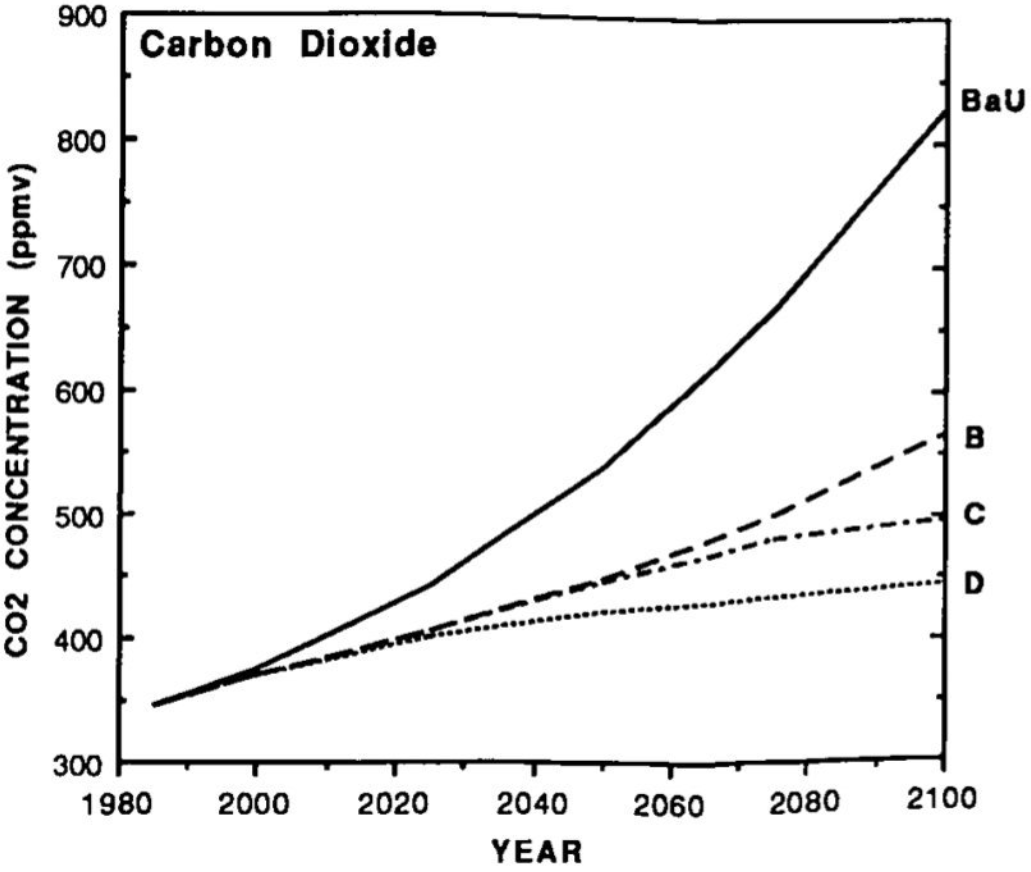
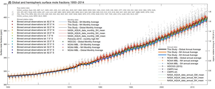 |
Figure 8: (Top panel) Projected CO2 increase for the IPCC First Assessment Report's four scenarios from 1985 to 2100 [1, figure 5 on page xix and figure A.3 on page 333]. (Bottom panel) Observed CO2 increase from 1950 - 2014 from various data sources. "Raw station data" acronyms represent individual sites at which data was collected. Acronyms: AQUA, Aqua satellite; ctrl, control runs of the model; CMIP5 models from the Coupled Model Intercomparison Project Phase 5; hist, historical runs of the models using past data; lat, latitude; GM, global monthly; MBL, marine boundary layer; NASA, National Aeronautics and Space Administration; NH, northern hemisphere; NOAA, National Oceanic and Atmospheric Administration; ppm(v), parts per million (by volume); SH, southern hemisphere; WDCGG, World Data Centre for Greenhouse Gases [33, figure 9 on page 2078]. CO2 levels reached ~409ppm in 2018. |
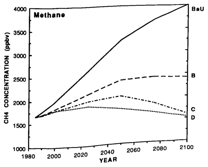
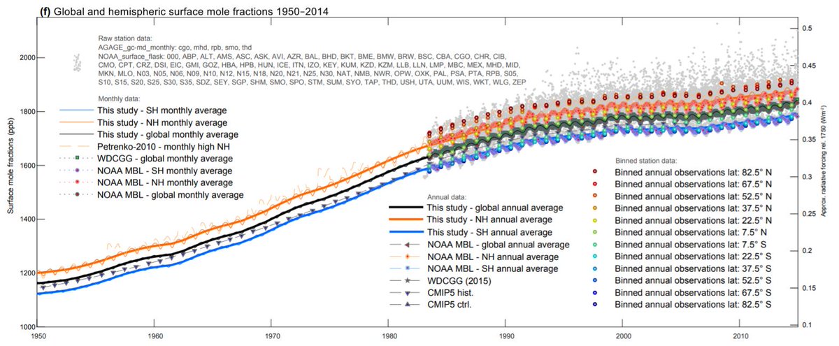 |
Figure 9: (Top panel) Projected CH4 increase for the IPCC First Assessment Report's four scenarios from 1985 to 2100 [1, figure 5 on page xix and figure A.3 on page 333]. (Bottom panel) Observed CH4 increase from 1950 - 2014 from various data sources. "Raw station data" acronyms represent individual sites at which data was collected. Acronyms: ctrl, control runs of the model; CMIP5 models from the Coupled Model Intercomparison Project Phase 5; hist, historical runs of the models using past data; lat, latitude; MBL, marine boundary layer; NH, northern hemisphere; NOAA, National Oceanic and Atmospheric Administration; ppb(v), parts per billion (by volume); SH, southern hemisphere; WDCGG, World Data Centre for Greenhouse Gases [33, figure 11 on page 2083]. CH4 levels reached ~1860ppb in 2018. |
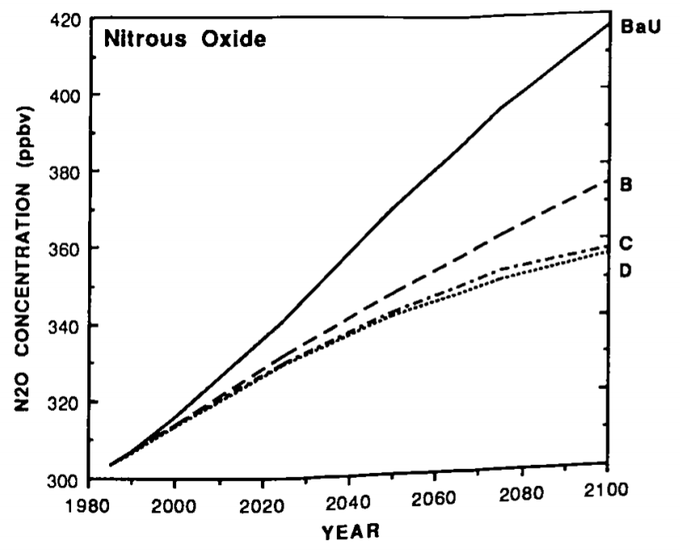
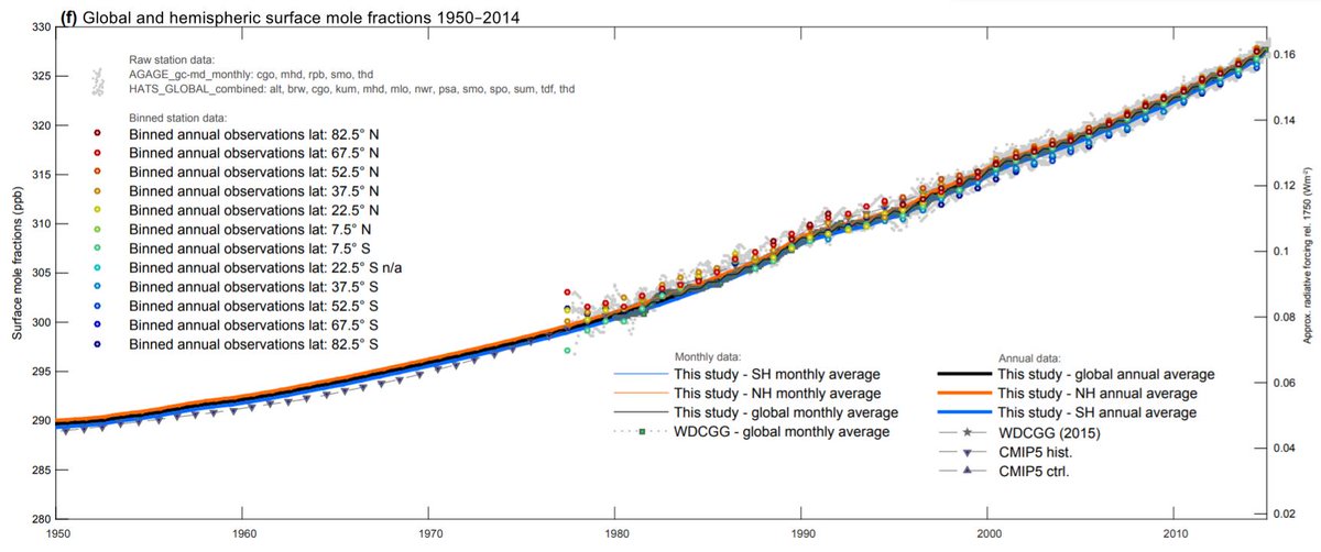 |
Figure 10: (Top panel) Projected N2O increase for the IPCC First Assessment Report's four scenarios from 1985 to 2100 [1, figure A.3 on page 333]. (Bottom panel) Observed N2O increase from 1950 - 2014 from various data sources. "Raw station data" acronyms represent individual sites at which data was collected. Acronyms: ctrl, control runs of the model; CMIP5 models from the Coupled Model Intercomparison Project Phase 5; hist, historical runs of the models using past data; lat, latitude; NH, northern hemisphere; ppb(v), parts per billion (by volume); SH, southern hemisphere; WDCGG, World Data Centre for Greenhouse Gases [33, figure 12 on page 2085]. N2O levels reached ~331ppb in 2018. |
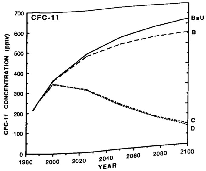
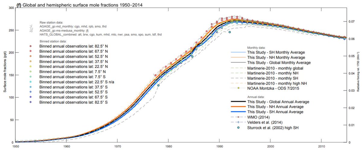 |
Figure 11: (Top panel) Projected CFC-11 increase for the IPCC First Assessment Report's four scenarios from 1985 to 2100 [1, figure 5 on page xix and figure A.3 on page 333]. (Bottom panel) Observed CFC-11 increase from 1950 - 2014 from various data sources. "Raw station data" acronyms represent individual sites at which data was collected. Acronyms: lat, latitude; NH, northern hemisphere; NOAA, National Oceanic and Atmospheric Administration; ppt, parts per trillion; ODS, ozone-depleting substance; ppt(v), parts per trillion (by volume); SH, southern hemisphere; WMO, World Meteorological Organization [33, figure S2]. CFC-11 levels reached ~230ppt in 2018. |
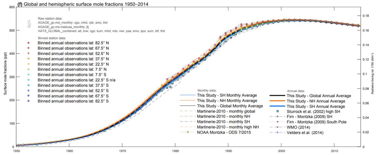 |
Figure 12: (Top panel) Projected CFC-12 increase for the IPCC First Assessment Report's four scenarios from 1985 to 2100 [1, figure A.3 on page 333]. (Bottom panel) Observed CFC-12 increase from 1950 - 2014 from various data sources. "Raw station data" acronyms represent individual sites at which data was collected. Acronyms: lat, latitude; NH, northern hemisphere; NOAA, National Oceanic and Atmospheric Administration; ppt, parts per trillion; ODS, ozone-depleting substance; ppt(v), parts per trillion (by volume); SH, southern hemisphere; WMO, World Meteorological Organization [33, figure S3]. CFC-12 levels reached ~510ppt in 2018. |
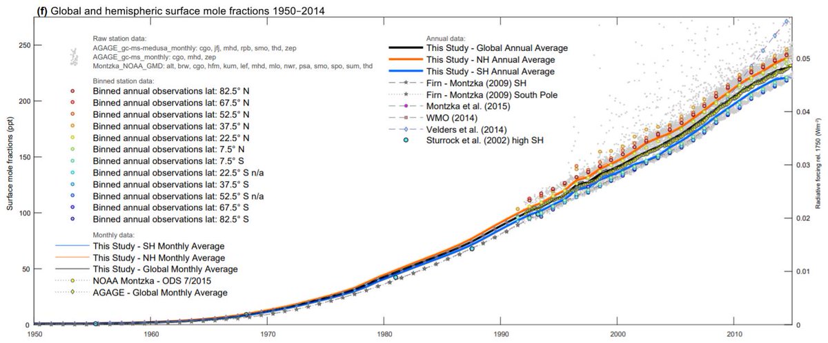 |
Figure 13: (Top panel) Projected HCFC-22 increase for the IPCC First Assessment Report's four scenarios from 1985 to 2100 [1, figure A.3 on page 333]. (Bottom panel) Observed HCFC-22 increase from 1950 - 2014 from various data sources. "Raw station data" acronyms represent individual sites at which data was collected. Acronyms: AGAGE, Advanced Global Atmospheric Gases Experiment; lat, latitude; NH, northern hemisphere; NOAA, National Oceanic and Atmospheric Administration; ppt(v), parts per trillion (by volume); ODS, ozone-depleting substance; SH, southern hemisphere; WMO, World Meteorological Organization [33, figure S15]. HCFC-22 levels reached ~240ppt in 2018. |
No comments:
Post a Comment