The outline for this post is as follows:
- The Myth and Its Flaw
- Context and Analysis (divided into multiple sections)
- Posts Providing Further Information and Analysis
- References
This is the "main version" version of this post, which means that this post lacks most of my references and citations. If you would like a more comprehensive version with all the references and citations, then please go to the "+References" version of this post.
References are cited as follows: "[#]", with "#" corresponding to the reference number given in the References section at the end of this post.
1. The Myth and Its Flaw
Changing carbon dioxide (CO2) levels correlate with long-term temperature changes on Earth. There is also an evidence-based scientific consensus that humans caused most of the recent global warming, predominately via increasing levels of greenhouse gases such as CO2 (just as there is an evidence-based scientific consensus on other topics). Therefore scientists attribute most of the recent warming to man-made release of CO2. Some critics object to this causal attribution, since the critics claim the attribution involves incorrectly inferring causation from correlation. The critics' claim is the myth this blogpost focuses on.
Proponents of this myth include William Happer, Roy Spencer, S. Fred Singer, Nicola Scafetta, Craig Idso, Robert Carter, Tim Ball, Don Easterbrook, Patrick Moore, Joseph D'Aleo, James Wallace III, Christopher Monckton, Willis Eschenbach of the blog WattsUpWithThat, Kenneth Richard of the blog NoTricksZone, the Fraser Institute, Joanne Nova, Warren Meyer, CO2 Science, Friends of Science, Principia Scientific International, and other anonymous people whom climate scientists correct.
This myth's popularity may help explain why American political conservatives are less likely to accept that human release of greenhouse gases caused most of the recent global warming (along with the disproportionate number of conservatives who do not accept that there is solid evidence of global warming).
The myth's flaw: Correlations between CO2 and temperature are not the only line of evidence showing that increased CO2 causes global warming, with CO2 causing most of the recent net warming. Other lines of evidence support this causal attribution, including the same types of evidence that support causal attribution in other scientific fields [57]. These lines of evidence include (with the corresponding sections in which I discuss each line of evidence):
- section 2.1 : correlation between the cause and its effect
- section 2.2 : plausibility / a well-evidenced causal mechanism illustrating how the cause would produce the effect
- section 2.3 : analogy / comparison to similar causes
- section 2.4 : experimental evidence linking cause and effect
- section 2.5 : strength (cause results in an effect with a large magnitude)
- section 2.6 : a physical gradient (more of the cause results in a greater effect)
- section 2.7 : consistency / reproducibility of the correlation between the cause and the effect
- section 2.8 : primacy / temporality (cause occurs before the effect and is temporally-associated with the effect)
- section 2.9 : specificity (cause results in a specific, predicted, observed set of effects not produced by various other proposed causes)
- section 2.10 : coherence with other lines of evidence / evidence excluding (or incoherent with) other plausible causes
{With the exception of sections 2.1 and 2.4, each section concludes with a summary of the section's overall point. So feel free to use these summaries as a guide through each section.}
One engages in special pleading (or offering an unjustified double-standard) if one accepts these lines of evidence for causation in other fields, while refusing to accept this evidence in the case of CO2 causing warming. Moreover, if myth proponents object to this evidence when it applies to CO2-induced warming, then, if proponents remain consistent in their reasoning, the proponents' logic commits them to objecting to this evidence when it applies to other topics. Thus myth defenders would be committed to objecting to evidence for well-supported causal claims, such as HIV causing AIDS (section 2.3) and smoking causing cancer (sections 2.5 and 2.9). And that would serve as a reductio ad absurdum for the myth proponents' objection. As aptly noted in a 2015 paper discussing other criticisms of the science on human-made climate change:
"Gardiner rightly points out that climate skeptics and deniers are cheating by leveling these concerns at climate science, and not at other sciences (e.g., physics, chemistry, economics, or even evidence-based medicine). Thus, Gardiner insists that if one takes science seriously at all, one must likewise take climate science seriously.
[...]
Nonetheless, there is an important lesson that we ought to draw from Gardiner’s discussion—ceteris paribus, one is not allowed to apply different epistemic standards in one area that one would not apply in another [56, page 8]."
Changing carbon dioxide (CO2) levels correlate with long-term temperature changes on Earth. There is also an evidence-based scientific consensus that humans caused most of the recent global warming, predominately via increasing levels of greenhouse gases such as CO2 (just as there is an evidence-based scientific consensus on other topics). Therefore scientists attribute most of the recent warming to man-made release of CO2. Some critics object to this causal attribution, since the critics claim the attribution involves incorrectly inferring causation from correlation. The critics' claim is the myth this blogpost focuses on.
Proponents of this myth include William Happer, Roy Spencer, S. Fred Singer, Nicola Scafetta, Craig Idso, Robert Carter, Tim Ball, Don Easterbrook, Patrick Moore, Joseph D'Aleo, James Wallace III, Christopher Monckton, Willis Eschenbach of the blog WattsUpWithThat, Kenneth Richard of the blog NoTricksZone, the Fraser Institute, Joanne Nova, Warren Meyer, CO2 Science, Friends of Science, Principia Scientific International, and other anonymous people whom climate scientists correct.
This myth's popularity may help explain why American political conservatives are less likely to accept that human release of greenhouse gases caused most of the recent global warming (along with the disproportionate number of conservatives who do not accept that there is solid evidence of global warming).
This myth's popularity may help explain why American political conservatives are less likely to accept that human release of greenhouse gases caused most of the recent global warming (along with the disproportionate number of conservatives who do not accept that there is solid evidence of global warming).
The myth's flaw: Correlations between CO2 and temperature are not the only line of evidence showing that increased CO2 causes global warming, with CO2 causing most of the recent net warming. Other lines of evidence support this causal attribution, including the same types of evidence that support causal attribution in other scientific fields [57]. These lines of evidence include (with the corresponding sections in which I discuss each line of evidence):
- section 2.1 : correlation between the cause and its effect
- section 2.2 : plausibility / a well-evidenced causal mechanism illustrating how the cause would produce the effect
- section 2.3 : analogy / comparison to similar causes
- section 2.4 : experimental evidence linking cause and effect
- section 2.5 : strength (cause results in an effect with a large magnitude)
- section 2.6 : a physical gradient (more of the cause results in a greater effect)
- section 2.7 : consistency / reproducibility of the correlation between the cause and the effect
- section 2.8 : primacy / temporality (cause occurs before the effect and is temporally-associated with the effect)
- section 2.9 : specificity (cause results in a specific, predicted, observed set of effects not produced by various other proposed causes)
- section 2.10 : coherence with other lines of evidence / evidence excluding (or incoherent with) other plausible causes
{With the exception of sections 2.1 and 2.4, each section concludes with a summary of the section's overall point. So feel free to use these summaries as a guide through each section.}
One engages in special pleading (or offering an unjustified double-standard) if one accepts these lines of evidence for causation in other fields, while refusing to accept this evidence in the case of CO2 causing warming. Moreover, if myth proponents object to this evidence when it applies to CO2-induced warming, then, if proponents remain consistent in their reasoning, the proponents' logic commits them to objecting to this evidence when it applies to other topics. Thus myth defenders would be committed to objecting to evidence for well-supported causal claims, such as HIV causing AIDS (section 2.3) and smoking causing cancer (sections 2.5 and 2.9). And that would serve as a reductio ad absurdum for the myth proponents' objection. As aptly noted in a 2015 paper discussing other criticisms of the science on human-made climate change:
"Gardiner rightly points out that climate skeptics and deniers are cheating by leveling these concerns at climate science, and not at other sciences (e.g., physics, chemistry, economics, or even evidence-based medicine). Thus, Gardiner insists that if one takes science seriously at all, one must likewise take climate science seriously.
[...]
Nonetheless, there is an important lesson that we ought to draw from Gardiner’s discussion—ceteris paribus, one is not allowed to apply different epistemic standards in one area that one would not apply in another [56, page 8]."
2. Context and Analysis
Section 2.1: Overview + correlation
Evidence can reveal correlations/associations, as with the correlation between saturated fat intake vs. heart disease (though a number of commentators object to this association, while other commentators point out flaws in these objections, in line with evidence that vegetarian diets that limit saturated fat intake also improve heart-disease-related metrics). In addition to correlation, scientists also investigate cause and effect. To aid in this pursuit, scientists and philosophers of science developed a number of frameworks for attributing an effect to a specific cause or causes. These frameworks for causal attribution include Bradford Hill considerations, Granger causality, John Stuart Mill's methods for causal inference, David Hume's methods (Hume also defended skepticism regarding causation in general), and concepts from information theory, among others.
One can apply these aforementioned frameworks to causation in different scientific fields, as has been done for information theory and Granger causality with respect to increased CO2 causing warming. But what justifies the claim that increased CO2 causes warming? Is a correlation between CO2 changes and temperature changes enough to justify this causal claim? To make these questions more vivid, suppose someone presented the following graphs showing a correlation between changing CO2 levels and temperature changes:


Figure 1: (Top panel) Global CO2 levels and global surface temperature change from 1910 - 2017. CO2 levels are shown in parts per million per volume (ppmv), which is equivalent to ppm. The temperature is relative to a baseline of 1951 - 1980, from NASA's Goddard Institute for Space Studies Surface Temperature analysis version 4 (GISS/GISSTEMP) [55, figure 1]. A number of other sources, including published studies, offer similar depictions of CO2 levels in relation to global temperature changes.
This figure may overestimate 1940s - 1970s cooling due to uncertainties tied to changes in temperature monitoring practices during World War II, as I discuss in "Myth: Karl et al. of the NOAA Misleadingly Altered Ocean Temperature Records to Increase Global Warming". Figure 23 below addresses this issue.
This top panel is not the best way to present a correlation that supports the theory of CO2-induced warming. For instance, there is a logarithmic, non-linear relationship between increased CO2 and increased temperature. The middle panel better accounts for this logarithmic relationship. So a 30ppm increase in CO2 would have a greater warming effect during the lower CO2 levels of the early 20th century vs. during the greater CO2 levels of the late 20th century. The logarithmic relationship between increased CO2 and CO2-induced warming means that a near-exponential increase in CO2 resulted in a more-linear rate of CO2-induced warming across the 20th century. The aforementioned more-linear CO2-induced warming combined with temperature trends caused by other factors, such as aerosols, yielding the observed 20th century temperature trend. Thus increased greenhouse gases contributed between a quarter to a half of the 1910s - 1940s warming. Other factors, such as increased solar output, contributed to 1910s - 1940s warming. But these factors can be ruled out as primary causes of post-1960s warming. The evidence ruling out these causes also rules in increased CO2 as the primary cause of post-1960s warming (see sections 2.5, 2.6, 2.9, and 2.10 for more on this, along with figures 22, 23, and 25).
(Middle panel) Relative global surface temperature change and the logarithm of CO2 concentration from 1880 - 2018. Relative temperature comes from NASA's Goddard Institute for Space Studies Surface Temperature analysis (GISS/GISSTEMP). Each 4-digit number represents a year, with a corresponding CO2 level on the x-axis and a relative temperature on the y-axis. For example, 2018 was ~0.8°C above the baseline average temperature, with a corresponding CO2 concentration of ~408 parts per million (ppm). Though not depicted in this figure, 2019 was ~0.9°C above the baseline average temperature, falling slightly below 2016 as the second-warmest year in GISS/GISSTEMP and other surface temperature trend analyses. 2019's corresponding CO2 level was ~411ppm. The "r" on the top left states the correlation coefficient [58]; this value is close to 1, indicating a strong, positive correlation between relative temperature and the natural logarithm of CO2 concentration. The logarithm of CO2 concentration is used here since there is a logarithmic relationship between increased CO2 and increased temperature. Other peer-reviewed and non-peer-reviewed sources offer a similar analysis. The trend-line for this graph implies ~2.4°C of warming per doubling of CO2, assuming the long-term net warming trend is equal to CO2-induced warming trend (y = 8.07{log(CO2) - 20.22}). CO2 here is used a surrogate for not only CO2 but other anthropogenic factors such as increases in methane (CH4), under the assumption that a doubling of CO2 implies a similar doubling of these factors. The slope likely under-estimates the equilibrium climate sensitivity discussed in section 2.5, since this slope does not account for factors in that section, such as the thermal inertia of the deep oceans. This implies that the surface warming lags the CO2 increase, as the deep oceans take up most of the energy first.
At least 7 other thermometer-based (a.k.a. instrumental) analyses and 1 contrarian-endorsed re-analysis confirm the post-1900 GISS/GISSTEMP temperature trend shown in the top and middle panels, as per figures 21 and 22. This includes the fossil-fuel-industry-funded and climate-contrarian-endorsed Berkeley Earth analysis. However, GISS/GISSTEMP may still over-estimate 1940s - 1970s cooling, as discussed above with respect to the top panel and as illustrated below in figure 23. Scientists will likely introduce more instrumental surface analyses in the future; this includes the upcoming GloSAT analysis, which is intended to cover global surface air trends dating back to the late 1700s. And at least 3 re-analyses that incorporate data from diverse sources, cover the post-1979 time-period and confirm the overall GISS/GISSTEMP trend for that period. This includes the climate-contrarian-endorsed ERA5 and JRA-55 re-analyses. I discuss the merits of various re-analyses and instrumental analyses in section 2.1 of "Myth: The IPCC's 1990 Report Over-estimated Greenhouse-gas-induced Global Warming".
Scientists tested and validated the data adjustment procedures used in instrumental temperature trend analyses. Non-experts examining the raw data further replicated the warming trend from mainstream instrumental analyses; multiproxy analyses also confirm the instrumental warming trend, as do other indirect measures that do not use thermometer data for air temperatures. Moreover, other signs of industrial-era warming occurred, such as rapid ice melt and sea level rise. And satellite-based analyses confirm recent surface warming trends; recent global warming occurred not only in surface temperatures records, but was also reflected in deep ocean warming (see figure 24), bulk atmospheric (tropospheric) trends from satellite-based analyses and weather balloons, sea level rise acceleration, etc., as shown in "Myth: No Global Warming for Two Decades". Thus there exist consilient/convergent, reproducible lines of evidence supporting the stated warming trend. Such consilience further increases the likelihood that the observed warming trend is real. Despite all this evidence, a myth proponent might still object to the CO2-temperature correlation by offering a baseless conspiracy theory in which NASA faked the GISS/GISSTEMP analysis, along with faking all these other signs of warming. I respond to this paranoid delusion in section 2.2 of "Myth: The IPCC's 2007 ~0.2°C/decade Model-based Projection Failed and Judith Curry's Forecast was More Reliable" and in response to objection 1 in section 3.1 of "John Christy, Climate Models, and Long-term Tropospheric Warming".
(Bottom panel) CO2 level and temperature change estimated from an Antarctic ice core [1]; a 2019 study explained similar results over a longer time-period using climate models. 1°C of Antarctic warming from this figure translates to ~0.6°C of global warming. The figure's data is taken from two published studies. "Years before present" (BP) on the x-axis means "years before 1950"; this point sometimes confuses contrarians. And the aforementioned data stops by about 38 BP, which is equivalent to ~1912. So this figure does not include most of the warming and CO2 increase since the 20th century; CO2 levels are now above 410ppm, the highest they have been in at least 2 million years.
Along with temperature, sea level also increased with increasing CO2 and decreased with decreasing CO2 in the distant past, as per warming-induced sea level rise from melting land ice and thermal expansion of ocean water. Moreover, warming-induced, man-made sea level rise also occurred during the industrial era. A number of other sources discuss how changes in greenhouse gas levels impact the ice age glacial-interglacial cycles shown in this bottom panel; see section 2.8 for further discussion.
Section 2.1: Overview + correlation
Evidence can reveal correlations/associations, as with the correlation between saturated fat intake vs. heart disease (though a number of commentators object to this association, while other commentators point out flaws in these objections, in line with evidence that vegetarian diets that limit saturated fat intake also improve heart-disease-related metrics). In addition to correlation, scientists also investigate cause and effect. To aid in this pursuit, scientists and philosophers of science developed a number of frameworks for attributing an effect to a specific cause or causes. These frameworks for causal attribution include Bradford Hill considerations, Granger causality, John Stuart Mill's methods for causal inference, David Hume's methods (Hume also defended skepticism regarding causation in general), and concepts from information theory, among others.
One can apply these aforementioned frameworks to causation in different scientific fields, as has been done for information theory and Granger causality with respect to increased CO2 causing warming. But what justifies the claim that increased CO2 causes warming? Is a correlation between CO2 changes and temperature changes enough to justify this causal claim? To make these questions more vivid, suppose someone presented the following graphs showing a correlation between changing CO2 levels and temperature changes:
One can apply these aforementioned frameworks to causation in different scientific fields, as has been done for information theory and Granger causality with respect to increased CO2 causing warming. But what justifies the claim that increased CO2 causes warming? Is a correlation between CO2 changes and temperature changes enough to justify this causal claim? To make these questions more vivid, suppose someone presented the following graphs showing a correlation between changing CO2 levels and temperature changes:


 |
Figure 1: (Top panel) Global CO2 levels and global surface temperature change from 1910 - 2017. CO2 levels are shown in parts per million per volume (ppmv), which is equivalent to ppm. The temperature is relative to a baseline of 1951 - 1980, from NASA's Goddard Institute for Space Studies Surface Temperature analysis version 4 (GISS/GISSTEMP) [55, figure 1]. A number of other sources, including published studies, offer similar depictions of CO2 levels in relation to global temperature changes. This figure may overestimate 1940s - 1970s cooling due to uncertainties tied to changes in temperature monitoring practices during World War II, as I discuss in "Myth: Karl et al. of the NOAA Misleadingly Altered Ocean Temperature Records to Increase Global Warming". Figure 23 below addresses this issue. This top panel is not the best way to present a correlation that supports the theory of CO2-induced warming. For instance, there is a logarithmic, non-linear relationship between increased CO2 and increased temperature. The middle panel better accounts for this logarithmic relationship. So a 30ppm increase in CO2 would have a greater warming effect during the lower CO2 levels of the early 20th century vs. during the greater CO2 levels of the late 20th century. The logarithmic relationship between increased CO2 and CO2-induced warming means that a near-exponential increase in CO2 resulted in a more-linear rate of CO2-induced warming across the 20th century. The aforementioned more-linear CO2-induced warming combined with temperature trends caused by other factors, such as aerosols, yielding the observed 20th century temperature trend. Thus increased greenhouse gases contributed between a quarter to a half of the 1910s - 1940s warming. Other factors, such as increased solar output, contributed to 1910s - 1940s warming. But these factors can be ruled out as primary causes of post-1960s warming. The evidence ruling out these causes also rules in increased CO2 as the primary cause of post-1960s warming (see sections 2.5, 2.6, 2.9, and 2.10 for more on this, along with figures 22, 23, and 25). (Middle panel) Relative global surface temperature change and the logarithm of CO2 concentration from 1880 - 2018. Relative temperature comes from NASA's Goddard Institute for Space Studies Surface Temperature analysis (GISS/GISSTEMP). Each 4-digit number represents a year, with a corresponding CO2 level on the x-axis and a relative temperature on the y-axis. For example, 2018 was ~0.8°C above the baseline average temperature, with a corresponding CO2 concentration of ~408 parts per million (ppm). Though not depicted in this figure, 2019 was ~0.9°C above the baseline average temperature, falling slightly below 2016 as the second-warmest year in GISS/GISSTEMP and other surface temperature trend analyses. 2019's corresponding CO2 level was ~411ppm. The "r" on the top left states the correlation coefficient [58]; this value is close to 1, indicating a strong, positive correlation between relative temperature and the natural logarithm of CO2 concentration. The logarithm of CO2 concentration is used here since there is a logarithmic relationship between increased CO2 and increased temperature. Other peer-reviewed and non-peer-reviewed sources offer a similar analysis. The trend-line for this graph implies ~2.4°C of warming per doubling of CO2, assuming the long-term net warming trend is equal to CO2-induced warming trend (y = 8.07{log(CO2) - 20.22}). CO2 here is used a surrogate for not only CO2 but other anthropogenic factors such as increases in methane (CH4), under the assumption that a doubling of CO2 implies a similar doubling of these factors. The slope likely under-estimates the equilibrium climate sensitivity discussed in section 2.5, since this slope does not account for factors in that section, such as the thermal inertia of the deep oceans. This implies that the surface warming lags the CO2 increase, as the deep oceans take up most of the energy first. At least 7 other thermometer-based (a.k.a. instrumental) analyses and 1 contrarian-endorsed re-analysis confirm the post-1900 GISS/GISSTEMP temperature trend shown in the top and middle panels, as per figures 21 and 22. This includes the fossil-fuel-industry-funded and climate-contrarian-endorsed Berkeley Earth analysis. However, GISS/GISSTEMP may still over-estimate 1940s - 1970s cooling, as discussed above with respect to the top panel and as illustrated below in figure 23. Scientists will likely introduce more instrumental surface analyses in the future; this includes the upcoming GloSAT analysis, which is intended to cover global surface air trends dating back to the late 1700s. And at least 3 re-analyses that incorporate data from diverse sources, cover the post-1979 time-period and confirm the overall GISS/GISSTEMP trend for that period. This includes the climate-contrarian-endorsed ERA5 and JRA-55 re-analyses. I discuss the merits of various re-analyses and instrumental analyses in section 2.1 of "Myth: The IPCC's 1990 Report Over-estimated Greenhouse-gas-induced Global Warming". Scientists tested and validated the data adjustment procedures used in instrumental temperature trend analyses. Non-experts examining the raw data further replicated the warming trend from mainstream instrumental analyses; multiproxy analyses also confirm the instrumental warming trend, as do other indirect measures that do not use thermometer data for air temperatures. Moreover, other signs of industrial-era warming occurred, such as rapid ice melt and sea level rise. And satellite-based analyses confirm recent surface warming trends; recent global warming occurred not only in surface temperatures records, but was also reflected in deep ocean warming (see figure 24), bulk atmospheric (tropospheric) trends from satellite-based analyses and weather balloons, sea level rise acceleration, etc., as shown in "Myth: No Global Warming for Two Decades". Thus there exist consilient/convergent, reproducible lines of evidence supporting the stated warming trend. Such consilience further increases the likelihood that the observed warming trend is real. Despite all this evidence, a myth proponent might still object to the CO2-temperature correlation by offering a baseless conspiracy theory in which NASA faked the GISS/GISSTEMP analysis, along with faking all these other signs of warming. I respond to this paranoid delusion in section 2.2 of "Myth: The IPCC's 2007 ~0.2°C/decade Model-based Projection Failed and Judith Curry's Forecast was More Reliable" and in response to objection 1 in section 3.1 of "John Christy, Climate Models, and Long-term Tropospheric Warming". (Bottom panel) CO2 level and temperature change estimated from an Antarctic ice core [1]; a 2019 study explained similar results over a longer time-period using climate models. 1°C of Antarctic warming from this figure translates to ~0.6°C of global warming. The figure's data is taken from two published studies. "Years before present" (BP) on the x-axis means "years before 1950"; this point sometimes confuses contrarians. And the aforementioned data stops by about 38 BP, which is equivalent to ~1912. So this figure does not include most of the warming and CO2 increase since the 20th century; CO2 levels are now above 410ppm, the highest they have been in at least 2 million years. Along with temperature, sea level also increased with increasing CO2 and decreased with decreasing CO2 in the distant past, as per warming-induced sea level rise from melting land ice and thermal expansion of ocean water. Moreover, warming-induced, man-made sea level rise also occurred during the industrial era. A number of other sources discuss how changes in greenhouse gas levels impact the ice age glacial-interglacial cycles shown in this bottom panel; see section 2.8 for further discussion. |
(In section 2.8, I rebut the argument that since figure 1's bottom panel shows that CO2 increases lag temperature increases, figure 1 undermines the case for CO2-induced warming. And in "Myth: An Ice Core Shows a Spike in CO2 Levels without a Spike in Temperature", I debunk attempts to use a modified version of figure 1 to argue that CO2 does not cause warming.)
The CO2-temperature correlation is fairly strong, with a correlation coefficient of ~0.9; the strong correlation is apparent enough that even non-experts can show it. Other sources also show a long-term correlation between CO2 and temperature changes. For instance, in section 2.10 I present other CO2-induced temperature trend correlations during the distant past and during the recent industrial-era. One common reply to this correlation is to claim that "correlation does not imply causation," as in the case of spurious correlations between stork population and human birth rates, or between a country's chocolate consumption and their number of Nobel laureates. So claiming that CO2 causes warming involves incorrectly inferring causation from correlation; this is the myth this blogpost focuses on.
Though it is true that correlation does not guarantee causation, correlation/association should be used as part of a cumulative case for causation. In this blogpost I illustrate this point by applying some methods of causal inference to show that CO2 caused global warming. I will primarily focus on Bradford Hill considerations used for inferring causation. I will also follow Bradford Hill's example and explain how these considerations apply not only to the CO2-temperature causal relationship, but also to causal relationships in numerous other branches of science. This should provide broader context on how scientists support causal claims using these considerations.
So if myth defenders object to these considerations, then they are not simply objecting to climate science; they are also objecting to causal attribution, and trend-based reasoning, in other scientific fields. As the climate scientist Gavin Schmidt, and other scientists, have noted:
So if myth defenders object to these considerations, then they are not simply objecting to climate science; they are also objecting to causal attribution, and trend-based reasoning, in other scientific fields. As the climate scientist Gavin Schmidt, and other scientists, have noted:
"Note that it helps enormously to think about attribution in contexts that don’t have anything to do with anthropogenic [a.k.a. human-made] causes. For some reason that allows people to think a little bit more clearly about the problem [2]."
(A note on analogies: Throughout this blogpost, I make analogies between CO2-induced warming and other topics, such saturated-fat-induced heart disease and HIV causing AIDS. The basic structure of these analogical arguments is:
- compare two or more matters
- point out a relevant similarity or difference between those matters
- draw a conclusion from that similarity or difference
Logical reasoning works in this way. For instance, one can point out that two arguments are both instances of modus ponens, and from that draw the conclusion that both arguments are formerly valid, such that if their premises are true, then their conclusion is true. Or one can point out that two arguments use wishful thinking, making both arguments not cogent. I use analogies for a number of reasons, such as exposing the special pleading involved in myth proponents defending the myth using ridiculous arguments they would not accept in another scientific topics. The analogies also provide a reductio ad absurdum by showing that if the myth advocate's reasoning was applied to other scientific topics, then it would commit them to not accepting well-supported causal claims that they should actually accept. And research shows that analogies to other topics can effectively expose errors in one's scientific reasoning.)
My use of Bradford Hill considerations should debunk the myth that correlations between CO2 and temperature changes are the only line of evidence showing that CO2 causes warming. These considerations will also support the evidence-based scientific consensus that humans caused most of the post-1950s and post-1970s net global warming, primarily through humanity's release of CO2. This point extends to the industrial-era global warming of the late 19th, 20th, and early 21st centuries, as per figures 22, 23, and 25. For instance, the Intergovernmental Panel of Climate Change (IPCC) notes that there is a 95% or greater chance that most of the global warming from 1951 to 2010 was caused by humans. The IPCC also claims that there is 90% or greater chance that man-made increases in greenhouses gases caused most of the warming from 1951 to 2010, with CO2 being the primary greenhouse gas released by human activity.
So let's see how Bradford Hill considerations support this evidence-based consensus on CO2-induced warming, starting with the metric of "plausibility."
Section 2.2: Plausibility / a well-evidenced causal mechanism
Astrology claims that distant planets, etc. strongly influence people's lives and personalities. Astrology remains deeply implausible since astrologists provide no evidence-based mechanism via which astronomical bodies could strongly affect people lives and personalities. Some critics accuse the myth proponent Nicola Scafetta of resorting to something like astrology. Scafetta, among others, looks for correlations between Earth's climate and astronomical phenomena, such as Jupiter's and Saturn's tidal forces. And as with astrologers, Scafetta (and others) use a "phenomenological" approach to side-step the need to provide a detailed, evidence-based mechanism for how these astronomical factors strongly influence phenomena on Earth. His pseudo-astrological account predicts slight global cooling after about 2001, though post-2001 warming actually occurred, as I discuss in section 2.5, "Myth: No Global Warming for Two Decades", and section 2.1 of "Myth: The IPCC's 2007 ~0.2°C/decade Model-based Projection Failed and Judith Curry's Forecast was More Reliable".
Other non-astrological astronomical explanations of climate change hinge on spurious correlations that quickly break down, or are based on easily-debunked, physically implausible mechanisms. And sometimes contrarians drop the "pseudo-" in "pseudo-astrology," by using astrology to explain climate change, as in the case of the astrologist Theodor Landscheidt. As with Scafetta, Landscheidt forecasted cooling when warming instead occurred. Amazingly, quite a number of contrarians treat Landscheidt's claims as being credible.
Fortunately, mainstream climate science is not astrology. Unlike astrologers, mainstream climate scientists offer well-evidenced mechanisms to account for cause-and-effect relationships. For instance, since at least the 1800s, scientists have known how greenhouse gases cause warming; a warming effect was known since at least Eunice Foote's 1856 work. Unfortunately, many members of the public do not understand the mechanisms underlying greenhouse-gas-induced warming, as discussed below (though education can remedy this lack of knowledge, increasing public acceptance of climate science and concern about climate change):
"However, the public virtually never sees cogent scientific explanations of global warming's mechanism.
[...]
Yet we might expect scientifically literate people to produce a brief, mechanistic, global warming explanation—as in these 35 words: “Earth transforms sunlight's visible light energy into infrared light energy, which leaves Earth slowly because it is absorbed by greenhouse gases. When people produce greenhouse gases, energy leaves Earth even more slowly—raising Earth's temperature [emphasis added] [3, pages 51 - 52].”"
To elaborate on this further, let's start with an analogy. Imagine an open pot of water, placed over a fire. The pot takes in energy from the fire, and also releases energy into the environment. One can add fuel to the fire, strengthening the fire and thus adding more energy to the pot, generating an energy imbalance in which the pot takes in more energy that the pot releases. The pot warms in response, releasing more energy as it warms; the more sensitive the pot is to the energy imbalance, the more the pot warms. The pot will stop warming in response to the pot releasing as much (or more) energy than the pot takes in, yielding an energy balance and an equilibrium in which the pot takes in about as much energy as it releases.
Earth's climate operates on the same general principle of temperature changes in response to an energy imbalance. Earth's surface takes in shorter-wavelength (higher energy) solar radiation and releases longer-wavelength (lower energy) radiation. If Earth releases less energy than it takes in, then this creates an energy imbalance, which results in Earth warming. Greenhouse gases such as CO2 and methane, emit radiation and transfer energy via colliding with other molecules. CO2 also absorbs some of the longer-wavelength radiation emitted by the Earth, but not incoming shorter-wavelength solar radiation, with CO2 absorbing radiation in specific wavelengths.
Thus greenhouse gases such as CO2 engage in radiative forcing, slow the rate at which Earth releases energy, and cause an energy imbalance that results in warming. Radiative forcing, with its units of watts per square meter (energy per unit of space per unit of time), measures that energy imbalance. There are other technical aspects of this process, such as an increasing effective emission altitude in response to the mechanism described above, but the aforementioned points should suffice for this blogpost. CO2-induced warming also melts solar-radiation-reflecting ice, increases water vapor levels, and affects cloud cover; this increases the amount of shorter-wavelength solar radiation absorbed by the Earth, as I discuss later in this section.
The IPCC depicts this process as follows:
 |
Figure 2: The IPCC's depiction of radiative forcing from greenhouse gases, in which greenhouses gases (such as CO2) slow the rate at which Earth releases energy, warming the Earth [4, figure 1 on page 7]. The United States National Aeronautics and Space Administration (NASA) provides a more quantitative depiction at a layman's level, as do other sources. |
This process is somewhat analogous to what happens to you when you wear a thick blanket. Your body generates heat through muscle contractions and other processes, somewhat analogous to the Sun adding shorter-wavelength radiation to Earth. Your thick blanket traps air near your skin, slowing the rate at which you release heat energy into the environment through your skin. Thus the blanket creates an energy imbalance, causing you to warm, somewhat akin to how increased greenhouse gas cause warming via an energy imbalance. This blanket-induced warming can damage the body in certain cases, especially in young children. In addition to this blanket analogy, other sources provide different comparisons that help illustrate the aforementioned greenhouse gas effect at a layman's level. Infrared-reflective coatings offer another analogy. Since at least the 1920s, scientists and engineers knew that one could coat glass with a film that allows shorter wavelength radiation (visible light) to pass through, while reflecting longer wavelength (infrared) radiation back. This reflected energy helps increase energy efficiency. Other products, such as CO2 lasers, more directly exploit the absorption and infrared emission properties of CO2.
Some individuals on the Internet make nonsensical criticisms of the science on the greenhouse gas effect; this applies especially to critics who attempt to replace the greenhouse effect with atmospheric pressure. Many of these critics, or sky dragon slayers, claim that the greenhouse effect violates the second law of thermodynamics. The slayers argue that the net flow of energy should be from the hotter object to the colder object, as per the second law. Yet the greenhouse effect (supposedly) assumes that a greenhouse-gas-rich atmosphere warms the surface, even though the lower atmosphere is colder than the surface.
But the slayers' criticism makes no sense, as illustrated by the blanket analogy. The blanket can warm you via an energy imbalance, even if the blanket is cooler than your body temperature; so a heated blanket is not required for warming you. Analogously, greenhouses gases do not need to make Earth's atmosphere warmer than the rest of the Earth, in order for these gases to warm Earth.
Or to give another analogy: suppose a pump above a pool of water adds water to the pool. A drain at the bottom of the pool allows water to flow out and into a tank downhill of the pool. There are at least two ways to increase the water level in the pool: increase the amount of water pumped in from above, or constrict the drain to limit the amount of water that leaves from below. The latter method works even though, with respect to the drain, the net flow of water is still downhill into the tank rather than uphill into the pool. Figure 3 below summarizes how constricting the drain would increase the level of water in the pool:
Analogously, there are at least two ways to warm the Earth. One can increase the amount of shorter-wavelength radiation coming in, such as by increasing solar radiation. Or one can slow Earth's release of longer-wavelength radiation, such as by increasing greenhouse gas levels. This latter method still works even though, with respect to the atmosphere, the net flow of longer-wavelength radiation is still out from the surface to the atmosphere and then into space.
This runs contrary to the slayers' faulty criticism, which claims that the greenhouse effect involves the net flow of longer-wavelength radiation in from the greenhouse-gas-rich atmosphere to the surface. Or to put in terms of the pool analogy: the slayers' nonsensical criticism is akin to saying that constricting the drain increases the pool's water level only if the net flow of water is uphill from the tank into the pool. Thus the slayers' critique fails since it depends on a misrepresentation of the greenhouse gas effect.
Other contrarians distort conservation of energy / the first law of thermodynamics, instead of the second law. The first law states that energy is neither created nor destroyed, but instead only shifts forms. The contrarians claim the greenhouse gas effect violates this law by creating energy that was not inputted by the Sun or some other source. This objection lacks merit because it conflates gross with net. The previous pool analogy, when adapted to figure 2, illustrates this point.
Imagine machines lie in the pool, half-way between the pool's top surface and the pool's drain-adjacent bottom. The machines take in some water heading towards the drain. The machines then shoot out this water randomly in all directions. Thus the machines take water that was heading drain-ward, and send it some of it surface-ward. This re-direction reduces drain-ward flow of water. Adding a sufficient number of machines slows the flow of water through the drain to the point that the drain releases less water than the pump adds, thereby increasing the level of water in the pool. The action of the machines parallels (with inverted directions) the right half of figure 2, in which greenhouse gases absorb infrared radiation heading upwards from Earth's surface and then send some of that energy downwards towards Earth's surface.
Now suppose a water balance exists in the pool, such that the pool maintains a constant volume of water. The rate of exchange of water is as follows, in liters per minute (positive numbers indicate water entering the pool, and negative numbers indicate water exiting the pool):
But the slayers' criticism makes no sense, as illustrated by the blanket analogy. The blanket can warm you via an energy imbalance, even if the blanket is cooler than your body temperature; so a heated blanket is not required for warming you. Analogously, greenhouses gases do not need to make Earth's atmosphere warmer than the rest of the Earth, in order for these gases to warm Earth.
Or to give another analogy: suppose a pump above a pool of water adds water to the pool. A drain at the bottom of the pool allows water to flow out and into a tank downhill of the pool. There are at least two ways to increase the water level in the pool: increase the amount of water pumped in from above, or constrict the drain to limit the amount of water that leaves from below. The latter method works even though, with respect to the drain, the net flow of water is still downhill into the tank rather than uphill into the pool. Figure 3 below summarizes how constricting the drain would increase the level of water in the pool:
 |
Figure 3: An analogy between the balance of water in a pool, and the Earth's energy balance, courtesy of @kmp010 [28]. (left panel) Water enters and leaves the pool at the same rate in liters per second (L/s), causing the level of the water to remain the same. Similarly, if Earth takes in as much energy as Earth releases, then Earth achieves an energy balance. (right panel) Constricting the drain causes water to leave the pipe at a slower rate than water entering the pipe. This causes the pool's water level to rise. Analogously, increasing greenhouse gas levels slow the rate at which Earth releases energy in particular wavelengths, to the point that Earth takes in more energy than Earth releases. This results in an energy imbalance, an increase in Earth's energy, and thus warming. |
Analogously, there are at least two ways to warm the Earth. One can increase the amount of shorter-wavelength radiation coming in, such as by increasing solar radiation. Or one can slow Earth's release of longer-wavelength radiation, such as by increasing greenhouse gas levels. This latter method still works even though, with respect to the atmosphere, the net flow of longer-wavelength radiation is still out from the surface to the atmosphere and then into space.
This runs contrary to the slayers' faulty criticism, which claims that the greenhouse effect involves the net flow of longer-wavelength radiation in from the greenhouse-gas-rich atmosphere to the surface. Or to put in terms of the pool analogy: the slayers' nonsensical criticism is akin to saying that constricting the drain increases the pool's water level only if the net flow of water is uphill from the tank into the pool. Thus the slayers' critique fails since it depends on a misrepresentation of the greenhouse gas effect.
Other contrarians distort conservation of energy / the first law of thermodynamics, instead of the second law. The first law states that energy is neither created nor destroyed, but instead only shifts forms. The contrarians claim the greenhouse gas effect violates this law by creating energy that was not inputted by the Sun or some other source. This objection lacks merit because it conflates gross with net. The previous pool analogy, when adapted to figure 2, illustrates this point.
Imagine machines lie in the pool, half-way between the pool's top surface and the pool's drain-adjacent bottom. The machines take in some water heading towards the drain. The machines then shoot out this water randomly in all directions. Thus the machines take water that was heading drain-ward, and send it some of it surface-ward. This re-direction reduces drain-ward flow of water. Adding a sufficient number of machines slows the flow of water through the drain to the point that the drain releases less water than the pump adds, thereby increasing the level of water in the pool. The action of the machines parallels (with inverted directions) the right half of figure 2, in which greenhouse gases absorb infrared radiation heading upwards from Earth's surface and then send some of that energy downwards towards Earth's surface.
Now suppose a water balance exists in the pool, such that the pool maintains a constant volume of water. The rate of exchange of water is as follows, in liters per minute (positive numbers indicate water entering the pool, and negative numbers indicate water exiting the pool):
- rate pump adds water to the pool : +5
- rate water exits the pool through the drain into the tank : -5
- rate machines take in water from the pool : -20
- rate machines release water into the pool (sum of all directions) : +20
- rate machines release water into the pool (only surface-ward direction) : roughly +10
The contrarians' objection states that the machines create new water, since the machines release +10 downwards, which is more than the +5 the pool adds to the tank. This objection fails since it focuses on the gross exchange of water, not the net exchange. For the machines to create new water for release, the machines must be net releasers; they must release more water than they take in. But the machines are not net releasers since they take in as much water as they release, re-directing some of the water surface-ward. So the contrarian objection lacks merit. Similarly, greenhouse gases do not create energy, but instead absorb and re-direct it. So when ones takes into account the net flow of energy (the sum of incoming solar radiation, upward infrared radiation, downward infrared radiation, etc.), the greenhouse gas effect does not violate the first law of thermodynamics. The effect's downward infrared radiation remains consistent with conservation of energy.
Radiation-induced warming from greenhouse gas increases occurred, as discussed further in section 2.4. So given the aforementioned discussion, the greenhouse effect provides an evidence-based mechanism via which CO2 increases cause warming. Other non-CO2 factors also impact this CO2-induced warming. In response to warming, positive feedbacks amplify subsequent warming and negative feedbacks limit subsequent warming; I discuss this further in section 2.8, along with "Myth: No Hot Spot Implies Less Global Warming and Support for Lukewarmerism". Evidence-based causal mechanisms underlie each one of these feedbacks. The primary long-term feedbacks are (see figure 4 for the relative magnitude of some of these feedbacks; other smaller feedbacks exist, such as positive feedback from methane causing more global warming, as warming lakes and warming-induced melting of ice releases more methane):
- Water vapor as a positive feedback: Warming evaporates liquid water to form water vapor. This increases water vapor levels in the air, because warmer air can hold more water vapor. More water vapor causes further warming, since water vapor is a greenhouse gas (see sections 2.3 and 2.8 for further discussion).
- Clouds as a positive feedback: Clouds reflect solar radiation into space, or emit infrared radiation into space, and thus can act as a negative feedback; clouds also reflect/absorb radiation emitted by the Earth or absorb solar radiation, and thus can act as a positive feedback. Lower level clouds tend to act as a negative feedback, while higher level clouds tend to act as a positive feedback. Climate models predict a net positive feedback from clouds, with radiative forcing from clouds becoming more positive with warming, due to increases in higher level clouds and reductions in lower level clouds in response to warming. For instance, suppose in 1990 clouds have a net cooling effect of -2.0 K/year. Then it warmed for 10 years due to non-cloud factors, leading to clouds having a more positive cooling effect of -1.5 K/year by 2000, allowing for more for warming 10 years, leading to the clouds having an even more positive cooling effect of -1.0 K/year by 2010, allowing for more warming, and so on. This illustrates how positive feedback from clouds can augment warming, even if clouds overall have a cooling effect each year. So what matters for feedback is how the clouds' impact changes with temperature changes, not necessarily whether the sign of the clouds' impact is positive or negative at a given point in time. A similar point applies to other feedbacks.
- Surface albedo as a positive feedback: Ice has a greater albedo than liquid water, meaning that ice reflects more visible light from the Sun back into space than does liquid water. Melting ice therefore reduces Earth's albedo and increases the amount of radiation absorbed by Earth's surface. This increase in absorbed radiation causes more surface warming and therefore more ice melt; thus melting ice acts as a positive feedback amplifying warming.
- Lapse rate reduction as a negative feedback: Temperature in the troposphere, a lower layer of the atmosphere, decreases with increasing height; the rate of decrease is known as the tropospheric lapse rate. The magnitude of the lapse rate decreases when the upper troposphere warms faster than the lower troposphere, and when the lower troposphere warms faster than the surface, especially in the tropics. Transferring warming from the surface up to the troposphere thus reduces the lapse rate and allows Earth to more easily radiate this energy into space. So lapse rate reduction limits global warming. In contrast to the tropics, within the Arctic the surface warms faster than the lower troposphere and the lower troposphere warms faster than the upper troposphere, leading to a lapse rate increase and a positive lapse rate feedback in the Arctic.
- Planck feedback as a negative feedback: As Earth warms, Earth radiates more energy into space, as per the Stefan-Boltzmann law. This increased radiation represents the Planck feedback and serves as a negative feedback that limits the amount of energy Earth accumulates as Earth warms.
These feedback mechanisms are borne out in reality. Water vapor, clouds, and reduced surface albedo acted as positive feedbacks amplifying global warming. And in the tropics, the mid-to-upper troposphere warmed more than near the surface, as shown in satellite analyses, weather balloon analyses, re-analyses, and other sources. This so-called tropospheric hot spot indicates that the tropical lapse rate decreased (I discuss this further in "Myth: The Tropospheric Hot Spot does not Exist"). This lapse rate reduction acted as a negative feedback limiting global warming. The Arctic near-surface also warmed faster than the Arctic upper troposphere, indicative of a positive lapse rate feedback. The processes underlying this positive lapse rate feedback contribute to strong surface warming in the Arctic, resulting in greater surface warming in the Arctic than in the tropics and than the global average, consistent with climate models and basic physical theory.
And in accordance with the Planck feedback, Earth released more radiation during the warm El Niño phase of an ocean cycle known as the El Niño-Southern Oscillation (ENSO); the radiation increase occurred largely because El Niño increased cloud cover and these clouds then reflected the solar radiation Earth would otherwise absorb. This cloud-based mechanism compensated for less emission of radiation by clouds during El Niño. Thus Earth radiated more energy into space as Earth warmed.
In contrast to the temporary ocean warming events such as El Niño, CO2 remains for much longer, driving a longer-term energy imbalance. Thus CO2 can cause long-term global warming, as CO2 has done in the past (ex: see the cited paleoclimate papers in figure 7), while El Niño does not, as I discuss in "Myth: El Niño Caused Post-1997 Global Warming". Eventually, however, CO2-induced warming stops, in part because increased radiation release by a warming Earth leads to an equilibrium in which Earth's release of energy into space equals the solar energy entering Earth. Figure 4 depicts a model-based estimate of how much various feedbacks contribute to warming upon equilibrium:
 |
Figure 4: (a) Average temperature increase for a doubling of atmospheric CO2 levels, upon reaching equilibrium, in atmosphere-ocean general circulation models (GCMs) from CMIP3 (phase 3 of the Coupled Model Intercomparison Project). This temperature increase is also known as equilibrium climate sensitivity, or ECS; I discuss ECS further in section 2.5. Panel a also depicts the contribution of various feedbacks to this temperature change in the CMIP3 models. The Planck response represents temperature response to forcing from CO2, without taking other feedbacks into account. (b) Average relative magnitude of each feedback in the CMIP3 models, with stronger positive feedbacks having a more positive value and stronger negative feedbacks having a more negative value. Error bars indicate +/- one standard deviation [6, figure 5].
|
Thus the Planck feedback eventually catches up to the radiative forcing from CO2, leading to equilibrium, stopping CO2-induced warming, and preventing irreversible, Venus-style runaway global warming with a runaway greenhouse gas effect. Positive feedback from melting ice also ends once all the ice melts, preventing the ice-albedo feedback from causing a runaway. Moreover, the water vapor feedback fails to result in irreversible, runaway warming. This is because water vapor is a condensing greenhouse gas that amplifies warming from longer-term factors, but fails to drive warming on its own, as I discuss in section 2.3. So in the absence of another factor, such as continued increases in CO2 or continued increases in solar output, to drive long-term warming above the temperature at which water vapor condenses, water vapor cannot drive warming and thus cannot cause a runaway (I discuss runaway warming further in section 2.8).
Even in the absence of CO2-induced runaway warming, increased CO2 contributes to ocean acidification, ocean deoxygenation, warming-induced sea level rise, frequency and intensity of extreme weather events, and mass extinctions (such as the current human-made mass extinction); I discuss ocean acidification further in "Myth: Ocean Acidification Requires that an Ocean Becomes an Acid". So evidence on these, and other, effects of CO2-induced climate change led to an evidence-based scientific consensus that climate change is a serious problem, regardless of the evidence against imminent, CO2-induced, runaway global warming. And despite the Planck response preventing runaway warming, positive feedback can augment CO2-induced warming at current and near-future atmospheric CO2 levels; moreover, radiative forcing from CO2 continues to increase with increasing CO2 levels, contrary to the notion of CO2's greenhouse gas effect becoming saturated.
Even in the absence of CO2-induced runaway warming, increased CO2 contributes to ocean acidification, ocean deoxygenation, warming-induced sea level rise, frequency and intensity of extreme weather events, and mass extinctions (such as the current human-made mass extinction); I discuss ocean acidification further in "Myth: Ocean Acidification Requires that an Ocean Becomes an Acid". So evidence on these, and other, effects of CO2-induced climate change led to an evidence-based scientific consensus that climate change is a serious problem, regardless of the evidence against imminent, CO2-induced, runaway global warming. And despite the Planck response preventing runaway warming, positive feedback can augment CO2-induced warming at current and near-future atmospheric CO2 levels; moreover, radiative forcing from CO2 continues to increase with increasing CO2 levels, contrary to the notion of CO2's greenhouse gas effect becoming saturated.
Let's contrast the aforementioned mechanisms with the following common, contrarian claim: industrial-era global warming simply represents a recovery from a "little ice age" (LIA) that occurred a few centuries ago. Let's set aside the question of whether or not the LIA was a worldwide event, with a globally simultaneous cooling period lasting for multiple decades. And let's also set aside the issue of what caused the LIA, though evidence points to a number of contributing factors that remain consistent with human release of greenhouse gases causing industrial-era global warming. The deeper issue is that "recovery from the LIA" represents a dormitive virtue.
Appealing to a dormitive virtue involves explaining an effect by appealing to the effect, usually via wordplay. This results in a pseudo-explanation, not a real explanation. The classic example of a dormitive virtue is claiming that a drug causes sleep due to the sleep-inducing power, or "dormitive virtue," of the drug. This account does not actually explain how the drug causes sleep; the account offers no causal mechanism. It simply names the supposed cause ("sleep-inducing power") by rephrasing the effect ("sleep"), linking them by definition.
Contrarians resort to the same tactic when they appeal to a "recovery from the LIA": they simply name the supposed cause ("recovery from the LIA") by rephrasing the effect ("warming following the LIA"), linking them by definition. Such an account offers no causal mechanism nor an explanation of how the effect was produced, nor why the warming began when it did, nor why the warming occurred at the rate it did in the hockey stick pattern I discuss in section 2.7, etc. This is made clear in the following 1988 quote from Sherwood Idso:
Contrarians resort to the same tactic when they appeal to a "recovery from the LIA": they simply name the supposed cause ("recovery from the LIA") by rephrasing the effect ("warming following the LIA"), linking them by definition. Such an account offers no causal mechanism nor an explanation of how the effect was produced, nor why the warming began when it did, nor why the warming occurred at the rate it did in the hockey stick pattern I discuss in section 2.7, etc. This is made clear in the following 1988 quote from Sherwood Idso:
"A comparative analysis of long-term (several-hundred-year) temperature and carbon dioxide (CO2) trends suggests that the global warming of the past century is not due to the widely accepted CO2 greenhouse effect but rather to the natural recovery of the Earth from the global chill of the Little Ice Age, which was both initiated and ended by some unrelated phenomenon [emphasis added], the latter expression of which is the very warming generally attributed to the CO2 increase of the past century [19]."
Idso's statement also suffers from the ABCD problem I discuss in section 2.10. The climate scientist Stefan Rahmstorf makes the point well when he writes:
"“Emerging from the little ice age” is not a physical mechanism or explanation [40]."
A vacuous "recovery from the LIA" account contrasts with increased solar irradiance as a mechanism of global warming, or the greenhouse-gas-induced causal mechanisms I discussed above. For instance, Syun-Ichi Akasofu, a proponent of the "recovery from the LIA" account (who views climate science in political terms), suggests that the recovery occurred because Earth received increased solar output and decreased cosmic ray exposure. This explanation fares poorly, especially with respect to post-1960s global warming, as I discuss in sections 2.9 and 2.10. Moreover, Akasofu's account entails that Earth slightly cooled since 2000, as did Scafetta's pseudo-astrological account from earlier in this section. But Earth instead warmed, as I discuss in section 2.5, "Myth: No Global Warming for Two Decades", and section 2.1 of "Myth: The IPCC's 2007 ~0.2°C/decade Model-based Projection Failed and Judith Curry's Forecast was More Reliable". Even some of Akasofu's defenders admit his prediction under-estimated warming, as per a larger effect from human-made, greenhouse-gas-induced warming. Despite these fatal flaws in Akasofu's account, he attempts to offer a non-vacuous mechanistic explanation for industrial-era global warming, though he initially failed to adequately do so and his work may not have undergone competent peer review.
In contrast to Akasofu, contrarians may resort to a vacuous account because they erroneously believe that Earth's nature is to warm or "recover" from a cold period such as the LIA. Sherwood Idso's quote above illustrates this point. But figure 1 debunks this contrarian idea, by showing that regions of the Earth can become much cooler than during the LIA. Thus contrarians cannot appeal to a dormitive virtue to claim that it is simply in Earth's nature to warm after a cold period. Instead if they want to explain why the Earth warmed instead of cooling further, then they need a causal mechanism detailing how this occurred. They cannot rebut the idea of CO2-induced, man-made global warming by appealing to a mechanism-free "memory" by which Earth's climate warms to its prior state following cooling.
In summary: many contrarians employ mechanism-free dormitive virtues and pseudo-astrological explanations. In contrast, mainstream climate science uses a broad understanding of the forcing and feedback mechanisms underlying, amplifying, and mitigating long-term CO2-induced warming. This differentiates climate science from astrology, and provides plausibility to the idea that CO2 causes warming amplified to levels large enough to account for most of the industrial-era global warming.
Section 2.3: Analogy / comparison to similar causes
(See section 2.1 for further discussion of the merits of using analogies)
Some viruses infect specific organisms, causing deficiencies of the immune system known as immunodeficiency syndromes. A classic example is feline immunodeficiency virus (FIV) infecting specific feline species. Overtime the population of organisms evolves, becoming more resistant to the virus. Thus when FIV infects these well-adapted organisms, the virus does not cause serious disease nor immunodeficiency. However, when FIV-infected blood from the well-adapted species transfers to a closely-related species that is not well-adapted, FIV can cause disease and immunodeficiency in this poorly-adapted population. This same pattern occurs with other viruses in the same family as FIV.
Some viruses infect specific organisms, causing deficiencies of the immune system known as immunodeficiency syndromes. A classic example is feline immunodeficiency virus (FIV) infecting specific feline species. Overtime the population of organisms evolves, becoming more resistant to the virus. Thus when FIV infects these well-adapted organisms, the virus does not cause serious disease nor immunodeficiency. However, when FIV-infected blood from the well-adapted species transfers to a closely-related species that is not well-adapted, FIV can cause disease and immunodeficiency in this poorly-adapted population. This same pattern occurs with other viruses in the same family as FIV.
Human immunodeficiency virus (HIV) is in the same family of viruses as FIV and other such viruses, such as equine infectious anemia virus, bovine immunodeficiency virus, and visna virus. HIV evolved from simian immunodeficiency virus (SIV), a virus that likely transferred from non-human primates to humans when humans butchered non-human primates for food or other products. HIV and SIV display a similar pattern as FIV: SIV causes little-to-no disease in primates that are well-adapted to it but causes disease (rarely) in poorly adapted non-human primates, SIV (now HIV) transferred from non-human primates to a closely-related group of primates known as humans, HIV caused disease and immunodeficiency in the poorly-adapted humans, and HIV caused little-to-no disease in the humans well-adapted to HIV. Thus HIV causes a disease known as acquired immunodeficiency syndrome or AIDS, though AIDS denialists do not admit this.
So how does this relate to CO2 and warming? Well, AIDS denialists compare themselves to "skeptics" of anthropogenic (human-made) global warming (AGW). Furthermore, AIDS denialists sometimes publish in the same disreputable venues, and resort to the same irrational tactics, as AGW denialists; hence these two forms of science denialism are often compared.
Beyond these points, the AIDS example illustrates that similar causes often result in similar effects. So for instance, HIV, SIV, and FIV are in the same family of viruses and produce similar effects in infected, poorly-adapted organisms. Thus AIDS denialists need to explain why HIV-related viruses such as SIV and FIV cause immunodeficiency syndromes, while the AIDS denialists claim that HIV does not cause the immunodeficiency syndrome AIDS. Failure to provide an explanation amounts to special pleading or an unjustified double-standard (credit to C0nc0rdance for independently developing this comparison).
A parallel point extends to greenhouse gases. So suppose an AGW denialist does not accept that greenhouse gases cause warming by instigating an energy imbalance. Then the denialist would need to explain why blankets warm the body by slowing down the rate of energy release, while greenhouse gases do not cause warming via a similar mechanism. Or why infrared-reflective coatings can increase energy efficiency, while greenhouse gases cannot similarly warm the Earth by absorbing and emitting infrared radiation (see section 2.2 for further discussion of the blanket and infrared-reflective coating analogies, along with energy imbalance). But suppose the denialist does accept that greenhouse gases such as water vapor and methane cause warming, while CO2 does not. The denialist would then need to explain why water vapor and methane cause warming via the mechanism discussed in section 2.2, while CO2 does not cause warming by the same mechanism. Failure to provide an explanation amounts to special pleading or an unjustified double-standard.
Some critics insist that CO2 cannot significantly impact climate, since Earth's atmosphere contains only trace amounts of CO2 measured in parts per million. Yet these same critics refute themselves when they claim that plants use trace levels of CO2 for photosynthesis. So the critics should stop pretending that trace amounts of a substance must always have negligible effects. Saying otherwise is as fallacious as an AIDS denialist saying that HIV cannot have a large effect on the human body, since HIV makes up just a trace proportion of the body's mass. Even though gases such as nitrogen, oxygen, and argon make up >98% of the atmosphere, they do not perform the radiative forcing that greenhouse gases do (I discussed radiative forcing in section 2.2). Thus greenhouse gases play an important role in climate, even though greenhouse gases occur at trace levels.
Though CO2 has some similarities to other greenhouse gases, it differs from them in important ways, just as HIV differs from FIV in ways that allow HIV, but not FIV, to cause AIDS in humans. Take, for instance, CO2 and methane. Though an individual methane molecule has more of a warming impact than an individual CO2 molecule, CO2 is a more important greenhouse gas than methane for a number of reasons. For example:
- CO2 is more abundant in the atmosphere.
- Bacteria break down much of the methane to form CO2.
- CO2 has a longer atmospheric residence time than methane, since methane readily reacts with other molecules higher in the atmosphere. Once CO2 and methane emissions cease, warming from increased CO2 persists longer than warming from increased methane (see figure 5 below).
- Methane levels, and methane's impact energy balance, have begun leveling off, while CO2 levels and impact continue to increase (see figure 5 below). The rate of methane increase, however, picked up again after 2008.
- Methane ends up being responsible for a minority of the anthropogenic impact on energy balance, with CO2 making up the majority (see figures 5 and 24 below).
The following figure illustrates the last point for predominately human-made increases in CO2, methane (CH4), and other greenhouse gases (in section 2.2 I discussed the "radiative forcing" mentioned on the graph's y-axis):
 |
Figure 5: Radiative forcing from different long-lived greenhouse gases up to 2008, with post-2008 projections under different scenarios for man-made emissions of these gases. The red line includes all the depicted long-lived greenhouse gases, with the exception of CO2, while the black line includes CO2. The y-axis on the top-right indicates how much CO2 (in ppm or "parts per million) would be needed to produce that equivalent amount of radiative forcing. The two lighter lines for line d represent the uncertainty for that emissions scenario; a similar point applies to the lighter lines for the "80% cut" red line [5, figure 3].
These CO2, methane, and N2O trends were updated in a subsequent 2016 paper, with CO2 still making up the vast majority of the radiative forcing [39, figure 3].
Acronyms: LLGHGs, long-lived greenhouses gases; CO2, carbon dioxide; CH4, methane; ODSs, ozone-depleting substances; N2O, nitrous oxide; HFCs, hydrofluorocarbons.
Emissions scenarios: Const.: constant emissions at 2008 levels; 80% cut : 80% emissions reduction phased in gradually from 2009 to 2050, and then held constant at that level post-2050.
Lines a, b, c, and d: a : constant emissions for CO2 and non-CO2 LLGHGs; b : constant CO2 emissions and 80% cut for non-CO2 LLGHGs; c : 80% cut for CO2 emissions and constant non-CO2 LLGHG emissions; d : 80% cut for both CO2 and non-CO2 LLGHG emissions [5, figure 3].
|
Figure 5 excludes water vapor, another greenhouse gas that, like methane, contrasts with CO2. CO2 absorbs energy at wavelengths missed by water vapor; this helps explain why CO2 can contribute to global warming even in the presence of water vapor. Furthermore, water vapor is a condensing greenhouse gas that condenses into liquid water at colder atmospheric temperatures. This makes water vapor very responsive to atmospheric temperature changes, and thus very poor at driving up long-term temperature to high levels in Earth's current climate. So water vapor is not a long-lived greenhouse gas and thus was not included in figure 5.
CO2, in contrast, is a non-condensing greenhouse gas that does not condense at typical atmospheric temperatures and pressures. This allows CO2 to accumulate in the presence of short-term temperature fluctuations. CO2 therefore has a longer atmospheric residence time than does water vapor. So in contrast to water vapor, CO2 can drive temperatures up in the long-term; water vapor is more important for maintaining an ongoing greenhouse gas effect, as opposed to water vapor driving long-term global warming. Moreover, water vapor levels sharply decrease with increasing height in the lower atmosphere (troposphere), while CO2 levels remain more uniform with increasing tropospheric height. Thus CO2 can exert a relatively larger greenhouse effect in the upper troposphere, even if water vapor levels remain relatively larger in the lower troposphere (I elaborated on the greenhouse effect in section 2.2).
As increased CO2 warms the atmosphere, atmospheric water vapor levels should increase in the warming air since warmer air can hold more water vapor. And since water vapor acts a greenhouse gas that causes warming, increased water vapor should act as a fast, positive feedback that amplifies the warming caused by CO2, as I discussed in section 2.2. Evidence confirms that increasing water vapor acted as a positive feedback that amplified warming. Water vapor levels increased in conjunction with warming, with much of the increase occurring in response to man-made global warming caused by increased CO2. Thus water vapor amplifies CO2-induced warming instead of driving it, as expected of a condensing greenhouse gas amplifying the long-term effect of a non-condensing greenhouse gas.
So comparing and contrasting CO2 with other gases, via analogy, lends credence to the idea that CO2 causes more longer-term warming than other gases, with industrial-era greenhouse-gas-induced global warming being primarily CO2-induced warming. Furthermore, the general mechanism of CO2-induced warming makes sense in comparison to other factors that cause warming. The mechanism also makes sense in comparison to other examples of how decreasing the output of a factor X out of (and/or increasing input of X into) a system can increase the levels of X in the system.
Section 2.4: Experimental evidence
Many people do not accept the evidence-based scientific consensus on genetically-modified (GM) food; they also distrust scientists on the topic of GM products. Yet study after study failed to find evidence that GM crops posed a significant safety risk. Furthermore, the few experimental studies that showed otherwise were plagued by serious problems, including basic statistical errors. So experimental evidence argues against the idea that GM crops cause damage to human health (I discuss an anti-GM-food study further in section 2.6).
In contrast, experimental evidence supports the causal link between CO2 and warming. For instance, experimental results show that CO2 absorbs and emits radiation in accordance with the evidence-based mechanism discussed in section 2.2; thus the laboratory data confirms the central mechanism via which CO2 causes warming. These laboratory results also match non-laboratory observations from Earth, Venus, Mars, and other astronomical bodies. Section 2.2 also discussed how technologies such as infrared-reflective coatings and CO2 lasers experimentally validate the infrared absorption and emission properties underlying the greenhouse gas effect.
Of course, one cannot run a laboratory experiment including all relevant aspects of CO2-induced warming from section 2.2, since a laboratory setup will lack clouds, a lapse rate in which temperature sharply decreases with increasing atmospheric height, a long enough time-frame for multi-decadal temperature changes to occur, etc. Similarly, one cannot run a laboratory experiment showing all the causal factors impacting tens of thousands of years of human evolution, billions of years of star formation, etc. Some planned, prospective experiments also cannot be run for ethical reasons, not just logistical reasons. But scientists can still gather evidence on these topics despite their inability to run laboratory experiments that encapsulate them from beginning to end, just as scientists can gather evidence of CO2-induced warming without running a laboratory experiment that encapsulates it from beginning to end. For instance, scientists can use natural experiments in which they examine results from outside of controlled settings such as a laboratory; such research occurred for GM products and policies, among other topics.
One could view CO2 increases in the distant past and recent past as natural experiments on the causal relationship between CO2 and warming, as noted by both mainstream climate scientists and myth proponents; I discuss this more in sections 2.5, 2.9, and 2.10. Ruddiman, for instance, presents evidence that pre-industrial human agricultural and land use practices increased CO2 and methane levels for thousands of years in a way that mitigated global cooling. Natural experiments on CO2-induced climate change in the distant past also help guide predictions of current industrial-era and future CO2-induced climate change, which are themselves natural experiments. Back in the 1890s, for example, Svante Arrhenius argued that increases in atmospheric CO2 levels would result in large amounts of warming, as per the high climate sensitivity discussed in sections 2.5 and 2.7. These high estimates of greenhouse-gas-induced warming continued through the 1930s and 1950s with the work of scientists such as Hulburt, Callendar, and Plass, as per figure 7 below in section 2.5. Various members of the public also became cognizant of the risk of global warming.
By the 1960s and 1970s, many more scientists were predicting imminent global warming than were predicting global cooling, as reflected in the peer-reviewed literature. And beginning in at least the 1970s, scientists used climate models to predict how much warming would result from a given increase in CO2, or from a given increase in radiative forcing from CO2 (see section 2.2 for further discussion of radiative forcing). Subsequent temperature trends of longer than a decade largely matched the predicted relationship between CO2-induced radiative forcing and CO2-induced warming, along with matching the predicted regional pattern of warming, as shown in academic and non-academic sources. This contrasts with inaccurate temperature trend predictions from myth proponents and other contrarians, as discussed in:
- section 2.2, section 2.5, and the caption for figure 20
- two Twitter threads [36; 37]
- "Myth: No Global Warming for Two Decades"
- section 1 of "Myth: The IPCC's 1990 Report Over-estimated Greenhouse-gas-induced Global Warming"
- sections 1 and 2.1 of "Myth: The IPCC's 2007 ~0.2°C/decade Model-based Projection Failed and Judith Curry's Forecast was More Reliable"
The 1990 First Assessment Report of the Intergovernmental Panel of Climate Change (IPCC [51]) provides a good example of accurately predicted warming; I discuss this in more detail in "Myth: The IPCC's 1990 Report Over-estimated Greenhouse-gas-induced Global Warming", and the discussion below will reference figures from that blogpost. In brief: the IPCC offered a business-as-usual scenario (BaU, also known as "scenario A") in which they projected post-1990 atmospheric increases for six greenhouse gases from figure 5 above, including CO2, in response to human emission of these gases. The IPCC also offered three other scenarios in which humans emitted less greenhouse gases, and thus atmospheric greenhouse gas levels rose less than in BaU. These were known as scenarios B, C, and D, as per figures 8 to 13 of "Myth: The IPCC's". The IPCC's 1990 report then stated how much energy increase, a.k.a. radiative forcing, would occur in response to the post-1990 greenhouse gas increases in each of these scenarios, along with how much warming would result from this forcing (figures 1 and 2 of "Myth: The IPCC's") and how much sea level rise would result from that warming.
Observed post-1990 warming and greenhouse-gas-induced radiative forcing followed scenario B, as per figures 4 and 5 of "Myth: The IPCC's". Thus the IPCC accurately predicted the ratio of observed warming vs. radiative forcing [49; 50]; i.e. the IPCC accurately represented the shorter-term climate sensitivity discussed in sections 2.5 and 2.7. Observed sea level rise also matched scenario B reasonably well. These accurate predictions are all the more impressive because the IPCC's projections focused on just greenhouse gas increases; they did not include changes in solar output, volcanic eruptions, aerosols, etc. So the IPCC correctly predicted the post-1990 multi-decadal warming trend by focusing on only greenhouse gas increases. This strongly supports the idea that greenhouse gas increases caused most of the recent global warming. Figure 6 below illustrates point:
 |
Figure 6: 1970 - 2017 projection from the 1990 First Assessment Report (FAR [51]) of the Intergovernmental Panel of Climate Change, compared with observational analyses on (top) a relative temperature vs. time basis, and (bottom) a relative temperature vs. radiative forcing basis. Temperature and radiative forcing are relative to a 1970 - 1989 baseline. The dashed, vertical grey line in the top panel depicts the start of the future projection period. The thick black lines in the top and bottom panels represent the average projection from the IPCC's business-as-usual scenario, while the dashed black lines represent the upper and lower bounds. The blue probability distribution in the bottom panel illustrates various combinations of observational analyses of warming vs. estimates of radiative forcing, with the dashed blue lines representing the upper and lower bounds of this ratio. So a greater, steeper slope in the bottom panel means larger climate sensitivity [49, supplemental figure S6]. FAR's business-as-usual (BaU, also known as "scenario A") scenario over-estimates the observed radiative forcing increase, since it over-estimates how much greenhouse gases levels increased and thus how much greenhouse-gas-induced warming occurred. Hence the blue observational lines falling on the lower end of the BaU projection range in the top panel. This contrasts with FAR's scenario B, which better matches observed post-1990 greenhouse gas increases, thus better representing the observed radiative forcing increase and temperature increase, as per figures 4, 5, and 8 to 13 of "Myth: The IPCC's 1990 Report Over-estimated Greenhouse-gas-induced Global Warming". The bottom panel accounts for BaU's discrepancy in radiative forcing, showing that BaU accurately represents warming per unit of radiative forcing. BaU and scenario B therefore both correctly estimate the shorter-term climate sensitivity discussed in sections 2.5 and 2.7. The shorter-term climate sensitivity (the transient climate response or TCR) for 1990 - 2017 was ~1.8 +/- 0.6 for the observational analyses and ~1.6 +/- 0.6 for FAR's projection. This fits within the IPCC's 2013 TCR range of 1.0 - 2.5, as estimated from multiple lines of evidence. Other sources offer commentary on this analysis. |
So the natural experiment of industrial-era, human-made increases in greenhouse gases provides further evidence that greenhouse gas increases (primarily CO2) caused most of the recent global warming, as per figure 6 above, along with figures 22, 23, and 25 below. The heavily-cited climate scientist Veerabhadran Ramanathan put the point rather well in a 1988 paper:
[...]
Since the dawn of the industrial era, the atmospheric concentrations of several radiatively active gases have been increasing as a result of human activities. The radiative heating from this inadvertent experiment has driven the climate system out of equilibrium with the incoming solar energy. According to the greenhouse theory of climate change, the climate system will be restored to equilibrium by a warming of the surface-troposphere system and a cooling of the stratosphere. The predicted changes, during the next few decades, could far exceed natural climate variations in historical times. Hence, the greenhouse theory of climate change has reached the crucial stage of verification. Surface warming as large as that predicted by models would be unprecedented during an interglacial period such as the present. The theory, its scope for verification, and the emerging complexities of the climate feedback mechanisms are discussed [47, page 293]."
Earlier in this section I cited evidence of radiative heating from greenhouse gas increases, consistent with Ramanathan's above statement, along with section 2.2's discussion of evidence on various climate feedbacks. Increased CO2 also continues to drive a disequilibrium, or energy imbalance reflected in radiative forcing, that warms the Earth, as per section 2.2. Moreover, the predicted rapid rate of interglacial surface warming, combined with bulk tropospheric warming and stratospheric cooling, occurred, as I discuss in sections 2.5 and 2.9, respectively. This predicted and observed warming in response to greenhouse-gas-induced radiative forcing remains large enough for increased CO2 to have caused most of the industrial-era global warming, as per sections 2.5, 2.7, along with figures 22, 23, and 25. Thus in the decades since Ramanathan's 1988 paper, the natural experiment of human-made greenhouse gas increases continues to show that increased CO2 caused most of the industrial-era global warming. The natural experiment of CO2 vs. temperatures change in the distant past also confirms that increased CO2 causes enough warming to account for most of the industrial-era warming, as per sections 2.5 and 2.7.
Section 2.5: Strength
Smoking dramatically increases lung cancer risk, as noted by Bradford Hill and other scientists for many decades, dating back to at least 1912. The increase in cancer risk is so large that it is unlikely to be due to chance. Conversely, second-hand smoking results in more moderate increases in health risks, though legislation enforcing smoke-free zones resulted in large benefits for human health, even for those who did not smoke. This legislation serves as a natural experiment, providing further evidence of the causal link between second-hand smoke and negative health effects, as per section 2.4.
A number of critics latched onto the more moderate health risks of second-hand smoking, in order to manufacture false doubt about these risks. These critics include people who also object to the mainstream science on CO2-induced, man-made global warming, such as S. Fred Singer, Fred Seitz, Joseph Bast, John Brignell, John Robson (of Climate Discussion Nexus), Michael Crichton, and Richard Lindzen. For instance, Lindzen parroted the tobacco industry's distortions of a report, even though this report presented evidence showing the health risks of second-hand smoking.
(Lindzen even reportedly extended his claims from second-smoking to smoking, underplaying the risk smoking poses to one's health, even as he continued smoking. US Vice President Mike Pence's also infamously, and falsely, claimed that smoking doesn't kill. Along the same lines, Bast used the {supposed} claims of unnamed "experts" to defend the false idea that moderate smoking does not raise one's risk of lung cancer and is not deadly. When confronted on this, Bast initially acted as if he never made the claim, but eventually admitted to it once presented with clear evidence of what he wrote.
Thus Bast resorted to the denialist tactics of manufacturing false doubt and appealing to fake experts. That is not surprising since Bast leads the tobacco-industry-funded front group, the Heartland Institute. The fossil fuel industry also funded Heartland, and, unsurprisingly, Heartland extended Bast's tactics on smoking-related science to anthropogenic-climate-change-related science. For example, Heartland published "Why Scientists Disagree about Global Warming: The NIPCC Report on Scientific Consensus" and hosted meetings at which various climate science contrarians presented, including the myth proponents William Happer, Roy Spencer, S. Fred Singer, Craig Idso {who also received funding from the Heartland Institute}, Robert Carter, Tim Ball, Don Easterbrook, Patrick Moore, and Christopher Monckton. Other presenters included Richard Lindzen, Willie Soon, Anthony Watts {who is also a Heartland Institute Fellow, authored debunked work Heartland then disseminated, and founded the popular contrarian blog WattsUpWithThat}, Nir Shaviv, Patrick Michaels, Ross McKitrick, Steven McIntyre, David Legates, Nils-Axel Mörner, Garth Paltridge, Joe Bastardi, Tony Heller, and Benny Peiser.)
Deniers on the science on smoking share many tactics with deniers on the science on CO2-induced warming. Thus these forms of science denialism are often compared. The following discussion illustrates this point, in the context of figuring out causes (etiology) for effects that may have multiple contributing causes:
"Arguments about the complex, multifactorial aetiology of [coronary heart disease] and cancer have long been used by the tobacco industry to dispute the epidemiological and other evidence. This approach to the evidence has also been documented in other industries, and the use of double standards in demands for evidence is a characteristic of many other fields [...]. Demands for perfect evidence, while misrepresenting the existing evidence, can also be observed in climate change denialism [citations removed] [18]."
(To put this quote another way: the tobacco industry argued that since multiple causes contribute to cancer, it was unclear whether smoking caused cancer. So the tobacco industry demanded evidence from a perfect scenario in which smoking was the only causal factor at work. Many critics of mainstream climate make an analogous argument by saying that since multiple factors affect long-term temperature trends, it remains unclear whether CO2 levels affect long-term temperature trends. They then demand evidence from a perfect scenario in which CO2 is the only causal factor at work. I address the critics' child-like mistake in section 2.10.)
Just as critics objected that second-hand smoking and moderate smoking, at best, only slightly increased health risks, one might expect these critics to also claim that CO2, at best, only caused slight warming. So according to this line of criticism, strength remains low for the relationship between second-hand smoking vs. health risk relationship, and for the relationship between CO2 vs. warming. Richard Lindzen makes just this sort of objection when he argues that climate sensitivity is low.
Just as critics objected that second-hand smoking and moderate smoking, at best, only slightly increased health risks, one might expect these critics to also claim that CO2, at best, only caused slight warming. So according to this line of criticism, strength remains low for the relationship between second-hand smoking vs. health risk relationship, and for the relationship between CO2 vs. warming. Richard Lindzen makes just this sort of objection when he argues that climate sensitivity is low.
Climate sensitivity states how much warming results from CO2's radiative forcing (see sections 2.2 and 2.3 for further discussion of radiative forcing). The positive feedbacks from sections 2.2 and 2.8 increase climate sensitivity, while negative feedbacks limit climate sensitivity. Equilibrium climate sensitivity, ECS, is climate sensitivity for up to the point at which Earth reaches an equilibrium state where Earth releases as much energy as it takes in, and fast feedbacks (as opposed to slower acting feedbacks) have exerted their full effect. Figure 4 depicts how much the feedbacks from section 2.2 contribute to equilibrium climate sensitivity. Transient climate sensitivity, TCS or TCR, is Earth's climate sensitivity over a shorter period of time, before Earth reaches equilibrium.
Different scientists give different definitions for forms of climate sensitivity, but the aforementioned definitions should suffice for this blogpost. Current industrial-era global warming is less than ECS, because of thermal inertia of the oceans and the fact that Earth has yet to reach an equilibrium state in which energy balance has been achieved, as per section 2.2. So there is more warming to come, including in the deeper ocean; in section 2.10, I briefly discuss the relationship between deeper ocean warming and climate sensitivity. ECS should be larger than TCR because thermal inertia of the deep oceans causes the deep oceans to absorb much of the energy imbalance from increased CO2, delaying much of the surface warming.
Scientists estimate climate sensitivity in a number of ways, such as examining how much warming occurred with CO2 increases in the distant past. Scientists can then use these climate sensitivity estimates to determine how much of the recent global warming was caused by increased CO2 levels. The vast majority of the climate sensitivity estimates imply that CO2 caused most of the recent global warming; thus these studies imply a large enough strength for the causal relationship between CO2 and warming. For instance, even deeply flawed studies with low climate sensitivity estimates involved CO2-induced warming being roughly equivalent to the observed warming trend since the late 19th century (I discuss this more in section 3.4 of "John Christy Fails to Show that Climate Models Exaggerate CO2-induced Warming" and in "Christopher Monckton and Projecting Future Global Warming, Part 1").
So for CO2 to have not caused most of the global warming that occurred since the late 19th century, one would need an ECS value substantially lower than 1.0°C (this change of 1.0°C is equivalent to a change of 1.0K). Such a value would lie outside the range supported by the vast majority of studies, as shown below:

 |
unlikely’ (<10%) to be, according to the IPCC [7, figures 2 and 3]. An alternative, unpublished depiction of recent climate sensitivity estimates is also available. The authors of figure 7 updated their results in a 2020 review, with a 'likely' ECS range of 2.6°C to 3.9°C based on multiple lines of evidence [61]. |
Lewis+Curry 2015, Lewis+Curry 2018, Monckton et al. 2015, and Specht et al. 2016 will be of little use to myth proponents, since those papers attribute most of the recent warming to CO2, consistent with Curry's other co-authored research. Even Roy Spencer, a contrarian defender of low climate sensitivity work, admits to humans causing most of the post-1950s, while advocating Lewis+Curry 2018's low climate sensitivity estimate. Monckton et al. also under-estimate warming by about a factor of two, as per "Myth: The IPCC's 1990 Report Over-estimated Greenhouse-gas-induced Global Warming"; their work suffers from other flaws discussed in "Christopher Monckton and Projecting Future Global Warming, Part 1". A critic might cite other outlier, low climate sensitivity estimates in figure 7 in order to argue that CO2 did not cause most of the recent global warming. But this would amount to unjustified cherry-picking that excludes higher sensitivity studies, such as a review that was not listed in figure 7. As noted by this review:
"The response of temperature to CO2 change (climate sensitivity) in the geologic past may help inform future climate predictions. Proxies for CO2 and temperature generally imply high climate sensitivities: ≥3 K per CO2 doubling during ice-free times (fast-feedback sensitivity) and ≥6 K during times with land ice (Earth-system sensitivity). Climate models commonly underpredict the magnitude of climate change and have fast-feedback sensitivities close to 3 K. A better characterization of feedbacks in warm worlds raises climate sensitivity to values more in line with proxies and produces climate simulations that better fit geologic evidence [17]."
Consistent with this result, a number of other studies showed that better characterization of feedbacks and other parameters increased climate-model-based sensitivity estimates, as shown in figure 7 and other research. A more recent 2018 review made a similar point, using data on climate in the distant past (paleoclimate) to estimate the effects of CO2-induced warming, climate sensitivity, and how much climate models under-estimate climate sensitivity:
"Comparison of palaeo observations with climate model results suggests that, due to the lack of certain feedback processes, model-based climate projections may underestimate long-term warming in response to future radiative forcing by as much as a factor of two, and thus may also underestimate centennial-to-millennial-scale sea-level rise [29]."
Furthermore, scientists revealed serious flaws in low sensitivity studies. Correcting these flaws tends to increase the corresponding climate sensitivity estimates, which provides a clear justification for rejecting these low sensitivity studies.
For instance, take Specht et al. 2016. Specht et al. 2016 claims that man-made CO2 emissions warmed Earth by 0.4K from 1860 - 1990. So doubling CO2 levels should cause more than 0.4K of warming; after all, from 1860 to 1990 CO2 levels increased from ~285 parts per million (ppm) to ~355ppm, which is much less than a doubling of CO2. Consistent with this, Specht et al. 2016 predicts more future warming, as atmospheric CO2 comes closer to doubling 1860 CO2 levels.
Specht et al. 2016 also notes that CO2-induced warming resulted in feedbacks (which Specht et al. 2016 calls "side effects [38, pages 2 and 8]") that caused ~1K of post-1860 warming. Thus Specht et al. 2016 entails that doubling CO2 would result in much more than 1K of warming, despite figure 7 attributing an ECS estimate of ~0.4K to Specht et al. 2016. 0.4K warming more likely represents Specht et al. 2016's estimate of the amount of warming caused by a CO2 increase from 285ppm to 355ppm, without taking feedbacks into account and before equilibrium is reached.
Idso 1998 is another low climate sensitivity article from figure 7. It argues that doubling CO2 levels from 300ppm to 600ppm results in no more than ~0.45K of warming, after feedbacks take effect. That is much lower than Specht et al. 2016's feedback-based estimate and flies in the face of the fact that Earth warmed by around three times that amount from 1910 to 2017, as CO2 rose from ~300ppm to ~405ppm (see figures 1, 21, 22, and 23). And there is more warming to come from that increase in CO2, because of thermal inertia and Earth not yet reaching an equilibrium state in which an energy balance has been achieved, as I mentioned earlier in this section. Idso 1998, and Sherwood Idso's earlier work from 1988, also use an unsound, mechanism-free appeal to a dormitive virtue in order to avoid attributing industrial-era warming to CO2, as I discussed in section 2.2. Moreover, he falsely predicted no warming, as per "Myth: No Global Warming for Two Decades". So Idso 1998 represents an outdated analysis that under-estimates CO2-induced warming and thus climate sensitivity.
Loehle 2015 from figure 7 achieves a low climate sensitivity, in part, by subtracting out warming that (supposedly) was caused by an ocean cycle known as the Atlantic Multi-decadal Oscillation or the AMO. But this subtraction likely over-estimates the warming impact of AMO, as I discuss in section 2.10 and the caption for figure 20. Thus Loehle 2015 likely under-estimates climate sensitivity.
Before authoring Loehle 2015, Craig Loehle authored another low climate sensitivity study: Loehle 2014 from figure 7. Loehle 2014 commits mistakes that were corrected in Cawley et al. 2015, undermining Loehle 2014's low estimate (see figure 7). Moreover, Loehle 2014 depends on a model from Loehle and Scafetta that lacks a sound basis in physics and statistics. This model forecasts post-2000 cooling, even though CO2-induced warming occurred over that period, as I discuss in section 2.5, "Myth: No Global Warming for Two Decades", "Myth: El Niño Caused Post-1997 Global Warming", and section 2.1 of "Myth: The IPCC's 2007 ~0.2°C/decade Model-based Projection Failed and Judith Curry's Forecast was More Reliable". Loehle 2014 therefore relies on an under-estimate of CO2-induced warming, and thus very likely under-estimates climate sensitivity. This is consistent with Loehle's history of under-estimating warming, such as when Loehle erroneously excluded recent warming from an analysis he performed.
Besides Loehle 2014, a number of other low sensitivity studies employ energy budget models, one model-based approach for estimating climate sensitivity. Six such studies from figure 7 are Forster + Gregory 2006, Otto et al. 2013 (on which Lewis is a co-author), Lewis+Curry 2015, Monckton et al. 2015, Bates 2016, and Lewis+Curry 2018. One can object to these energy-budget-model-based climate sensitivity estimates, without violating basic physics and without rejecting observational analyses. So these model-based estimates assume more than just basic physics, as admitted by Forster, a defender of energy-budget-model-based estimates (though more recently, Forster argued against ECS estimates below 2K). In comparison to other methods of estimating climate sensitivity, energy budget models often generate lower estimates due to a number of limitations. These limitations include under-estimating actual rates of historical warming, inaccurately representing the influence of sulfate aerosols on Earth's temperature, and assuming that climate sensitivity for future CO2-induced warming is equivalent to climate sensitivity over the past century or so.
And as previously noted, addressing these errors results in higher estimates of climate sensitivity that are closer to paleoclimate estimates (paleoclimate estimates that use data covering time-periods longer than the past century or so of observations used in energy-budget-model-based estimates). Consistent with this, for example, climate sensitivity estimated from temperature trends beginning after 1950 remains larger than Lewis+Curry's energy-budget-model climate sensitivity estimates that cover longer time-periods dating back to the 1800s. Thus, even if Lewis+Curry's post-1800s TCR estimate of ~1.3 accurately represented climate sensitivity for the time-period it covered (which it likely did not), then climate sensitivity still may have recently increased above that value.
In a 2018 paper, Lewis+Curry attempt to address the longer time-frame / paleoclimate issue by cherry-picking paleoclimate results for a period of time known as the Last Glacial Maximum (LGM), while ignoring other paleoclimate data. Yet the papers and authors Lewis+Curry cite on the LGM either critique Lewis+Curry's low, energy-budget-model-based ECS estimate of ~1.8K, or defend a higher ECS estimate, along with other research yielding higher climate sensitivity estimates from data on glacial cycles. So Lewis+Curry's sources undermine their low ECS estimate. Moreover, a more recent research manuscript under peer review yields an ECS of ~3.2K from the LGM, consistent with the average value from one of Lewis+Curry's cited sources, and higher than the ~2.4K or ~2.7K values from Lewis+Curry's other three cited authors. This provides further evidence against Lewis+Curry's low ECS estimate of ~1.8K at the LGM. More recently, another paper pointed out additional flaws in Lewis+Curry's 2018 paper, with a counter-response from Lewis-+Curry.
In addition to Lewis+Curry 2018, Lewis also co-authored Lewis+Grünwald 2018, which examined other paleoclimate estimates from the IPCC's 2013 Fifth Assessment Report. He used that evidence to argue for a median ECS of ~1.9K, but with a wider uncertainty range that includes higher climate sensitivity values (1.1K–4.05K for Lewis+Grünwald vs. 1.2K–3.1K for Lewis+Curry 2018). His Lewis+Grünwald estimate will likely need to increase even more, if and when he addresses more recent paleoclimate studies with higher sensitivity estimates and which were not included in the IPCC's 2013 report. This may already be occurring since Lewis provided a paleoclimate-based ECS range of 1K–6K in 2019, after the publication of Lewis+Grünwald 2018.
In a 2019 presentation, Lewis defends low climate sensitivity by saying climate models with high sensitivity over-estimate post-1979 warming. But in reality, the difference between the model-based projections vs. observational analyses results from errors in inputted forcings, differences in coverage between the observational analyses vs. the model-based projections, etc., not models over-estimating climate sensitivity, as covered in sections 2.1 and 2.2 of "Myth: Santer et al. Show that Climate Models are Very Flawed". Once one accounts for these issues, the models accurately represent recent warming, without one having to reduce the models' climate sensitivity. Consistent with this, post-1950s (including post-1970s) observations support a climate sensitivity value higher than Lewis' and more in line with climate models. One cannot save Lewis' case by claim much of the recent warming results from multi-decadal unforced internal variability, such as ocean cycles, since that variability does not account for the vast majority of the warming, as per figures 23, 22, and the caption of figure 20.
Lewis attempts to get around this by saying that if early climate models accurately projected observed warming, then these models must have over-estimated TCR by about 50%. This is because, on Lewis' reasoning, the early models projected radiative forcing only from increased CO2, but observed total forcing was more than 50% greater than observed CO2-induced forcing. So if climate models matched observed warming while under-estimating observed total forcing, then the climate models over-estimated TCR (since TCR represents warming per unit of forcing; I discussed radiative forcing in section 2.2).
There at least three problems with Lewis' reasoning. First, some of the models included forcings other than increased CO2. Second, some of the models over-estimated CO2-induced forcing because they over-estimated the observed CO2 increase; that would bring the models' projected total forcing closer the observed total forcing, even if the models projected only CO2-induced forcing. Third, even if one accounts for differences between projected vs. observed forcings, the models still accurately represented TCR and the observed temperature trend, as noted in academic and non-academic sources. I went over all three of these points with respect to model-based projections from the 1990 IPCC's First Assessment Report in section 2.4 and in "Myth: The IPCC's 1990 Report Over-estimated Greenhouse-gas-induced Global Warming".
In fact, post-1960s TCR also argues against Lewis+Curry's ECS value. To see why, note that TCR should be substantially smaller than ECS, as discussed earlier in this section. Lewis+Curry tacitly acknowledge this, with Lewis+Curry 2018 having a TCR of ~1.3K and an ECS of ~1.7K or ~1.8K. But post-1960s temperature trends support a TCR of ~1.6K or more, consistent with climate models, but larger than Lewis+Curry's TCR value and not substantially smaller than their ECS value. So Lewis+Curry's low climate sensitivity estimate again conflicts with the more recent observational evidence.
These model and sensitivity results further rebut Lewis' case for low climate sensitivity. In fact, the models forecasted warming better than Lewis' co-author Judith Curry, with Curry under-estimating warming, as shown in "Myth: The IPCC's 2007 ~0.2°C/decade Model-based Projection Failed and Judith Curry's Forecast was More Reliable". This supports the idea that Curry's energy-budget-model-based under-estimate of climate sensitivity caused in her to under-estimate CO2-induced warming in her temperature trend predictions.
So if you have ever heard a defender of low climate sensitivity estimates claim that they "showed climate sensitivity was low using observations," then the defender likely used an energy budget model plus observational data, not just observational data. And they likely under-estimated climate sensitivity. But once again, even if my above discussion fails and the energy-budget-model-based estimates of Lewis+Curry 2015, Lewis+Curry 2018, or Monckton et al. 2015 turn out to be correct, then their climate sensitivity estimates would still remain high enough for human-made greenhouse-gas-induced warming to account for most of the recent warming. Even Roy Spencer, a contrarian defender of low climate sensitivity work, admits that with respect to Lewis+Curry's research, consistent with Curry's other co-authored work.
The work of Richard Lindzen, a persistent critic of the mainstream science on CO2-induced warming, provides another example of under-estimating climate sensitivity. For instance, in 1995 Lindzen estimated ECS to be ~0.3K. Figure 7 also shows a low ECS estimate of ~0.5K from Lindzen+Choi in 2009, and another low estimate of ~0.7K from Lindzen+Choi in 2011. Lindzen then built on this in 2017 by saying that climate sensitivity was most consistent with a value of ~0.75K. He justified this by stating that the total industrial-era increase in all non-condensing greenhouse gases resulted in a radiative forcing increase equivalent to the 3.7 watts per square meter increase from doubling CO2, allowing one to use observed warming to estimate the climate sensitivity from this forcing increase (I discussed non-condensing greenhouse gases in section 2.3 and in figure 5; I covered radiative forcing in section 2.2).
Lindzen's aforementioned reasoning fails for a number of reasons. For example, if Lindzen drastically under-estimated shorter-term and longer-term climate sensitivity, then he would likely also under-estimate multi-decadal greenhouse-gas-induced warming, as per section 2.4's discussion of temperature trend predictions. And Lindzen is indeed under-estimating warming: as of 2019, Lindzen's 2005 surface temperature trend prediction for 2005 - 2025 under-estimates post-2005 warming, even if one uses the climate-contrarian-endorsed ERA5 and JRA-55 re-analyses, along with the fossil-fuel-industry-funded Berkeley Earth analysis. But given Lindzen's track-record, there is a good chance he will disingenuously dodge this evidence against his position, as discussed in "Myth: Karl et al. of the NOAA Misleadingly Altered Ocean Temperature Records to Increase Global Warming" (for a discussion of the relative merits of various surface temperature trend analyses, section 2.1 of "Myth: The IPCC's 2007 ~0.2°C/decade Model-based Projection Failed and Judith Curry's Forecast was More Reliable").
And contrary to what Lindzen claimed, the industrial-era greenhouse-gas-induced radiative forcing increase was less than that of doubling CO2, so Lindzen under-estimated the warming from doubling CO2 levels. Moreover, Lindzen cast doubt on there being positive feedback from water vapor, clouds, and reduced surface albedo, thus contradicting later evidence on the positive water vapor feedback, positive cloud feedback, and positive surface albedo feedback, as per section 2.2. His downplaying of each of these positive feedbacks contributed to him under-estimating climate sensitivity. This resulted in Lindzen being unable to adequately account for large temperature changes during the LGM, consistent with LGM climate sensitivity being higher than Lindzen claimed. He also under-estimated the cooling effect of aerosols, leading to him under-estimate the opposing warming effect of the greenhouse gas increases. Taking aerosols into account results in an industrial-era greenhouse-gas-induced warming effect of ~1.6K up until 2017 (see figure 23), consistent with studies showing that post-1960s global warming supports a TCR of ~1.6K or more. This is more than quadruple Lindzen's 1995 sensitivity value and roughly double his 2017 value.
But even this under-estimates how badly Lindzen distorted climate sensitivity. After all, as noted earlier in this section, industrial-era global warming is less than ECS, because of thermal inertia of the oceans and the fact that Earth has yet to reach an equilibrium state in which energy balance has been achieved, as per section 2.2. So there is more warming to come, which would further increase the greenhouse-gas-induced warming effect above the values Lindzen claims. Combine that with Lindzen over-estimating the industrial-era greenhouse-gas-induced radiative forcing increase, and Lindzen's 2017 value of ~0.75K under-estimates ECS by much more than a factor of 2. And his 1995 ECS estimate of ~0.3K is particularly ridiculous, since a ~0.4K greenhouse-gas-induced warming effect occurred from 1995 - 2017 (see figure 23), even though the greenhouse-gas-induced radiative forcing increase during this period was much lower than that of doubling CO2.
Moving on to Lindzen+Choi's 2009 paper that gave an ECS estimate of ~0.5K: that paper committed, in Lindzen's own words, "stupid mistakes [8]," consistent with Lindzen's long history of offering debunked defenses of low climate sensitivity estimates. Lindzen intended Lindzen+Choi 2011 to follow up on, and correct, the 2009 estimate. However, this 2011 paper suffered withering criticism and was rebutted by subsequent research. Similar rebuttals arose for the low climate sensitivity work from Roy Spencer, Craig Loehle, and energy-budget-model based estimates.
(Interestingly, the energy industry may have supported Willie Soon, Spencer, Lindzen, Judith Curry, Sherwood Idso, Patrick Michaels, and the myth proponent Craig Idso. The first five individuals generated spuriously low climate sensitivity estimates {see figure 7; Soon co-authored Monckton et al. 2015}, while Michaels cherry-picked low climate sensitivity estimates. Craig Idso went even further by using his blog CO2Science to post a doctored image that removed recent warming. I discuss both Craig Idso and Michaels further in part A of section 2.4 of "Myth: No Hot Spot Implies Less Global Warming and Support for Lukewarmerism".
Harde also generated a low climate sensitivity estimate from figure 7, though some of his other work on CO2 has been rebutted and was not subject to rigorous peer review. Soon's work suffered similar issues as well, and the editor-in-chief of a scientific journal resigned in protest over the journal publishing Spencer's deeply flawed defense of low climate sensitivity. Along the same lines, Ollila's 2014 and 2016 work on low climate sensitivity {shown in figure 15 below} was published in predatory, likely fake "journals" that were not listed on indices such as the Master Journal List. The same is true of Harde 2017 from figure 7 above, along with Loehle 2015. And out of the four reviewers for Ollila's 2016 article, only one provided a detailed review of the paper. This review pointed out deep, crippling problems with Ollila's article. Yet the predatory "journal" published Ollila's dubious article anyway; I discuss further issues with Ollila's work in section 2.7.
But it could just be an interesting coincidence that peer review and funding issues surround the work of many prominent defenders of anomalously low climate sensitivity estimates, though this seems to be a recurring problem among contrarians/denialists.)
If low climate sensitivity arguments fail, then a myth defender might offer an alternative argument based on strength; namely: the magnitude of recent warming has yet to exceed natural variability to an unprecedented level, and thus one cannot ascribe the warming to increased CO2 levels from fossil fuel combustion. This argument makes no sense, both in climate science and other scientific contexts.
For example, suppose that a city's average mortality rate is 10 deaths per week. There is quite a bit of variability in this trend from week to week, such that on some weeks no one dies, but on other weeks 20 people die. A serial killer then murders one person every 2 weeks in the city from January to June. These murders would not substantially increase the city's mortality rate; so one would not detect a statistically significant, unprecedented change in the city's mortality rate during the killer's murders vs. before the murders.
For example, suppose that a city's average mortality rate is 10 deaths per week. There is quite a bit of variability in this trend from week to week, such that on some weeks no one dies, but on other weeks 20 people die. A serial killer then murders one person every 2 weeks in the city from January to June. These murders would not substantially increase the city's mortality rate; so one would not detect a statistically significant, unprecedented change in the city's mortality rate during the killer's murders vs. before the murders.
But none of this implies that one cannot ascribe the murders to the serial killer. After all, one might have fingerprints, DNA, witnesses, camera footage, and other evidence showing that the serial killer caused the deaths of those people (I discuss this more in the context of forensic science and the "specificity" consideration in section 2.9, along with the ABCD argument in section 2.10). Thus the mortality rate and total number of deaths do not need to greatly spike past natural variability, in order for one to show who caused a recent trend in deaths. Similarly, the warming rate and magnitude of global warming does not need to greatly spike past natural variability, in order for one to show that CO2 caused most of the recent warming. To say otherwise is special pleading / an unfair double-standard, since myth proponents likely do not similarly demand an unprecedented change in temperature before attributing that change to another factor such as a volcanic eruption, change in solar output, an ocean cycle such as the El Niño-Southern Oscillation (ENSO), etc.
This does not mean, however, that rates of change are irrelevant. For instance, a dramatic increase in mortality rate that is substantially above past natural variability, might suggest that a cause beyond natural variability is at play, such as a viral epidemic. But though a greatly increased mortality rate can support the hypothesis of a cause beyond natural variability, the greatly increased mortality rate is not required for supporting that hypothesis. Analogously, though greatly increased warming rates can support the hypothesis of a cause for warming beyond natural variability, the greatly increased warming rate is not required for supporting that hypothesis, though scientists often speak on unprecedented climate-related trends.
Figure 8 depicts how large the industrial-era global warming rate is relative to other longer-term temperature trends over the past ~2000 years, in accordance with the hockey stick pattern [54, figure 1a] discussed in section 2.7 and presented in figures 12, 13, and 14, among other research (a related paper also shows how industrial-era warming occurred across the vast majority of the globe at a similar time, in contrast to previous, more localized warming and cooling periods over the past ~2000 years; this rebuts false claims made the the contrarian Freeman Dyson):
Scotese and others illustrate a similar point by discussing the magnitude of recent warming in comparison to warming since Earth emerged from a glacial period ~21,000 years ago (figure 1 above depicts this emergence):
Figure 8 depicts how large the industrial-era global warming rate is relative to other longer-term temperature trends over the past ~2000 years, in accordance with the hockey stick pattern [54, figure 1a] discussed in section 2.7 and presented in figures 12, 13, and 14, among other research (a related paper also shows how industrial-era warming occurred across the vast majority of the globe at a similar time, in contrast to previous, more localized warming and cooling periods over the past ~2000 years; this rebuts false claims made the the contrarian Freeman Dyson):
 |
Figure 8: Global surface temperature trend over the past 2000 years back to 1 CE, based on instrumental data (thermometers) and reconstructions from indirect, proxy measurements of temperature. The instrumental data extends from 1850 - 2017. Each trend covers a period of 51 years, stated in units of °C/century, and ends on the year given on the x-axis. The horizontal lines represent the upper range of pre-industrial (pre-1850) warming rates from reconstructions (solid green line) or calculated by climate models (dashed orange line). This figure is a simplification [52; 53] of a previously published analysis [54, figure 4a]. Multiproxy analyses confirm the instrumental warming trend, as do other indirect measures that do not use thermometer data for air temperatures. The industrial-era warming rate is also large relative to the past ~10,000 years to ~21,000 years. In the 12 decades from the 1900s to 2010s, Earth's surface warmed by ~1.3°C; ~0.9°C of warming occurred in the 50 years from the beginning of 1970 to the end of 2019, coinciding with a sharp increase in the rate of human-made, greenhouse-gas-induced warming. And ~1.0°C of global surface warming occurred from 1964 - 2019 at a rate of ~0.17°C/decade. This places us on track for a bit less than 3°C of warming from the 1900s to end of the 21st century. Some individuals might mistakenly believe this temperature change is irrelevant, since they experience larger local temperature fluctuations over shorter time periods. But these shorter-term local fluctuations are not comparable to the effect of longer-term global warming. As an analogy: the surface of a small section of human skin could warm by 5°C for just a short time, without affecting the person's health much. But if a person had a fever where their body warmed by 2.0°C and stayed that way long-term, then that would have a larger effect on their health. Similarly, longer-term global warming can have a larger effect than shorter-term local temperature fluctuations. For instance, Earth's surface was only about 3.5°C - 5°C cooler over 17,000 years ago relative to the 1800s, during the glacial phase of Earth's ice age (remembering that 1°C of warming at high latitudes translates to ~0.6°C of global warming in data for this older period). Moreover, Earth's surface was only 2°C - 3°C warmer than the 2000s during the Middle Pliocene over 2.5 million years ago, resulting in an ice-free Arctic Ocean in the summer, along with CO2 levels of around 400ppm. Consistent with this, scientists project an ice-free summer for the Arctic Ocean during the mid-to-late 21st century; CO2 levels are also now above 410ppm, the highest they have been in at least 2 million years and increasing at a rate not seen for tens of millions of years. |
Scotese and others illustrate a similar point by discussing the magnitude of recent warming in comparison to warming since Earth emerged from a glacial period ~21,000 years ago (figure 1 above depicts this emergence):
[...]
But Nature may not have its way. Things have changed. We have changed things. The addition of CO2 to the atmosphere during the last 200 years of human industry has amplified this natural warming trend and the average global temperature has risen rapidly. [...] Since 1880, [the average global temperature] has increased another .6° degrees to 14.4°C (as of 2015). This rate of warming is ~50 times faster than the rate of warming during the previous 21,000 years [emphasis added; endnotes removed] [14, page 2]."
(In figure 14A I depict the warming rate over the past ~11,000 years, in comparison to the much greater warming rate over the past couple of centuries. Thus anthropogenic, industrial-era warming recently pushed Earth's average surface temperature out of the range it lay within for at least the past ~11,000 years or more. One can assess Scotese's claims on the past ~21,000 years since the last glaciation by examining figure 14A, along with other papers. Other research also estimated the relative impact of CO2-induced anthropogenic warming in the context of glacial cycles. I discuss Scotese's work further in section 2.10, with a focus on how myth proponents and contrarians abuse Scotese's research.)
So though a greatly increased warming rate above natural variability is not required for supporting the idea of anthropogenic global warming, industrial-era global warming still spiked beyond recent natural variability. Thus strength with respect to magnitude of warming supports the idea that something other than natural variability caused industrial-era global warming. Contrarians such as Anthony Watts and Judith Curry offer a different argument based on strength and magnitude of warming. A version of this argument goes as follows:
CO2 levels increased much more during the latter half of 20th century than during the early 20th century. So increased CO2 likely did not contribute much to 1910s - 1940s global warming. Yet, the contrarians argue, 1910s - 1940s warming is roughly the same magnitude as 1970s - 1990s warming. Thus increased CO2 also (supposedly) did not contribute much to 1970s - 1990s warming. Instead, whatever factor(s) caused 1910s - 1940s warming also likely caused 1970s - 1990s warming.
Figure 9 below from Watts' contrarian blog illustrates this line of reasoning, supplemented with comments that Watts added to the image (Watts approvingly posted this image and comment that he found on another blog):
 |
Figure 9: Anthony Watts' cited image from his blog WattsUpWithThat, arguing that since the rate of 1976 - 2000 warming is statistically indistinguishable from the rate of 1917 - 1944 warming, then most of the post-1976 warming cannot be attributed to human release of CO2. Watts cited source includes [34] a quote from Judith Curry in order to bolster this point [35]. Curry continued using this type of erroneous reasoning on causal attribution up until at least January 2019, despite the fact that her published research entails that increased CO2 caused most of the industrial-era global warming, and despite her being repeatedly corrected on her flawed reasoning. Curry's response was to falsely insinuate that climate scientists exaggerated the impact of greenhouse gases and climate change, while minimizing early 20th century warming, in order to keep their jobs. Given her baseless paranoia, it is surprising that she claims to be unaware of why more people do not share her views on causal attribution. I further discuss her poor reasoning on causal attribution in "Myth: Judith Curry Fully and Accurately Represents Scientific Research". Her failure to adequately acknowledge the strength of the CO2 vs. warming relationship may explain why she falsely predicted post-1990s multi-decadal global cooling or a flat temperature trend; for more on this, see "Myth: No Global Warming for Two Decades", section 2.1 of "Myth: The IPCC's 2007 ~0.2°C/decade Model-based Projection Failed and Judith Curry's Forecast was More Reliable", and a separate Twitter thread [37]. And I address her claims on early 20th century warming in "Myth: Karl et al. of the NOAA Misleadingly Altered Ocean Temperature Records to Increase Global Warming". |
The contrarians' argument fails for a number of reasons, which I discuss in various sections of this post. For instance:
- The argument assumes that the rate of CO2 increase is linearly-related the rate of CO2-induced warming. For example, on this assumption, increasing CO2 by 30 parts per million (ppm) from 280ppm to 310ppm would have about the same warming effect as increasing CO2 30ppm from 380ppm to 410ppm. But this assumption is false. There is a logarithmic, non-linear relationship between increased CO2 and increased temperature. So a 30ppm increase in CO2 would have a greater warming effect during the lower CO2 levels of the early 20th century vs. during the greater CO2 levels of the late 20th century. The logarithmic relationship between increased CO2 and CO2-induced warming means that a near-exponential increase in CO2 resulted in a more-linear rate of CO2-induced warming across the 20th century (see sections 2.6 and 2.10 for more on this, along with figures 22, 23, and 25).
- The aforementioned more-linear CO2-induced warming combined with temperature trends caused by other factors, such as aerosols, yielding the observed 20th century temperature trend. Thus increased greenhouse gases contributed between a quarter to a half of the 1910s - 1940s warming depicted in figure 9 (see section 2.10, figure 22, and figure 23).
- Other factors, such as increased solar output, contributed to 1910s - 1940s warming. But these factors can be ruled out as primary causes of post-1960s warming. The evidence ruling out these causes also rules in increased CO2 as the primary cause of post-1960s warming (see sections 2.9 and 2.10, along with figures 22 and 23).
- Figure 9 cites HadCRUT, a surface temperature analysis known to under-estimate recent warming due to its poorer coverage in rapidly warming areas, such as the Arctic. Moreover, HadCRUT4 likely over-estimates 1910s - 1940s warming, in large part because of changes in sea surface temperature measuring practices during World War II, as I go over in "Myth: Karl et al. of the NOAA Misleadingly Altered Ocean Temperature Records to Increase Global Warming" (see figure 22 in comparison to figure 23).
- Even if one accepts the HadCRUT analysis cited in figure 9, 1976 - 2000 warming likely occurred at a greater rate than 1917 - 1944 warming, though the relatively small size of years means that the difference may not be statistically significant. Including more years of data would help resolve this issue. Yet the contrarians' argument leaves out the post-1990s global warming that I discuss in "Myth: No Global Warming for Two Decades" and section 2.1 of "Myth: The IPCC's 2007 ~0.2°C/decade Model-based Projection Failed and Judith Curry's Forecast was More Reliable" (see figures 21, 22, and 23). When one includes this warming, post-1970s warming through 2018 is over 1.5 times as long as 1910s - 1940s warming, with a greater warming rate in every global surface temperature analysis. Take, for instance, the HadCRUT4 analysis that is particularly relevant to Watts' "HadCRUT" citation in figure 9. HadCRUT4 warming rates for 1917 - 1944, 1976 - 2000, and 1976 - 2017 are (respectively and in K per decade): 0.15, 0.18, and 0.18. When combined with the longer time-period for 1976 - 2017 vs. 1917 - 1944, this means that the total amount of global warming was greater from 1976 - 2017 than for 1917 - 1944 (see figures 21, 22, and 23). Thus, if one thought that the magnitude of post-1970s warming was pertinent, then the increased magnitude of post-1970s warming (vs. 1917 - 1944 warming) undermines Watts' cited claim that CO2 did not cause most of the post-1970s warming.
- The observed post-2000 warming rate of ~0.2 K per decade is on par with IPCC model-based projections that include increased CO2 causing most of the recent warming. This warming rate also rebuts the predictions of cooling or no warming made by contrarians such as Curry, Loehle, Anastasios Tsonis, and François Gervais, along with Akasofu and Scafetta from section 2.2, as I discuss in the caption for figure 20, "Myth: No Global Warming for Two Decades", section 2.1 of "Myth: The IPCC's 2007 ~0.2°C/decade Model-based Projection Failed and Judith Curry's Forecast was More Reliable", and "Myth: El Niño Caused Post-1997 Global Warming". In separate multi-tweet Twitter threads [36; 37], I mention numerous examples of denialists under-estimating recent warming, in contrast to more accurate warming projections from sources such as the IPCC, as per section 2.4. So the contrarians may under-estimate more recent warming because they used 1910s - 1940s warming to unduly minimize the strength of the CO2 vs. warming relationship.
- Increased CO2 does not need to cause most of the 1910s - 1940s global warming in order for it to cause most of the post-1970s warming, just as humans do not need to have caused every forest fire in the distant past in order for humans to have caused a recent forest fire. Along similar lines, the police can have clear evidence that a particular forest fire resulted from arson even if the police cannot explain every forest fire in the past, just as scientists can have clear evidence that increased CO2 caused most of the post-1970s warming even if scientists cannot explain every instance of global warming in the past (see section 2.10 for more on this). Thus one can attribute most of the post-1970s warming to increased CO2, even if this warming is of the same magnitude as past non-CO2-induced warming. Causal attribution does not require that an anthropogenic trend greatly spike above natural, non-anthropogenic trends, as I illustrated with the serial killer example earlier in this section.
(For more context on 1910s - 1940s warming, especially with respect to sea surface warming, see "Myth: Karl et al. of the NOAA Misleadingly Altered Ocean Temperature Records to Increase Global Warming")
So in conclusion: a recent warming rate greatly above past natural variability (to an unprecedented degree) is not required for supporting the CO2-temperature relationship. Despite this fact, industrial-era global warming is large and rapid, especially in the context of the past 21,000 years since the last glacial period. Evidence from the distant past also shows that increased CO2 caused significant levels of global warming, consistent with high climate sensitivity. Moreover, evidence supports a climate sensitivity estimate high enough that CO2 caused most of the recent global warming; I argue for this point further in section 2.7. Thus the strength of the CO2-temperature relationship supports the claim that increased CO2 caused most of the industrial-era global warming.
Section 2.6: A physical gradient
A sizable proportion of the public feels uncomfortable with vaccination and with the claims scientists make regarding vaccination. For instance, US President Donald Trump claimed that doctors deceitfully induce autism in children by giving the children too many vaccines too soon. This is consistent with his contrarianism on vaccination, and correlates with his supporters being more likely to view vaccination negatively.
Different vaccine denialists (or anti-vaxxers) offer different proposals for how vaccines cause conditions such as autism (I discuss vaccination further in section 2.7 and autism in section 2.10). Some vaccine denialists claim that vaccines contain aluminum-based and/or mercury-based compounds that cause disease, or that doctors give too many vaccines too soon, overwhelming/irritating the child's immune system. Others anti-vaxxers argue that vaccines contain excessive levels of immune-activating substances from viruses, bacteria, etc. and that these substances, known as antigens, damage the child.
If the anti-vaxxers' causal hypotheses were correct, then providing more vaccines doses per child and vaccinating more children should either make the children's condition worse, or increase the number of children who suffer from diseases such as neurological conditions. Thus a biological gradient, or a dose-response relationship, should hold between disease vs. vaccine doses and vaccination rates.
If the anti-vaxxers' causal hypotheses were correct, then providing more vaccines doses per child and vaccinating more children should either make the children's condition worse, or increase the number of children who suffer from diseases such as neurological conditions. Thus a biological gradient, or a dose-response relationship, should hold between disease vs. vaccine doses and vaccination rates.
But this biological gradient did not manifest. Increasing exposure to vaccine antigens did not result in greater risk for neurological conditions, including in populations at greater risk for autism. The levels of aluminum-based compounds in vaccines also remained too low to pose a serious risk, and the levels of mercury-containing compounds in vaccines did not correlate with autism rates. Moreover, vaccinated children did not suffer from an over-reactive or under-reactive immune system relative to unvaccinated children, nor were vaccinated children more prone to disease.
Instead, unvaccinated and under-vaccinated children remained more susceptible to vaccine-preventable conditions than were fully vaccinated children, including with respect to conditions that can damage the nervous system. And receiving vaccines on-time did not increase neurological risk in comparison to delaying vaccination; in fact, receiving vaccines on-time correlated with reduced neurological risk. This type of evidence led to an evidence-based scientific consensus on vaccine safety and efficacy, to the point that many doctors and medical scientists defend mandatory childhood vaccination (with allowances for medically-based exemptions), consistent with doctors vaccinating their own children. So the biological gradient went in the opposite direction than was predicted by the anti-vaxxers' causal hypotheses.
Just as the anti-vaxxers' causal hypotheses imply a (debunked) biological gradient, CO2-induced warming implies a physical gradient: more CO2 results in more warming, with more CO2 causing more radiative forcing. So, for instance, increasing CO2 from 200 parts per million (ppm) to 300ppm should result in less of CO2-induced warming effect than increasing CO2 from 200ppm to 400ppm. This physical gradient manifests, as shown in figures 1 and 5. Scientists can even roughly quantify this gradient, as shown in figures 7 and 15.
Thus evidence confirms the physical gradient predicted for CO2-induced warming, while debunking the biological gradient predicted by anti-vaxxers' ideas. A confirmed gradient is not a trivial matter, as illustrated by a retracted anti-genetically-modified-food study that failed to find a biological gradient for the paper's debunked causal hypothesis; a greater amount of the proposed cause did not result in a greater effect (I discuss genetically modified food further in section 2.4). The anti-vaxxers' failed biological gradients also illustrate that discovering a gradient is not trivial.
Though a physical gradient holds between increased CO2 and increased temperature, the relationship between increased CO2 levels and warming is logarithmic, not linear. This means that within a certain range of CO2 levels, doubling CO2 levels results in the same amount of warming, regardless of whether that doubling is 200ppm up to 400ppm, or 400ppm up to 800ppm. This relationship, however, breaks down in extreme cases.
Atmospheric CO2 levels increased in a roughly exponential manner over the past two centuries, alongside a near-exponential increase in CO2 emissions from human activity; this increased CO2 levels to the highest levels in at least 2 million years and at a rate not seen for tens of millions of years. This near-exponential increase in atmospheric CO2 caused a more-linear CO2-induced warming trend, as predicted by mainstream climate science, given the logarithmic relationship between increased CO2 levels and increased temperature. And this CO2-induced warming effect from human combustion of fossil fuels dates back to at least the mid-to-late 1800s, if not earlier. In section 2.10 I discuss how this long-term, more-linear CO2-induced warming trend combines with shorter-term factors that impact temperature; figures 22, 23, and 25 depict this point.
Thus more-linear CO2-induced warming from a near-exponential increase in CO2 levels, along with estimates of climate sensitivity and greater CO2 increases correlating with greater warming, illustrate the physical gradient between increased CO2 and warming. This physical gradient lends further credence to the notion of CO2 causing most of the recent global warming.
Section 2.7: Consistency / reproducibility of the correlation
During the 1990s and 2000s, a number of American social conservatives obscured the likely role condoms played in reducing the transmission of two groups of viruses: human papillomavirus (HPV), a group of viruses that cause cervical cancer, and herpes simplex virus (HSV). Yet multiple studies, including subsequently published work, showed a correlation between condom use vs. reduced risk of HSV and HPV infection. This correlation makes mechanistic sense since condoms cover some of the routes of HSV and HPV infection, though condoms do not prevent all HPV and HSV infections (see section 2.2 for more on the role of mechanisms in causal attribution). So the repeatedly confirmed correlation between condom use vs. reduced HSV and HPV infection risk debunks the misrepresentations offered by some American conservatives.
And just as in the case of HSV and HPV, in the 2000s and 2010s a number of religious and social conservatives misrepresented the facts on HPV vaccination. These conservatives insinuated that providing HPV vaccination to girls and young women would increase promiscuity, since the girls and young women would feel less fearful of sexually transmitted viruses such as HPV. This increased promiscuity would increase in the rate of sexually transmitted infection; thus HPV vaccination would increase sexually transmitted infections and promiscuity.
Yet study after study showed that HPV vaccination was not associated with an increase in sexually transmitted infections or promiscuity. Instead, HPV vaccination did what it was supposed to do: reduce the rate of HPV infection and the rate of cancers caused by HPV, as shown in numerous studies published by different researchers. So these reproducible correlations rebutted the "vaccination increases promiscuity and infections" causal hypothesis, while supporting the "vaccination reduces infections and virus-induced disease" causal hypothesis.
The HPV and HSV examples illustrate the importance of robust correlations reproduced by different research groups, when assessing causal hypotheses. This point extends to reproducible results in other branches of science, including climatology. Independent research groups apply different analysis methods to climate data. These research groups and methods serve as a check on one another, helping remedy the mistakes involved in any one research group or method.
This is one reason why scientists use different approaches/methods to test a conclusion: the strengths of one method can compensate for the weaknesses in another method, so that one knows that the results are not just due to the flaws of one particular method. This leads to consilient/convergent lines of evidence supporting a conclusion, as in the case of the evidence-based scientific consensus that CO2 caused most of the recent global warming.
Thus different research groups can readily reproduce the correlation between CO2 and temperature changes, as shown in figures 1, 7, and 19. And different causal frameworks support the attribution of warming to CO2, as I discussed in section 2.1. This contrasts with the lack of reproducibility evident in the work of critics of the evidence-based scientific consensus on CO2-induced warming. One such critic/contrarian is Javier of Judith Curry's blog. Javier presents figure 10 below in order to argue that recent warming resulted from a natural cycle, instead of the warming being predominately caused by CO2. Other contrarians make a similar argument. Figure 11 shows the actual trend, as depicted in the paper Javier cites as his source:
 |
Figure 10: Javier's graph of a reconstruction of northern hemisphere temperature changes, in comparison to his proposed natural cycle. The solid gray line represents the temperature reconstruction from the 500 to 1978, the black line reflects the low frequency trend for the reconstruction, and the dotted line indicates warming from 1975 - 2000. Javier claims this reconstructed temperature trend comes from a paper authored by Moberg et al.; I present that paper's actual reconstruction in figure 12 below. The red line depicts Javier's proposed natural cycle, which he describes as the "980-year Eddy cycle [...], with a declining Neoglacial trend of –0.2 °C/millennium." Acronyms are as follows: DACP - Dark Ages cold period; MWP - medieval warm period; LIA - little ice age; MGW - modern global warming [20, figure 115]. On a shorter time-scale, Javier forecasts no warming for the first quarter of the 21st century and fairly minimal sea level rise; I predict both of his forecasts will fail. |
 |
200 600 1000 1400 1800
Year (AD)
Figure 11: Moberg et al. 2005 proxy-based reconstruction of northern hemisphere temperature changes. The red line represents the multi-proxy temperature reconstruction from the years 1 to 1979, the dark blue line reflects the low frequency trend for the reconstruction, the light blue lines shows the low frequency trend when individual proxy series are excluded one at at time, and the green line indicates trends from the instrumental record (instead of the proxy-based temperature reconstruction) until after 1990 [21, figure 2b on page 3]. |
Figure 11 depicts recent temperature as being clearly warmer than temperature from the 1000s; thus Moberg et al., the authors of figure 11, note that post-1990 warmth appears to be unprecedented in comparison to the rest of their temperature reconstruction (I discussed the relevance of "unprecedented" trends in section 2.5, especially in relation to figure 8). In contrast to figure 11, Javier's figure 10 makes recent temperature appear as warm as temperature from the 1000s. This has the effect of making recent temperatures appear as warm as the medieval warm period (MWP) of around the 1000s; I discuss the MWP further in part A of section 2.4 of "Myth: No Hot Spot Implies Less Global Warming and Support for Lukewarmerism".
In addition to distorting Moberg et al.'s comparison of recent temperature to temperature in the distant past, Javier's figure 10 also excludes the pre-500s data shown in Moberg et al.'s figure 11. This conveniently excludes data that argues against Javier's "natural cycle" explanation. After all, based on Javier's natural cycle (shown in red in figure 10), temperature in figure 11 should increase from about 500AD to 1AD, coming close to a temperature peak by 1AD. But figure 11 shows no such pattern. So Javier's "natural cycle" correlation is not reproducible in the very temperature reconstruction he cites. Thus Javier unjustifiably excludes data that argues against his hypothesis, despite Javier saying:
"Nice try, but there is no escaping the evidence whenever it doesn’t fit your pet hypothesis [27]."
But there is a deeper problem here: Javier's figure 10 presents just one temperature reconstruction from the northern hemisphere. Other northern hemisphere reconstructions exist. Javier knows this since he cites these reconstructions, even though he does not show his natural cycle appearing in said reconstructions. Javier's figure 10 cycle should appear in these reconstructions, if Javier's cycle-based explanation yields reproducible results. Yet Javier's smoothed cycle does not show up in other reconstructions of the northern hemisphere. Nor does his cycle appear in reconstructions of the southern hemisphere. This is because the MWP was not as pronounced in the southern hemisphere, possibly because the ratio of ocean-to-land is higher in the southern hemisphere than in the northern hemisphere, and ocean warms less readily than land.
One can combine evidence from the both hemispheres in order to generate a more global picture. This picture shows a hockey stick pattern, in which global average temperature is relatively constant, with some warming during the MWP. Then rapid warming occurs during the past two centuries, forming the blade of the hockey stick pattern [54, figure 1a]; this blade can be shown with proxy records, or with the instrumental record through direct and indirect means. The blade of this hockey stick recently pushed Earth's average surface temperature out of the range it lay within for at least the past ~11,000 years or more. The hockey stick even appears in sources that "skeptics"/contrarians distort, including in many regional temperature trends in the northern hemisphere. Figure 12 depicts the hockey stick in northern hemisphere reconstructions:
One can combine evidence from the both hemispheres in order to generate a more global picture. This picture shows a hockey stick pattern, in which global average temperature is relatively constant, with some warming during the MWP. Then rapid warming occurs during the past two centuries, forming the blade of the hockey stick pattern [54, figure 1a]; this blade can be shown with proxy records, or with the instrumental record through direct and indirect means. The blade of this hockey stick recently pushed Earth's average surface temperature out of the range it lay within for at least the past ~11,000 years or more. The hockey stick even appears in sources that "skeptics"/contrarians distort, including in many regional temperature trends in the northern hemisphere. Figure 12 depicts the hockey stick in northern hemisphere reconstructions:
 |
Figure 12: Proxy-based reconstructions of northern hemisphere temperature changes. The noted temperature reconstructions come from the listed sources, with the temperature reconstructions being depicted in yellow, green, dark gray, dark blue, light blue, and pink lines. 95% confidence intervals for the yellow and green lines are shown using yellow and green shading, respectively. The instrumental temperature trends are represented by light gray and red lines, covering the period of 1850 to 2006. The light gray line is for land + ocean temperature trends, while the red line covers only land. The straight black lines that meet at 1000AD and 2000AD are not relevant for our purposes; they connect this graph to another graph that focuses on the temperature period after 1000AD. Acronyms as follows: EIV (error-in-variables) and CPS (composite plus scale) represent two different methods for generating proxy-based temperatures trend in relation to instrumental trends; HAD : land + ocean temperature trends from HadCRUT3v (version 3 of the United Kingdom's Hadley Center, Climate Research Unit Surface Temperature record); CRU : land temperature trends from CRUTem3v, the land-only component of HADCRUT [22, figure 3 on page 13256]. |
Many "skeptics"/contrarians avoid this hockey stick pattern by either cherry-picking temperature records from particular locations or by focusing on temperature records from just the northern hemisphere. Javier engages in this misleading cherry-picking, including in his use of figure 10. Figures 13 and 14 below depict the hockey stick in global analyses:
 |
Figure 13: Proxy-based reconstructions of global temperature changes. Each panel from a to f depicts the temperature trend with different data analysis choices. The gray line represents the high resolution multi-proxy reconstruction and the dark blue line reflects the low resolution multi-proxy reconstruction, with 95% confidence intervals shown as blue and gray shading, respectively. High resolution records have a resolution finer than 5 years, while lower resolution records have a resolution of 5 years or coarser. The instrumental temperature trend is depicted by the the red line, covering the period of 1850 to 2014. Panel f is the outlier among the panels because of its low resolution reconstruction in blue. This low resolution reconstruction contains a very low number of proxies, due to the data analysis choices made in panel f. This low resolution reconstruction in panel f also has less overlap with the instrumental record in red, making this reconstruction more difficult to compare to the instrumental record. Acronyms: HR - high resolution; LR - low resolution; HADCRUT4 - version 4.2 of the United Kingdom's Hadley Center, Climate Research Unit Surface Temperature record, modified as per the work of Cowtan and Way [23, figure 7] These results come from a 2017 paper that updated a 2013 paper, and was itself updated in a 2019 paper [54, figure 1a]. All three show the hockey stick. |
 |
| Figure 14: Proxy-based reconstructions of global and hemispheric temperature changes. Temperature changes are relative to a 1850-1880 baseline, with shading indicating +/- 1 standard deviation [24, figures 2A and 2B]. The results come from a previously published paper, combining proxy-based temperature estimates with the more recent instrumental record. The x-axis represents "years before present" (years BP) [25], which means "years before 1950AD" in paleoclimatology; this point sometimes confuses contrarians. Each unit on the x-axis represents 1000 years; so, for instance, "10" is 10,000 years BP. (A) Surface temperature trends for the globe (red) and for the extra-tropical northern hemisphere for the noted latitudes of 30°N to 90°N (green). (B) Surface temperature trends for the extra-tropical southern hemisphere for the noted latitudes of 30°S to 90°S [24, figures 2A and 2B]. The northern hemisphere cooling trend in panel A from before roughly 2000 years ago (so before "2" on the x-axis) has been contested by more recent research. This recent research argues for warming up until about 2000 years ago. This warming trend was much less rapid than recent warming, consistent with the hockey stick and climate model results. This largely resolves the so-called "Holocene conundrum", though some controversy still persists over whether or not there was broad, large cooling from ~7000 years BP to ~2000 years BP. Ruddiman also shows that pre-industrial human land use and agricultural practices increased CO2 and methane levels in a way that mitigated global cooling during this period. |
The hockey sticks in figures 8, 12, 13, and 14 show recent warming that is much more rapid and greater than warming during the MWP, with recent temperatures being warmer than during the MWP, consistent with section 2.5's discussion of "unprecedented" trends. Javier's natural cycle in figure 10 contrasts with this pattern: his cycle involves recent warming occurring at about the same rate as during the MWP, and recent temperature not being substantially warmer than during the MWP. Thus the hockey sticks from figures 8, 12, 13, and 14 do not reflect Javier's natural cycle from figure 10. So Javier's alternative, non-CO2-based explanation for recent warming fails the consistency/reproducibility portion of the Bradford Hill considerations.
Instead the hockey stick is the reproducible result in temperature reconstructions with more global coverage. This hockey stick pattern fits with a model in which recent warming was rapid in the context of the past 2000 years, and the recent warming was coincident with a sharp increase in atmospheric CO2 levels (I explain the role of warming rates in causal attribution in section 2.5). This warming melted ice and also contributed to sea level rise, since warming above land melts land ice which then flows into the ocean and warming of the oceans results in thermal expansion of water. Melting sea ice also made a small, largely negligible contribution to sea level rise, since sea ice is less dense than ocean water, with a lower salt concentration. Thus sea level rise accelerated during periods of warming, such as during post-1970s warming and during the past couple of decades. Moreover, human release of greenhouse gases contributed substantially to sea level rise and ice melt.
This counters the claims of the contrarian Roger Andrews, who tries to use ice trends and sea level rise to argue against increased CO2 as the primary cause of warming following the little ice age of a few centuries ago (in section 2.2, I explain the fatal flaws in Andrews' "recovery from the little ice age" pseudo-explanation). Ice trends, sea level, and other proxies instead display a hockey stick pattern, with rapid ice melt and sea level rise during the industrial-era. So the reproducible hockey stick lends further credence to the idea of CO2-induced warming.
The hockey stick is not the only reproducible result relevant to CO2-induced warming; there is a reason the medical researcher John Ioannidis and the National Academy of Sciences praise the high reproducibility standards of climate change research, even as Ioannidis points out problems in other scientific fields. Once the science yields reproducible lines of evidence in support of a scientific theory that withstood attempts at falsification, one can consider the science settled enough to rely on, without 100% certainty being required, regardless of whether it is the science on HIV causing AIDS, smoking causing cancer, or human-caused greenhouse-gas-induced global warming. So it makes no sense to demand science provide perfect evidence or 100% proof, instead of reproducible lines of evidence that are settled enough.
For instance, figure 1 and its caption depict the reproducible surface temperature record that yields multi-decadal correlations between CO2 changes and temperature changes. In contrast, the myth proponents Roy Spencer repeatedly offered non-reproducible under-estimates of both surface warming and bulk atmospheric warming, the latter of which is discussed further in sections 2.1 and 2.2 of "Myth: Evidence Supports Curry's Claims Regarding Satellite-based Analyses and the Hot Spot". Figure 7 also documents the reproducible, consistent lines of evidence showing that equilibrium climate sensitivity (ECS) is above 1.1°C, and thus great enough for CO2 to have cause most of the recent global warming, as I discussed in section 2.5. And figure 15 below depicts more consilience/reproducibility with respect to transient climate sensitivity, or the transient climate response to CO2 (TCR; I discussed the transient climate response in section 2.5):
For instance, figure 1 and its caption depict the reproducible surface temperature record that yields multi-decadal correlations between CO2 changes and temperature changes. In contrast, the myth proponents Roy Spencer repeatedly offered non-reproducible under-estimates of both surface warming and bulk atmospheric warming, the latter of which is discussed further in sections 2.1 and 2.2 of "Myth: Evidence Supports Curry's Claims Regarding Satellite-based Analyses and the Hot Spot". Figure 7 also documents the reproducible, consistent lines of evidence showing that equilibrium climate sensitivity (ECS) is above 1.1°C, and thus great enough for CO2 to have cause most of the recent global warming, as I discussed in section 2.5. And figure 15 below depicts more consilience/reproducibility with respect to transient climate sensitivity, or the transient climate response to CO2 (TCR; I discussed the transient climate response in section 2.5):
 |
Figure 15: Published estimates of TCR drawn from different methods. Different colors represent different studies. Dots mark means, medians, or best estimates; colored bars designate different percentile ranges. The gray range displays the 1°C to 2.5°C range within which the TCR is ‘likely’ to lie (probability >66%), as assessed by the IPCC. The gray vertical line indicates a value of 3°C above which TCR is ‘extremely unlikely’ to be (<5%), according to the IPCC [7, figure 1]. Various subsequently published TCR estimates, both with respect to relative changes in atmospheric CO2 levels or with respect to cumulative CO2 emissions, were also within the IPCC's likely range. Scientists in the 1970s, 1980s, and 1990s also predicted TCR values large enough for increased CO2 to have caused most of the industrial-era global warming, as per section 2.4 and figure 6; subsequently observed warming confirmed those predicted TCR values. |
As noted in section 2.5, Lewis+Curry 2015 will not help myth proponents, since it attributes most of the recent warming to CO2, consistent with Curry's other co-authored research. And in section 2.5 I mentioned major faults with Lewis+Curry's lower equilibrium sensitivity (ECS) estimate; similar points apply to some of the lower TCR estimates in figure 15, such as Loehle's work and the estimates from Lewis+Curry. Additionally, Ollila 2014 uses an energy-budget-model-based approach that under-estimates climate sensitivity. Ollila 2014 also falsely claims that there is no evidence for positive feedback from clouds and water vapor. It does this by willfully ignoring published evidence (such at the evidence I cited in section 2.2), and by cherry-picking the deeply flawed NCEP re-analysis that I discuss in sections 2.6 and 2.7 of "Myth: No Hot Spot Implies Less Global Warming and Support for Lukewarmerism". And Ollila 2016 uses a volcanic eruption to argue for low climate sensitivity, even though the evidence from observed volcanic eruptions supports higher climate sensitivity and positive feedback from water vapor (though more recent research offers mixed results on the ability of climate models to accurately represent the temperature response to volcanic eruptions).
It is unsurprising that Ollila's work contains these obvious flaws, since, as I discussed in section 2.5, Ollila 2014 and Ollila 2016 were published in predatory, likely fake "journals" that were not listed on indices such as the Master Journal List. And the one instance of detailed peer review for Ollila's 2016 article, pointed out crippling flaws in his work. Ollila even advocates the long-debunked idea that the greenhouse gas effect conflicts with the first law of thermodynamics (I rebutted this contrarian talking point in section 2.2). I discuss further flaws in Ollila's work elsewhere [43]. So Ollila's dubious work does little to undermine the reproducible range of values for climate sensitivity in the form of TCR.
Besides Ollila, other contrarians offer low climate sensitivity estimates that were not reproducible. For example, in section 2.5 I discussed how subsequent research rebutted the low climate sensitivity work of Richard Lindzen, Roy Spencer, Craig Loehle, and various energy-budget-model based estimates. Numerous research groups also failed to reproduce Lewis+Curry's low ECS estimate of ~1.8°C for the Last Glacial Maximum (LGM), and instead ended up with higher estimates, once they took into account how climate sensitivity changes in a warming world. The most recent studies have a central ECS estimate of ~2.7°C or more. This undermines Lewis+Curry's low ECS estimate of ~1.8°C for industrial-era global warming, since Lewis+Curry claim the LGM's ECS is more comparable to that of the industrial-era. But even Lewis+Curry's low ECS estimate is high enough for human-made greenhouse-gas-induced warming to account for most of the recent warming, consistent with Curry's other co-authored work and as admitted by the myth proponent Roy Spencer. So the reproducibility of ECS values above 1.1°C supports the claim that increased CO2 caused most of the industrial-era global warming, despite the wide range of ECS values (see figure 7).
Moreover, the size of the temperature range for climate sensitivity estimates is not the sole barometer of progress in climate science. For example, despite the fact that the IPCC's ECS estimate remained between 1.5°C - 4.5°C for decades, climate science improved in other ways, including improved estimates of cloud responses, better understanding of the sources of uncertainty in sensitivity estimates, and more lines of evidence for the noted ECS and TCR ranges. This matters especially in the case of TCR vs. ECS; the former has a narrower range of values (see figure 7 vs. figure 15) that is better constrained by observed warming, and is more useful for predicting more immediate, multi-decadal greenhouse-gas-induced warming trends vs. longer trends on century time-scales (though some papers dispute this last point, arguing that ECS better explains differences between model-based temperature trend projections; section 2.4 discusses accurate predictions of greenhouse-gas-induced warming trends). The range for ECS also decreased in a 2020 review paper, based on multiple lines of evidence.
Combined with the aforementioned improvements, the reproducibility of TCR estimates above 1.0°C and ECS estimates above 1.1°C provides further supporter to the idea that increased CO2 caused most of the recent global warming. This reproducibility remains absent from much of the work produced by critics of mainstream science on CO2-induced warming and high climate sensitivity. So reproducibility argues against very low climate sensitivity estimates, in favor of climate sensitivity estimates high enough for increased CO2 to have caused most of the industrial-era global warming, and in favor of a hockey stick temperature pattern consistent with industrial-era CO2 increases causing rapid industrial-era warming.
Section 2.8: Primacy / Temporality
Causes are temporally-associated with their effects, and causes occur before their effects. A myth defender might therefore object that CO2 increases occur after temperature increases, and thus CO2 increases do not cause temperature increases. But the proponent's reasoning is flawed. A CO2-temperature lag fails to show that increased CO2 does not cause warming, since positive feedback explains how CO2 can cause subsequent warming in the presence of a lag. Examining feedbacks in other contexts clarifies this point.
As I discussed in section 2.2, positive feedbacks, in response to an effect, amplify subsequent instances of that effect. In contrast, negative feedbacks, in response to an effect, mitigate subsequent instances of that effect. For over a century the scientific community discussed positive and negative feedbacks that occur in climatology. And the concepts of "positive feedback" and "negative feedback" are not specific to climate science; instead these concepts appear in a number of scientific fields.
Positive and negative feedback also extend to everyday life. Take the following example: media advertisements can cause an initial increase in movie sales. People who see the movie can then tell other people about the movie, causing movie sales to increase by word-of-mouth. These new movie-goers then tell even more people about the movie, further increasing movie sales by word-of-mouth. Therefore one ends up with a positive feedback loop where word-of-mouth causes more movie sales, which causes more word-of-mouth, which causes more movie sales, which causes more word-of-mouth, and so on. Word-of-mouth thus increased movie sales via positive feedback. Yet word-of-mouth lagged the initial increase in movie sales, since media advertisements, not word-of-mouth, caused the initial increase in movie sales. This positive feedback need not entail an eternal runaway increase in sales, since other factors can mitigate movie sales. For instance, as the word-of-mouth increase in sales becomes very large, contrarians/hipsters may find it more fashionable to avoid seeing the movie and to encourage others to avoid seeing the movie. So word-of-mouth can later end up mitigating movie sales via this negative feedback.
As in the movie example, positive feedback explains how CO2 causes warming, even in the presence of a CO2-temperature lag. To see how, first note that another factor (such as a change in Earth's orbit and/or axial tilt relative to the Sun) can cause some initial ocean warming. The CO2-saturated warming oceans then release CO2 into the atmosphere, this atmospheric CO2 causes further ocean warming, and a positive feedback loop begins between CO2-induced ocean warming and warming-induced ocean release of CO2.
Melting ice also contributes to the warming via the surface albedo feedback, as I discussed in section 2.2. To recap: ice reflects more visible light from the Sun back into space than does liquid water. Melting ice therefore reduces Earth's albedo and increases the amount of radiation absorbed by Earth's surface. This increase in absorbed radiation contributes to more surface warming and therefore more ice melt; thus melting ice acts as a positive feedback amplifying warming. The geologist Peter Hadfield (a.k.a. potholer54) and the Australian Academy of Science offer the following helpful summary of this process, depicting the initial warming caused by changes in Earth's orbit and/or axial tilt relative to the Sun, and the subsequent greenhouse-gas-induced warming amplified by positive feedback:


So CO2-induced positive feedback from warming oceans and melting ice helps explain how CO2 causes the subsequent warming, even if CO2 did not cause the initial warming. None of this implies that CO2 does not cause warming. In fact, increased CO2 causes much of the subsequent warming after a CO2-temperature lag, as shown in studies of CO2-induced global warming in the distant past in the context of glacial cycles. In addition to CO2-temperature lags, there are also past cases in which CO2 rises before or at the same time as the initial temperature rise in particular regions. This is compatible with CO2 causing the initial warming in one region and most of the subsequent warming, as in the current period of global warming over the past couple of centuries.
And unlike during CO2-temperature lags in the distant past, warming oceans are not the cause of recent CO2 rise, since the non-CO2-saturated oceans acted as net uptakers of CO2. Instead human combustion of fossil fuels caused the vast majority of the recent CO2 rise, as per the third and fourth panels of figure 16, driving some CO2 from the atmosphere into the oceans (this follows from Henry's law, since that law implies that increasing CO2 in the atmosphere increasingly favors CO2 heading from the atmosphere into the oceans, instead of CO2 heading from the oceans into the atmosphere, for a given value of Henry's law constant at a given temperature). So when one adds all non-anthropogenic factors together, these non-anthropogenic factors serve as net uptakers of atmospheric CO2 during the industrial-era, not net releasers. Thus the CO2-temperature lag does not apply to recent warming over the past century or so, and the CO2-warming relationship meets the primacy / temporality consideration for causal attribution.


 |
Figure 16: Processes by which greenhouse-gas-induced warming and positive feedback can occur when changes in greenhouse gas levels lag changes in temperature. Though the top two panels of figure 16 were made by the geologist Peter Hadfield, a.k.a. potholer54, a number of published papers discuss the overall process as well. The Australian Academy of Science generated the bottom panel. (First panel) Factors, such as a change in Earth's orbit and/or axial tilt relative to the Sun, cause initial warming. Increased CO2 lags, and does not cause, this initial warming. This warming initiates a number of positive feedbacks that result in more warming. For instance, CO2-saturated warming oceans release more CO2 (as per Henry's law constant increasing with warming), and this increased CO2 causes more warming. Stronger winds spread out ice and warming melts more ice, lowering Earth's albedo and thus reducing the amount of solar radiation reflected by ice. This results in more warming. Melting permafrost also releases methane, another greenhouse gas that causes further warming (as I discussed in section 2.3). (Second panel) The aforementioned positive feedbacks cause the subsequent warming that follows the initial orbital-forcing-induced warming. Increase CO2 precedes, and contributes to, this subsequent warming [31, from 3:34 to 5:00]. (Third and Fourth panels) These bottom panels also include increased water vapor as a positive feedback on warming, as I discussed in section 2.2. In contrast to periods orbital-forcing-induced warming in the distant past where changes in CO2 lag changes in temperature, modern anthropogenic warming involves humans increasing CO2 levels without CO2 lagging temperature. This man-made CO2 increase precedes, and causes, warming [32, figure 1.1 on page 5]. |
And unlike during CO2-temperature lags in the distant past, warming oceans are not the cause of recent CO2 rise, since the non-CO2-saturated oceans acted as net uptakers of CO2. Instead human combustion of fossil fuels caused the vast majority of the recent CO2 rise, as per the third and fourth panels of figure 16, driving some CO2 from the atmosphere into the oceans (this follows from Henry's law, since that law implies that increasing CO2 in the atmosphere increasingly favors CO2 heading from the atmosphere into the oceans, instead of CO2 heading from the oceans into the atmosphere, for a given value of Henry's law constant at a given temperature). So when one adds all non-anthropogenic factors together, these non-anthropogenic factors serve as net uptakers of atmospheric CO2 during the industrial-era, not net releasers. Thus the CO2-temperature lag does not apply to recent warming over the past century or so, and the CO2-warming relationship meets the primacy / temporality consideration for causal attribution.
A myth defender might still insist that the CO2 cannot cause warming, since CO2 increases lag temperature increase. But as I discussed above, this objection fails since:
- The CO2 increase over the past couple of centuries did not lag the temperature increase, since humans, not temperature-dependent ocean and terrestrial mechanisms, caused the CO2 increase. So the temperature lag objection does not apply to recent warming.
- CO2 increases did not always lag temperature increases in the distant past.
- Positive feedback accounts for how increased CO2 can cause temperature increases that follow the CO2 increase, even if other factors cause the initial temperature increase.
Alternatively, a myth proponent might object that the aforementioned positive feedback from figure 16 implies irreversible, runaway global warming, yet runaway global warming does not occur. But this objection also fails, since positive feedback does not imply a runaway warming for at least four reasons.
First, positive feedback eventually ceases. For instance, positive feedback from melting ice will stop once all the ice melts. Moreover, positive feedback from water vapor cannot drive the long-term warming needed for a runaway under temperatures in which water vapor condenses, as mentioned in section 2.2. Second, the Planck feedback eventually stops the warming and Earth reaches an equilibrium state in which no further warming occurs in virtue of Earth releasing as much energy as it takes in, as I discussed in section 2.2. So even though positive feedback augments CO2-induced warming at current and near-future atmospheric CO2 levels, the increased radiation release that results from warming helps prevent runaway warming.
Third, the oceans cease releasing CO2 into the atmosphere, once atmospheric CO2 reaches a high enough level, as per Henry's law (once again: increasing CO2 in the atmosphere increasingly favors CO2 heading from the atmosphere into the oceans, over CO2 heading from the oceans into the atmosphere, for a given value of Henry's law constant at a given temperature). That stops the positive feedback between CO2-induced ocean warming and warming-induced ocean release of CO2. Fourth, once equilibrium is reached and global warming ceases, positive feedbacks can drive long-term global cooling. Cooling can result from orbital forcing, which involves slight changes in Earth's orbit and tilt relative to the Sun. So orbital forcing causes slight cooling or other factors reduce atmospheric CO2 levels. This initiates a positive feedback in which colder oceans take up more CO2, which results in more ocean cooling, which results in more ocean uptake of CO2, and so on. Furthermore, cooling results in more frozen ice, which reflects incoming solar radiation (see section 2.2) and thus act as a positive feedback promoting cooling, resulting in more frozen ice, and so on.
Earth therefore ends up in a glacial cycle, instead of irreversible, runaway global warming, as depicted in the colder portions of the cycle shown in figure 1's bottom panel. Humans, however, increased CO2 levels to over 410ppm, much larger than the highest values of figure 1's glacial cycles of the past 800,000 years. So humans increased CO2 concentration to the highest level in at least 2 million years, with CO2 concentration increasing at the largest rate in tens of millions of years. This increased CO2 will result in near-future warming, postponing glacial cooling from the positive feedback loop.
So though much of the paleoclimate evidence supports higher positive feedback with correspondingly higher climate sensitivity (see figure 7), Earth's warming and cooling patterns differ from Venus' runaway warming (as acknowledged by the climate scientist James Hansen). Runaway warming on Earth will not occur for at least another billion years, when solar radiation increases enough to drive a massive energy imbalance on Earth. Therefore positive feedback does not entail runaway global warming.
The aforementioned points on positive feedback and primacy/temporality are not ad hoc, since they are supported by evidence and apply to other causal relationships. For example, coagulation produces molecules that cause further coagulation via positive feedback. The activity of these molecules eventually runs out, limiting the positive feedback. Coagulation also produces inhibitors that act as a negative feedback overcoming the initial positive feedback, eventually limiting coagulation. Positive and negative feedback also govern the flow of sodium and potassium ions that generate electrical signals (action potentials) in the body. Positive feedback amplifies the initial signal by facilitating the flow of sodium ions, while negative feedback eventually stops the signal by limiting the flow of sodium ions and increasing the flow of potassium ions.
In summary: positive feedback helps explain how CO2 can cause subsequent warming when increased CO2 lags the initial warming. Moreover, increased CO2 did not lag recent industrial-era global warming, since humans, not temperature-dependent ocean and terrestrial mechanisms, caused the CO2 increase. This led to a rapid industrial-era increase in CO2, followed by a rapid, hockey stick pattern of global warming, as per section 2.7. This warming trend was superimposed on smaller temperature trends from other factors (ex: changes in solar output), such that the rate of warming was not always constant, as discussed in section 2.10, figure 22, and figure 23. So the CO2-temperature relationship meets the primacy/temporality metric.
Section 2.9: Specificity
Forensic science and pathology depend on the idea that different causes of death produce different effects on the body; therefore one can infer the cause of death by examining effects on the body. For instance, the effects of death by blunt force trauma differ from the effects of death by smoking, with biochemical/biological models positing mechanisms that result in specific smoking-induced effects (despite US Vice President Mike Pence's infamously false claim that smoking doesn't kill, and the denialism on smoking's health risks discussed in section 2.5).
Analogous points apply to science in general, including climate science, as noted by various climate scientists; I build on this comparison with the ABCD argument in section 2.10. Different causes of global warming produce different, specific effects; thus one can infer the cause of global warming by examining specific, model-based, predicted effects, just as one can infer that smoking killed someone by examining specific, model-based, predicted effects on the body. So complaining that climate science cannot use models would be as misguided as complaining that other scientific fields, such as biochemistry and epidemiology, cannot use models. It is reminiscent of the tobacco industry and its defenders complaining about epidemiological models, in order to avoid epidemiological evidence of the health risks of smoking. This may partially explain why the medical researcher John Ioannidis places the science on man-made climate change on par with the science showing that smoking kills people, praises the high reproducibility standards of climate science, and claims it is a scandal that governments failed to act more decisively on climate change (despite how Internet critics/denialists often abuse Ioannidis' work in order to illegitimately undermine public confidence in climate science). The National Academy of Sciences, among others, makes a similar point on the strength of the evidence for anthropogenic CO2-induced warming, in comparison to other topics in science.
Analogous points apply to science in general, including climate science, as noted by various climate scientists; I build on this comparison with the ABCD argument in section 2.10. Different causes of global warming produce different, specific effects; thus one can infer the cause of global warming by examining specific, model-based, predicted effects, just as one can infer that smoking killed someone by examining specific, model-based, predicted effects on the body. So complaining that climate science cannot use models would be as misguided as complaining that other scientific fields, such as biochemistry and epidemiology, cannot use models. It is reminiscent of the tobacco industry and its defenders complaining about epidemiological models, in order to avoid epidemiological evidence of the health risks of smoking. This may partially explain why the medical researcher John Ioannidis places the science on man-made climate change on par with the science showing that smoking kills people, praises the high reproducibility standards of climate science, and claims it is a scandal that governments failed to act more decisively on climate change (despite how Internet critics/denialists often abuse Ioannidis' work in order to illegitimately undermine public confidence in climate science). The National Academy of Sciences, among others, makes a similar point on the strength of the evidence for anthropogenic CO2-induced warming, in comparison to other topics in science.
As mentioned above, CO2-induced warming comes with a number of specific, predicted effects. For example, CO2-induced global warming should warm the surface and the troposphere, a lower layer of the atmosphere. Solar-induced warming also warms the surface and the troposphere. Solar-induced and CO2-induced warming, however, differ in their effects higher in the atmosphere. CO2-induced warming results in cooling of the stratosphere, a layer of the atmosphere higher than the troposphere. Ozone reduction, due to factors such as human production of ozone-depleting chlorofluorocarbons (CFCs), also causes strong stratospheric cooling, as I discuss in "Myth: The Sun Caused Recent Global Warming and the Tropical Stratosphere Warmed". In contrast, solar-induced warming does not strongly cool the stratosphere, as discussed in figure 17 below:
 |
Figure 17: Summary of factors influencing global climate, and the predicted effects of these factors. The top two rows are the primary non-anthropogenic/natural forcing factors, while the other rows summarize the main anthropogenic factors. Some of the listed effects last only a few years (ex: volcanic warming of the stratosphere), while other effects last longer (ex: the effects of well-mixed greenhouse gases last for decades to centuries). Note that CO2-induced global warming would cool the stratosphere, while solar-induced warming would warm the stratosphere [9, table 1 on page 5].
|
Ozone depletion and increased CO2 caused stratospheric cooling up to the mid-1990s, as predicted by the scientific community during the 1960s, 1970s, and 1980s. Ozone stabilization (in response to anti-CFC international agreements such as the Montreal Protocol) mitigated stratospheric cooling from the mid-1990s to the present, though post-1997 stratospheric cooling remains in many data-sets, especially higher in the stratosphere where CO2-induced cooling is more pronounced (I present some published images of this in a multi-tweet Twitter thread [33]).
This is in agreement with predictions made in the 1970s and 1980s. For instance, since at least the 1960s, scientists have known that CO2-induced stratospheric cooling increases with increasing stratospheric height; in 1980, this point was even acknowledged by scientists working for the fossil fuel company Exxon, consistent with energy industry scientists' acceptance of greenhouse-gas-induced climate change. The tropopause, a region between the troposphere and stratosphere, also rose, consistent with stratospheric cooling caused by ozone depletion and increased CO2, along with increasing geopotential height due to thermal expansion of the troposphere.
This is in agreement with predictions made in the 1970s and 1980s. For instance, since at least the 1960s, scientists have known that CO2-induced stratospheric cooling increases with increasing stratospheric height; in 1980, this point was even acknowledged by scientists working for the fossil fuel company Exxon, consistent with energy industry scientists' acceptance of greenhouse-gas-induced climate change. The tropopause, a region between the troposphere and stratosphere, also rose, consistent with stratospheric cooling caused by ozone depletion and increased CO2, along with increasing geopotential height due to thermal expansion of the troposphere.
So the stratospheric cooling pattern, combined with observed warming of the troposphere and surface, matches the profile one would expect of CO2-induced warming combined with decreased (and then stabilizing) stratospheric ozone levels, as shown in figure 17. Some individuals called this pattern of stratospheric cooling with tropospheric warming a piece of "smoking gun" evidence of CO2-induced human-caused climate change, thereby again making a forensic science analogy between identifying causes of warming and identifying causes of death. Increased CO2 also contributed to the observed cooling of the mesosphere and thermosphere, atmospheric layers above the stratosphere, consistent with CO2-induced global warming. And the regional pattern of warming and precipitation matches what one would expect from CO2-induced warming, instead of warming caused by other factors, such as increasing levels of solar-radiation-absorbing black carbon aerosols, increasing solar output, and climate variability. So greenhouse gas increases caused most of the industrial-era global warming effect, as opposed to factors such as increases in human-made aerosols (see figures 23 and 25).
One can distinguish aerosol-induced warming from CO2-induced warming using the seasonal cycle. To see why, first note that CO2-induced warming melts sea ice, affecting ocean heat uptake in a way that results in more warming in the winter than in the summer. This reduces the magnitude of the northern hemisphere seasonal cycle (SC, a.k.a. the magnitude of the annual cycle; in the upper troposphere SC instead increases, though the discussion here will focus on surface SC). Augmented sulfate aerosol levels also decrease SC, while causing global cooling by reflecting solar radiation. So if solar-induced global warming occurred via a reduction in sulfate aerosols leading to an increase in absorbed solar radiation (a.k.a. global brightening), then SC should increase.
But in reality global warming occurred from the 1960s to the 1990s, with SC decreasing and sulfate aerosol levels/emissions increasing. Global warming then continued post-1990s, with SC stabilizing and then increasing as sulfate aerosol levels/emissions stabilized and then decreased. This observed pattern thus conflicts with the sulfate-aerosol-based solar-induced warming hypothesis. The observed pattern instead fits with a scenario in which post-1960s greenhouse-gas-induced warming more than offset the cooling effect of sulfate aerosols, as per figure 23 below, with changes in both aerosols and greenhouse gases impacting SC.
CO2-induced warming and solar-induced warming also yield specific predictions for energy imbalance. If increased solar output caused most of the recent global warming, then more shorter-wavelength radiation (for total solar irradiance) should reach Earth, as I discussed in section 2.2. This radiation increase did not occur, as I go over in section 2.10. Similarly, other solar parameters such as ultraviolet radiation, radio flux, and magnetic flux, did not increase. In contrast, if increased CO2 caused recent global warming, then there should be increased absorbance in specific wavelengths of energy that CO2 is predicted to absorb, along with increased radiation in the wavelengths CO2 emits. This greenhouse-gas-induced increase in absorption and emission occurred, shifting Earth's energy balance, as per section 2.2. Thus Earth's energy imbalance matches what one would predict for CO2-induced warming, but not solar-induced warming. I discuss other aspects of this energy imbalance in section 2.10.
And as I discussed in section 2.2, CO2-induced warming reduces the amount of ice reflecting solar radiation and impacts cloud reflection/absorption of solar radiation. Changing cloud cover as an initial driver of global warming fails to adequately explain the timing of warming; it strains credulity to claim that clouds just coincidentally changed in a pattern matching the rapid, industrial-era CO2 increase, such that changing cloud cover caused most of the rapid, industrial-era, hockey stick pattern of warming from section 2.7. It further strains credulity to claim that clouds just coincidentally changed to cause the post-1960s warming acceleration from figure 23, which occurred with a post-1960s acceleration in increased human-made radiative forcing, primarily from increased CO2, as per figure 25. The observed temporal pattern of temperature changes matches what one would predict from longer-term drivers such as changes in greenhouse gas levels, aerosols, and solar output (see figures 22 and 23), instead of shorter-term feedbacks that do not drive warming, such as clouds and water vapor (as per section 2.2).
Moreover, changing cloud cover, in contrast to CO2 increases, did not contribute much to the previously discussed multi-decadal stratospheric cooling, especially higher in the stratosphere. In fact, a seminal 1967 paper projected that global warming driven by reduction in lower level clouds would, as with solar-induced global warming, come with warming of the stratosphere, not stratospheric cooling that increases with increasing height. Warming driven by decreasing surface albedo (ex: from melting ice, as per section 2.2) suffers from the same problem. This also undermines the 'cosmic ray' hypothesis I discuss further in section 2.10, since this hypothesis depends on less lower level clouds and increasing solar output both causing the observed pattern of atmospheric temperature trends. Increased CO2 thus better accounts for atmospheric temperature trends than does changes in clouds alone, even in light of how CO2-induced changes in clouds affect Earth's energy balance. So instead of cloud cover changes initially causing global warming, changes in clouds instead acted as a positive feedback amplifying greenhouse-gas-induced warming, as per section 2.2.
(Note: Some contrarians use an outdated version of the International Satellite Cloud Climatology Project {ISCCP} analysis to claim clouds, not greenhouse gas increases, initially drove recent global warming. This ISCCP analysis contained very serious data errors / heterogeneities, as scientists knew for years, including the scientists responsible for updating the analysis. Consistent with this, the outdated ISCCP analysis conflicted with other data sources. So it fails to adequately support the claim that clouds drove and initiated recent multi-decadal global warming.)
Moreover, the rate of daytime warming vs. nighttime warming differs between CO2-induced warming vs. solar-induced warming. Increased solar output would warm days more than nights, since the Sun shines during the day. This would increase the diurnal temperature range (DTR), which measures the difference between daily maximum temperature vs. daily minimum temperature; regional differences also affect DTR. In contrast, CO2-induced warming should decrease the DTR, by warming nights more than days. Increased CO2 also impacts clouds, and these cloud changes can then influence DTR. On shorter, non-multi-decadal time periods, DTR can fluctuate up or down in response to shorter-term factors. However, overall DTR decreased from the 1950s, consistent with CO2-induced warming and arguing against a large contribution from solar-induced warming.
Deeper ocean warming offers another contrast between greenhouse-gas-induced warming and some other types of warming. For example, during the warm El Niño phase of an ocean cycle known as ENSO (the El Niño-Southern Oscillation), the transfer of energy from the deeper oceans to the surface air causes temporary surface warming. So El Niño temporarily decreases ocean heat content, as it warms the surface air. In contrast, greenhouse gas increases both warm the surface air and increase ocean heat content, especially the top 700 meters or 2000 meters. This observed pattern of deeper ocean warming helps rule out internal variability, such as ENSO, as a primary cause of the observed long-term surface warming trend, as per "Myth: El Niño Caused Post-1997 Global Warming".
Deeper ocean warming offers another contrast between greenhouse-gas-induced warming and some other types of warming. For example, during the warm El Niño phase of an ocean cycle known as ENSO (the El Niño-Southern Oscillation), the transfer of energy from the deeper oceans to the surface air causes temporary surface warming. So El Niño temporarily decreases ocean heat content, as it warms the surface air. In contrast, greenhouse gas increases both warm the surface air and increase ocean heat content, especially the top 700 meters or 2000 meters. This observed pattern of deeper ocean warming helps rule out internal variability, such as ENSO, as a primary cause of the observed long-term surface warming trend, as per "Myth: El Niño Caused Post-1997 Global Warming".
Thus deeper ocean warming, stratospheric cooling that increases with increasing height (with surface and tropospheric warming, along with a rising tropopause and increasing geopotential height), mesospheric cooling, thermospheric cooling, the regional pattern of warming and precipitation, reduced seasonal cycle in the northern hemisphere, the energy imbalance, and reduced diurnal temperature range, are specific effects that jointly point to increases in greenhouse gases, such as CO2, as the predominant cause of recent global warming. These and other signs, or fingerprints, help distinguish a cause of warming from another cause of warming, as noted by the IPCC and as per the analogy between identifying causes in climate science vs. identifying causes in forensic science. See the ABCD argument in section 2.10 for further discussion of this analogy.
(Note: The so-called tropospheric hot spot {i.e. tropical tropospheric warming that increases with increasing height, as per the negative lapse rate feedback discussed in section 2.2.} is not a fingerprint since it occurs with any strong warming of the tropical oceans, regardless of the cause of that warming. The hot spot's existence or absence argues neither for nor against any proposed cause of warming. And even if the hot spot were a greenhouse-gas-specific fingerprint, it would not undermine this section's conclusion, since the hot spot exists. For further discussion, see "Myth: The Tropospheric Hot Spot is a Fingerprint of CO2-induced Warming" and "Myth: The Tropospheric Hot Spot does not Exist".)
(Note: The so-called tropospheric hot spot {i.e. tropical tropospheric warming that increases with increasing height, as per the negative lapse rate feedback discussed in section 2.2.} is not a fingerprint since it occurs with any strong warming of the tropical oceans, regardless of the cause of that warming. The hot spot's existence or absence argues neither for nor against any proposed cause of warming. And even if the hot spot were a greenhouse-gas-specific fingerprint, it would not undermine this section's conclusion, since the hot spot exists. For further discussion, see "Myth: The Tropospheric Hot Spot is a Fingerprint of CO2-induced Warming" and "Myth: The Tropospheric Hot Spot does not Exist".)
Section 2.10: Coherence with other lines of evidence / exclusion of other likely causes
In section 2.6 I discussed how no biological gradient manifests between vaccinations and autism, undermining the claim that vaccines cause autism. But vaccinations are not the only proposed cause of changing autism rates; other causal hypotheses compete with the vaccine hypotheses offered by anti-vaxxers / vaccine denialists. Take the following well-supported associations with increasing rates of autism diagnosis:
- Increasing age of parents at the time the child is conceived or born (though a recent paper disputes this point), combined with genetic/transcriptomic factors
- No change in the underlying rate of autism; instead reported rates of autism increased due to changes in the diagnostic criteria for autism, along with more attention, resources, medical training, etc., focused on diagnosing autism
So while the evidence conflicts, or remains incoherent, with the anti-vaxxer's causal hypotheses (as I discussed in section 2.6), the evidence largely coheres with the factors listed above.
Coherence and incoherence with evidence also apply to other scientific/pseudoscientific topics. For instance, young Earth creationists claim a deity caused the universe and Earth to begin existing less than 11,000 years ago; thus animals did not evolve over millions of years. This claim runs afoul of numerous lines of evidence showing that Earth, the universe, and life on Earth existed more than 11,000 years ago.
Just as evidence remains incoherent with the creationist's causal claim, evidence excludes, or coheres with, proposed causes of warming. AGW denialists often evade this evidence by using the same nonsensical tactics creationists use to dodge evidence; so these two forms of science denialism are often compared. A parallel point applies for comparisons between AGW denialism vs. the aforementioned vaccine denialism; these comparisons are sometimes made by the denialists themselves, with vaccine denialists publishing in the same disreputable venues as AGW denialists and AIDS denialists.
And as illustrated in the above case of vaccine denialism, evidence that conflicts with one causal claim can be consistent with a different causal claim. The causal relationship between CO2 and warming, for example, coheres with a number lines of evidence. Increased CO2 accounts for the specific phenomena I mentioned in section 2.9, including surface and tropospheric warming, in conjunction with cooling of the stratosphere, mesosphere, and thermosphere. Solar-induced warming from increasing solar radiation would not explain this pattern of warming and cooling.
Increases in greenhouse gases such as CO2 also help account for sea level rise and other parameters, such as the observed pattern of ocean warming. During the pre-industrial period, human land use and agricultural practices increased CO2 and methane levels for thousands of years in a way that mitigated global cooling, as per the work of Ruddiman. Furthermore, CO2 and other greenhouse gases impact climate on Venus, Mars, Titan, and other astronomical bodies, as I discussed in section 2.4. Thus the causal relationship between CO2 and warming coheres with a wide range of evidence.
Increases in greenhouse gases such as CO2 also help account for sea level rise and other parameters, such as the observed pattern of ocean warming. During the pre-industrial period, human land use and agricultural practices increased CO2 and methane levels for thousands of years in a way that mitigated global cooling, as per the work of Ruddiman. Furthermore, CO2 and other greenhouse gases impact climate on Venus, Mars, Titan, and other astronomical bodies, as I discussed in section 2.4. Thus the causal relationship between CO2 and warming coheres with a wide range of evidence.
On a geologic time-scale, increased CO2 helps explain warming in the distant past, as I discussed in section 2.8 and as illustrated by the paleoclimate studies in figure 7. To counter this point, some myth proponents (such as Patrick Moore and Christopher Monckton) offer the following graph:
 |
| Figure 18: An out-dated comparison of average global temperature to CO2 levels in the atmosphere, across various period in Earth's history [10]. The CO2 analysis comes from Berner, while the temperature plot comes from Scotese's adaptation of data from Frakes et al.. |
Figure 18 remains deeply flawed, since it does not account for solar output. To put this mistake into context, imagine if a child ran an experiment to estimate how water levels influence plant growth. The child runs different trials, with each trial providing a different amount of water to the plants. However, the child does not control for the amount of sunlight, nor does the child make sure that the plants received about the same amount of sunlight in each trial. The child then concludes that water levels do not affect plant growth, since the child found no significant correlation between plant growth and the amount of water given to the plants. Of course, the child's conclusion is wrong, since the child did not account for changes in sunlight between the trials.
Thus the child did not account for their control variable (changing amount of sunlight), leading them to falsely conclude there was no relationship between their independent variable (changing water levels) and their dependent variable (plant growth). Defenders of figure 18 make an analogous mistake, if they use figure 18 to conclude that CO2 does not cause warming, without controlling for changes in solar output. Those who use figure 18 do not account for their control variable (changing solar output), leading them to falsely conclude there was no relationship between their independent variable (changing CO2 levels) and their dependent variable (changing temperature). W. Jackson Davis makes this mistake when he claims increased CO2 does not correlate with increased temperature on geological time-scales.
This mistake can also result in one falsely believing that since non-CO2 factors, such as solar output, affect temperature trends, then CO2 does not significantly affect temperature trends. That would be on par with a kid believing that since the amount of sunlight affects plant growth, then water levels do not significantly affect plant growth. And as I discussed in section 2.5, that child-like mistake is also akin to thinking that since multiple factors contribute to cancer rates, then smoking does not affect cancer rates. As with the tobacco industry's nonsensical reasoning on smoking-induced cancer, figure 18's child-like mistake implicitly involves a double-standard / special pleading in which one demands evidence from a perfect scenario in which only one causal factor is at work in order for one to accept a proposed cause, while not making the same ridiculous demand on another topic.
So how could anyone make the obvious, child-like mistake implicit in figure 18? The data sources for figure 18 did not make figure 18. This child-like, flawed comparison was instead made, or copied, by non-experts such as Patrick Moore and Christopher Monckton. So the data sources for figure 18 are not to blame, as the geologist Peter Hadfield (a.k.a. potholer54) points out.
For instance, Berner, the source for figure 18's CO2 data, notes that solar radiation was lower in the distant past:
For instance, Berner, the source for figure 18's CO2 data, notes that solar radiation was lower in the distant past:
"Ws = factor expressing the effect on global mean temperature of the increase in solar radiation over geological time [11, page 184]"
Frakes et al., Scotese's source for the temperature analysis used in figure 18, also mention decreased solar output with higher CO2 levels in the distant past. So they are aware that one needs to account for changing solar output on a geological time-scale. Furthermore, Frakes et al. accept greenhouse warming caused by increased CO2:
"Palaeoclimates are examined in terms of Cold and Warm modes--phases during which the Earth's climates were either relatively cool with ice forming in high latitudes or when high levels of CO2 led to "greenhouse" warmings [emphasis added] and temperate floras and faunas inhabited polar regions [12, abstract]."
"The Earth's global mean surface temperature depends on its orbital parameters, the luminosity of the Sun, and the planet's distance from the Sun. It also depends on the planetary albedo (surface and cloud reflectivity) and on the composition and dynamics of the atmosphere and hydrosphere.
In the Earth's atmosphere the dominant greenhouse gas is CO2 [emphasis added]. The CO2 content of the atmosphere has changed with time in response to changes in the rates and patterns of tectonic activity [...] Over geologic time these changes led to variations in the Earth's climate [emphasis added] [12, pages 1 - 2]."
"This means that over the long term there is indeed a correlation between CO2 and paleotemperature, as manifested by the atmospheric greenhouse effect [11, page 201]."
(I discuss the atmospheric greenhouse effect further in section 2.2).
"Palaeoclimates are examined in terms of Cold and Warm modes--phases during which the Earth's climates were either relatively cool with ice forming in high latitudes or when high levels of CO2 led to "greenhouse" warmings [emphasis added] and temperate floras and faunas inhabited polar regions [12, abstract]."
In the Earth's atmosphere the dominant greenhouse gas is CO2 [emphasis added]. The CO2 content of the atmosphere has changed with time in response to changes in the rates and patterns of tectonic activity [...] Over geologic time these changes led to variations in the Earth's climate [emphasis added] [12, pages 1 - 2]."
Berner also acknowledges greenhouse-gas-induced warming, and the correlation between CO2 vs. temperature:
(I discuss the atmospheric greenhouse effect further in section 2.2).
Scotese confirms this greenhouse-gas-induced warming when he presents the temperature data which figure 18 used:
"Geological indicators of climate and palaeontological evidence suggest that Earth may have experienced 'runaway' greenhouse warming at the end of the Palaeozoic.
[...]
The pattern of the Permo-Triassic extinction seems to fit with an episode of super-greenhouse global warming [13, pages 101 - 102 and 110]."
His Permo-Triassic statement agrees with subsequent research linking the Permian extinction to increases in greenhouse gases such as CO2. However, his statement on "runaway" Paleozoic warming conflicts with the preponderance of evidence arguing against Venus-like runaway warming in Earth's past, as discussed in section 2.8 (though Scotese may have placed "runaway" in quotation marks to indicate that he did not mean a Venus-like runaway).
Scotese recently provided an improved update of the temperature change estimate from figure 18. This update includes much of the recent global warming of the past couple of centuries, warming largely absent from figure 18. And in presenting this update, Scotese acknowledges greenhouse warming caused by human release of CO2:
(In section 2.5, I further discussed Scotese's statements on the relationship between the magnitude of recent warming vs. warming in the distant past.)
Therefore, despite myth proponents' abuse of figure 18, the original sources for figure 18's data confirm the correlation between CO2 and temperature, consistent with greenhouse-gas-induced warming. And the sources do not make figure 18's child-like mistake of arguing against a CO2-temperature correlation by ignoring changes in solar output. The climate scientist Dana Royer corrects figure 18's mistake with the following graph (made for a scientific conference) that depicts how the combined impact of solar output and CO2 accounts correlates with long-term temperature changes:
Therefore, despite myth proponents' abuse of figure 18, the original sources for figure 18's data confirm the correlation between CO2 and temperature, consistent with greenhouse-gas-induced warming. And the sources do not make figure 18's child-like mistake of arguing against a CO2-temperature correlation by ignoring changes in solar output. The climate scientist Dana Royer corrects figure 18's mistake with the following graph (made for a scientific conference) that depicts how the combined impact of solar output and CO2 accounts correlates with long-term temperature changes:
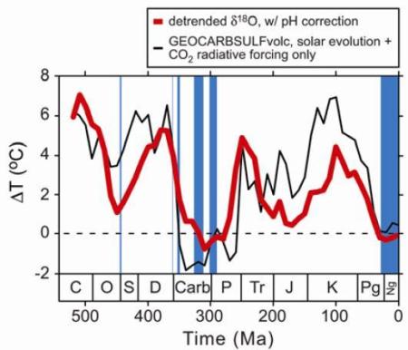 |
Figure 19: Correlation between temperature and the combined response from CO2, solar radiation, the carbon cycle, the sulfur cycle, and weathering of volcanic rocks [15]. The red line represents a temperature proxy based on oxygen isotope levels. The black line uses estimates of CO2's radiative forcing and changing solar output, combined with a GEOCARBSULFvolc analysis (a model-based estimate using proxies) that estimates the carbon cycle, the sulfur cycle, and weathering of volcanic rocks. (It would be self-defeating to employ figure 18 and then complain that GEOCARBSULFvolc uses a model, since figure 18 also uses a model {GEOCARBIII, an earlier, less advanced version of GEOCARBSULFvolc} to produce figure 18's CO2 line. This undermines the position of the contrarian Javier since, in a recent blogpost at Judith Curry's blog, Javier uses the older GEOCARBIII results to argue against increased CO2 as the predominant cause of recent global warming. In addition to committing the child-like mistake I previously discussed, Javier also uses a flawed temperature change estimate, in contrast the estimate represented by the red line above. Subsequent research used this revised temperature estimate and analyses such as GEOCARBSULFvolc to show that greenhouse gases (including CO2 and methane) drove climate changes in the distant past, contrary to what Javier claimed. In opposition to this, another paper used the outdated temperature estimate and GEOCARBIII to argue that cosmic rays likely impacted climate in the distant past, though more recent research disputes this. Moreover, cosmic ray effects do not explain recent global warming.) |
In response to figure 19, a myth defender might argue that scientists cannot know whether the Sun or CO2 caused recent warming, since solar output and CO2 do not correlate with every temperature change in figure 19. But this objection fails. To say otherwise would be as implausible as saying that police cannot know that arsonists caused a recent forest fire, unless police can explain every forest fire that ever happened. Such a claim is implausible because police can find clear evidence that arsonists, as opposed to a lightning strike, caused the recent fire, even if police lack an explanation for some fires in the distant past. The arsonists do not need to cause every forest fire in the past, in order for the arsonists to cause a recent forest fire.
Analogously, scientists can present evidence that increased CO2, as opposed to increased solar output, caused most of the recent global warming, even if scientists lack an explanation for some warming in the distant past (I went over some of this evidence throughout this blogpost, especially in section 2.9, and I will present further evidence later in this section). And CO2 can cause recent warming, even if CO2 did not cause every instance of warming in the past.
Alternatively, myth proponents might claim that figure 19's correlation is predominately due to solar output, not CO2. If this is true, then this would argue in favor of increasing solar output as the predominant cause of long-term warming, not CO2. But this objection fails since solar output steadily increased on the time-scale of hundreds of millions of years (which has various implications), yet temperature in figure 19 did not steadily increase. So the correlation with temperature does not depend on just solar output, and CO2 helps explain warming in the geologic past in the context of decreased solar activity. Evidence from the geologic record therefore coheres with the theory of CO2-induced warming.
The solar-induced warming hypothesis fares especially poorly when applied to post-1950s global warming, as I discussed in section 2.9 of this post and in section 2.3 of "Myth: The Sun Caused Recent Global Warming and the Tropical Stratosphere Warmed". The solar-induced warming hypothesis does not cohere with evidence such as:
- Significant global warming remains even after correcting for total solar irradiance (TSI).
- The relationship between solar output and global warming fails a number of statistical tests and model-based tests.
- Solar output has not correlated well with recent global warming. An indirect test of this is cosmic ray exposure, since TSI should limit the ability of cosmic rays to reach Earth. Yet Earth's cosmic ray exposure did not significantly decrease during post-1970s global warming, providing further evidence that TSI did not significantly increase during this warming. Solar flux also decreased, consistent with decreasing TSI. Nicola Scafetta attempts to get around this by claiming TSI increased from 1970 - 2000 and decreased post-2000. He states that these TSI changes correlate with 1970 - 2000 surface warming and a nearly stable 2000 - 2018 temperature trend, while claiming this temperature pattern conflicts with model-based estimates of CO2-induced, man-made warming. Scafetta's argument fails since statistically significant warming occurred from 2000 - 2018, at a rate roughly on par with, or greater than, 1970 - 2000 warming, as I discuss in a separate Twitter thread [46]. And Scafetta fails in his attempt to use the El Niño-Southern Oscillation (ENSO) to explain away this post-2000 warming, as per "Myth: El Niño Caused Post-1997 Global Warming". Thus, by Scafetta's own reasoning, the post-2000 significant warming trend undermines his TSI analysis, just as a post-2000 stable trend would have supported his analysis. This result is consistent with Scafetta's history of false predictions on temperature trends, as covered in section 2.1 of "Myth: The IPCC's 2007 ~0.2°C/decade Model-based Projection Failed and Judith Curry's Forecast was More Reliable", "Myth: No Global Warming for Two Decades", section 2.2, section 2.5, and the caption of figure 20. Scafetta's TSI estimate also conflicts with a number of other estimates based on satellite data, sunspot records, etc., and it abuses an outdated 1993 analysis from Hoyt and Schatten which I discuss in more detail in section 2.3 of "Myth: The Sun Caused Recent Global Warming and the Tropical Stratosphere Warmed".
Given these aforementioned points, scientists project that greenhouse-gas-induced warming should overcome the cooling effect of future shorter-term decreases in solar activity. If this occurs, then this would provide further evidence coherent with the CO2-induced warming and incoherent with increased solar output as the primary cause of recent warming.
Myth proponents could, of course, propose any number of ad hoc, alternative causal explanations for industrial-era warming and the associated effects discussed in section 2.9. Examples include references to solar ultraviolet radiation. Or solar radio flux. Or solar magnetic flux. Or Earth's magnetic field increasing (decreasing), thereby decreasing (increasing) the amount of cosmic rays reaching Earth. Or... But even when evidence rebuts these factors as explanations for most of the post-1970s global warming, committed contrarians/denialists will likely just find some other excuse for not admitting that increased CO2 caused most of the warming.
The geologist Peter Hadfield / Potholer54, among others, aptly and humorously calls this ABCD: Anything But Carbon Dioxide. This is reminiscent of the tobacco industry explaining cancer and coronary heart disease with ABS (Anything But Smoking), AIDS denialists explaining AIDS with ABHIV (Anything But HIV), armchair non-experts explaining trends in Australian bushfires with ABCC (Anything But Climate Change), and so on. One should expect such behavior from denialists using motivated reasoning and special pleading to avoid an evidence-based conclusion they find ideologically-inconvenient.
But if proponents expect their proposed alternative to supplant the CO2-based explanation, then their alternative explanation needs at least as much evidence in support of it as the CO2-based explanation. For example, their alternative requires confirmed predictions, as per section 2.9. It also needs to fulfill the other causal considerations summarized in section 1, at least as well as the CO2-based explanation does. One cannot simply invent an explanation with little-to-no evidence and expect it to be taken as seriously as an explanation supported by overwhelming evidence, regardless of whether the topic is explaining industrial-era warming, explaining AIDS, explaining cancer, or some other topic.
To build on the forensic science comparison from sections 2.5 and 2.9, which a number of scientists use: ABCD is akin to a defense attorney using baseless, motivated reasoning to defend their client, despite overwhelming evidence showing the defendant committed the crime. This can take the form of proposing a conveniently unspecified (or under-specified) cause, or offering a cause that does not account for the observed pattern of effects. The following two defenses illustrate each of these strategies, respectively:
"Someone else committed the crime. Called this person 'X.' X happened to appear at the crime scene at the time the crime was being committed, like the defendant, and left at the same time as the defendant. X has the same height, weight, physical build, skin tone, shoe size, clothing, blood type, vocal cadence, facial appearance, etc. as one would predict the defendant would leave behind on a video recording and at the crime science.
No, I cannot tell you who X is, but you cannot prove with 100% certainty that no such person exists. The world is complex and you don't know everything about it, so it's possible that X exists without you knowing about them. You just pretend otherwise for political reasons and because you would make money off of convicting the defendant. Also, please ignore the fact that the defendant has a long history of committing this same type of crime, and of being at the scene of this type of crime."
"Claude committed this crime. He has has the same skin tone as one would predict the defendant to leave behind. But please disregard the fact that Claude's blood type doesn't match the perpetrator's blood left at the crime scene, and that Claude is significantly taller than the perpetrator shown in the video recording of the crime."
Just as evidence can be incoherent with Claude being the perpetrator of the crime, evidence also remains incoherent with a number of other proposed explanations of most of the recent, multi-decadal global warming. These failed causal explanations include ozone-depleting chlorofluorocarbons (CFCs) as the primary cause of warming, along with ocean cycles such as the El Niño-Southern Oscillation (ENSO) and the Atlantic Multi-decadal Oscillation (AMO). I rebut ENSO as an alternative explanation in section 2.9 and in "Myth: El Niño Caused Post-1997 Global Warming", while I address the AMO more in the caption of figure 20 below. Moreover, Qing-Bin Lu's CFC-induced warming hypothesis falsely forecast no global warming, when global warming actually occurred, as I discuss in "Myth: No Global Warming for Two Decades" and a separate Twitter thread.
To take another example: the orbital forcing from section 2.8 would not explain industrial-era global warming, since that forcing would now result in either a flat temperature trend or drive cooling towards the next glaciation, not warming. Even layman-level sources cover this point fairly well. Previous orbital forcing over the past 800,000 years failed to drive CO2 levels above 310ppm, let alone to current levels that are above 410ppm. This fits with an overall picture in which human activity, not orbital forcing, increased CO2 concentration to the highest level in at least 2 million years, with CO2 concentration increasing at the largest rate in tens of millions of years. The warming from this increase in CO2 and other greenhouse gases occurred at a much faster rate than the orbital-forcing-induced warming of the previous deglaciation, as discussed in section 2.5. This industrial-era warming overcame, and will continue to overcome for the foreseeable future, the cooling effect of orbital forcing.
To take another example: the orbital forcing from section 2.8 would not explain industrial-era global warming, since that forcing would now result in either a flat temperature trend or drive cooling towards the next glaciation, not warming. Even layman-level sources cover this point fairly well. Previous orbital forcing over the past 800,000 years failed to drive CO2 levels above 310ppm, let alone to current levels that are above 410ppm. This fits with an overall picture in which human activity, not orbital forcing, increased CO2 concentration to the highest level in at least 2 million years, with CO2 concentration increasing at the largest rate in tens of millions of years. The warming from this increase in CO2 and other greenhouse gases occurred at a much faster rate than the orbital-forcing-induced warming of the previous deglaciation, as discussed in section 2.5. This industrial-era warming overcame, and will continue to overcome for the foreseeable future, the cooling effect of orbital forcing.
The cosmic ray hypothesis provides another case study in how competitors to human-made greenhouse-gas-induced warming fail. The cosmic ray hypothesis includes the following steps:
- Increasing total solar irradiance (TSI) decreases the amount of cosmic rays reaching Earth.
- Decreasing cosmic ray exposure leads to less lower level clouds, since cosmic rays seed clouds.
- Less lower level clouds initiates global warming, since those clouds reflect incoming solar radiation back into space.
An older paper argued that cosmic rays likely impacted climate in the distant past, though more recent papers rebut this. But for more recent warming, each aforementioned step of the cosmic ray hypothesis failed. With respect to step 3, cloud changes did not initiate global warming, as per section 2.9. Instead clouds acted as a positive feedback on greenhouse-gas-induced warming, as per section 2.2. Moreover, cosmic rays did not strongly drive recent cloud formation, resulting in a lack of significant correlation between cosmic rays and global cloud cover. And TSI decreased post-1970s, so cosmic ray exposure did not decrease; this contradicts steps 1 and 2. Therefore examining changes in solar output not only undermined the solar-induced-warming hypothesis, but also undermined the cosmic ray hypothesis.
(Interestingly, the myth defender Nir Shaviv, a well-known proponent of the cosmic ray hypothesis, falsely claimed that the bulk lower atmosphere {a.k.a. the troposphere} warmed less than Earth's surface. Presumably Shaviv also believed that his cosmic ray hypothesis remains compatible with the troposphere warming less than the surface, since he continued to advocate the hypothesis while making his aforementioned statement on warming patterns. He also claimed this warming pattern contradicted a prediction of CO2-induced warming. Yet in actuality, the bulk troposphere warmed about as much as, or a bit more, than the surface, as Shaviv later admitted. So by Shaviv's logic, this represents a confirmed prediction of CO2-induced warming, but not of his cosmic ray hypothesis, further strengthening the case for CO2-induced warming relative to Shaviv's hypothesis. Shaviv also stated that climate models over-estimated recent global warming; published research rebuts Shaviv's claim about climate models and I debunk his point further in "Myth: Santer et al. Show that Climate Models are Very Flawed".
Moreover, Henrik Svensmark, the most prominent advocate of the cosmic ray hypothesis, peddled the idea that in 2009 global warming stopped and global cooling began, with the possibility that cooling would continue for 10 - 20 years. And as with Shaviv, Svensmark used his claim to criticize climate models. Ole Humlum, Jan-Erik Solheim, and Kjell Stordahl also forecasted global cooling from 2009 to 2020 as a result of decreasing solar output, as they spread the cosmic ray hypothesis. Yet their claims failed miserably since global warming continued post-2009 through 2019 for Earth's surface, bulk troposphere, and deeper ocean. Humlum, Svensmark, Shaviv, etc. may distort temperature trends because they over-estimate the impact of factors such as solar-induced changes in cosmic ray exposure, while under-estimating the magnitude of greenhouse-gas-induced warming.)
And just as accounting for changing solar output in figure 19 revealed the relationship between CO2 and temperature in the deep past, correcting for proposed causes of warming leaves a recent CO2-induced warming trend. This recent trend should be more-linear than the rise in CO2 concentration, as I discussed in section 2.6. Figure 20 below illustrates this point, by showing one depiction of how ocean cycles, changes in solar output, and volcanic effects operate in conjunction with more-linear CO2-induced warming. Figure 22 presents a more recent analysis that takes into account the smaller role of AMO and the correspondingly larger role of the cooling effect of sulfate aerosols; figure 23 builds on this, with more recent estimates of early 20th century warming and the impact of aerosols. Figure 21 depicts the observed surface warming trend, without correcting for these factors:
 |
Figure 20: (a) Relative global surface temperature trend from 1856 - 2010 after correcting for TSI (total solar irradiance, a measure of the solar radiation reaching Earth), El Niño-Southern Oscillation (ENSO), and volcanic aerosols. The upper-left, boxed inset depicts a measurement of the Atlantic Multi-decadal Oscillation (AMO), a cycle that affects ocean temperatures. (b) Global surface temperature trend after correcting for the AMO, TSI, ENSO, and volcanic aerosols [16]. It's unclear whether the AMO is an independent cause of ocean warming vs. the AMO being a type of ocean warming caused by other factors. There is also some dispute over whether the AMO impacts temperature as strongly as is shown panel (b). For instance, sulfate aerosols, instead of just the AMO, partially offset CO2-induced warming during the 1940s to 1970s. Some sources attribute much of the recent warming to the AMO, while many more sources argue that the AMO does not account for much of the recent warming (ex: figures 22 and 23 below). In either case, greenhouse gases such as CO2 substantially contributed to recent global warming. This is especially the case since if large global temperature changes occur in response to internal variability such as the AMO, then that suggests that large temperature changes would also occur in response to changes in CO2, as per the high climate sensitivity discussed in section 2.5 and consistent with points made by the climate scientist Peter Jacobs. And since the post-1964 multi-decadal global warming trend extends over more than 50 years (see figures 1, 21, 22, and 23, among other sources; ~1.0°C of post-1964 global surface warming occurred at a rate of ~0.17°C/decade), the roughly 30-year increasing portion of the roughly 60-year AMO cycle likely does not account for such a long warming trend. This undermines attempts to use the AMO to object to man-made global warming. For example, François Gervais proposed that the AMO undermines claims of a large, man-made CO2-induced warming trend. Gervais' position implies a number of false predictions tied to the downward phase of the AMO, including that satellite-based analyses show post-2002 cooling, that the Earth's surface cooled post-1998, that the rate of sea level rise decreased post-1998, and that the rate of global sea ice melt was greatly mitigated. I address these false claims more in "Myth: No Global Warming for Two Decades" and in section 2.1 of "Myth: The IPCC's 2007 ~0.2°C/decade Model-based Projection Failed and Judith Curry's Forecast was More Reliable". Judith Curry and Anastasios Tsonis both also proposed a large role for the AMO. This caused Curry and Tsonis, like Gervais, to falsely predict a lack of warming when warming actually occurred, as covered in section 2.1 of "Myth: The IPCC's 2007 ~0.2°C/decade Model-based Projection Failed and Judith Curry's Forecast was More Reliable". Moreover, other contrarians made false claims that under-estimated warming due to an over-reliance on a ~60-year cycle; these contrarians include DocMartyn writing for Judith Curry's blog, Javier on Curry's blog, Nicola Scafetta, Craig Loehle, Rolf Werner (in otherwise commendable work co-authored with Dimitar Valev, Dimitar Danov, Veneta Guineva, and Andrey Kirillov), Syun-Ichi Akasofu, Don Easterbrook, Joseph D'Aleo, Nils-Axel Mörner, Clive Best, Pat Frank, Girma Orssengo, William Gray, Dietrich Koelle, Fritz Vahrenholt, Sebastian Lüning, Leonid B. Klyashtorin, Alexey A. Lyubushin, Joachim Seifert, Frank Lemke, Thayer Watkins, Dan Pangburn, Warren Meyer, and David J. Pristash. Thus over-estimation of the AMO's relative impact led a number of contrarians to falsely predict that global warming would cease with the downward phase of the AMO. Norman C. Trelour attempts to explain recent warming, while maintaining the 60-year cycle; this leads Trelour to accept a near-exponential greenhouse-gas-induced warming trend that dwarfs the temperature trend from the 60-year cycle. So the relatively small impact of the AMO's 60-year cycle implies that it is not the predominant cause of industrial-era global warming, including post-1960s warming. Moreover, internal variability from the AMO would not account for the observed pattern of deeper ocean warming, as discussed in section 2.9 with respect to internal variability from ENSO, another ocean cycle. And the AMO index remained relatively flat post-1997, such that the AMO did not cause the post-1997 global warming discussed in section 2.1 of "Myth: The IPCC's 2007 ~0.2°C/decade Model-based Projection Failed and Judith Curry's Forecast was More Reliable" and in "Myth: No Global Warming for Two Decades". In fact, the AMO index showed no net positive trend post-1856 and post-1930, implying that it did not drive the long-term warming trends for these periods (figures 21, 22, 23, and 25 depict these warming trends). A similar point applies to another ocean cycle, the Pacific Decadal Oscillation or PDO, during the post-1900 and post-1975 time-periods. |
 |
Figure 21: Global land+ocean surface temperature trend relative to mean temperature from 1961 - 1990, as depicted in various analyses [26, figure 1b]. Other sources offer a similar depiction, but with the addition of four more analyses, including an analysis from the Japanese Meteorological Association (JMA). The JMA provides a post-1890 land+ocean analysis with less global coverage, while the China Meteorological Agency (CMA) also provides a post-1900 global land analysis, as do others, including for the post-1983 period. The CMA recently provided a post-1900 global land+ocean analysis well. Other ocean temperatures analyses exist, confirming recent warming as well. The above figure includes neither the CMA analysis nor the JMA analysis, but both analyses show a similar pattern of 1900s - 1940s warming, temperature stagnation or slight cooling from the 1940s - 1960s, and post-1960s warming. Scientists will likely introduce more instrumental surface analyses in the future; this includes the upcoming GloSAT analysis, which is intended to cover global surface air trends dating back to the late 1700s. This figure may overestimate 1940s - 1970s cooling due to uncertainties tied to changes in temperature monitoring practices during World War II, as I discuss in "Myth: Karl et al. of the NOAA Misleadingly Altered Ocean Temperature Records to Increase Global Warming". Figure 23 below addresses this issue. |
 |
Figure 22: (A) Global surface temperature trend from 1891 - 2017 relative to a baseline of 1961 - 1990, as depicted in various analyses. (B) Contributions to the trend in panel A, from (a) the Atlantic Multi-decadal Oscillation, (b) the El Niño-Southern Oscillation and the Interdecadal Pacific Oscillation, (c) volcanoes, (d) solar output in the form of total solar irradiance {TSI}, (e) greenhouse gases and anthropogenic aerosols combined, (f) the Arctic Oscillation, and (g) the residual left over when the effect of factors a through f are subtracted out from panel A. (C) (a) Comparison of the relative surface temperature trend for 1891 - 2015 from panel A {black line} to the sum of the factors mentioned in panel B, sub-panels a through f {red line}. (b) Comparison of the relative surface temperature trend from 1891 - 2015 from panel A {black line} to climate model projections {blue line} from phase 5 of the Coupled Model Intercomparison Project {CMIP5} [30]. This panel exaggerates recent differences between the CMIP5 projections and the relative surface temperature trend, for reasons I discuss in sections 2.1 and 2.3 of "Myth: Santer et al. Show that Climate Models are Very Flawed". The residual temperature spike around the 1940s in panel g likely stems from uncertainties tied to changes in temperature monitoring practices during World War II, as I discuss in "Myth: Karl et al. of the NOAA Misleadingly Altered Ocean Temperature Records to Increase Global Warming". Figure 23 below addresses this issue. |
 |
| Figure 23: Relative global surface temperature trend from 1850 - 2017 (observations, for HadOST), with the contribution of various factors to this temperature trend (colored lines). The gray line is the sum of each of the depicted colored lines. The surface temperature trend takes into account changes in sea surface temperature measuring practices during the 1930s and 1940s, which I elaborate more on in "Myth: Karl et al. of the NOAA Misleadingly Altered Ocean Temperature Records to Increase Global Warming". The authors of this figure adapted it from the results of their 2019 paper. Note that this figure accounts for the long-term global surface temperature trend without recourse to large internal variability in the form of the Atlantic Multi-decadal Oscillation (AMO), as did figure 22. This supports the idea that the AMO played little role in driving long-term industrial-era global warming [44; 45; 48]. This figure displays global warming acceleration post-1998. Post-1998 acceleration also appears in global surface temperature trend analyses such as ERA5 (which is endorsed by the contrarians Judith Curry and Ryan Maue), NASA's GISTEMP, NOAA's global analysis, NCEP-2, and 20CR, consistent with other sources on accelerating climate change. For further discussion of accelerating warming, see section 2.1 of "Myth: The IPCC's 2007 ~0.2°C/decade Model-based Projection Failed and Judith Curry's Forecast was More Reliable". |
Figures 22 and 23 illustrate how short-term variations from changes in solar output, ENSO, etc., can operate in conjunction with long-term, more-linear CO2-induced warming (I discussed 1910s - 1940s warming further in section 2.5). This is analogous to how weekly weather patterns can operate in conjunction with a seasonal, multi-month, axial-tilt-induced warming trend in Canada from mid-winter to mid-summer, as noted by the geologist Peter Hadfield. These figures also show the role of sulfate aerosols in mitigating pre-1970s CO2-induced warming. Thus evidence excluding a number of other likely causes of global warming, helps support the predicted causal relationship between increased CO2 and warming.
And the ocean warming trend largely matches the pattern of radiative forcing from increased CO2, even when one takes into account radiative forcing from other factors, such as TSI (I discussed radiative forcing in section 2.2). Figures 24 and 25 below illustrate this point. This is consistent with previous research showing that increases in greenhouse gases such as CO2 help explain the observed pattern of ocean warming.
So accounting for radiative forcing and temperature trends from other factors, Earth's climate in the distant past, etc., provides further support for the claim that increases in well-mixed greenhouse gases (especially CO2) caused most of the recent warming. The evidence coheres with greenhouse gases as an explanation, while ruling out a number of other proposed causes of warming.
 |
Figure 24: Relative ocean heat content, as estimated using different analyses. The analyses in question are listed on the left of panel B, with their corresponding colors; other analyses not shown here also show increased ocean heat content. The GF analysis originated in the paper from which this figure was taken, while the other listed analyses come from previously published research. The analyses cover the latitudes 80°N to 80°S, except for Domingues, which covers 65°N to 65°S. Estimates are in ZJ or ZJ/yr (ZJ per year), where 1 ZJ = 10^21 joules of energy. Estimates are also relative to a 2006 - 2015 baseline, with shading representing the uncertainty for each estimate. (Top inset for each panel) Linear trend in ocean heat content, with error bars, over the periods noted. (Bottom inset for each panel) Relative ocean heat content (A) to a depth of 0 meters to 700 meters, (B) 0 meters to 2000 meters, and (C) below 2000 meters [41, figures 1A, 1B, and 1C; (also see: 59, figure 14; 60, figure 2)]. |
 |
Figure 25: Radiative forcing trend from 1750 - 2011. The colored, filled-in regions in the line graph correspond to the colored labels on the left side of the graph. These colored labels also correspond to the bar graph on the right; the bar graph shows radiative forcing for each factor from 1750 - 2011, with error bars representing uncertainty estimates. The solid black line and red line on the line graph depicts total radiative forcing and radiative forcing from man-made (anthropogenic) factors, respectively, as per the labels on the bottom right of the graph. Abbreviations: BC - black carbon aerosols; Strat. H2O - stratospheric water vapor; Trop. O3 - tropospheric ozone; WMGHG - well-mixed greenhouse gases (excludes water vapor); Aer-Rad - aerosol radiation interactions; Aer-Cld - aerosol cloud interactions; Strat. O3 - stratospheric ozone. [42, figure 8.18 on page 699]. Since this 2013 IPCC figure was made, scientists updated radiative forcing estimates using further data. So progress in climate science did not simply end with this figure. For instance, solar radiative forcing estimates decreased. These updates, however, do not greatly change the magnitude of the total forcing estimates from 1750 - 2011. |
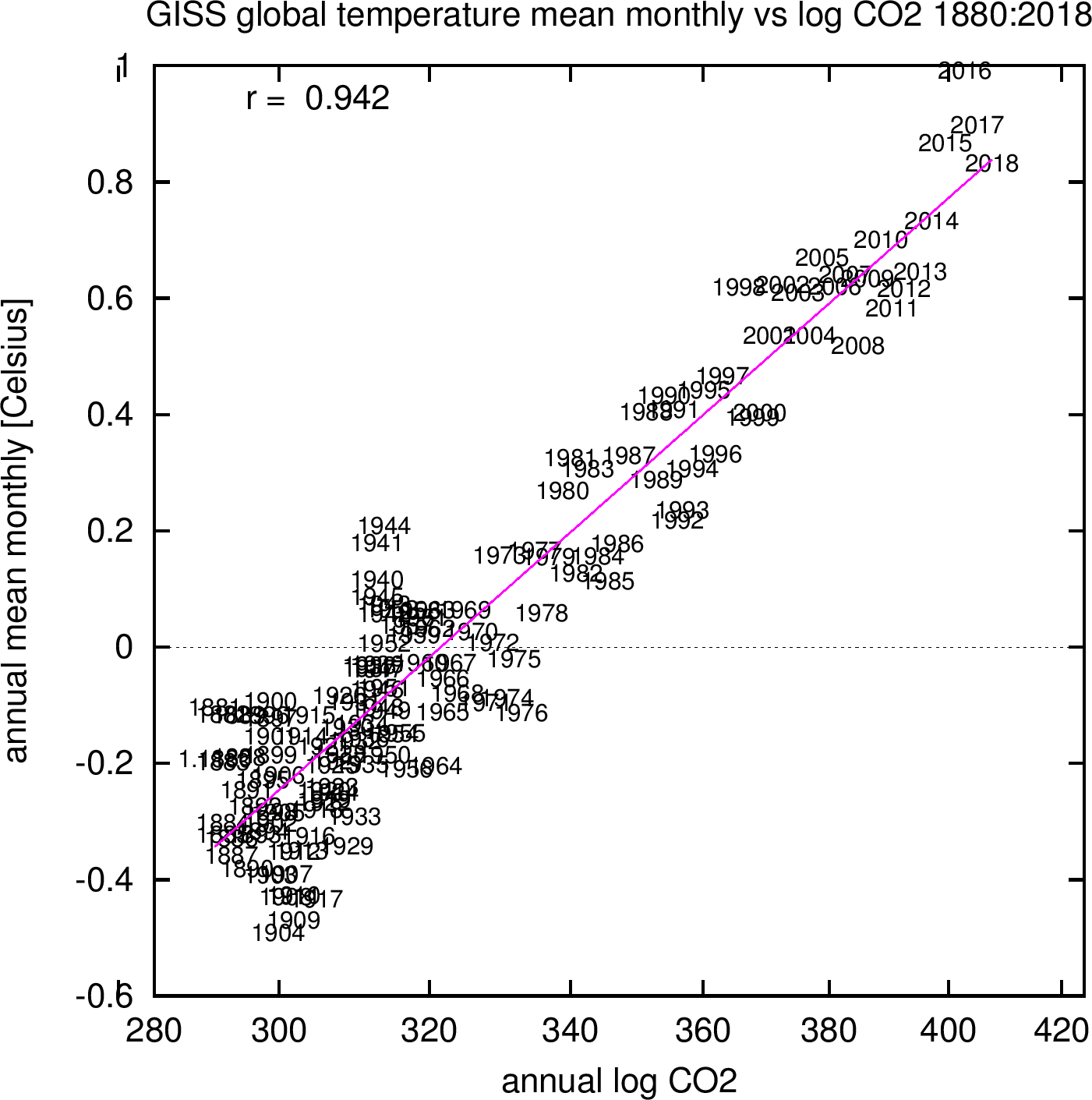
Your first comment was "Changing carbon dioxide (CO2) levels correlate with long-term temperature changes on Earth" WRONG CO2 levels increase as temperatures rises. The additional CO2 coming from the ocean. Salt water releases CO2 as it warms.
ReplyDeleteYour talking point was already addressed in section 2.8.
DeleteNext time, actually read what you're responding to, instead of just parroting long-debunked denialist talking points.