The outline for this post is as follows:
- The Myth and Its Flaw
- Context and Analysis
- Posts Providing Further Information and Analysis
- References
This is the "main version" of this post, which means that this post lacks most of my references and citations. If you would like a more comprehensive version with all the references and citations, then please go to the "+References" version of this post.
References are cited as follows: "[#]", with "#" corresponding to the reference number given in the References section at the end of this post.
1. The Myth and Its Flaw
Climate models predict that in moist tropical areas, a region of the lower atmosphere will warm more than Earth's surface. This is known as the "hot spot". The myth states that the lack of a hot spot implies that various factors (known as "feedbacks") will not substantially increase global warming to the level predicted by climate models. Thus the lack of a hot spot means that mainstream scientists over-estimate future global warming.
Proponents of this myth include David Evans, Roy Spencer, John Christy, Matt Ridley, William Happer, Craig Idso, Nicola Scafetta, Joseph D'Aleo, James Wallace III, Tim Ball, Don Easterbrook, Christopher Monckton, Anthony Lupo, the Global Warming Policy Foundation, C3 Headlines, Friends of Science, Popular Social Science, Turbulent Eddie, Rud Istvan, and possibly Richard Lindzen. Stefan Molyneux, GlobalWarming.Org, and the Heartland Institute repeat this myth as well, though these proponents usually cite either Evans or Spencer as their support for the myth.
The myth's flaw: the hot spot represents a negative feedback that limits the rate of global warming. So the lack of a hot spot would imply greater warming, not less warming. Myth proponents claim otherwise because they make claims that contradict scientific evidence and/or they misrepresent how the hot spot forms. Myth defenders also distort or ignore the evidence supporting mainstream estimates of carbon-dioxide-induced (CO2-induced) warming.
Climate models predict that in moist tropical areas, a region of the lower atmosphere will warm more than Earth's surface. This is known as the "hot spot". The myth states that the lack of a hot spot implies that various factors (known as "feedbacks") will not substantially increase global warming to the level predicted by climate models. Thus the lack of a hot spot means that mainstream scientists over-estimate future global warming.
Proponents of this myth include David Evans, Roy Spencer, John Christy, Matt Ridley, William Happer, Craig Idso, Nicola Scafetta, Joseph D'Aleo, James Wallace III, Tim Ball, Don Easterbrook, Christopher Monckton, Anthony Lupo, the Global Warming Policy Foundation, C3 Headlines, Friends of Science, Popular Social Science, Turbulent Eddie, Rud Istvan, and possibly Richard Lindzen. Stefan Molyneux, GlobalWarming.Org, and the Heartland Institute repeat this myth as well, though these proponents usually cite either Evans or Spencer as their support for the myth.
2. Context and Analysis
Section 2.1: The hot spot represents a negative feedback limiting warming
Earth's atmosphere contains multiple layers. The layer closest to the Earth's surface air is known as the troposphere. Tropospheric temperature decreases with increasing height; the rate of decrease is known as the tropospheric lapse rate.
Climate models and basic physical theory predict that warming at Earth's surface will cause more water to evaporate, especially over tropical oceans. This evaporation increases the amount of water vapor in the air, since warmer air can hold more water vapor. The vapor-rich air then rises into the troposphere by convection. The water vapor subsequently condenses with increasing tropospheric height, since tropospheric temperature and pressure decreases with increasing height.
Condensation of water vapor releases some of the energy that went into evaporating the water; this is known as release of latent heat. This latent heat release causes tropospheric warming. So latent heat release causes more warming of the lower troposphere and even more warming of the upper troposphere, as water vapor condenses with increasing height. Thus latent heat release shrinks the rate at which tropospheric temperature decreases with increasing height; in this way latent heat release reduces the magnitude of the tropospheric lapse rate, as depicted in figure 1:

Figure 1: A diagram of tropical tropospheric warming reducing the magnitude of the tropospheric lapse rate (adapted from Crok, Strengers, and Verheggen [1, page 3], though originally taken from a climate science textbook [24]). The horizontal dimension represents temperature, with temperature increasing as one goes to further right. The vertical dimension represents altitude in the troposphere, with altitude increasing as one goes further up from Earth's surface at the black line. The blue line represents the tropical temperature profile before warming, while the red line represents the tropical temperature profile after warming. Latent heat release causes more warming with increasing height, leading to the red line being steeper than the blue line. As a result, there is less of a temperature decrease with increasing height after tropical warming. Thus the lapse rate's magnitude is greater for the blue line than for the red line, indicative of a lapse rate reduction in response to tropical warming.
Section 2.1: The hot spot represents a negative feedback limiting warming
Earth's atmosphere contains multiple layers. The layer closest to the Earth's surface air is known as the troposphere. Tropospheric temperature decreases with increasing height; the rate of decrease is known as the tropospheric lapse rate.
Climate models and basic physical theory predict that warming at Earth's surface will cause more water to evaporate, especially over tropical oceans. This evaporation increases the amount of water vapor in the air, since warmer air can hold more water vapor. The vapor-rich air then rises into the troposphere by convection. The water vapor subsequently condenses with increasing tropospheric height, since tropospheric temperature and pressure decreases with increasing height.
Condensation of water vapor releases some of the energy that went into evaporating the water; this is known as release of latent heat. This latent heat release causes tropospheric warming. So latent heat release causes more warming of the lower troposphere and even more warming of the upper troposphere, as water vapor condenses with increasing height. Thus latent heat release shrinks the rate at which tropospheric temperature decreases with increasing height; in this way latent heat release reduces the magnitude of the tropospheric lapse rate, as depicted in figure 1:
 |
Figure 1: A diagram of tropical tropospheric warming reducing the magnitude of the tropospheric lapse rate (adapted from Crok, Strengers, and Verheggen [1, page 3], though originally taken from a climate science textbook [24]). The horizontal dimension represents temperature, with temperature increasing as one goes to further right. The vertical dimension represents altitude in the troposphere, with altitude increasing as one goes further up from Earth's surface at the black line. The blue line represents the tropical temperature profile before warming, while the red line represents the tropical temperature profile after warming. Latent heat release causes more warming with increasing height, leading to the red line being steeper than the blue line. As a result, there is less of a temperature decrease with increasing height after tropical warming. Thus the lapse rate's magnitude is greater for the blue line than for the red line, indicative of a lapse rate reduction in response to tropical warming. |
The aforementioned tropical warming amplification is called the tropical tropospheric hot spot by myth defenders. As myth proponent Roy Spencer puts it:
"One of the most vivid predictions of global warming theory is a “hotspot” in the tropical upper troposphere, where increased tropical convection responding to warming sea surface temperatures (SSTs) is supposed to cause enhanced warming in the upper troposphere [2]."
So the hot spot I will discuss relates to amplification of warming as one goes from the tropical surface to higher in the tropical troposphere. This is different from the question of whether the amount or magnitude of observed tropospheric warming matches the amount of warming projected by climate models; I address the "magnitude" issue in "Myth: Santer et al. Show That Climate Models are Very Flawed", and to a lesser extent in "Myth: The CCSP Presented Evidence Against the Hot Spot's Existence".
Figure 2 depicts a modeled hot spot (amplification of warming with increasing height in the tropics) in response to warming caused by increased solar activity or in response to warming caused by increased carbon dioxide (CO2):
 |
Figure 2: ECHAM3/LSG model (European Center/Hamburg Model 3 / Large Scale Geostrophic coupled atmosphere-ocean climate model) simulation of the atmospheric response to (a) increased solar forcing (from increased solar output) and (b) increased CO2 forcing (from increased CO2 levels). Colored areas indicate significant responses, with darker blues indicating cooling and darker reds indicating warming. The horizontal axis represents latitude, with the tropics being between roughly 30°N and 30°S [3, page 707]. The vertical axis represents altitude, with decreasing atmospheric pressure as altitude increases. The tropical troposphere lies below 150hPa, while the tropical stratosphere is above 70hPa [4]. Tropical tropospheric warming increases with height in both panels a and b, indicating that the hot spot forms in response to both solar-induced warming and CO2-induced warming. In contrast, strong tropical stratospheric cooling comes with CO2-induced warming, but not solar-induced warming. This figure is taken from a 2001 report of the United Nations Intergovernmental Panel on Climate Change (IPCC) [3, page 707]. |
Multiple lines of evidence show that the hot spot exists, though many "skeptics" of mainstream climate science claim otherwise, as I discuss in "Myth: The Tropospheric Hot Spot does not Exist". But for the sake of argument, suppose that the hot spot does not exist. What would that imply? That question is the subject of the myth: myth proponents claim that the lack of a hot spot would indicate that various factors (known as feedbacks) are not increasing global warming as much as predicted by climate models and mainstream climate science. Thus the hot spot shows that mainstream climate science over-estimates the amount of global warming, according to the myth advocates.
The myth proponents are wrong. To see why, let's examine the mainstream scientific position on the hot spot and see what evidence supports this position.
If the hot spot does not exist, then there are two main explanations for the hot spot's absence:
- There is no surface warming, and thus no warming for the troposphere to amplify.
- The tropical troposphere does not behave somewhat like a moist adiabat.
Option 1 fails since there is clear evidence of multi-decadal surface warming for both land and oceans. There are also other signs of warming, such as sea level rise resulting from melting ice and thermal expansion of water, increased hurricane intensity, and increased water vapor levels, among other metrics.
Furthermore, the absence of tropospheric amplification does not imply a lack of surface warming, since a number of regions (including deserts and the Arctic) have surface warming with neither tropospheric amplification in the upper troposphere nor amplification of warming with increasing elevation. Increased CO2 causes surface warming in both the Arctic and deserts, despite the lack of strong upper tropospheric amplification. This makes sense since these regions are dissimilar to a moist adiabat, consistent with climate model results and basic physical theory. So the aforementioned lines of evidence debunk option 1's claim of no surface warming.
Furthermore, the absence of tropospheric amplification does not imply a lack of surface warming, since a number of regions (including deserts and the Arctic) have surface warming with neither tropospheric amplification in the upper troposphere nor amplification of warming with increasing elevation. Increased CO2 causes surface warming in both the Arctic and deserts, despite the lack of strong upper tropospheric amplification. This makes sense since these regions are dissimilar to a moist adiabat, consistent with climate model results and basic physical theory. So the aforementioned lines of evidence debunk option 1's claim of no surface warming.
That leaves option 2. If option 2 is right, then latent heat release did not significantly decrease the magnitude of the tropospheric lapse rate. If instead option 2 were wrong and the hot spot did exist, then the tropical troposphere behaves somewhat like a moist adiabat in which latent heat release by condensing water vapor transfers energy from the surface to the upper troposphere. The upper troposphere would then emit much of this energy away from Earth. To borrow an analogy from the climate researcher Mark Richardson: this energy transfer is similar to sweating, in which sweat evaporates on a person's skin and then condenses elsewhere, cooling the skin and transferring body heat to the site of condensation. The hot spot similarly involves transferring energy from Earth's surface to higher in the troposphere, where that energy more easily radiates away. So the hot spot's lapse rate reduction serves as a negative feedback that limits global warming, though one paper disputes this point by arguing that upper tropospheric warming can augment ocean warming.
But on the whole, the scientific literature shows that surface warming with no hot spot implies less negative feedback and greater warming. Even the noted climate contrarian John Christy admitted that the lapse rate feedback is a negative feedback, as did his fellow contrarian Ross McKitrick, after the climate scientist Michael Mann pointed this out to Christy. Thus surface warming, in conjunction with option 2, implies that the tropics have greater surface warming and remain very different from a moist adiabat.
This makes sense in light of other regions that also radically differ from a moist adiabat, but have significant surface warming. For example, the Arctic and deserts have some of the greatest surface and lower tropospheric warming on the planet, even though the Arctic and deserts lack a hot spot of amplified warming in the upper troposphere and thus lack a strong lapse rate feedback. So the "amplification" in the hot spot's "tropospheric amplification" is not indicative of positive feedback that amplifies global warming. Instead the hot spot's "tropospheric amplification" means 1, not 2:
- Tropospheric amplification: Upper tropospheric warming is amplified relative to surface warming.
- Positive feedback: Global warming (that is: total warming, including both surface warming and tropospheric warming) with the hot spot is amplified relative to global warming without the hot spot.
Maybe the myth persists because many myth advocates accept 2, due to their confusion of 2 with 1? If so, then these myth defenders are wrong, since the hot spot's negative lapse rate feedback means that 2 is false. In contrast to the proposed hot spot in the tropics, the lapse rate feedback is positive in the Arctic, with more surface warming than upper tropospheric warming. The processes underlying this positive lapse rate feedback contribute to strong surface warming in the Arctic, resulting in greater surface warming in the Arctic than in the tropics and than the global average, consistent with climate models and basic physical theory. This again fits with the idea that the tropical tropospheric hot spot acts as a negative feedback that limits global warming, in contrast to the positive lapse rate feedback in the tropics.
The aforementioned points result in a conundrum for the myth proponent Richard Lindzen. Lindzen claims that the hot spot's absence could be evidence of strong negative feedback or muting of the positive feedbacks that would otherwise amplify warming. Therefore, all other things being equal, a model lacking the hot spot should have stronger negative feedback and thus less warming. Yet Lindzen admits that the magnitude of a model's hot spot does not correlate with how much CO2-induced warming that model projects; this projection is known as the model's climate sensitivity. So Lindzen's position appears contradictory.
One might defend Lindzen's position by claiming that his discussion of negative feedback applies to the upper troposphere, while his claims on sensitivity apply to CO2-induced warming that occurs near Earth's surface. That defense fails, however, since Lindzen states that CO2-induced warming must warm the tropical upper troposphere. So his claims on negative feedback in the upper troposphere would then also apply to sensitivity, thus implying that the hot spot's magnitude should correlate with climate sensitivity. But Lindzen disavows that conclusion, at least when it comes to climate models. Therefore the conundrum remains for Lindzen's position.
And in accord with Lindzen's example, myth advocates insinuate that the hot spot's absence would mean muted positive feedback. But as we just saw, the hot spot's absence would imply a muted lapse rate feedback, less negative feedback, and thus more global warming. Therefore the myth defenders are wrong.
Thus by clarifying the relationship between the hot spot and the lapse rate feedback, one debunks the myth proponents' claim that the hot spot's absence would imply that models over-estimate long-term global warming. Climate models project a decrease in the magnitude of the lapse rate reduction, and thus an increase in CO2-induced global warming. The lapse rate feedback has decreased, further supporting the model-based warming projections, though data on climate in the distant past (paleoclimate) suggests that climate models may under-estimate in the lapse rate feedback for past climates.
Section 2.2: The hot spot's significance
So if the hot spot is not a sign of positive feedback, why is the hot spot important? Critics of mainstream climate science focused on the hot spot because they believed (or pretended to believe) that the hot spot's absence meant:
- increased CO2 levels did not cause recent global warming (for more on this, see "Myth: The Tropospheric Hot Spot is a Fingerprint of CO2-induced Warming")
- less global warming would occur, due to reduced positive feedback
Both of these beliefs are false, and thus neither belief adequately explains why the hot spot is important. Instead the hot spot is significant for other reasons, including:
- the hot spot serves as negative feedback that limits global warming
- the hot spot's tropospheric warming affects higher-elevation regions, melting land ice in these areas
- the hot spot influences precipitation events, including tropical cyclones (for more on this, see section 2.6 of "Myth: The Tropospheric Hot Spot does not Exist")
Therefore discussing the hot spot is important, even if one is not interested in debunking contrarians' myths regarding the hot spot. However, I think debunking contrarian myths is also important, especially when politically-motivated parties, such as John Christy and ICECAP, use hot spot myths to mislead Congress and the general public (in "John Christy and Atmospheric Temperature Trends", I discuss other examples of Christy misrepresenting science in politically expedient ways). I hope this clarifies why I spent so much discussing the hot spot and the myths surrounding it.
With that, I have stated what's necessary for debunking the myth. I could therefore stop my post right here, and you could stop reading this post at this point.
However, I want to address some of the specific claims myth advocates make in defense of the myth; I devote the rest of this post to doing that. So if you want the details on where the myth proponents go wrong, then feel free to continue reading the content below. The material below also explains why Matt Ridley's "lukewarmer" position is nonsense. This helps explain why many climate scientists think myth defenders under-estimate future CO2-induced warming.
Section 2.3: Mainstream predictions on feedbacks vs. myth proponents' claims
Myth proponents typically defend the myth by linking the hot spot to positive feedback that amplifies global warming. Figure 3 depicts a number of positive feedbacks included in climate models, alongside the hot spot's lapse rate feedback:
 |
Figure 3: (a) Average equilibrium temperature change (ECS) in response to a doubling of atmospheric CO2 levels in atmosphere-ocean general circulation models (GCMs) from CMIP3 (phase 3 of the Coupled Model Intercomparison Project), and the contribution of various feedbacks to this temperature change in the CMIP3 models. The Planck response represents temperature response to forcing from CO2, without taking other feedbacks into account. (b) Average relative magnitude of each feedback in the CMIP3 models, with stronger positive feedbacks having a more positive value and stronger negative feedbacks having a more negative value. Error bars indicate +/- one standard deviation [5].
|
Figure 3 presents the average equilibrium climate sensitivity for an older set of climate models used by the United Nations Intergovernmental Panel on Climate Change (IPCC). Equilibrium climate sensitivity (ECS) is climate sensitivity when Earth is in an equilibrium state where Earth releases as much energy as it takes in, and fast feedbacks (as opposed to slower acting feedbacks) have exerted their full effect. Transient climate sensitivity (TCS or TCR) is Earth's climate sensitivity over a shorter period of time, before Earth reaches equilibrium. Different scientists give different definitions for climate sensitivity and ECS, but the aforementioned definitions should suffice for this blogpost.
The IPCC offers a central TCR estimate of ~1.8K, and a central ECS estimate of ~3K, in agreement with figure 3. I will refer to these as high estimates of climate sensitivity in this blogpost.
Figure 3 also depicts positive feedback from:
- surface albedo
- water vapor
- clouds
The first feedback refers to surface albedo, which represents the proportion of light reflected by Earth's surface. Ice has a greater albedo than liquid water, implying that ice reflects more visible light from the Sun back into space than does liquid water. Melting ice therefore reduces Earth's albedo and increases the amount of radiation absorbed by Earth's surface. This increased in absorbed radiation causes more surface warming and therefore more ice melt; thus melting ice acts as a positive feedback amplifying warming, as per the first feedback listed above.
The second and third feedbacks are linked together by water vapor, so I will discuss them together. Water vapor and CO2 are two greenhouse gases. CO2 absorbs energy at wavelengths missed by water vapor, which helps explain why CO2 can contribute to global warming even in the presence of water vapor. Furthermore, water vapor is a condensing greenhouse gas that condenses into liquid water at colder atmospheric temperatures. This makes water vapor very responsive to atmospheric temperature changes, and thus very poor at driving up long-term temperature to very high levels in Earth's current climate.
CO2, in contrast, is a non-condensing greenhouse gas that does not condense at the temperatures and pressures normally seen in the troposphere. This allows CO2 to accumulate in the presence of short-term atmospheric temperature fluctuations. CO2 therefore has a longer atmospheric residence time than does water vapor. So in contrast to water vapor, CO2 can drive temperatures up in the long-term, resulting in a long-term correlation between CO2 and temperature.
Since water vapor levels remain sensitive to air temperature, one might wonder how CO2-induced warming might affect water vapor levels. One can answer this query using the concepts of specific humidity and relative humidity. Relative humidity is the mass of the water vapor in the air relative to the maximum amount of water vapor the air can hold at that temperature. Relative humidity should stay about the same with long-term warming. Specific humidity is the mass of water vapor relative to the mass of water-vapor-containing air; specific humidity should increase with warming, since warmer air can hold more water vapor.
So as increased CO2 warms the atmosphere, atmospheric water vapor levels should increase in the warming air. And since water vapor acts a greenhouse gas that causes warming, increased water vapor will serve as a fast, positive feedback that amplifies the warming caused by CO2. This water vapor feedback is not the same as the lapse rate feedback from the hot spot; the former is a positive feedback resulting from accumulating water vapor absorbing radiation emitted by the Earth, while the latter is a negative feedback resulting from condensing water vapor releasing latent heat and the upper troposphere then emitting much of this energy away from Earth. Even the climate contrarian Christy admits this, while also admitting that the lapse rate feedback is a negative feedback (though he pretends otherwise when speaking with the general public):
"For models in general, water vapor feedback doubles the surface warming. The lapse rate feedback mitigates this somewhat at the surface [22]."
Though strongly positive water vapor feedback roughly correlates with strongly negative lapse rate feedback in regions of high precipitation, this relationship breaks down if precipitation is not taken into account. In fact, some of the strongest warming on Earth occurs in deserts, where water vapor feedback amplifies surface warming, without a hot spot forming. So the hot spot (and thus the lapse rate feedback) should not be treated as an invariable marker of positive water vapor feedback. Yet many myth proponents (including David Evans, Roy Spencer, and Matt Ridley) erroneously treat the hot spot's absence as a sign that positive water vapor feedback is missing.
In addition to acting as a positive feedback on warming, water vapor can condense to form clouds. These clouds can then act as a positive feedback or as a negative feedback, depending on the nature of the clouds and how high the clouds are in the atmosphere: clouds can reflect solar radiation and thus act as a negative feedback, or clouds can reflect/absorb radiation emitted by the Earth and thus act as a positive feedback. Lower level clouds tend to act as a negative feedback, while higher level clouds tend to act as a positive feedback. Climate models predict a net positive feedback from clouds due to increases in higher level clouds and reductions in lower level clouds, though different models disagree on some aspects of this cloud feedback.
So let's synthesize the above points into seven model-based predictions with respect to the feedbacks and projected warming in figure 3:
- There should be a hot spot (upper tropospheric warming greater than surface warming in the tropics), indicative of a lapse rate reduction that acts as a negative feedback on warming. In the Arctic, surface warming should exceed upper tropospheric warming, implying a lapse rate increase that acts as a positive feedback on warming.
- Estimates of climate sensitivity using measurements of past CO2 levels and warming, should be, on average, around the value given in figure 3 and the corresponding high estimate of ECS and TCR.
- Water vapor levels increase during warming, with an increase in specific humidity.
- Relative humidity stays fairly constant.
- Higher water vapor levels act as a positive feedback on warming.
- Clouds act as a net positive feedback on warming.
- Melting ice should reduce Earth's albedo and act as a positive feedback on warming.
These predictions contrast with the proposals made by myth advocates:
- Evans, Spencer, and every other myth defender argue that there is no hot spot. I discuss this further in "Myth: The Tropospheric Hot Spot does not Exist".
- Ridley, Evans, the Global Warming Policy Foundation, and C3 Headlines state that climate sensitivity is low. Ridley also uses the (supposed) lack of a hot spot to justify a lukewarmer position; this position states that figure 3 over-estimates CO2-induced warming (see "Christopher Monckton and Projecting Future Global Warming, Part 1" for more on lukewarmerism).
- Evans and Friends of Science claim that specific humidity decreased in the mid- to upper troposphere; similarly, Ridley and Spencer state that specific humidity is not increasing. Spencer also claims that climate models failed to predict this lack of an increase in specific humidity, since the climate models may not accurately represent precipitation processes. Evans adds that water vapor levels decreased as CO2 levels increased.
- Friends of Science state that relative humidity decreased.
- Many myth proponents, including Evans, Spencer, and Ridley, argue that much of the predicted water vapor feedback did not occur.
- Evans mentions a proposal in which increased solar activity shielded Earth from cosmic rays, reducing cloud cover and thereby warming the Earth. Evans also states the cloud responses are not well understood. Both Evans and Spencer link model failure with respect to clouds to model failures with respect to precipitation, while Spencer and Ridley dispute the idea that the clouds amplify warming in a way that implies higher climate sensitivity. Friends of Science also state that clouds act as a net negative feedback on warming.
So let's take stock of what the evidence shows regarding these predictions, starting with prediction #2 (I address prediction #1 in section 2.1 and in "Myth: The Tropospheric Hot Spot does not Exist").
Section 2.4: Prediction #2, Climate sensitivity is relatively high;
Part A: Matt Ridley's failed defenses of low climate sensitivity
(I discuss climate sensitivity further in "Christopher Monckton and Projecting Future Global Warming, Part 1". In that series I also address "lukewarmers" such as myth proponents Matt Ridley and Roy Spencer; these lukewarmers believe that figure 3 over-estimates the amount of CO2-induced warming.)
Myth defender Matt Ridley disputes the high equilibrium climate sensitivity of ~3K from figure 3; he calls it "catastrophic" global warming, a straw man commonly offered in "skeptic"/contrarian circles. Ridley provides at least eight arguments for a low equilibrium climate sensitivity of 1K to 2K. His first argument is that estimates of climate sensitivity decreased overtime. Ridley seems to get this idea from contrarian blogs and Patrick Michaels; Michaels typically depicts the decrease in sensitivity estimates using a particular image. Figure 4 below presents a later version of Michaels' image that was updated after Ridley made his comments regarding decreasing climate sensitivity estimates:
 |
Figure 4: Range of recent estimates of climate sensitivity, in comparison to the estimates used by the Interagency Working Group on the Social Cost of Carbon Climate (Roe and Baker, 2007) [6]. |
Figure 4 is problematic for at least three reasons. The figure is less comprehensive than a scientific review of the literature; this review presents recent evidence in support of figure 3's high climate sensitivity. An alternative, unpublished depiction of recent climate sensitivity estimates is also available. Figure 4 also excludes other studies that show higher climate sensitivity, and it excludes papers that show flaws in figure 4's studies. These last two reasons are connected since correcting the flaws in figure 4's studies tends to increase the studies' climate sensitivity estimates (I discuss this more in section 2.5 of "Myth: Attributing Warming to CO2 Involves the Fallaciously Inferring Causation from a Mere Correlation"). And matters become even worse for figure 4 when one includes other studies with climate sensitivity estimates greater than that of figure 3. If one were to follow Michaels' and Ridley's logic, then including these studies shows that figure 3 may under-estimate how much feedbacks amplify CO2-induced warming.
Since Michaels' figure 4 excludes these studies in order to support a lower climate sensitivity estimate, Michaels cherry-picks studies. And Ridley then relies on Michaels cherry-picking. So Ridley's first argument cherry-picks, in order make it appear that estimates of climate sensitivity decreased overtime; this is not the first time critics have accused Ridley of cherry-picking climate sensitivity studies.
Strangely, Ridley's second argument may create tension with his aforementioned first argument: Ridley's first argument cites some studies that estimate climate sensitivity based, in part, on measurements of surface warming. But Ridley's second argument claims that the surface warming may be over-estimated, due to data adjustments by an "extremist" NASA scientist [7] or due to warming caused by urbanization. This urbanization-induced warming is also known the urban heat island effect, or UHI for short (I discuss UHI further in section 3.5 of "Christopher Monckton and Projecting Future Global Warming, Part 1"). These factors may cause scientists to over-estimate the amount of CO2-induced warming, and thus artificially inflate climate sensitivity estimates.
Ridley's argument against surface-based records lacks merit for a number of reasons:
These points undermine Ridley's attempt to use UHI (and conspiracist insinuations about a NASA scientist) to discredit the surface temperature. Since Ridley distrusts the surface-based temperature records, he instead opts for satellite-based analyses of lower tropospheric warming. And according to Ridley, satellite-based analyses from Remote Sensing Systems (RSS) and a team at the University of Alabama in Huntsville (UAH) show less warming than the surface-based analyses. So the satellite-based analyses appear to justify Ridley's claim that scientists over-estimate the surface-based warming trend.
To see the problem with Ridley's reasoning, let's start with one of Ridley's preferred sources: Judith Curry. Curry lauds the European Centre for Medium-Range Weather Forecasts Interim re-analysis (ERA-I), a temperature re-analysis that incorporates satellite data. She also discusses a 2016 paper that compares ERA-I's lower tropospheric temperature analysis to that of RSS and UAH. That paper showed that the ERA-I, UAH, and RSS lower tropospheric warming trends were very similar, with all three trends being lower than surface warming trends from three sources:
The paper suggests a number of possible explanations for this difference between tropospheric and surface warming, including urbanization biasing the surface temperature record. That is the conclusion Ridley wants: that the surface records over-estimate warming when compared to the satellite records, and this over-estimation might cause scientists to over-estimate climate sensitivity.
But Ridley's reasoning collapses once one examines the scientific literature on ERA-I and RSS. In 2014 and again in 2016, the ERA-I team admitted that ERA-I under-estimates lower tropospheric warming. Other scientists acknowledged this point as well. And in 2017, RSS published a study that corrected issues in RSS' homogenization. These corrections increased RSS' lower tropospheric warming trend.
Moreover, a number of weather balloon analyses support a greater tropospheric warming trend, despite the fact that the weather balloon analyses likely contain heterogeneities that artificially reduce their warming trend. So neither the RSS nor ERA-I analyses support Ridley's conclusion that satellite-based lower tropospheric warming trends remain lower than surface warming trends:
A 2018 report showed that when one updates the analyses through 2017, the radiosonde-based analyses, RSS satellite-based analysis, and two other re-analyses (JRA-55 and MERRA-2) show more lower tropospheric warming than UAH. In fact, only ERA-I shows as little global lower tropospheric warming as UAH. And that does not help Ridley's case, when ERA-I is known to under-estimate lower and middle tropospheric warming.
That leaves only UAH to support Ridley's conclusion. But UAH has a long history of under-estimating tropospheric warming due to UAH's faulty homogenization, other scientists have critiqued UAH's homogenization methods, and UAH's satellite-based temperature analyses often diverge from analyses made by other research groups, in both the troposphere and other atmospheric layers. Ridley's argument thus remains on shaky ground if all he has to rely on is Spencer's UAH analysis.
And even Carl Mears, a member of the RSS team, admits that satellite-based tropospheric temperature measurements remain less certain than surface temperature measurements (based on his published uncertainty estimates). The U.S. Global Change Research Program makes much the same point. So Ridley's second argument fails since neither the satellite-based lower tropospheric temperature record nor UHI provide a strong reason for thinking that the surface temperature is flawed in a way that would cause scientists to significantly over-estimate climate sensitivity.
Despite Ridley's discussion of UHI and an "extremist" adjuster manipulating surface temperature records [7], Ridley still makes claims based on the observed surface temperature record. One of Ridley's arguments on this point baffles me: he claims that reduced (or non-existent) global warming since the late 1990s supports a low climate sensitivity estimate. So in this third argument, he seemingly assumes that high climate sensitivity entails that CO2 is the only factor significantly affecting shorter-term temperature.
But Ridley's assumption is mistaken: climate sensitivity reflects a temperature response to CO2, and a strong response to CO2 is compatible with a strong, short-term response to non-CO2 factors. A number of studies illustrate this point, by showing that high climate sensitivity remains compatible with the post-1998 temperature record. This is because non-CO2 factors can drive temperature downwards of short time scales, even if there is long-term CO2-induced warming. To say otherwise would be to conflate short-term trends with CO2's effect on long-term climate; it would be akin to saying that a multi-month warming trend from mid-winter to mid-summer is not real, because the current week was cooler than last week (I discuss this analogy further in section 3.4 of "John Christy, Climate Models, and Long-term Tropospheric Warming").
Ridley's cherry-picking eventually came back to haunt him. He falsely claims global warming paused, as I discuss in "Myth: No Global Warming for Two Decades" and "Myth: Karl et al. of the NOAA Misleadingly Altered Ocean Temperature Records to Increase Global Warming". Ridley also under-estimates post-1993 warming; this warming occurred at around double the rate Ridley erroneously claims, as I discuss in a separate Twitter thread [23] and in section 2.1 of "Myth: The IPCC's 2007 ~0.2°C/decade Model-based Projection Failed and Judith Curry's Forecast was More Reliable". CO2-induced global warming thus continued, as I cover in "Myth: El Niño Caused Post-1997 Global Warming". So Ridley likely under-estimates warming because he under-estimates the impact of increased CO2 relative to shorter-term factors.
Ridley makes matters even worse by cherry-picking short-term trends that begin in 1997. This cherry-picking has the effect of minimizing his warming trend, since 1997 and 1998 were especially warm due to the warm phase of an ocean cycle known as the El Niño-Southern Oscillation (ENSO). And Ridley's short-term, post-1997 trend becomes even more biased when one takes into account the 1998 transition in satellite temperature monitoring equipment, along with RSS improving their satellite-based homogenization for the post-1998 Ridley abused. Yet Ridley still cherry-picks this short-term trend anyway, as if neither faulty homogenization nor El Niño could skew a short-term temperature trend, in the presence of CO2-induced warming. So Ridley's third argument fails since he implicitly assumes that high climate sensitivity requires that CO2 is the only factor influencing shorter-term temperature changes he cherry-picks.
Ridley's fourth argument makes a similar mistake, but on a larger time-scale: he states that climate sensitivity is low, since ice core records show that temperature can decrease while CO2 stays high. But in making this argument, he runs afoul of the fact that positive feedback and high climate sensitivity do not entail that CO2 is the only factor significantly affecting longer-term temperature. So, for example, climate sensitivity could be high, even if a reduction in solar output caused temporary global cooling in the presence of high CO2 levels. Ridley's fourth argument therefore hinges on a false assumption.
And his argument appears even weaker in light of the robust correlation between CO2 vs. temperature in ice cores and other data sources. Figure 9 below illustrates this correlation for an ice core record:
Since Michaels' figure 4 excludes these studies in order to support a lower climate sensitivity estimate, Michaels cherry-picks studies. And Ridley then relies on Michaels cherry-picking. So Ridley's first argument cherry-picks, in order make it appear that estimates of climate sensitivity decreased overtime; this is not the first time critics have accused Ridley of cherry-picking climate sensitivity studies.
Strangely, Ridley's second argument may create tension with his aforementioned first argument: Ridley's first argument cites some studies that estimate climate sensitivity based, in part, on measurements of surface warming. But Ridley's second argument claims that the surface warming may be over-estimated, due to data adjustments by an "extremist" NASA scientist [7] or due to warming caused by urbanization. This urbanization-induced warming is also known the urban heat island effect, or UHI for short (I discuss UHI further in section 3.5 of "Christopher Monckton and Projecting Future Global Warming, Part 1"). These factors may cause scientists to over-estimate the amount of CO2-induced warming, and thus artificially inflate climate sensitivity estimates.
Ridley's argument against surface-based records lacks merit for a number of reasons:
- Diverse, non-NASA research groups used different methods to show about the same rate of global warming. So Ridley is wrong when he says the warming results from adjustments by an "extremist" NASA scientist [7].
- Temperature proxies confirm the observed pattern of global warming. And there are also other signs of warming, such as increased hurricane intensity, along with sea level rise resulting from melting ice and thermal expansion of water.
- Scientists can correct for UHI by using processes known as homogenization. Homogenization corrects for artifacts / errors known as heterogeneities or inhomogeneities; these heterogeneities artificially skew temperature records (I discuss homogenization in more detail in section 3.1 of "John Christy, Climate Models, and Long-term Tropospheric Warming", and in "Myth: The Tropospheric Hot Spot does not Exist" I discuss heterogeneities further). Homogenization techniques are validated for both surface and tropospheric measurements, to the point that even non-experts can check the accuracy of the surface-based homogenization. When one corrects for UHI, there is still statistically significant surface warming and most of the observed surface warming remains.
- The global warming trend is often not significantly higher in urban areas vs. rural areas. When there is a significant difference, homogenization can correct for this urbanization-induced difference.
- Wind mitigates the effect of UHI. So if UHI was responsible for much of the long-term warming, then there should be a large discrepancy in the temperature record for windy areas vs. non-windy areas. However, this predicted difference is not observed. Thus UHI is not responsible for much of the long-term warming trend
- Take one of the worst cases of UHI: China. UHI may account for up to around a third of the surface warming trend in China, though a number of scientists have shown that this number likely over-estimates UHI's contribution to China's surface warming. But, for the sake of argument, suppose one accepts that UHI caused roughly a third of China's surface warming trend. And then suppose one removes this estimated UHI-induced warming from the Chinese warming trend. Then China's warming trend closely matches the average global warming trend. So China, one of the worst cases of UHI, gives one little reason for thinking that UHI substantially skews the average, homogenized, global warming trend.
These points undermine Ridley's attempt to use UHI (and conspiracist insinuations about a NASA scientist) to discredit the surface temperature. Since Ridley distrusts the surface-based temperature records, he instead opts for satellite-based analyses of lower tropospheric warming. And according to Ridley, satellite-based analyses from Remote Sensing Systems (RSS) and a team at the University of Alabama in Huntsville (UAH) show less warming than the surface-based analyses. So the satellite-based analyses appear to justify Ridley's claim that scientists over-estimate the surface-based warming trend.
To see the problem with Ridley's reasoning, let's start with one of Ridley's preferred sources: Judith Curry. Curry lauds the European Centre for Medium-Range Weather Forecasts Interim re-analysis (ERA-I), a temperature re-analysis that incorporates satellite data. She also discusses a 2016 paper that compares ERA-I's lower tropospheric temperature analysis to that of RSS and UAH. That paper showed that the ERA-I, UAH, and RSS lower tropospheric warming trends were very similar, with all three trends being lower than surface warming trends from three sources:
 |
Figure 5: Global, relative surface temperature trends from 1979 - 2014 for ERA-I (ECMWF), GISTEMP (Goddard Institute for Space Studies Surface Temperature Analysis), and HadCRUT4 (Hadley Centre, Climate Research Unit Temperature analysis) [14, figure 1]. |
 |
Figure 6: Global, relative tropospheric temperature trends from 1979 - 2014 for ERA-I (ECMWF), UAH version 6.0, and RSS version 3.2. UAH, RSS, and ERA-I "TLT" trends represent the lower troposphere, while "ECMWF mid trop" represents the mid-troposphere [14, figure 3]. |
The paper suggests a number of possible explanations for this difference between tropospheric and surface warming, including urbanization biasing the surface temperature record. That is the conclusion Ridley wants: that the surface records over-estimate warming when compared to the satellite records, and this over-estimation might cause scientists to over-estimate climate sensitivity.
But Ridley's reasoning collapses once one examines the scientific literature on ERA-I and RSS. In 2014 and again in 2016, the ERA-I team admitted that ERA-I under-estimates lower tropospheric warming. Other scientists acknowledged this point as well. And in 2017, RSS published a study that corrected issues in RSS' homogenization. These corrections increased RSS' lower tropospheric warming trend.
Moreover, a number of weather balloon analyses support a greater tropospheric warming trend, despite the fact that the weather balloon analyses likely contain heterogeneities that artificially reduce their warming trend. So neither the RSS nor ERA-I analyses support Ridley's conclusion that satellite-based lower tropospheric warming trends remain lower than surface warming trends:
 |
Figure 7: Near-global, lower tropospheric temperature trends from 1979 - 2016 for RSS and UAH, relative to a baseline of 1979 - 1981. Depicted trends come from version 3.3 and version 4.0 of the RSS analysis, along with version 5.6 and version 6.0 of the UAH analysis. RSS version 4.0 is an update of RSS version 3.3, while UAH version 6.0 is an update of UAH version 5.6. The lower lines (black, gray, red, and pink) indicate relative temperature. The upper lines (green and purple) display the difference between the relative temperature values from different analysis versions [15, figure 9a]. |
 |
Figure 8: Comparison of relative, lower tropospheric temperature trends from 1979 - 2012 for satellite-based analyses and weather-balloon-based analyses, as presented by the RSS team. The figure covers specific regions where valid weather balloon data is available for each weather balloon analysis. The satellite-based analyses are RSS version 3.3, RSS version 4.0, UAH version 5.6, and UAH version 6.0. The weather balloon analyses are Hadley Center Radiosonde Temperature (HadAT), Radiosonde Observation Correction using Reanalysis (RAOBCORE), Radiosonde Innovation Composite Homogenization (RICH), and Iterative Universal Kriging (IUK) [15, figure 12]. RSS did not include Radiosonde Atmospheric Temperature Products for Assessing Climate (RATPAC), since RATPAC lacked the homogenization needed for a valid comparison [15, page 7712]. |
A 2018 report showed that when one updates the analyses through 2017, the radiosonde-based analyses, RSS satellite-based analysis, and two other re-analyses (JRA-55 and MERRA-2) show more lower tropospheric warming than UAH. In fact, only ERA-I shows as little global lower tropospheric warming as UAH. And that does not help Ridley's case, when ERA-I is known to under-estimate lower and middle tropospheric warming.
That leaves only UAH to support Ridley's conclusion. But UAH has a long history of under-estimating tropospheric warming due to UAH's faulty homogenization, other scientists have critiqued UAH's homogenization methods, and UAH's satellite-based temperature analyses often diverge from analyses made by other research groups, in both the troposphere and other atmospheric layers. Ridley's argument thus remains on shaky ground if all he has to rely on is Spencer's UAH analysis.
And even Carl Mears, a member of the RSS team, admits that satellite-based tropospheric temperature measurements remain less certain than surface temperature measurements (based on his published uncertainty estimates). The U.S. Global Change Research Program makes much the same point. So Ridley's second argument fails since neither the satellite-based lower tropospheric temperature record nor UHI provide a strong reason for thinking that the surface temperature is flawed in a way that would cause scientists to significantly over-estimate climate sensitivity.
Despite Ridley's discussion of UHI and an "extremist" adjuster manipulating surface temperature records [7], Ridley still makes claims based on the observed surface temperature record. One of Ridley's arguments on this point baffles me: he claims that reduced (or non-existent) global warming since the late 1990s supports a low climate sensitivity estimate. So in this third argument, he seemingly assumes that high climate sensitivity entails that CO2 is the only factor significantly affecting shorter-term temperature.
But Ridley's assumption is mistaken: climate sensitivity reflects a temperature response to CO2, and a strong response to CO2 is compatible with a strong, short-term response to non-CO2 factors. A number of studies illustrate this point, by showing that high climate sensitivity remains compatible with the post-1998 temperature record. This is because non-CO2 factors can drive temperature downwards of short time scales, even if there is long-term CO2-induced warming. To say otherwise would be to conflate short-term trends with CO2's effect on long-term climate; it would be akin to saying that a multi-month warming trend from mid-winter to mid-summer is not real, because the current week was cooler than last week (I discuss this analogy further in section 3.4 of "John Christy, Climate Models, and Long-term Tropospheric Warming").
Ridley's cherry-picking eventually came back to haunt him. He falsely claims global warming paused, as I discuss in "Myth: No Global Warming for Two Decades" and "Myth: Karl et al. of the NOAA Misleadingly Altered Ocean Temperature Records to Increase Global Warming". Ridley also under-estimates post-1993 warming; this warming occurred at around double the rate Ridley erroneously claims, as I discuss in a separate Twitter thread [23] and in section 2.1 of "Myth: The IPCC's 2007 ~0.2°C/decade Model-based Projection Failed and Judith Curry's Forecast was More Reliable". CO2-induced global warming thus continued, as I cover in "Myth: El Niño Caused Post-1997 Global Warming". So Ridley likely under-estimates warming because he under-estimates the impact of increased CO2 relative to shorter-term factors.
Ridley makes matters even worse by cherry-picking short-term trends that begin in 1997. This cherry-picking has the effect of minimizing his warming trend, since 1997 and 1998 were especially warm due to the warm phase of an ocean cycle known as the El Niño-Southern Oscillation (ENSO). And Ridley's short-term, post-1997 trend becomes even more biased when one takes into account the 1998 transition in satellite temperature monitoring equipment, along with RSS improving their satellite-based homogenization for the post-1998 Ridley abused. Yet Ridley still cherry-picks this short-term trend anyway, as if neither faulty homogenization nor El Niño could skew a short-term temperature trend, in the presence of CO2-induced warming. So Ridley's third argument fails since he implicitly assumes that high climate sensitivity requires that CO2 is the only factor influencing shorter-term temperature changes he cherry-picks.
Ridley's fourth argument makes a similar mistake, but on a larger time-scale: he states that climate sensitivity is low, since ice core records show that temperature can decrease while CO2 stays high. But in making this argument, he runs afoul of the fact that positive feedback and high climate sensitivity do not entail that CO2 is the only factor significantly affecting longer-term temperature. So, for example, climate sensitivity could be high, even if a reduction in solar output caused temporary global cooling in the presence of high CO2 levels. Ridley's fourth argument therefore hinges on a false assumption.
And his argument appears even weaker in light of the robust correlation between CO2 vs. temperature in ice cores and other data sources. Figure 9 below illustrates this correlation for an ice core record:
 |
| Figure 9: CO2 level and temperature change measured from an Antarctic ice core [8]. When calculating climate sensitivity, 1°C of Antarctic warming translates to ~0.6°C of global warming. The data is taken from two published studies. "Years before present" (BP) for ice cores means "years before 1950". And the aforementioned data stops by about 38 BP, which is equivalent to ~1912. So this figure does not include most of the warming and CO2 increase since the 20th century; CO2 levels are now above 405ppm. |
In his fifth argument, Ridley states that climate models over-estimate observed temperature rises, and thus the models over-estimate both positive feedback and climate sensitivity. But his argument collapses since other factors explain most of the difference between observed warming vs. model-based projections of warming. These factors include heterogeneities in the observations, random/internal variability in the climate system, and errors in the information inputted into the models. The aforementioned explanations imply neither that the models are flawed nor that the models over-estimate climate sensitivity, as I discuss in "Myth: Santer et al. Show That Climate Models are Very Flawed". So those explanations debunk Ridley's fifth argument for low climate sensitivity.
The sixth argument from Ridley implies that the hot spot's absence shows that positive water vapor feedback is muted and thus climate sensitivity is low. This sixth argument lacks merit since the hot spot exists, as I discuss in "Myth: The Tropospheric Hot Spot does not Exist". The evidence for the hot spot places Ridley in an awkward position, since Ridley claims to trust satellite analyses more than surface-based analyses, even though his "no tropical troposphere hot-spot [9]" claim conflicts with at least five different satellite analyses that show the hot spot (I consider only four of these analyses to be fairly reliable).
And as I discussed above, the hot spot implies a negative feedback from lapse rate reduction, not positive feedback from water vapor. So the hot spot's absence would imply less negative feedback, more warming, and therefore a higher climate sensitivity. Ridley's argument is therefore wrong since it draws the opposite conclusion from the hot spot's (supposed) absence.
Ridley's seventh argument states that funding goes to scientists researching human-induced global warming, instead of to scientists investigating natural, non-human-caused (or non-anthropogenic) climate change. So, according to Ridley, climate scientists present figure 3's "dangerous [21]" climate sensitivity estimate because scientists need that estimate to exaggerate the risk of human-caused climate change and thus justify their research funding.
Ridley then tries to bolster his case by listing other occasions in which scientists (supposedly) over-estimated climate responses. His examples include predictions regarding an imminent ice age, increased hurricane intensity, and an acceleration in sea level rise. Unfortunately, Ridley's argument runs afoul of scientific evidence, basic scientific reasoning, and facts regarding how the scientific enterprise works. Let's address these issues in turn.
Ridley's hurricane and sea level claims contradict evidence showing increased hurricane intensity and accelerating sea level rise coinciding with periods of global warming, including during post-1970s global warming and during warming over the past couple of decades. And there was no 1970s scientific consensus regarding an imminent ice age. Instead, more scientists predicted imminent warming than imminent cooling, with warming predictions having a greater impact on the scientific literature. Ridley obscures this accurate warming prediction by relying on 1970s media coverage of a (supposed) imminent ice age. Thus Ridley fails to give climate scientists the credit they merit.
Despite their accurate predictions, climate scientists are not perfect; scientists, both at the IPCC and elsewhere, often under-estimate the effects of climate change. In the case of scientists at the IPCC, their under-estimation of trends likely results from critics (often contrarians themselves) applying undue pressure to scientists. This runs contrary to Ridley's claims that research funding caused climate scientists to exaggerate climate change dangers. In order to make it look like climate scientists constantly exaggerate climate change risks, critics of mainstream climate science carefully cherry-pick particular instances in which the models used by the IPCC over-estimate a given trend, while disregarding instances in which the models under-estimate a trend. Ridley resorts to such cherry-picking.
And even though climate scientists could justifiably use "alarmist" language to increase concern about CO2-induced warming, the tone of IPCC scientists tends to be more tentative and less "alarmist", with the IPCC paying proper attention to how to talk about uncertainty. Many mainstream climate scientists also avoid defending hyperbolic notions such "[imminent] runaway global warming" and "catastrophic anthropogenic global warming," despite Ridley's insinuations to the contrary. This also conflicts with Ridley's claim that "the climate science establishment has a vested interest in alarm [21]," as does the fact that mainstream climate scientists often correct exaggerated media stories on climate change. So Ridley seems to lack a basic understanding of how climate scientists operate.
Ridley's ignorance becomes even more clear when he insinuates that funding drives climate scientists' support of figure 3's high climate sensitivity and the associated estimates of CO2-induced, anthropogenic climate change. High climate sensitivity estimates date back to at least 1896, with Arrhenius' ECS estimate of >4K or >5K. So it makes no sense to claim that scientists recently made up high sensitivity estimates in order to maintain their funding.
Moreover, climate scientists receive funding for research into non-anthropogenic climate change, despite Ridley's insinuating otherwise. For example, climate science progressed from the ~1900s to ~1950s, without much focus on anthropogenic climate change, despite research on the subject dating back to 1890s. Contrarians / myth proponents such as Richard Lindzen, Roy Spencer, John Christy, Roger Pielke Sr., Judith Curry, Willie Soon, Craig Idso, David Legates, and Anthony Watts also benefited from government funding, even though some of the contrarians co-authored debunked claims that went against figure 3's high climate sensitivity estimate. Yet Ridley uses Spencer's words to prop up the idea that funding organizations unfairly favor those who support the consensus on anthropogenic climate change, despite the fact that Spencer's own government funding contradicts Spencer and Ridley's funding narrative.
To make matters even worse for their narrative, a 2013 review of abstracts for climate change papers found that most abstracts took no stance of anthropogenic global warming, akin to how most abstracts in Earth science would take no stance on plate tectonics. Another 2016 paper surveyed other studies on this subject, noting that scientists continued to publish research on topics such as ENSO and ice ages. Consistent with this, Steven Sherwood, a climate researcher unfairly berated by myth proponents such as David Evans, recently published paper on non-anthropogenic climate change. So research on non-anthropogenic climate change (even contrarian research) receives funding. This makes sense once one understands how actual funding practices differ from Ridley's and Spencer's paranoid narrative.
Funding organizations judge grant proposals based on factors such as preliminary data presented in the proposal, whether the proposal writers have access to the tools needed for their proposed project, etc., not based on whether the proposal supports a pre-determined conclusion. That applies to research in cancer just as much as it applies to research in climate science; for instance, scientists receive funding to examine non-anthropogenic causes of cancer, just like scientists receive funding to examine non-anthropogenic causes of climate change. So saying that climate research funding only goes towards work on pre-determined conclusions regarding anthropogenic climate change, is as ignorant as saying cancer research funding only goes towards work on pre-determined conclusions regarding smoking and other anthropogenic causes of cancer. Yet Ridley displays this sort of paranoid ignorance in his discussion of climate science funding.
To his ignorance Ridley adds a baseless conspiracy theory: the climate science community (supposedly) exaggerates climate change risks for the sake of funding. Denialists often employ these sorts of conspiracy theories against scientists who present evidence that debunks the denialists' position. Ridley's conspiracy theory suffers from a number of flaws, some of which I summarize below (I discuss these flaws in more depth in section 3.1 of "John Christy, Climate Models, and Long-term Tropospheric Warming"):

I find it sad that an accomplished science writer like Ridley would resort to such easily debunked, conspiracy-theory-mongering in his seventh argument. Unfortunately, his reasoning gets even worse: Ridley's eighth argument is so flawed that it convinced me that Ridley either deceives people or he is incompetent. Ridley argues that the past two centuries of global warming are not as rapid as warming during the medieval warm period (MWP) from around 500AD to 1000AD. Furthermore, past post-glacial warming periods show that natural factors can cause warming, even when CO2 levels do not significantly change. Thus, according to Ridley, non-anthropogenic factors can match CO2 in terms of warming, including contributing to recent temperature trends.
Ridley's reasoning here does nothing to change the fact that increased CO2 caused most of the recent global warming, since humanity's impact on climate counter-acted natural variability. Ridley admits this. To say otherwise would be as implausible as saying that police cannot know that arsonists caused a recent forest fire, unless police can explain every forest fire that happened since 500AD. Such a claim is implausible because police can find clear evidence that arsonists caused the fire, even if police lack an explanation for some fires in the distant past. Analogously, scientists can present evidence that CO2 caused most of the recent global warming, even if scientists lack an explanation for some warming in the distant past. This evidence of CO2-induced warming includes cooling of higher layers in the atmosphere and atmospheric absorption of energy in the energy wavelengths CO2 is predicted to absorb (I discuss this more in "Myth: The Sun Caused Recent Global Warming and the Tropical Stratosphere Warmed").
Not only does Ridley's argument fail to rebut recent CO2-induced warming, but Ridley's argument rests on a misleading fabrication. To see why, take the following figure Ridley presents in support of his eighth argument:
Figure 11 (supposedly) shows a MWP in northern hemisphere regions outside of the tropics. The MWP, however, was not as pronounced in the southern hemisphere, possibly because the ratio of ocean-to-land is higher in the southern hemisphere than in the northern hemisphere, and ocean warms less readily than land. One can combine evidence from both hemispheres in order to generate a more global picture. This picture shows a hockey stick pattern, in which global average temperature is relatively constant, with some warming during the MWP. Then rapid warming occurs during the past two centuries, forming the blade of the hockey stick pattern.
The hockey stick even appears in sources that "skeptics"/contrarians distort, including in many regional temperature trends in the northern hemisphere. Many "skeptics"/contrarians avoid this hockey stick pattern by either cherry-picking temperature records from particular locations or by focusing on temperature records from just the northern hemisphere. Ridley engages in this misleading cherry-picking with his use of figure 11.
You may wonder why I use the term "supposedly" when discussing figure 11. I use this term because figure 11 is a fabrication. This becomes clear when one compares figure 11 to the original graph presented below:
Figure 11 removes some of the recent warming shown at the end of figure 12 in the form of a dashed line. Removing this warming makes it easier for Ridley to claim that recent temperature and recent warming are not greater than during the MWP. So Ridley's figure 11 partakes in the "skeptic"/contrarian/denialist tradition of fabricating graphs in an attempt to minimize recent warming relative to warming in the more distant past (for more discussion on this with other temperature reconstructions, see my discussion of Javier's analysis in section 2.7 of "Myth: Attributing Warming to CO2 Involves the Fallaciously Inferring Causation from a Mere Correlation"). This returns us to my previous point regarding Ridley's incompetence or deception. Either:
Section 2.5: Prediction #2, Climate sensitivity is relatively high;
Part B: Failed defenses of low climate sensitivity from other myth proponents
So that addresses Ridley's incompetent (or deceptive) attempts to critique figure 3's high climate sensitivity. In addition to Matt Ridley, a number of other myth defenders argue that climate sensitivity is low and thus positive feedback is muted. These proponents include the Global Warming Policy Foundation (GWPF) and C3 Headlines. Neither GWPF nor C3 Headlines bring much new material to the discussion, beyond two claims.
And as I discussed above, the hot spot implies a negative feedback from lapse rate reduction, not positive feedback from water vapor. So the hot spot's absence would imply less negative feedback, more warming, and therefore a higher climate sensitivity. Ridley's argument is therefore wrong since it draws the opposite conclusion from the hot spot's (supposed) absence.
Ridley's seventh argument states that funding goes to scientists researching human-induced global warming, instead of to scientists investigating natural, non-human-caused (or non-anthropogenic) climate change. So, according to Ridley, climate scientists present figure 3's "dangerous [21]" climate sensitivity estimate because scientists need that estimate to exaggerate the risk of human-caused climate change and thus justify their research funding.
Ridley then tries to bolster his case by listing other occasions in which scientists (supposedly) over-estimated climate responses. His examples include predictions regarding an imminent ice age, increased hurricane intensity, and an acceleration in sea level rise. Unfortunately, Ridley's argument runs afoul of scientific evidence, basic scientific reasoning, and facts regarding how the scientific enterprise works. Let's address these issues in turn.
Ridley's hurricane and sea level claims contradict evidence showing increased hurricane intensity and accelerating sea level rise coinciding with periods of global warming, including during post-1970s global warming and during warming over the past couple of decades. And there was no 1970s scientific consensus regarding an imminent ice age. Instead, more scientists predicted imminent warming than imminent cooling, with warming predictions having a greater impact on the scientific literature. Ridley obscures this accurate warming prediction by relying on 1970s media coverage of a (supposed) imminent ice age. Thus Ridley fails to give climate scientists the credit they merit.
Despite their accurate predictions, climate scientists are not perfect; scientists, both at the IPCC and elsewhere, often under-estimate the effects of climate change. In the case of scientists at the IPCC, their under-estimation of trends likely results from critics (often contrarians themselves) applying undue pressure to scientists. This runs contrary to Ridley's claims that research funding caused climate scientists to exaggerate climate change dangers. In order to make it look like climate scientists constantly exaggerate climate change risks, critics of mainstream climate science carefully cherry-pick particular instances in which the models used by the IPCC over-estimate a given trend, while disregarding instances in which the models under-estimate a trend. Ridley resorts to such cherry-picking.
And even though climate scientists could justifiably use "alarmist" language to increase concern about CO2-induced warming, the tone of IPCC scientists tends to be more tentative and less "alarmist", with the IPCC paying proper attention to how to talk about uncertainty. Many mainstream climate scientists also avoid defending hyperbolic notions such "[imminent] runaway global warming" and "catastrophic anthropogenic global warming," despite Ridley's insinuations to the contrary. This also conflicts with Ridley's claim that "the climate science establishment has a vested interest in alarm [21]," as does the fact that mainstream climate scientists often correct exaggerated media stories on climate change. So Ridley seems to lack a basic understanding of how climate scientists operate.
Ridley's ignorance becomes even more clear when he insinuates that funding drives climate scientists' support of figure 3's high climate sensitivity and the associated estimates of CO2-induced, anthropogenic climate change. High climate sensitivity estimates date back to at least 1896, with Arrhenius' ECS estimate of >4K or >5K. So it makes no sense to claim that scientists recently made up high sensitivity estimates in order to maintain their funding.
Moreover, climate scientists receive funding for research into non-anthropogenic climate change, despite Ridley's insinuating otherwise. For example, climate science progressed from the ~1900s to ~1950s, without much focus on anthropogenic climate change, despite research on the subject dating back to 1890s. Contrarians / myth proponents such as Richard Lindzen, Roy Spencer, John Christy, Roger Pielke Sr., Judith Curry, Willie Soon, Craig Idso, David Legates, and Anthony Watts also benefited from government funding, even though some of the contrarians co-authored debunked claims that went against figure 3's high climate sensitivity estimate. Yet Ridley uses Spencer's words to prop up the idea that funding organizations unfairly favor those who support the consensus on anthropogenic climate change, despite the fact that Spencer's own government funding contradicts Spencer and Ridley's funding narrative.
To make matters even worse for their narrative, a 2013 review of abstracts for climate change papers found that most abstracts took no stance of anthropogenic global warming, akin to how most abstracts in Earth science would take no stance on plate tectonics. Another 2016 paper surveyed other studies on this subject, noting that scientists continued to publish research on topics such as ENSO and ice ages. Consistent with this, Steven Sherwood, a climate researcher unfairly berated by myth proponents such as David Evans, recently published paper on non-anthropogenic climate change. So research on non-anthropogenic climate change (even contrarian research) receives funding. This makes sense once one understands how actual funding practices differ from Ridley's and Spencer's paranoid narrative.
Funding organizations judge grant proposals based on factors such as preliminary data presented in the proposal, whether the proposal writers have access to the tools needed for their proposed project, etc., not based on whether the proposal supports a pre-determined conclusion. That applies to research in cancer just as much as it applies to research in climate science; for instance, scientists receive funding to examine non-anthropogenic causes of cancer, just like scientists receive funding to examine non-anthropogenic causes of climate change. So saying that climate research funding only goes towards work on pre-determined conclusions regarding anthropogenic climate change, is as ignorant as saying cancer research funding only goes towards work on pre-determined conclusions regarding smoking and other anthropogenic causes of cancer. Yet Ridley displays this sort of paranoid ignorance in his discussion of climate science funding.
To his ignorance Ridley adds a baseless conspiracy theory: the climate science community (supposedly) exaggerates climate change risks for the sake of funding. Denialists often employ these sorts of conspiracy theories against scientists who present evidence that debunks the denialists' position. Ridley's conspiracy theory suffers from a number of flaws, some of which I summarize below (I discuss these flaws in more depth in section 3.1 of "John Christy, Climate Models, and Long-term Tropospheric Warming"):
- For Ridley's conspiracy theory to work, the conspiracy would need to involve (at least) hundreds of conspirators, given the broad scientific consensus on anthropogenic climate change. The conspiracy would also need to date back to at least the late 1800s, since high climate sensitivity estimates first arose then. And numerous researchers from different fields would need to be involved in the conspiracy, since evidence from these fields supports figure 3's high climate sensitivity (see figure 10 below; this figure depicts older climate sensitivity estimates using proxies to estimate CO2 levels and temperature in the distant past {paleoclimate evidence} or in the more recent past {instrumental evidence}). Such a conspiracy is unlikely to exist, given the enormous amount of proposed conspirators spread across more than a century. Scientific evidence, not a conspiracy theory, better explains such a scientific consensus among a diverse group of experts, as with other evidence-based scientific consensuses.

 |
Figure 10: Estimates of (a) TCR and (b) ECS from the scientific literature. The histogram height is proportional to the relative probability that CS is at the value shown on the horizontal axis. For example, the bottom panel on (b) includes Aldrin et al. 2012, where the maximum value for the histogram is around 1.7K, indicating that 1.7K is the most likely value for ECS of all possible ECS values examine in Aldrin et al. 2012. Horizontal bars show the probability range and the circles mark the median estimate. The dashed lines in (a) show estimates from a previous IPCC report (AR4). The boxes on the right-hand side indicate limitations and strengths of each line of evidence. A blue box implies an overall line of evidence that is well understood, has small uncertainty, or many studies and overall high confidence. Pale yellow indicates medium confidence, and dark red implies low confidence [20, figure 10.20 of page 925]. |
- Ridley would likely reject a conspiracy theory about how scientists exaggerate the health risks of smoking, so that scientists could maintain their funding for smoking research. Therefore Ridley engages in special pleading when he accepts an analogous conspiracy theory about climate scientists exaggerating CO2-induced, anthropogenic global warming. This also rebuts Ridley's conspiracist logic, since his logic would support the rejection (or non-acceptance) of well-evidenced scientific facts that one should accept.
- Ridley's reasoning undermines his position, since one could use his reasoning to claim that research funding motivates many climate scientists to generate low climate sensitivity estimates. Paranoid conspiracy theories often undermine themselves in an analogous way.
- Ridley tries to immunize his position against falsification. To see why, note that Ridley could claim that any evidence against his low climate sensitivity must have (supposedly) been manufactured by scientists motivated by research funding. Those scientists would also either cover-up or ignore evidence of low climate sensitivity, which explains any absence of evidence for Ridley's position. And, of course, any low climate sensitivity estimates count as support for Ridley's position. In this way, Ridley relies on an impossible burden of proof that no high climate sensitivity evidence could ever meet. That runs contrary to cogent scientific reasoning, yet denialists still resort to this type of flawed logic in order to evade falsification. Ridley is no different.
I find it sad that an accomplished science writer like Ridley would resort to such easily debunked, conspiracy-theory-mongering in his seventh argument. Unfortunately, his reasoning gets even worse: Ridley's eighth argument is so flawed that it convinced me that Ridley either deceives people or he is incompetent. Ridley argues that the past two centuries of global warming are not as rapid as warming during the medieval warm period (MWP) from around 500AD to 1000AD. Furthermore, past post-glacial warming periods show that natural factors can cause warming, even when CO2 levels do not significantly change. Thus, according to Ridley, non-anthropogenic factors can match CO2 in terms of warming, including contributing to recent temperature trends.
Ridley's reasoning here does nothing to change the fact that increased CO2 caused most of the recent global warming, since humanity's impact on climate counter-acted natural variability. Ridley admits this. To say otherwise would be as implausible as saying that police cannot know that arsonists caused a recent forest fire, unless police can explain every forest fire that happened since 500AD. Such a claim is implausible because police can find clear evidence that arsonists caused the fire, even if police lack an explanation for some fires in the distant past. Analogously, scientists can present evidence that CO2 caused most of the recent global warming, even if scientists lack an explanation for some warming in the distant past. This evidence of CO2-induced warming includes cooling of higher layers in the atmosphere and atmospheric absorption of energy in the energy wavelengths CO2 is predicted to absorb (I discuss this more in "Myth: The Sun Caused Recent Global Warming and the Tropical Stratosphere Warmed").
Not only does Ridley's argument fail to rebut recent CO2-induced warming, but Ridley's argument rests on a misleading fabrication. To see why, take the following figure Ridley presents in support of his eighth argument:
 |
Figure 11: Ridley's figure [16, page 4], likely lifted from the CO2 Science blog [18] and (supposedly) "adapted" from a scientific paper [17]. The figure purports to depict relative temperature up to 1999 for the northern hemisphere outside of the tropics, using temperature proxies (black lines). Blue shading represents the standard deviation, one representation of the margin of error for the proxy records. Temperature is relative to a baseline of 1961 - 1990 [16, page 4; 18]. Abbreviations are follows: RWP - Roman warm period, DACP - Dark Ages cold period, MWP - Medieval warm period, LIA - Little Ice Age, and CWP - Current warm period [19]. |
Figure 11 (supposedly) shows a MWP in northern hemisphere regions outside of the tropics. The MWP, however, was not as pronounced in the southern hemisphere, possibly because the ratio of ocean-to-land is higher in the southern hemisphere than in the northern hemisphere, and ocean warms less readily than land. One can combine evidence from both hemispheres in order to generate a more global picture. This picture shows a hockey stick pattern, in which global average temperature is relatively constant, with some warming during the MWP. Then rapid warming occurs during the past two centuries, forming the blade of the hockey stick pattern.
The hockey stick even appears in sources that "skeptics"/contrarians distort, including in many regional temperature trends in the northern hemisphere. Many "skeptics"/contrarians avoid this hockey stick pattern by either cherry-picking temperature records from particular locations or by focusing on temperature records from just the northern hemisphere. Ridley engages in this misleading cherry-picking with his use of figure 11.
You may wonder why I use the term "supposedly" when discussing figure 11. I use this term because figure 11 is a fabrication. This becomes clear when one compares figure 11 to the original graph presented below:
 |
Figure 12: Relative temperature up to 1999 for the northern hemisphere outside of the tropics, using temperature proxies (gray lines) and HadCRUT surface temperature record (dashed black line from 1850 - 1999). Gray shading represents the standard deviation, one representation of the margin of error for the proxy records. Temperature is relative to a baseline of 1961 - 1990, HadCRUT data serving as the baseline [17, figure 3 on page 345]. |
Figure 11 removes some of the recent warming shown at the end of figure 12 in the form of a dashed line. Removing this warming makes it easier for Ridley to claim that recent temperature and recent warming are not greater than during the MWP. So Ridley's figure 11 partakes in the "skeptic"/contrarian/denialist tradition of fabricating graphs in an attempt to minimize recent warming relative to warming in the more distant past (for more discussion on this with other temperature reconstructions, see my discussion of Javier's analysis in section 2.7 of "Myth: Attributing Warming to CO2 Involves the Fallaciously Inferring Causation from a Mere Correlation"). This returns us to my previous point regarding Ridley's incompetence or deception. Either:
- Ridley copied figure 11 from another source (ex: a denialist blog such as CO2 Science) without bothering to check the original paper that contained figure 12. If so, then Ridley is incompetent; as a science writer and someone with a scientific degree, he should know to read the scientific literature, not just denialist blogs. That is especially the case when he tries to cite graphs from scientific sources, in an attempt to critique experts working in mainstream climate science.
- Or Ridley read the original paper containing figure 12, and thus Ridley knew that figure 11 was a misleading modification of figure 12. If so, then Ridley deceived his audience when he presented figure 11 without figure 12. This deception could be motivated by the financial benefits Ridley receives from leasing land for coal mining.
To make matters worse for Ridley, Ljungqvist, the author of figure 12, later co-authored research showing a hockey stick pattern in an analysis with more global coverage, instead of just the extra-tropical northern hemisphere shown in figure 10. This hockey stick pattern of industrial-era rapid warming that pushed global temperature beyond the levels since over the past 2000 years, further undermines Ridley's abuse of figure 11.
Section 2.5: Prediction #2, Climate sensitivity is relatively high;
Part B: Failed defenses of low climate sensitivity from other myth proponents
So that addresses Ridley's incompetent (or deceptive) attempts to critique figure 3's high climate sensitivity. In addition to Matt Ridley, a number of other myth defenders argue that climate sensitivity is low and thus positive feedback is muted. These proponents include the Global Warming Policy Foundation (GWPF) and C3 Headlines. Neither GWPF nor C3 Headlines bring much new material to the discussion, beyond two claims.
First, GWPF and C3 Headlines say the hot spot does not appear in HadAT2 (Hadley Center Radiosonde Temperature) weather balloon data from 1996 - 2012. This amounts to cherry-picking a time-frame, since the HadAT2 analysis shows the hot spot on some longer time-scales. Moreover, HadAT2 is an outlier analysis among the five available weather balloon analyses.
The HadAT2 team also acknowledges the heterogeneities in HadAT2 analysis; they therefore recommend that researchers also examine other weather balloon analyses and the RSS satellite analysis. These other analyses show the hot spot, as I discuss in "Myth: The Tropospheric Hot Spot does not Exist". Yet GWPF and C3 Headlines do not mention these analyses and thus fail to follow the HadAT2's team sound advice. GWPF and C3 Headlines thus cherry-pick a particular weather balloon analysis and cherry-pick a time-frame within that analysis, in order to unjustifiably deny the hot spot's existence.
Second, GWPF and C3 Headlines claim that there is no positive feedback, since instead of temperature continuing ever upward, tropospheric temperature briefly spikes and returns to normal during El Niño. This statement puzzles me for the same reason some of Ridley's arguments baffled me: GWPF and C3 Headlines run afoul of the fact that positive feedback and high climate sensitivity do not entail that CO2 is the only factor significantly affecting temperature. Non-CO2 factors can drive temperature downwards of short time scales, even if there is long-term CO2-induced warming. So GWPF and C3 Headlines are misguided in their attempt to use a short-term response to debunk long-term positive feedback.
In contrast to GWPF and C3 Headlines, David Evans provides a slightly more interesting argument for low climate sensitivity. Evans appeals to ice-core-based estimates that indicate that CO2 levels increased after warming occurred; that is: CO2 lags temperature. He uses to argue that there is little positive feedback on CO2-induced warming.
Scientists can explain the CO2-temperature lag as follows: another factor (such as a change in Earth's orbit and/or axial tilt relative to the Sun) causes some initial ocean warming, the CO2-saturated warming oceans release CO2 into the atmosphere, this atmospheric CO2 causes further ocean warming, and a positive feedback loop begins between CO2-induced ocean warming and warming-induced ocean release of CO2. Melting ice also contributes to the warming via surface albedo feedback. So increased CO2 causes the subsequent warming, but not the the initial warming.
There are also past cases in which the atmospheric CO2 rise occurs before, or at the same time as, the initial temperature rise in particular regions. This is compatible with CO2 causing the initial warming in one region and most of the subsequent warming, as in the current period of global warming that began around the 19th century. Warming oceans are not the cause of increasing CO2 over the past couple of centuries, since the non-CO2-saturated oceans acted as net uptakers of CO2. None of this implies low climate sensitivity; in fact, sensitivity needs to be high enough for CO2 to cause much of the subsequent warming after a CO2-temperature lag, as shown in studies of CO2-induced global warming in the distant past (including ice-core-based studies). So this paleoclimate evidence rebuts Evans' claim of low climate sensitivity, even in the presence of a CO2-temperature lag.
The paleoclimate evidence also debunks another argument from Evans: Evans claims that figure 3's positive feedback is too close to runaway global warming in which Earth continuously warms in an irreversible way. Ridley also tries to link predictions of runaway global warming to mainstream climate science from the 1980s. But the high sensitivity in figure 3 does not entail a runaway. In fact, much of the paleoclimate evidence supports a higher climate sensitivity than shown in figure 3, even though Earth's warming and cooling patterns differ from Venus' runaway warming (as acknowledged by the climate scientist James Hansen). So positive feedback does not entail runaway global warming. There are at least three reasons for this.
First, positive feedback eventually ceases. For instance, positive feedback from melting ice will stop once all the ice melts. Second, once global warming ceases, positive feedbacks can drive long-term global cooling. Cooling can result from orbital forcing, a cycle that involves slight changes in Earth's orbit and tilt relative to the Sun. Orbital forcing causes slight cooling or other factors reduce atmospheric CO2 levels. This initiates a positive feedback in which colder oceans take up more CO2, which results in more ocean cooling, which results in more ocean uptake of CO2, and so on. Furthermore, cooling results in more frozen ice, which acts as a positive feedback promoting cooling, which results in more frozen ice, and so on. The Earth thus ends up in a glacial cycle.
The third reason is a bit more complex, but understanding it is crucial for understanding long-term climate on Earth. As Earth warms, Earth radiates more energy into space (as per the Stefan-Boltzmann law), instead of all the energy just accumulating. Scientists can observe this increased radiation during a warm El Niño; the radiation increase occurs largely because El Niño increases cloud cover and these clouds then reflect the solar radiation Earth would otherwise absorb. This cloud-based mechanism compensates for less emission of radiation by clouds during El Niño.
In contrast to a temporary El Niño, CO2 remains for much longer, absorbing radiation released by Earth's surface. This radiation absorption slows the rate at which Earth released energy, creating an energy imbalance, where Earth radiates energy less energy than Earth takes in from space. This energy imbalance causes Earth to warm. Thus CO2 can cause long-term global warming, as CO2 has done in the past.
Eventually, however, CO2-induced warming stops, in part because increased radiation release by a warming Earth leads to an equilibrium in which Earth's release of energy into space equals the energy entering Earth from space. So even though positive feedback can augment CO2-induced warming at current and near-future atmospheric CO2 levels, runaway warming does not occur due to this increased radiation release. Runaway warming on Earth will not occur for at least another billion years, when solar radiation increases enough to drive a massive energy imbalance on Earth. This rebuts Evans and Ridley's attempt to link mainstream climate science to a prediction of imminent, runaway global warming.
Section 2.6: Prediction #3, Specific humidity increases
Scientists can measure specific humidity using re-analyses that incorporate data from weather balloons (radiosondes), satellites, and other sources. Researchers use homogenization to correct the data for heterogeneities in these data sources. There are at least six homogenized re-analysis groupings, with each grouping having different re-analysis versions and updates. The homogenized groupings are as follows:
- European Centre for Medium-Range Weather Forecasts Interim re-analysis (ERA-I)
- Modern-Era Retrospective analysis for Research and Applications (MERRA)
- National Centers for Environmental Prediction / Climate Forecast System Re-analysis (CFSR or NCEP/CFSR)
- Japan Meteorological Agency Re-analysis (JRA)
- National Centers for Environmental Prediction / National Center for Atmospheric Research re-analysis (NCEP, NCEP-2, or NCEP/NCAR)
- 20th Century Re-analysis (20CR)
(You can access re-analysis data using a free online tool [12; 13]. I do not present such an analysis here and instead rely on published, peer-reviewed analyses that show better familiarity with possible issues with the re-analyses than I would.)
20CR only incorporates surface data, and thus may not be very useful for examining mid- to upper tropospheric trends. And I cannot find any papers examining CFSR's tropical tropospheric trends for humidity, though CFSR and 20CR show increasing specific humidity in an unpublished analysis. So let's set aside CFSR and 20CR. That leaves us with four re-analysis groupings. The following figure presents specific humidity measurements from analyses in these four groupings:
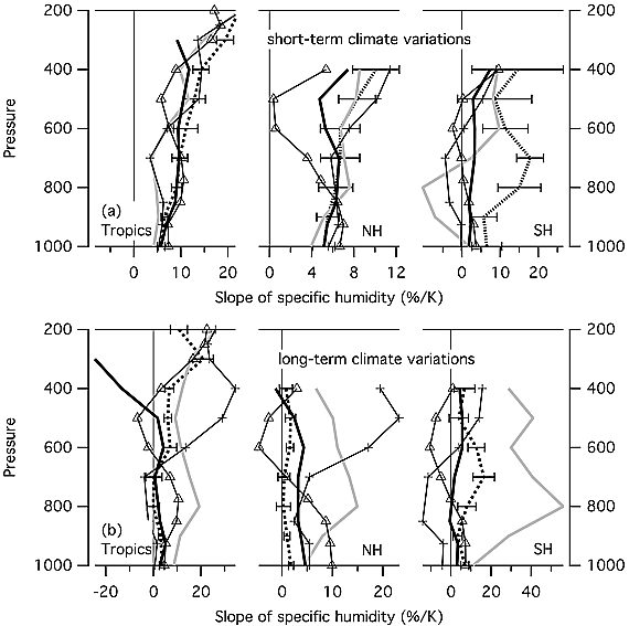 |
Figure 13: Trends in specific humidity for the ECMWF-Interim (ERA-I), MERRA, JRA-25, ERA-40, and NCEP re-analyses. NCEP does not provide data at 200hPa. Data covers 1989 - 2010 for ECMWF-Interim, and from 1979 - 2010 for the remaining re-analyses. 95% confidence intervals are shown only for ECMWF-Interim [10]. The vertical axis represents altitude, with decreasing atmospheric pressure as altitude increases [4]. Three geographic regions are displayed: the tropics (20°S to 20°N), northern hemisphere ("NH"; 20°N to 50°N), and southern hemisphere ("SH"; 20°S to 50°S). Top panel: Specific humidity change per year. The trend is represented as a percent; i.e. the specific humidity trend divided by the average specific humidity for a given pressure level over the entire time period. Middle panel: Short-term specific humidity change per unit of warming. The data is filtered to remove variations with a time-scale longer than 10 years. The trend is represented as a percent, as in the top panel. Bottom panel: Long-term specific humidity change per unit of warming. The data is filtered to remove variations with a time-scale shorter than 10 years. The trend is represented as a percent, as in the top panel [10]. |
I will focus on long-term, tropical upper tropospheric trends, since myth proponents focus on this region when discussing the hot spot's long-term, tropical upper tropospheric warming. Thus I will focus on the left-most portions of the top panel and of the bottom panel in figure 13 (if you are curious about the northern hemisphere trends vs. the southern hemisphere trends, then keep in mind that the troposphere warms more in the northern hemisphere than in the southern hemisphere; also note that some radiosonde data suggests that ERA-I and MERRA under-estimate increasing specific humidity in the lower troposphere).
Based on the top panel of figure 13, ERA-I, MERRA, and JRA-25 show some increased specific humidity in the tropical upper troposphere at around the 300hPa level, which represents a level at which the hot spot should occur (see "Myth: The Tropospheric Hot Spot does not Exist" for evidence of the hot spot at 300hPa). In contrast, ERA-40 and NCEP do not show increased specific humidity at this level. When one shifts to examining specific humidity increases per unit of warming in the bottom panel of figure 13, ERA-I, MERRA, JRA-25, and ERA-40 show increased humidity at 300hPa in the tropics. NCEP is the only re-analysis to show a decrease. So ERA-I, MERRA and JRA-25 support the prediction of increased specific humidity, while NCEP, and to a lesser extent ERA-40, argue against the prediction.
Some individuals defend NCEP's specific humidity reduction, including myth proponents David Evans and Roy Spencer, along with Garth Paltridge, who views climate science in political terms. Spencer claims that climate models failed to predict the specific humidity reduction, because the models may not accurately represent precipitation processes. Spencer's defense fails, however, since the models make fairly accurate predictions about precipitation patterns and the water cycle. And it is ERA-I, not NCEP, that better represents precipitation patterns. So Spencer's appeal to precipitation patterns would actually imply support for the specific humidity increases from ERA-I and climate models.
And even setting aside Spencer's reply, there are quite a number of reasons to reject NCEP's (and to a lesser extent, ERA-40's) reduction in specific humidity and instead accept the specific humidity increase depicted in ERA-I, MERRA, and JRA-25. These reasons include:
- Satellite analyses indicate that specific humidity increased up to the upper troposphere, including the tropical upper troposphere. However, ERA-I and MERRA over-estimate these increases over the past decade or so.
- Radiosonde analyses show increasing water vapor levels in the tropical troposphere and just outside of the deep tropics.
- ERA-I and MERRA tend to perform better than NCEP, and its improved successor NCEP-2, when it comes to representing atmospheric phenomena, with a couple of short-term exceptions. One should therefore consider using another re-analysis instead of NCEP-2, let alone using NCEP-2's more flawed predecessor NCEP. In comparison to NCEP and NCEP-2, ERA-I shows better agreement with precipitation data and water vapor measurements from satellite analyses, global positioning system radio occultation (GPS RO), and homogenized radiosondes. Homogenized radiosonde analyses also show greater agreement with tropospheric warming trends from ERA-I and MERRA than with trends from NCEP. This fits with NCEP's history of under-estimating upper tropospheric warming. So overall, NCEP seems less credible than ERA-I when it comes to upper tropospheric warming and humidity.
- ERA-I updates and improves ERA-40.
- Unlike ERA-I and MERRA, NCEP fails to accurately represent the specific humidity increase during the 1998 El Niño. And in comparison to NCEP, ERA-I and MERRA are better designed for examining long-term specific humidity trends.
The above points, along with the lines of evidence presented below, debunk Evans' defense of NCEP's decreasing specific humidity trend:
- Evans argues in favor of the radiosonde data used in the NCEP analysis, as does Spencer. However, this data contained heterogeneities. Homogenized radiosonde data shows greater agreement with ERA-I than with NCEP/NCEP-2 when it comes to water vapor and tropospheric warming trends. So Evans once again abuses radiosonde data that contain large heterogeneities, while he side-steps better-validated data sources (see "Myth: The Tropospheric Hot Spot does not Exist" for another example of Evans doing this).
- Since Evans wants to use the NCEP trend to argue against positive water vapor feedback increasing climate sensitivity, Evans appeals to other lines of evidence for low climate sensitivity. In particular, he appeals to ice-core-based estimates that indicate that CO2 levels increase after warming occurs. But Evan's reply fails, as I discussed in the context of prediction #2: evidence from the distant past (including ice-core-based evidence) rebuts Evans claim of low climate sensitivity.
- Evans claims that the hot spot's absence supports NCEP's declining specific humidity trend, since increased specific humidity should amplify warming in the upper troposphere. But Evans' point here fails, since multiple lines of scientific evidence show that the hot spot exists, as I discuss in "Myth: The Tropospheric Hot Spot does not Exist". Evans reasoning also fails because positive water vapor feedback does not cause the hot spot. Instead, latent heat release by condensing water vapor causes the hot spot.
Section 2.7: Prediction #4, Relative humidity remains fairly constant
Unlike specific humidity, relative humidity decreases during warm El Niño years such as 1998, as illustrated in figure 14 below for ERA-I:

 |
Figure 14: ERA-I and ERA-40 tropical (20°S to 20°N) average from 1979 - 2012, relative to a baseline of 1979 - 2001. Black lines represent ERA-I trends, while gray shading indicates ERA-40 trends. Panels a, b, and c display tropical upper tropospheric data at an atmospheric pressure level of 300hPa, while panel d shows data two meters above Earth's surface. Warming in panel c is greater than warming in panel d [11, figure 23 on page 348], indicative of a hot spot. |
The ERA-40 trends in figure 14 are less relevant than the ERA-I trends, since ERA-I updates and improves ERA-40. It remains unclear whether ERA-I's slight relative humidity increase (panel a, figure 14) represents a real trend, as opposed to resulting from a heterogeneity.
To put the ERA-I data into context, let's examine the tropical upper tropospheric trends from some of the other re-analyses (I again exclude CFSR and 20CR for the reasons discussed in the section on prediction #3, though an unpublished 20CR analysis shows fairly constant or slightly decreasing relative humidity in the tropical upper troposphere, while an unpublished CFSR analysis shows a fairly constant relative humidity in the tropical upper troposphere until ~2002, when relative humidity sharply decreases):
- ERA-I: Fairly constant relative humidity, with a possible slight increasing or slight decreasing trend, depending on how the ERA-I data is processed.
- MERRA: Fairly constant relative humidity until ~2002, when relative humidity sharply decreases.
- JRA-55: Fairly constant relative humidity until ~2002, when relative humidity sharply increases.
- NCEP: Relative humidity strongly decreases (both globally and in the tropics).
So the re-analyses conflict with one another, especially after 2002. Examining other sources helps reveal which analysis trends are less plausible. Let's start with the satellites as a source.
Satellite analyses show that upper tropospheric relative humidity is not constant in every geographical region, though relative humidity in the tropics is fairly constant, slightly increases with warming from 2000 - 2010, or slightly decreases since 1979. These satellite analyses show much better agreement with ERA-I than with MERRA; the satellites analyses conflict even more with the JRA-55's strongly increasing relative humidity trend. And the satellite analyses show no strong increase nor decrease in relative humidity in ~2002. This suggests that the MERRA's ~2002 decrease and JRA-55's ~2002 increase are heterogeneities, possibly resulting from how these two analyses process their relative humidity data sources.
The satellite analyses therefore cast doubt on large, long-term increases or decreases in relative humidity, while supporting ERA-I's fairly constant trend in relative humidity. This conclusion is further supported by the fact that homogenized radiosonde analyses also lack a sharp increase or decrease in 2002, though the analyses show long-term relative humidity increases in some regions and decreases in other regions. So overall, both the JRA-55 and MERRA trends appear less plausible than that ERA-I trend.
That leaves the NCEP trend. NCEP humidity trends should not be trusted, for the reasons I went over with respect to prediction #3. To make matters even worse for NCEP defenders, NCEP-2 shows a global, long-term increase in relative humidity, contradicting the long-term decrease seen in NCEP (though an unpublished NCEP-2 analysis shows a decrease in tropical relative humidity that is smaller than the decrease present in NCEP). This casts further doubt on the NCEP analysis, since NCEP-2 was meant as an improvement on NCEP.
One might appeal to radiosonde data in order to defend the NCEP analysis. However, radiosonde relative humidity data contained heterogeneities. Homogenized relative humidity analyses fit better with ERA-I, MERRA, and JRA-55, than with NCEP and NCEP-2. For instance, a homogenized radiosonde analysis from just outside the tropics shows fairly constant relative humidity, in conjunction with tropospheric warming and increasing specific humidity.
So the homogenized radiosonde data and the satellite data support the ERA-I's relative humidity analysis over NCEP's analysis. This rebuts Friends of Science's attempt to show that relative humidity decreased, based on their cherry-picking of the NCEP analysis and their exclusion of every other re-analysis. The satellite results also place myth proponent Roy Spencer in an interesting position, since Spencer plans to use the same satellite data that supports the ERA-I's fairly constant relative humidity trend.
Section 2.8: Predictions #5 - #7, Positive feedback from water vapor + clouds + reduced surface albedo
Friends of Science use a NASA Water Vapor Project (NVAP) analysis to argue that water vapor decreased science the 1980s. However, NVAP could not be used for this purpose, given unresolved heterogeneities in the NVAP analysis. More homogeneous analyses reveal that water vapor levels increased during recent periods of global warming, with much of the increase occurring in response to man-made global warming caused by increased CO2. So Evans was wrong when he claimed that water vapor levels decreased as CO2 levels increased. This water vapor increase acted as a positive feedback that amplified warming. So myth defenders are wrong when they claim that much of the predicted water vapor feedback did not occur.
Clouds also acted as a positive feedback, consistent with model-based predictions. Cloud responses may therefore augment CO2-induced global warming. This evidence debunks Friends of Science's claim that clouds act as a net negative feedback on warming, Spencer's criticism of positive feedback from clouds, and Ridley's objections to positive cloud feedback. Evans relies on data from the International Satellite Cloud Climatology Project (ISCCP) to argue for low climate sensitivity. Evans uses the ISCCP data on other occasions, as does Kenneth Richard of the No Tricks Zone blog. Unfortunately, the earlier ISCCP analysis contained large heterogeneities; the homogenized ISCCP analysis supports positive feedback from clouds, consistent with climate model predictions and other data-sets.
Spencer and Evans link (supposed) model failure with respect to clouds with model failures with respect to precipitation. Yet models made fairly accurate predictions about precipitation patterns and the water cycle. So Spencer and Evans' point does not fit with the evidence. On another occasion, Evans' takes a more moderate position by stating that cloud responses are not well understood. Scientists may have gone a long way in addressing Evan's concern, given the aforementioned evidence on positive cloud feedback, models accurately representing cloud-based responses, improvements in how climate models simulate clouds, and reduced uncertainty in estimates of cloud feedback.
Spencer and Evans link (supposed) model failure with respect to clouds with model failures with respect to precipitation. Yet models made fairly accurate predictions about precipitation patterns and the water cycle. So Spencer and Evans' point does not fit with the evidence. On another occasion, Evans' takes a more moderate position by stating that cloud responses are not well understood. Scientists may have gone a long way in addressing Evan's concern, given the aforementioned evidence on positive cloud feedback, models accurately representing cloud-based responses, improvements in how climate models simulate clouds, and reduced uncertainty in estimates of cloud feedback.
Earth's exposure to cosmic rays also did not change in a way consistent with cosmic rays reducing cloud cover and thereby causing recent global warming. This rebuts Evans' reference to the idea that increased solar activity shielded Earth from cosmic rays, reducing cloud cover and Earth's albedo, and thus warming the Earth. In contrast, melting ice reduced Earth's surface albedo and acted as a positive feedback amplifying warming, as observed in regions such as the Arctic.
Section 2.9: Taking stock of the predictions
So let's return to the seven model-based predictions for figure 3. How did the predictions fare, based on the evidence? Well:
- Well-supported: There should be a hot spot, indicative of a lapse rate reduction that acts as a negative feedback on warming (for more on this, see "Myth: The Tropospheric Hot Spot does not Exist"). In the Arctic, surface warming should exceed upper tropospheric warming, implying a lapse rate increase that acts as a positive feedback on warming.
- Well-supported: Estimates of climate sensitivity using measurements of past CO2 levels and warming, should be, on average, around the value given in figure 3.
- Well-supported: Water vapor levels increase during warming, with an increase in specific humidity.
- Evidence is mixed: Relative humidity stays fairly constant.
- Well-supported: Higher water vapor levels act as a positive feedback on warming.
- Well-supported: Clouds act as a net positive feedback on warming.
- Well-supported: Melting ice should reduce Earth's albedo and act as a positive feedback on warming.
So most of the model-based predictions were borne out, with the possible exception of prediction #4 regarding relative humidity. Hopefully the evidence on prediction #4 will become clearer in the future. And even given the issues with prediction #4, the evidence on predictions #2, #5, #6, and #7 show that positive feedback is occurring, consistent with the model-based predictions. This is true regardless of whether or not the hot spot exists, as per prediction #1. Therefore these observed positive feedbacks provide another line of evidence against the myth proponents' claim that the hot spot's absence implies muted positive feedback and less global warming.
3. Posts Providing Further Information and Analysis
- Section 2.2 of "Myth: Attributing Warming to CO2 Involves the Fallaciously Inferring Causation from a Mere Correlation"
- Section 3.2 of "John Christy and the Tropical Tropospheric Hot Spot, Part 1"
- "Myth: The Tropospheric Hot Spot does not Exist"
- Section 3.1 of "Christopher Monckton and Projecting Future Global Warming, Part 1"
No comments:
Post a Comment